Spatial Intelligence Is Becoming an Agent. Where Do You Stand?

Spatial Intelligence Is Becoming an Agent. Where Do You Stand?
Geoawesome Team · July 2026 · 7 min read
The question that keeps surfacing at every geo conference, summit, and community call this year is the same one: when does spatial intelligence stop being a layer and start being the reasoning itself?
For decades, the answer was: not yet. GIS required portals, experts, and deliberate workflows. You had to know where the data lived, how to access it, and how to translate a question into a query. The interface between curiosity and geospatial insight was friction – necessary, accepted, and largely invisible to the people who’d learned to live with it.
That friction is dissolving. Fast.
Two products. One shift.
At OGC Connect Helsinki in June 2026, Javier de la Torre of CARTO demonstrated something that stopped the room. He typed a single question about new data centers going up in Finland – reportedly for Microsoft – and what they might mean for power, water, and forests nearby. No portal. No layer picker. No GIS specialist stands between the question and the answer.
The agent took it from there. It found candidate sites on its own. Without being told a single dataset name, it reached into the National Land Survey of Finland, the Finnish Environment Institute, Copernicus, Statistics Finland, and Eurostat – sources it was never pointed toward – pulled what it needed, and came back with a complete spatial analysis, every number linked to its source.
“No portal. No layer picker. No GIS specialist in the loop.”
Javier de la Torre, CARTO – OGC Connect Helsinki, June 2026 · He called it: disintermediation
The same week, GIS Cloud publicly released a suite of generative AI tools that take a different but complementary approach. Instead of an autonomous agent operating without supervision, GIS Cloud has embedded natural language directly into its GIS platform – letting users describe what they want to do in plain language and having the platform handle the GIS operations behind the scenes. Spatial queries. Form generation. Voice input. Photo-to-record extraction. MCP integration with Claude. All human-in-the-loop by design – but the barrier to entry is completely gone.
Two very different products. The same underlying shift.
The numbers behind the shift
This isn’t just demo season. The foundations are genuinely moving.
WGIC’s Horizons 2026 report named geospatial as “critical digital infrastructure” – not a specialist layer tucked behind GIS workflows, but a foundation that other systems build on top of. The ITU has described geospatial large language models as introducing “a transformative paradigm in which natural language becomes the interface to spatial intelligence.” Put those things together and the bottleneck quietly moves. It’s no longer can the model do this. It’s do we have the reference data, provenance, and standards to let it do this responsibly.
Cherie Wong, Mapbox’s SVP of Location Services, made a version of this point at The Next Geo in April 2026: maps have stopped being static visual products – they’ve become programmable systems, more like cloud infrastructure than pictures. Her sharper point, and the one worth sitting with: AI doesn’t reduce the need for reliable mapping infrastructure. It raises the bar for it. Agents are only as trustworthy as the spatial data they’re quietly standing on.
The question we can’t answer alone
The Helsinki demo already answered “does this work.” It works. Convincingly. What it didn’t answer – what no single demo, report, or benchmark can – is whether we, the people who build and depend on spatial systems, are ready to let an agent act on our behalf without a human checking its work first.
That answer isn’t the same for everyone. It depends on your domain – flood risk modelling is not the same trust calculus as retail site selection. It depends on your data quality, your regulatory environment, and how much of an explainability gap you can live with when something goes wrong. A benchmark score doesn’t settle any of that.
Only the community actually doing the work can.
Tell us where you stand
7 questions · under 2 minutes · no login needed · closes July 20, 2026
Open until July 20, 2026 · No login required · Results published in the August edition
This isn’t a data collection exercise. It’s how we figure out, together, what we actually think about the line we’re all about to cross.
Send it to the colleague who’s already building this stuff – and the one who thinks it’s overhyped. We want both.
How do you like this article? Read more and subscribe to our monthly newsletter!




#Deep Tech

Next article
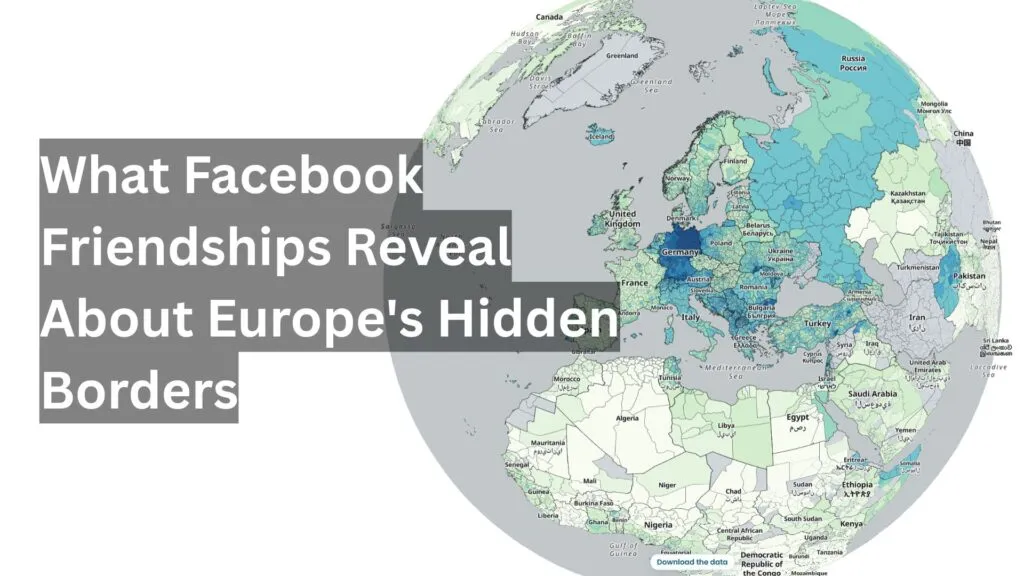
Geospatial data has always been more than dots on a map – it’s actually a way for describing how people, cultures, and economies actually reach across distance. Borders drawn on maps rarely match the lived reality of a place: families split by a new frontier still call each other, diaspora communities still send money home, and workers still follow the same seasonal routes their parents did. Mapping these ties turns history and migration into something visible, revealing the world as a network of relationships that geography alone can’t fully explain.
Meta and a team of NYU Stern economists have just released an updated version of the Social Connectedness Index (SCI). The SCI measures the relative probability that two people in different places are Facebook friends. That sounds like a strange thing to build a research dataset around, but it turns out to be a good proxy for the real social ties that connect places: migration corridors, minority communities split by a border redrawn a century ago, seasonal labour circuits, whatever has moved people between two spots over time.
The 2026 release covers 178 countries, with subnational data down to GADM level 2, geoBoundaries units, NUTS regions, and US counties and ZIP codes.
What the index actually measures
For any pair of locations, the SCI is built from anonymised Facebook friendship data, scaled so that the strongest observed connection in a file gets a value near 1,000,000 and the weakest gets a value near 1. If the SCI between Warsaw and London is twice that between Warsaw and Madrid, a randomly chosen Facebook user in Warsaw is roughly twice as likely to be friends with someone in London as with someone in Madrid.
It isn’t a measure of friendship intensity or contact frequency, and it says nothing about people who aren’t on Facebook. But at the scale of countries and regions, it picks up something real: places with a shared border, a migration wave, or a minority population tend to show up strongly connected, while political boundaries and plain distance suppress the number even between close neighbours.
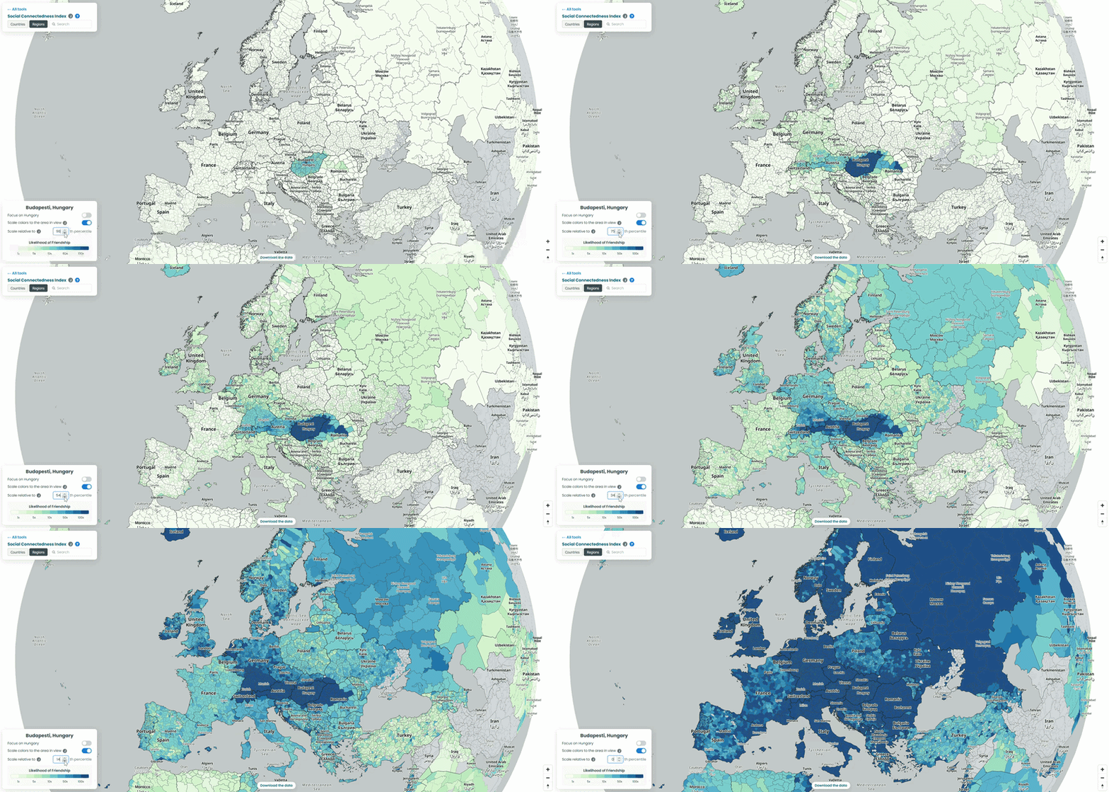
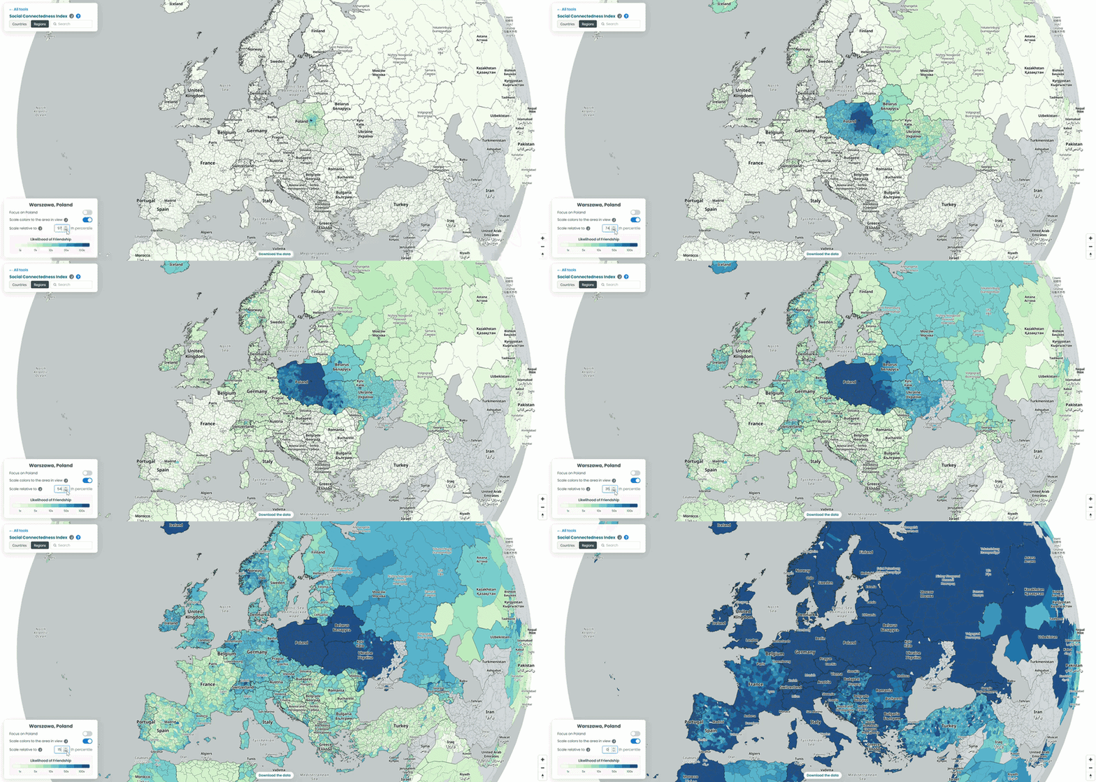
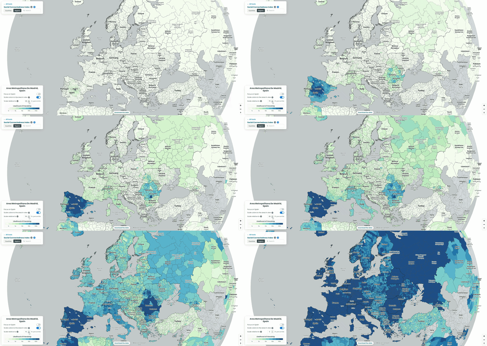
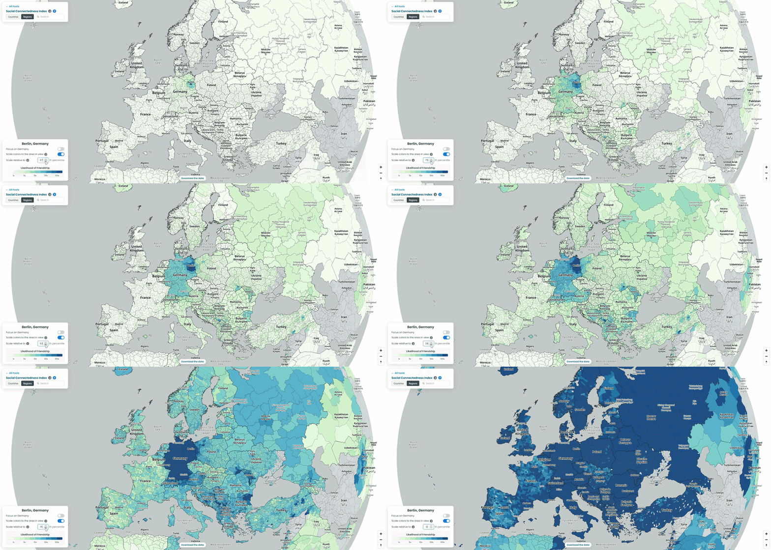
For each country in our example, we pulled the top 10 connections for every NUTS3-level region to a location outside its own borders, then looked at which neighboring countries absorbed the largest share of those cross-border ties. To explore the data yourself, choose a country from the list and interact with the map – zoom in to see regional detail or zoom out to trace how its connections extend across borders. We also played with the “Scale relative to Xth percentile” slider on the SCI explorer, moving it from 100 down to 1, to see how the visible connections from the capitals of each country shift as weaker ties are revealed (See examples below!).
Hungary’s counties are tied to their historical minorities
The Romanian and Serbian numbers aren’t spread evenly across those countries. They concentrate hard in a handful of specific counties: Harghita and Covasna in Romania, and North Bačka and North Banat in Serbia. Those four happen to be the parts of Transylvania and Vojvodina with the largest ethnic Hungarian populations left over from the 1920 border changes after the First World War. A century later, that history still shows up clearly in who’s friends with whom on Facebook. The Austrian connections tell a more simple, present-day story: they cluster in Tyrol and around Salzburg, both regions that pull in Hungarian seasonal workers for tourism and hospitality.
Poland’s counties point at the neighbours and western-european countries
In the interactive map, the top connections from Polish counties are dominated by Western European countries: Germany leads by a wide margin, with the Netherlands, Switzerland, Norway and, more surprisingly, Iceland also standing out. Worth noting: Ukraine and Belarus don’t appear here at all, because both are missing from the underlying SCI dataset – they are, however, included in the map on the SCI explorer itself (See visual below!).
The Iceland connection is easy to miss but worth pausing on. It splits fairly evenly between the capital region around Reykjavik and the rest of the country, which lines up with something well-documented but rarely visualised: Poles are the largest immigrant group in Iceland, and they’re spread across fishing and tourism towns nationwide, not clustered in the capital the way most migrant communities are. The interactive map reads as a fairly clean picture of the labour migration that followed Poland’s 2004 EU accession.
Spain’s strongest ties abroad go to Romania!
Romania takes by far the largest share of top connections from Spanish counties, well ahead of Portugal, despite Portugal sharing a land border with Spain and Romania being over 2,000 kilometres away. It matches a real, large migration story: Spain has one of the largest Romanian communities in Europe, built up over roughly two decades of labour migration, concentrated in agriculture and construction. Bulgaria shows up too following a similar pattern. It’s a good example of the SCI’s core finding holding up here in reverse: distance normally predicts connectedness well, and this is a case where migration history overrides it completely.
Germany’s connections read like a map of its guest worker and refugee history
Germany has 400 NUTS3 districts (the most of any country in the release) so this map has the most going on. Balcan countries lead the top connections, followed by a cluster in Austrian nd Switzerland. Kosovo and North Macedonia are the two that stand out, since neither is an EU member and neither shares a border with Germany. Both trace back to the same source: the large Kosovar and North Macedonian diaspora built up first through the 1960s-80s Gastarbeiter recruitment programmes and then reinforced by refugee movements during and after the Yugoslav wars. Greece’s presence is the older half of the same Gastarbeiter story. It’s a rare case of a single dataset making six decades of labour and refugee migration visible in one picture.
How far does the NUTS data actually reach?
All four interactive maps above use the SCI’s NUTS 2024 file, which only covers Europe. Worth knowing exactly how far “Europe” goes here before reading too much into any gaps: the file has region-level data for 36 countries, from Germany’s 454 districts down to 3 each for Cyprus, Luxembourg, and Montenegro. Turkey is included as a candidate country, as are Albania, Serbia, North Macedonia, Bosnia and Herzegovina, and Montenegro. Iceland, Norway, and Switzerland are in as EFTA members. Anywhere outside that list, this particular file has nothing to say, even if the country-to-country SCI file covers it.
Where to get the data
The full SCI dataset, including the country-to-country, GADM, geoBoundaries, NUTS, and US county and ZIP code files, is freely available through the Humanitarian Data Exchange. Meta’s team also runs an interactive explorer for browsing connectedness maps without writing any code, and a companion GitHub repository with an R-based mapping tool for more advanced use.
Data like this only becomes useful once it’s put on a map, and GIS tools make that operation straightforward. But turning a spreadsheet of index values into a convincing map comes with a responsibility to be clear about what’s actually being shown. The SCI is a proxy built from one platform’s friendship data, not a census of who is connected to whom, and its coverage gaps can just as easily be mistaken for an absence of real-world ties as for a gap in the source. Anyone building on this data, or reading a map made from it, should treat it the way you’d treat any single proxy: a signal worth exploring, not a complete picture on its own.
References
Johnston, D., Kuchler, T., Kulkarni, M., & Stroebel, J. (2026). The Social Connectedness Index. Data in Brief.
Bailey, M., Cao, R., Kuchler, T., Stroebel, J., & Wong, A. (2018). Social Connectedness: Measurement, Determinants, and Effects. Journal of Economic Perspectives, 32(3), 259-280.
How do you like this article? Read more and subscribe to our monthly newsletter!