
Google built a system that goes from a plain-English question to a trained planetary model without a data engineer touching it. NISAR opened its radar archive to everyone. A chunk of Greenland the size of Manhattan floated away, and Sentinel-1 watched the cracks spread for months beforehand. Meanwhile western Europe burnt through its worst fire season on record, and there is now a browser app that lets you replay the smoke.
From a Question to a Trained Model, With Nobody in the Middle
The most substantial release of the month is easy to underrate because it has no pictures of Earth in it. Google Research introduced the planetary prediction engine on 27 August, an experimental system that takes a geospatial question in ordinary language and runs the whole modelling pipeline itself: finding relevant data, engineering features, training models, checking them, and writing up the result.
Anyone who has built this kind of model knows where the weeks go. Not the modelling, the assembly. Finding covariates, aligning them, working out which ones leak the answer into the inputs. The engine handles those steps in three stages. It first turns the prompt into hard geographic constraints and hunts for signals across Data Commons and Earth Engine, then searches government portals and academic repositories live when a repository does not have what it needs. It fuses those covariates with foundation model embeddings, AlphaEarth for imagery and the Population Dynamics model for socio-demographics, and runs what the team calls a Feature Gate that throws out any covariate failing four anti-leakage tests. Only then does it search across model families and fit something.
The benchmarks are the interesting part. Across 21 CDC health indicators it reached a mean R² of 76.8 percent against 60.0 percent for a manual expert pipeline. Downscaling food security in Nigeria from state to local government area level, it more than doubled the baseline, 66.1 percent against 31.5 percent. Nowcasting new transmission zones during the 2026 Bundibugyo ebolavirus outbreak in the DRC, it correctly flagged 15 of 18 newly invaded health zones across five weekly forecasts, about ten points better than the published Bayesian baseline. The consistent finding across all of it is that statistical covariates and foundation model embeddings work better together than either does alone. They encode different things.
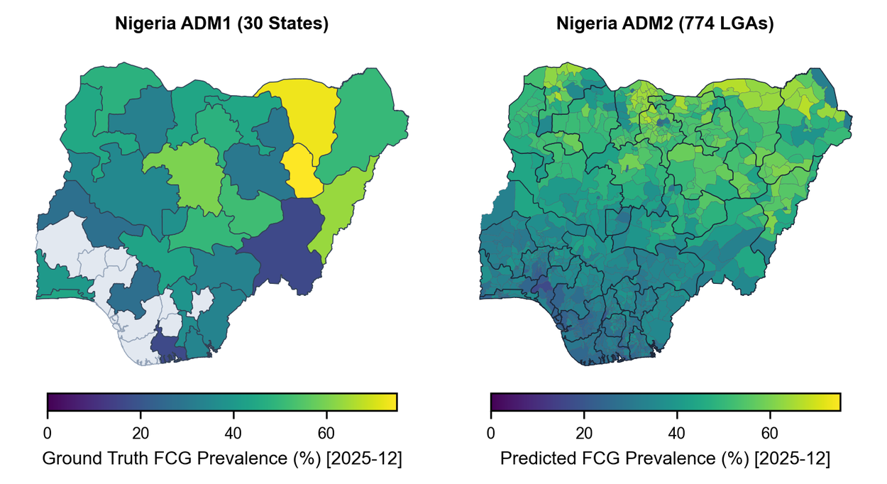
Food security downscaled from state to local government area level, ground truth against prediction for December 2025. Credit: Google Research
Background: Geospatial Reasoning, the framework this builds on
Embeddings Get a Clock
The other half of the Google story landed on 29 July. Until now the AlphaEarth Satellite Embedding dataset has been annual: one 64-band snapshot per calendar year, global. Useful for mapping, less useful for watching something change. Custom Satellite Embeddings, now in private preview, let you request embeddings for your own area and your own window, down to a five-day cadence.
That shift from annual mapping to rolling monitoring is what makes the product worth attention. The example that makes the case is the Palisades Fire in Los Angeles: embeddings from before the fire, embeddings from after, and a change map built by taking the dot product similarity between them, which isolates the burn scar in bright white without anyone writing a burn index. Same technique works for crop cycles, storm damage, vegetation encroaching on power lines, and EU Deforestation Regulation compliance.
There is a free route in for researchers. Google is offering selected academics a sample dataset through Earth Engine, with applications open until 15 October. Prior Earth Engine experience and an institutional affiliation are expected.
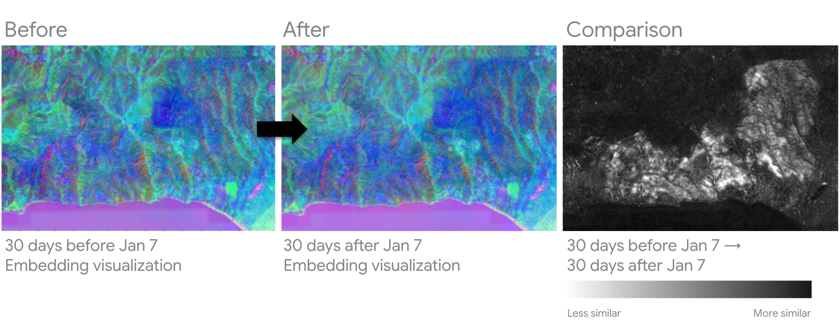
Embedding states 30 days before and 30 days after 7 January, with a change map on the right built from dot product similarity. The burn scar isolates in bright white. Credit: Google Maps Platform
NISAR Opens the Archive
NISAR started releasing calibrated L-band products continuously on 20 July, covering observations back to 17 June. Earlier releases had been small batches of sample or pre-calibrated data. ISRO began putting S-band products out through its Bhoonidhi system four days later. Between them the two instruments give complementary views at different wavelengths, and the satellite covers nearly all land and ice twice every 12 days.
The image everyone shared was the one NASA nicknamed the hummingbird: Nunatak Zaterjavshijsja in East Antarctica, a mountaintop pushing through an ice stream, with crevasses radiating out from it like feathers. Worth being precise about what the colours mean, because the composite gets reposted without context. Magenta and green are radar response categories, not ice. Magenta corresponds to returns from smoother surfaces, green to volume scattering and irregular structure such as crevasse faces, white where both are strong. The bird shape is real geography: the mountain obstructs the flowing ice, stress builds, and the ice fractures around it. The same scene in Landsat 9 optical imagery is mostly white.


Petermann Lets Go
On 4 August a 76 square kilometre section of Petermann Glacier’s floating ice tongue broke away in northwest Greenland. It is the glacier’s largest loss of floating ice since 2012 and the biggest Arctic calving since 2020. The resulting ice island is roughly the size of Manhattan and up to 150 metres thick.
What makes this one worth more than a headline is that it was watched happening. Sentinel-1 imagery on 3 August showed the centreline of the tongue deteriorating; by the next day the ice island had detached from the eastern side. Researchers funded partly through ESA’s FutureEO ARCTEX project have been tracking Petermann since 2019, documenting fractures growing across the tongue. Interferometric observations from April had already picked up deformation months ahead of the break.
The interferometry was possible because Sentinel-1C and Sentinel-1D were flying in tandem during Sentinel-1D’s commissioning, giving one-day repeat SAR. That cadence let the team follow crack propagation close to real time and measure how the ice tongue moved with the tides. Two more rifts are propagating, with potential ice islands of roughly 97 and 87 square kilometres behind them. Environment and Climate Change Canada is tracking the berg’s drift, since masses this size can persist for years and fragment into pieces that are harder to detect.
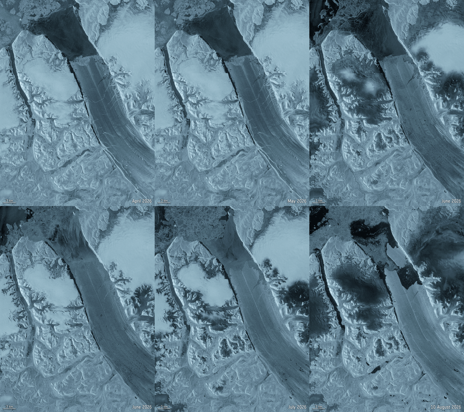
Sentinel-1 radar, April to August 2026. The fractures widen across the tongue for months before the 4 August calving. Credit: ESA
The Ocean’s Warmest July, and Europe’s Worst Fires
The July 2026 Copernicus bulletin recorded the highest July sea surface temperature ever measured across the extra-polar ocean, 20.96°C, past the 2023 record of 20.89°C. Developing El Niño conditions in the equatorial Pacific are part of it. Around Europe, SSTs hit July records along the Atlantic coast and western Mediterranean, with strong to severe marine heatwaves.
On land the pattern was a sharp west to east split. Western Europe had its hottest June to July on record at 2.79°C above average, beating 2022, along with its third and fourth heatwaves since May, while eastern Europe and Scandinavia ran cooler than average. Soil moisture in western Europe was lower than in July 2022. The Seine, Rhine and Danube all ran exceptionally low, squeezing water supply, irrigation, river transport and energy production.
That combination produced the fire season. France went through its worst July on record for wildfire carbon emissions at 0.89 Mt C, well past its 2022 record of 0.64 Mt C, with large fires in the Fontainebleau forest near Paris and across the southeast.
If you want to explore that yourself, CAMS released Fire Emissions Watch on 29 July, a browser app over the Global Fire Assimilation System dataset. It covers 2003 to the present, shows both satellite-derived emissions and forecast smoke plumes, and lets you replay a period, switch between grid cells, countries, provinces or a custom selection, and download charts. It runs in the browser because ECMWF converted the underlying data to Zarr, which is a quietly significant piece of plumbing news in itself.
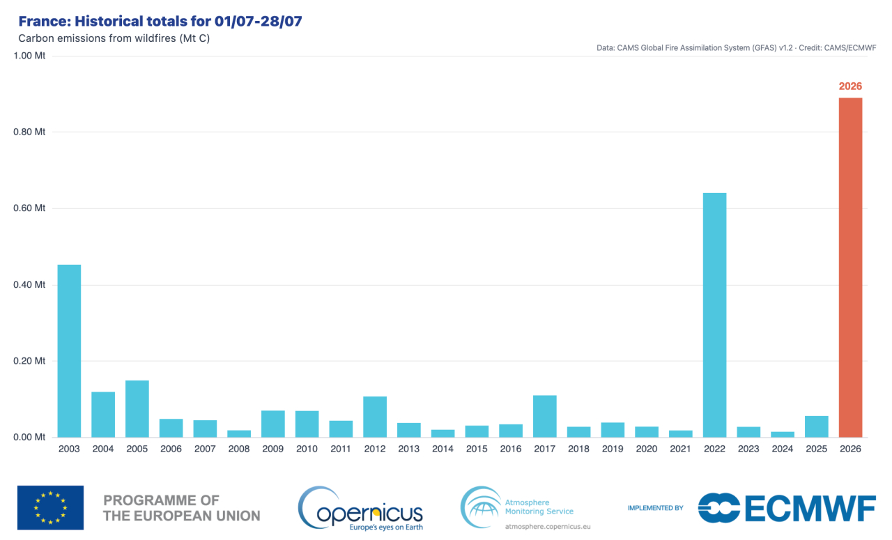
Carbon emissions from wildfires in France, 1 to 28 July, each year since 2003. 2026 reached 0.89 Mt C against the 2022 record of 0.64 Mt C. Credit: CAMS
Related: faster Sentinel-3 data for European fire monitoring, NOAA satellites on the western US outbreak, and NASA Worldview’s Oregon, Washington and British Columbia imagery
Overture Data Arrives as Parquet Layers in ArcGIS Online
A practical one for anyone working with large open datasets. Esri has released eight Early Access Parquet feature layers built from Overture Maps Foundation data: addresses, railways, infrastructure points, lines and polygons, places, major cities and division areas.
The Parquet feature layer type went into beta in the June 2026 ArcGIS Online release, and it exists for exactly this case, large read-only cloud-hosted datasets. Overture publishes monthly from OpenStreetMap, Esri Community Maps, Microsoft, Meta and others, which is far too much to copy into a hosted feature service. Worth noting the limitations: symbology and popup configuration cannot live inside the Parquet layer itself, so Esri is sharing pre-configured web maps through a group rather than raw layers. Filtering, labelling and symbology changes work.
Paper Towns and Other Cartographic Mischief
The best map story of the month is nearly a century old. Open Culture revisited the practice of planting fake towns on maps as copyright traps. The logic holds up: two cartographers might independently draw the same real town, but they will not independently invent the same fake one, so a rival’s map containing your invention is proof of copying.
Agloe, New York was one such invention, placed in Delaware County in the 1920s by Otto G. Lindberg and his assistant Ernest Alpers while making maps for Esso. Then something odd happened. A business called Agloe Lodge Farms opened in 1930 and put the name on a fishing lodge it acquired. When Rand McNally was challenged over including Agloe on their own maps, they could point to county records. The fake place had become real enough to defend. The lodge later closed, and by 2014 the name had dropped off Google Earth.
Elsewhere in map craft: John Nelson and Peter Atwood have been reviewing the maps that appear in films, ESA has put its ESTEC facility online as a virtual tour, and if you need to pin down an old scan, MapTiler published a walkthrough of georeferencing an image online with advanced transformations and GCP lists.
Worth a Look
A few more from the month. Esri on meshes versus Gaussian splats for reality capture, and on multiscale surface tools for seafloor structure. Geo Week News on making 3D data something a machine can act on. GPS World on HydroGNSS data opening up, and Inside GNSS on using ADS-B data to map GNSS interference. Space.com on the first air-breathing satellite thruster for very low Earth orbit. Google Earth on mapping and monitoring Latin American biodiversity under 30×30. USGS on Landsat tracing the life cycle of a mine. Planet on what satellite mosaics are and how they keep maps current. And DroneDJ on a DJI drone flying the Khumbu Icefall on Everest.
Compiled by the Geoawesome team. Got something we missed? Reach out, we read everything.
Did you like this post? Read more and subscribe to our monthly newsletter!



#Ideas

Next article


Trimble’s Q2 Results Show the Business Behind Its ‘AI-Native’ Ambition
Every technology company now has an AI sentence. Trimble has something more useful: five years of financial restructuring that might allow the sentence to become a business model.
The positioning, construction and industrial-technology company reported second-quarter 2026 revenue of $972 million, up 11% year over year. Adjusted earnings reached $0.86 per share, while annualized recurring revenue rose to $2.51 billion, up 14%, according to Trimble’s quarterly announcement.
Trimble raised its full-year outlook and said it achieved a 30% adjusted EBITDA margin a year earlier than planned. The measures are company-defined and adjusted, but the quarter gives real financial weight to its claim that Trimble can become an “AI-native intelligence and execution layer for the physical world.”
The more interesting question is not whether Trimble uses AI. It is whether the company’s mix of hardware, software and field data gives it an advantage that Autodesk, Bentley, Hexagon, Procore and specialist AI vendors cannot easily copy.
The quarter completes a longer transformation
Trimble’s February 2026 investor overview provides the clearest benchmark. Between 2020 and 2025, ARR increased from $1.3 billion to $2.4 billion. Recurring revenue rose from 40% to 65% of total revenue, while software, services and recurring products expanded from 58% to 79% of the mix.
Over the same period, non-GAAP gross margin increased from 59% to 72%, non-GAAP operating margin from 23% to 28%, and adjusted EBITDA margin from 25% to 29%.
The new 30% quarterly EBITDA result therefore looks less like a one-off AI dividend and more like the latest stage of a deliberate portfolio shift. Trimble divested 23 businesses and completed 13 acquisitions over the five-year period, moving away from lower-margin or less connected operations while concentrating on software-led workflows.
Revenue moved from $3.2 billion in 2020 to $3.6 billion in 2025—modest expansion compared with ARR growth. Much of the value creation came from changing revenue quality, not simply making Trimble larger.
Trimble occupies an unusual competitive position
Trimble is neither a pure AEC software company nor a traditional instrument manufacturer. It competes with Autodesk and Nemetschek in design and construction applications, Bentley in infrastructure workflows, Hexagon in measurement and digital reality, Procore in construction management, and Topcon or Deere in field systems and machine automation.
That breadth is both its moat and its organizational problem.
Autodesk is larger in design software, with fiscal-2026 revenue above $6.4 billion. Bentley is more concentrated on infrastructure software, at roughly $1.55 billion in recent comparisons. Trimble sits between them in software scale but has a broader physical footprint. Software-heavy peers often command higher margins and valuations; Trimble must prove its connected hardware adds strategic value rather than diluting software economics. Its five-year margin trend suggests progress.
What “AI-native” could mean in practice
Trimble CEO Rob Painter has repeatedly emphasized “ground truth”: connecting digital models with precise information from work happening in the field. That is a credible differentiator.
A generic AI assistant can summarize a specification. Trimble can potentially connect that specification to a coordinated model, a survey control network, site measurements, schedules and machine guidance. The valuable output is not another answer in a chat window; it is a better decision that reaches a crew or machine.
Trimble says it has millions of software users and hundreds of thousands of connected instruments and machines. Recent moves include conversational AI in SketchUp, autonomous procurement and quotation in Transporeon, AI estimating tools and the acquisition of construction-risk specialist Document Crunch. Together they show the intended stack: simpler interfaces, domain models extracting operational signals, and field systems closing the loop between recommendation and execution.
Competitors are pursuing the same direction. Autodesk is embedding AI across design and construction data. Bentley is building infrastructure intelligence around digital twins and asset data. Hexagon combines sensors, reality capture and industrial software. Procore owns a large construction collaboration graph. Trimble cannot win merely by placing assistants inside existing products.
Its defensible position would be the coordinated chain from measurement to model to action.
The risks behind the margin story
Adjusted EBITDA excludes specified costs, and quarterly margins can benefit from mix and timing. The better evidence is multi-year: ARR nearly doubled, recurring revenue gained 25 percentage points of mix and gross margin expanded by 13 points.
AI introduces another risk. Construction, geospatial, transportation and agriculture have different data models, buying centers and tolerance for automated decisions. Trimble’s portfolio was assembled across many products and acquisitions. Calling it one intelligence layer is easier than making permissions, identifiers and workflows interoperable across the entire estate.
As software moves closer to machine movement, measurement or safety-critical work, Trimble will also need stronger traceability and validation than a conventional document assistant.
A stronger business, with an unfinished AI thesis
Trimble’s Q2 results are important because they show the company entering the AI cycle from a stronger financial position than it occupied five years ago. Recurring revenue is larger, margins are higher and the portfolio is more focused.
That does not prove Trimble has become AI-native. The next benchmark is whether AI raises retention, cross-selling, consumption revenue and customer productivity across connected workflows.
If Trimble can demonstrate that, the hardware will not be a legacy burden. It will be the sensing and execution network that makes its software harder to replace.
Sources: Trimble Q2 2026 results; Trimble February 2026 investor overview; Trimble Q1 2026 earnings transcript; AEC software benchmark; 2025 “Big Four” construction-software comparison.
How do you like this article? Read more and subscribe to our monthly newsletter!