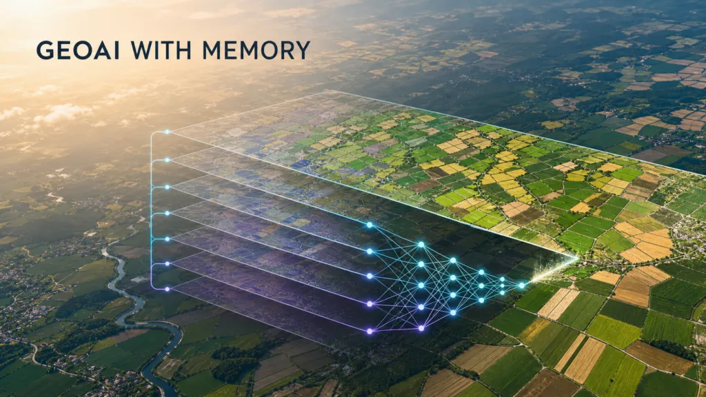

Earth-observation systems produce vast historical archives, but the models creating those archives often behave as if every year were the first.
A crop-mapping model might process the latest Sentinel imagery, infer what is growing in each field and then hand the result to a separate consistency layer. That workflow can work, but it keeps temporal reasoning outside the model. A new study asks a deceptively simple question: what if the model could directly use its own earlier maps as another input?
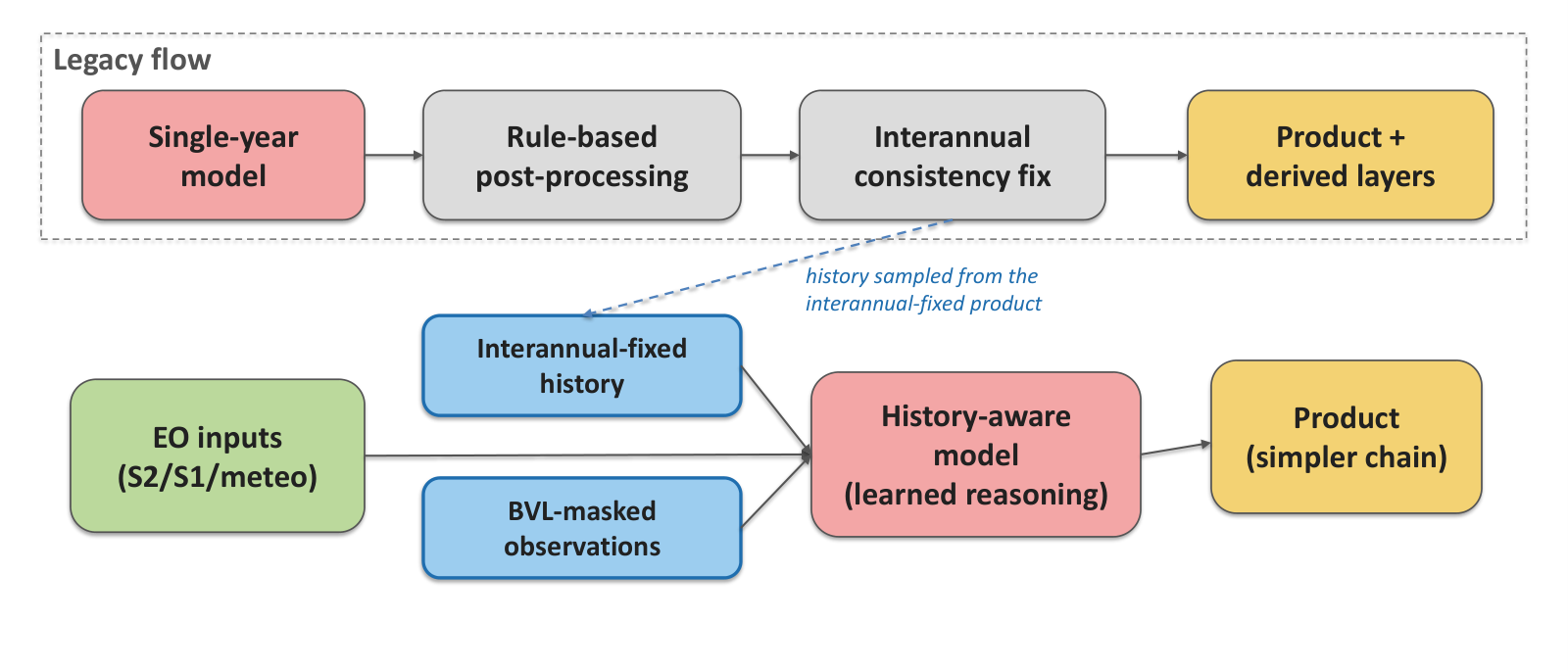
The research, focused on the Copernicus High Resolution Layer Croplands production setting, offers a practical version of “memory” for GeoAI. The authors do not propose a general-purpose agent or a larger foundation model. Instead, they feed thirteen years of aligned historical class predictions and a Basic Vegetation Layer signal into the existing multi-source architecture.
The missing temporal context
Most land-cover systems already acknowledge that geography changes over time. The problem is where that logic lives. In many operational pipelines, the classifier sees only the current year while temporal rules are applied later. This separation makes the system harder to optimize end to end and prevents the current prediction from learning directly from previous output patterns.
The paper reframes those prior maps as a “free input modality”: free not because they cost nothing to produce, but because an operational programme has already created them. Instead of treating yesterday’s predictions as an inert archive, the model treats them as structured context.
Turning old predictions into a new input
The added branch is deliberately lightweight. It consumes two aligned time series for each location: the product’s own class history and a vegetation mask. The model then combines those features with the baseline inputs used in production.
This matters because historical predictions encode more than class labels. They also capture the behaviour of the whole earlier production process: sensor availability, model decisions, local crop rotations and the way particular landscapes are represented. Used carefully, that record can help the new model distinguish genuine change from a one-year anomaly.
The approach is also operationally attractive. It does not require building a new continental reference database or acquiring a novel sensor. It reuses an asset the programme already owns.
Modest overall gains, larger gains where history matters
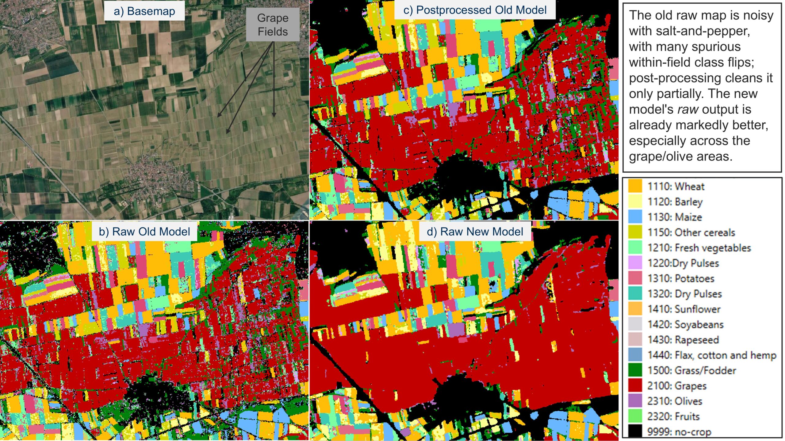
The headline improvement is not a dramatic leap in aggregate accuracy. That is important context. The value appears in more consistent predictions, class-level gains and fewer implausible year-to-year changes.
For a continental product, those changes can be strategically significant. Users often compare annual maps, measure transitions and detect trends. A small improvement in a single-year score may understate the benefit if the resulting time series contains fewer false flips.
Why consistent masks matter
Temporal stability is not simply aesthetic. A noisy transition can be mistaken for crop rotation, land abandonment or a change in management. Those errors propagate into statistics, policy analysis and downstream machine-learning systems.
By making history available during inference, the model gains a prior about what is plausible at a location. The vegetation layer provides an additional constraint, helping it avoid classifications that conflict with the land’s broad physical state.
Not every problem needs a larger foundation model
The study lands at a moment when the geospatial AI conversation is dominated by foundation models and agentic workflows. Its lesson is more prosaic and possibly more useful: some operational improvements come from better system design rather than more parameters.
A mature mapping programme has accumulated valuable internal data. Turning that archive into a model input can be cheaper, more explainable and easier to deploy than replacing the entire stack.
The danger of inherited errors
History can also mislead. Previous maps contain their own systematic errors, and a model trained to trust them may repeat or reinforce those mistakes. The authors’ result should therefore be read as evidence for controlled temporal context, not as permission to treat past predictions as ground truth.
Future operational work will need to monitor error persistence, confidence calibration and performance in places where land use changes abruptly. New construction, extreme weather and changes in agricultural practice are exactly the cases where yesterday’s map may be least reliable.
GeoAI with memory
The broader implication extends beyond crop mapping. Any regularly updated geospatial product—buildings, roads, forests, impervious surfaces or settlement layers—could potentially use its own output history as context.
The shift is subtle: a mapping model stops being a sequence of isolated annual classifiers and starts behaving like a system with continuity. That is not full agentic reasoning, but it is a meaningful step toward GeoAI that understands not only where something is, but how its mapped state has evolved.
Research source: “Multi-Year Geospatial Reasoning using Interannually-Consistent Historical Predictions as a Free Input Modality”. The paper is a preprint and its reported findings have not yet been independently replicated.
How do you like this article? Read more and subscribe to our monthly newsletter!



#GeoAI

Next article
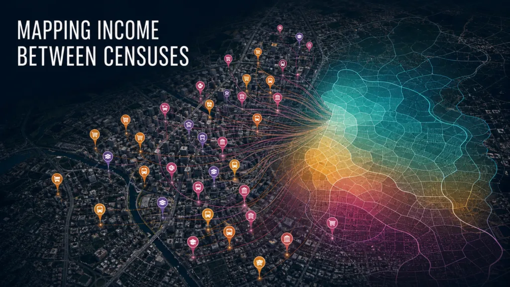
Census income maps are essential infrastructure for public policy, retail planning and social research. They are also snapshots. By the time a decennial census has been cleaned, mapped and embedded in decision-making, neighborhoods may already be changing faster than the official data can show.
A new study asks whether a familiar commercial map can help fill that gap. Using points of interest retrieved from Google Maps and income data from Brazil’s 2022 census, the researchers trained machine-learning models to estimate monthly household reference income across census sectors in São Paulo. The result is not a substitute for official statistics. It is a useful test of how the institutional landscape recorded by a mapping platform can act as a proxy for local socioeconomic structure.
The problem with ten-year snapshots
Income estimates are unusually difficult to update between censuses. Surveys can provide timely indicators at national or regional scale, but their samples are rarely dense enough to describe small neighborhoods. Satellite imagery can identify buildings, roads and physical change, yet wealth is not always visible from above. Administrative records can be powerful, although access, consistency and privacy constraints limit their reuse.
Points of interest offer a different signal. Restaurants, clinics, schools, banks, shops and public services encode how a place functions. Their mix can reflect purchasing power, employment patterns, public investment and accessibility. Because commercial mapping platforms are updated more often than censuses, POIs could provide a relatively current layer for estimating where socioeconomic conditions may have shifted.
Reading the institutional landscape
The study links Google Maps POIs to census sectors and represents each area through the composition of nearby place categories. Rather than assuming that a single amenity indicates affluence or deprivation, the models learn patterns across the broader local mix. The authors test dimensionality-reduction techniques, including principal component analysis and non-negative matrix factorization, before using regression models to estimate income.
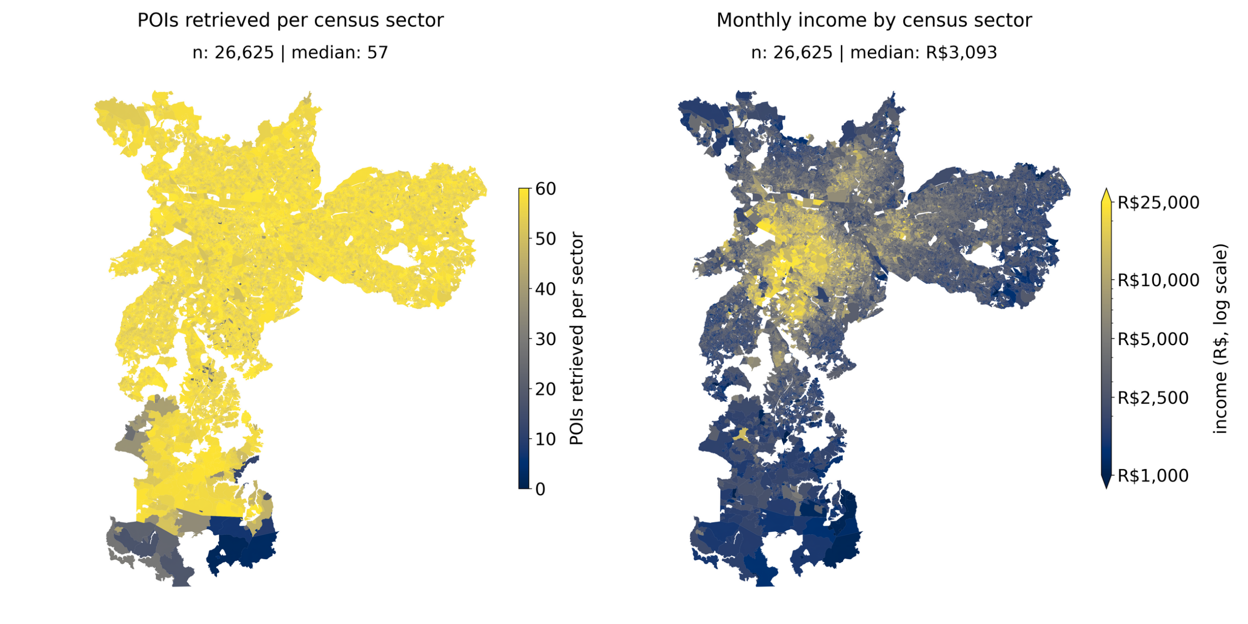
This framing matters. A POI database is not merely a directory of destinations; at sufficient scale, it becomes a representation of urban economic organization. The research suggests that commercially maintained location data can reveal a substantial share of neighborhood-level income variation, even without direct access to transactions, mobile-phone traces or household records.
Spatial validation makes the result more credible
Geospatial prediction is vulnerable to leakage. If nearby sectors are split randomly between training and test sets, a model can appear accurate partly because neighboring places resemble one another. That is useful for interpolation, but it can overstate performance when the real task is to generalize into locations the model has not effectively seen.
The authors address this with spatially structured validation, dividing the study area into geographic blocks rather than relying only on random samples. This is one of the paper’s most important methodological choices. It makes the results more relevant to operational use, where agencies and companies may want to estimate conditions in areas with limited reference data rather than merely reproduce patterns next door.
What the model appears to be learning
The strongest signal comes from combinations of places, not from a universal rich-place or poor-place checklist. Financial services, specialized retail, health care, education and leisure may all contribute, but their meaning depends on context and co-location. A dense commercial center can contain amenities associated with high spending while serving residents from much poorer surrounding districts.
That ambiguity is why the study should be read as location intelligence rather than automated socioeconomic labeling. The model identifies statistical associations within São Paulo’s urban system. It does not establish that a particular venue causes income, nor that the same POI composition would carry the same meaning in another city.
The model is weakest where mistakes may matter most
The error maps show that performance is not evenly distributed. High-income sectors can be difficult to estimate, and places with sparse, atypical or informally documented economic activity may also be poorly represented. Google Maps coverage is shaped by business visibility, user contributions and platform policies. Informal enterprises and low-digital-presence services can be missing even when they are important to local livelihoods.
That creates an important equity question. If a model is deployed to allocate services, prioritize inspections or target investment, systematic underrepresentation of informal or rapidly changing neighborhoods could reinforce the same blind spots the system is intended to reduce. Performance averages are therefore less informative than knowing where, and for whom, the model fails.
A four-year temporal mismatch
The study also contains a temporal limitation that deserves attention. The target income layer comes from the 2022 census, while the Google Maps POIs were retrieved later. The model is therefore relating two urban snapshots separated by several years. In stable neighborhoods that may be acceptable. In areas affected by redevelopment, business turnover or new transport investment, the mismatch can blur the relationship.
This does not invalidate the experiment, but it changes the claim. The paper demonstrates that recent platform POIs contain information associated with earlier census income. A production monitoring system would need repeated POI snapshots, versioned collection procedures and newer ground truth to show that it can reliably detect change between censuses.
A complement, not a replacement
For public agencies, the most promising use may be as an early-warning or prioritization layer. A POI-based model could flag sectors whose commercial and institutional profile has changed enough to justify a survey, field visit or administrative-data review. For businesses, it could support market screening in places where official small-area statistics are outdated, provided uncertainty and coverage bias remain visible.
The strategic lesson reaches beyond Google Maps. Location platforms increasingly function as privately maintained observations of urban life. Their data can supplement slow official systems, but they also introduce dependence on opaque collection rules, shifting taxonomies and licensing conditions. Reproducibility becomes an operational issue: a model trained today may be difficult to recreate if the platform’s inventory or access method changes.
The research is currently an arXiv preprint and should be treated as an early result rather than a validated production recipe. Its value lies in demonstrating a practical bridge between location intelligence and official statistics—and in making the limitations of that bridge visible.
How do you like this article? Read more and subscribe to our monthly newsletter!