
Google and NASA released an AI model that found 23,000 methane plumes nobody had spotted, including at 24 of the 25 worst-emitting landfills on Earth. A glacier fell off Langtang Lirung and killed hundreds of people 100 km downstream. Europe put two Earth observation satellites up on one rocket for the first time. And a team at Durham worked out that the bright moving smudges in their winter radar images were emperor penguins.
Finding Methane Nobody Was Looking At
Google Research and NASA JPL published MAPL-EMIT in PNAS this month, and released the model, the code and the resulting plume database. The short version: it reads the full radiance spectrum from EMIT, the hyperspectral instrument on the International Space Station, and picks out methane plumes at 60 metres per pixel.
The technical move is combining spectral and spatial information in one vision transformer rather than running a matched filter per pixel. That lets the model use plume shape to trace a source, and to separate overlapping plumes in dense industrial areas where conventional methods smear them together. It was trained on 3.6 million physics-based synthetic plumes injected into real EMIT radiance data.
The results are worth stating precisely because they get rounded off in coverage. Against hand-annotated NASA L2B plume complexes across 1,084 EMIT granules, the model recovered 84 percent. It also flagged roughly 1.5 times as many plausible plumes as human analysts, which is where the “50 percent more” figure comes from, and about 23,000 additional plumes globally. Those two numbers measure different things, and the second is the more interesting one: these are candidate detections, not confirmed leaks, and the paper backs them with airborne comparisons and controlled release experiments rather than asserting them outright.
The landfill finding is the part with immediate policy weight. The model located plumes at 24 of the world’s 25 largest-emitting landfills. Europe’s Methane Regulation mandated satellite monitoring and a super-emitter alert system, but covers oil, gas and coal, not waste.
Weather Forecasting Stops Waiting
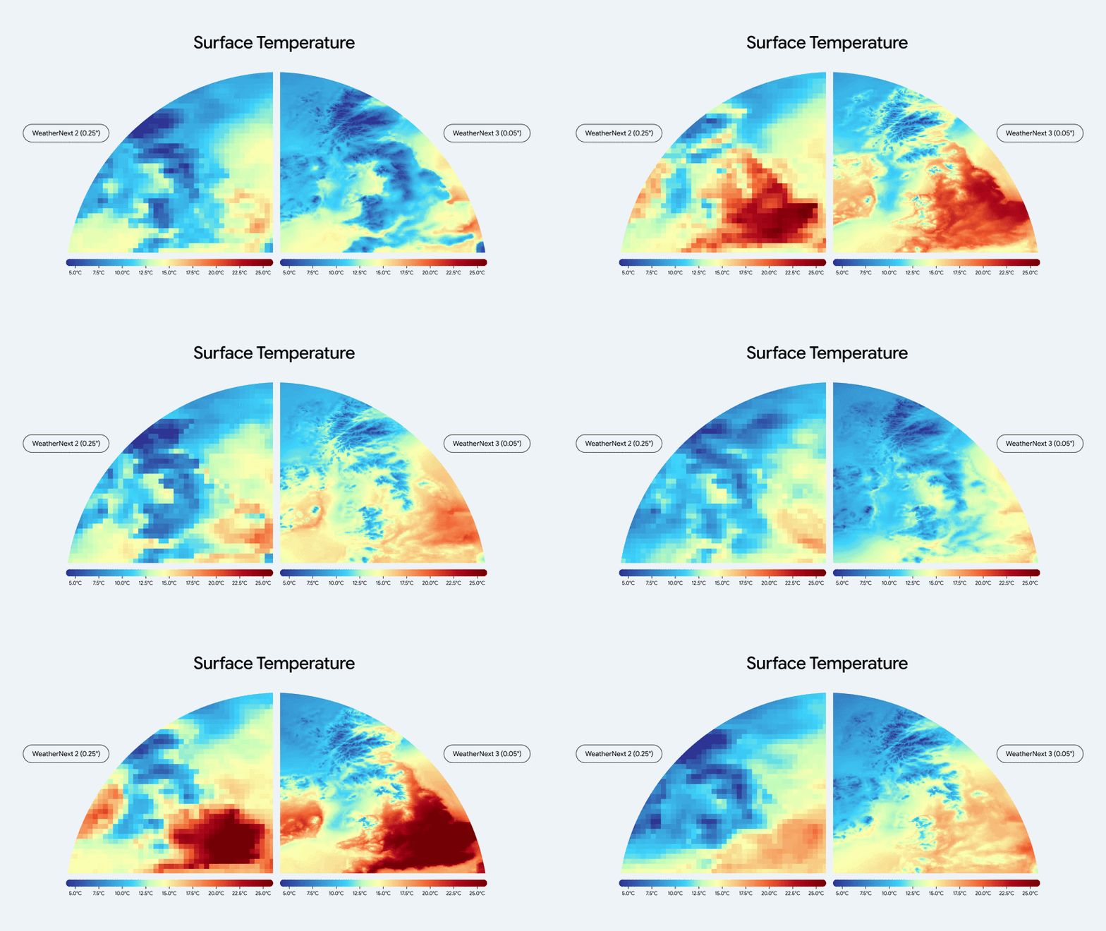
Google DeepMind and Google Research released WeatherNext 3 on 3 September. The headline numbers are resolution and cadence: a 5 km grid for surface temperature and moisture against 25 km before, refreshed hourly against every six hours.
The structural change underneath is more interesting than the accuracy claim. Most AI weather models train on and initialise from ECMWF analysis, which takes around five hours to assemble and updates every six. WeatherNext 3 layers live geostationary satellite mosaics on top, which cuts the lag between the last observation and the forecast from roughly seven hours to three or four. For nowcasting and severe weather that gap is the whole game.
It also outputs wind speed at 100 metres, near turbine hub height, plus cloud cover and solar radiation, which is a clear move towards grid operators and renewables forecasting rather than consumer weather. The model is running in Search, Gemini, Maps, the Maps Platform Weather API and Cloud.
One caveat worth carrying: the 50 percent precipitation improvement is Google’s own figure against its own predecessor. Independent live comparison exists through Brightband’s open leaderboard, but a peer-reviewed architecture paper had not appeared at the time of the announcement.
Nepal, and What the Satellites Saw
On the morning of 26 August a section of glacier on the north face of Langtang Lirung collapsed. The impact released energy equivalent to a magnitude 5.2 earthquake. The resulting flow of water, ice and rock travelled nearly 100 km down the Lende Khola and Trishuli valleys, destroyed the Gyirong Port crossing on the China border, and struck dozens of settlements. Hundreds were killed and thousands reported missing.
ESA published before and after imagery on 31 August, and the acquisition detail matters. The clearest pairing is a Landsat 9 scene from 26 August, roughly two hours after the collapse, against Sentinel-2 from 24 August. Both were processed through shortwave infrared, which separates water and ice from cloud in a valley system that is cloud-covered most of the time. Copernicus Emergency Management Service was activated for flood extent and damage assessment.
The attribution question is still open and should be treated that way. Analysis of satellite imagery found the glacier north of Langtang Lirung moving around 10 mm per month between January and August, with the rate accelerating in the weeks before failure. Researchers have pointed to warm conditions and permafrost instability as plausible contributors, since meltwater working into crevasses weakens ice-rock bonds. No rain was recorded at Rasuwa district headquarters that morning. That is a coherent picture, not a proven mechanism, and the published work so far is careful about saying so.


The same event in natural colour: Sentinel-2 on 27 August, the day after, against 12 August before the flood. Credit: contains modified Copernicus Sentinel data (2026), processed by ESA
Europe Launches Two at Once
Flight VV30 lifted off from Kourou at 03:21 CEST on 15 September carrying both FLEX and Copernicus Sentinel-3C. It was Vega-C’s first dual launch, using the Vespa adapter to stack the two: Sentinel-3C on top, deployed first, with FLEX encapsulated below and injected about an hour later.
Sentinel-3C continues the operational workhorse line, carrying OLCI, SLSTR, the SAR altimeter and a microwave radiometer for ocean colour, surface temperature and topography, feeding near real-time ocean and weather forecasting.
FLEX is the more unusual of the two. The Fluorescence Explorer measures chlorophyll fluorescence from terrestrial vegetation, the faint light plants re-emit during photosynthesis. That signal is a direct indicator of photosynthetic activity rather than a proxy inferred from greenness, which is what vegetation indices give you. It flies at 814 km in a 27-day repeat, designed to fly in tandem with Sentinel-3 so the fluorescence retrieval can be corrected using coincident optical and thermal data.

Flight VV30 leaving Kourou at 03:21 CEST on 15 September, Vega-C’s first dual launch. Credit: ESA

FLEX flies in tandem with Sentinel-3 so the faint fluorescence signal can be corrected using coincident atmospheric and land-surface data. Credit: ESA
Penguins in the Dark
The nicest piece of remote sensing this month came out of Durham University. Emperor penguins breed through the Antarctic winter, which is precisely when optical satellites are useless because there is no sunlight for months. Nearly 70 colonies sit on fast ice around the continent, many never visited by anyone.
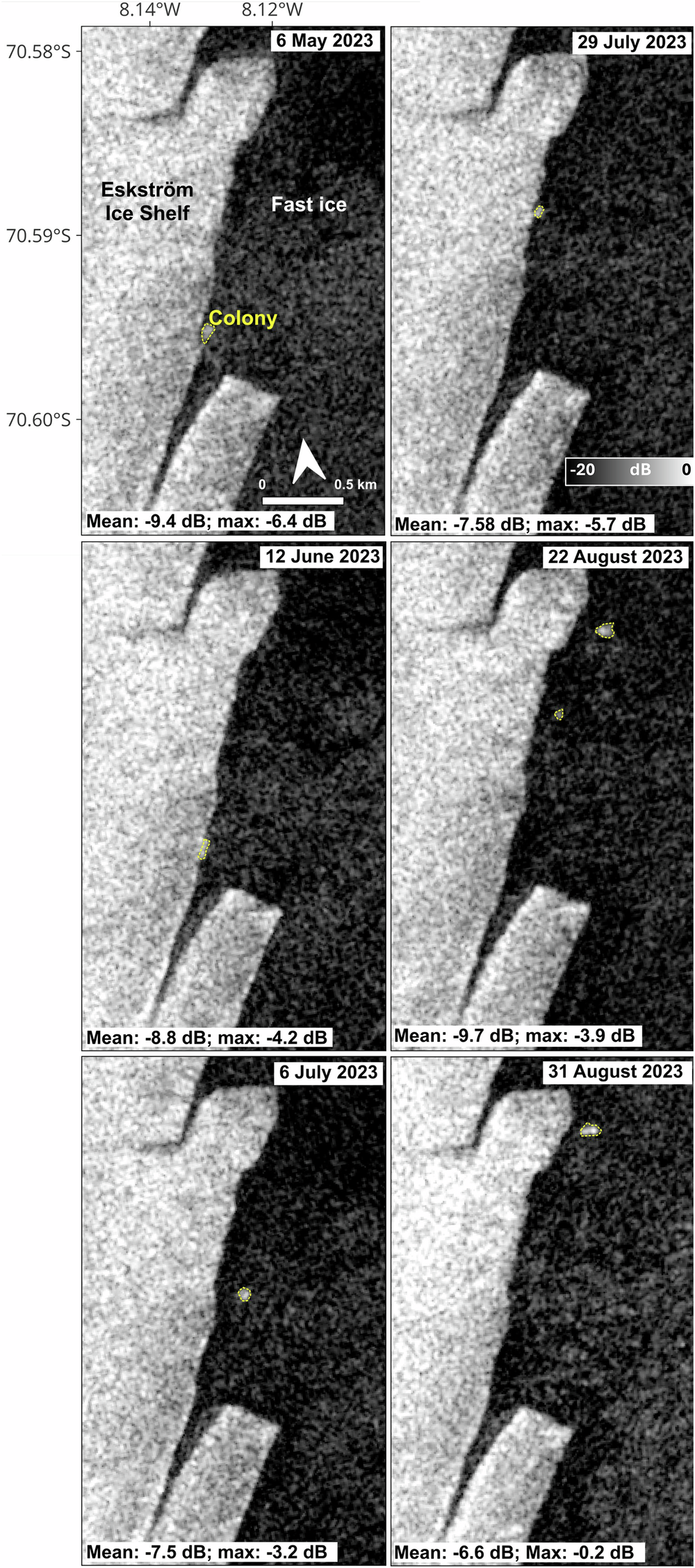
Grant Macdonald’s team noticed bright clusters of pixels drifting around on Sentinel-1 SAR imagery against the smooth dark backdrop of stable fast ice. Icebergs and rough ice are also bright, but they do not move when the ice is fixed. Comparing against optical imagery from September, when light returns, confirmed the moving smudges were the colonies themselves. Birds about 1.2 metres tall, standing in dense huddles, scatter enough to show up against flat ice.
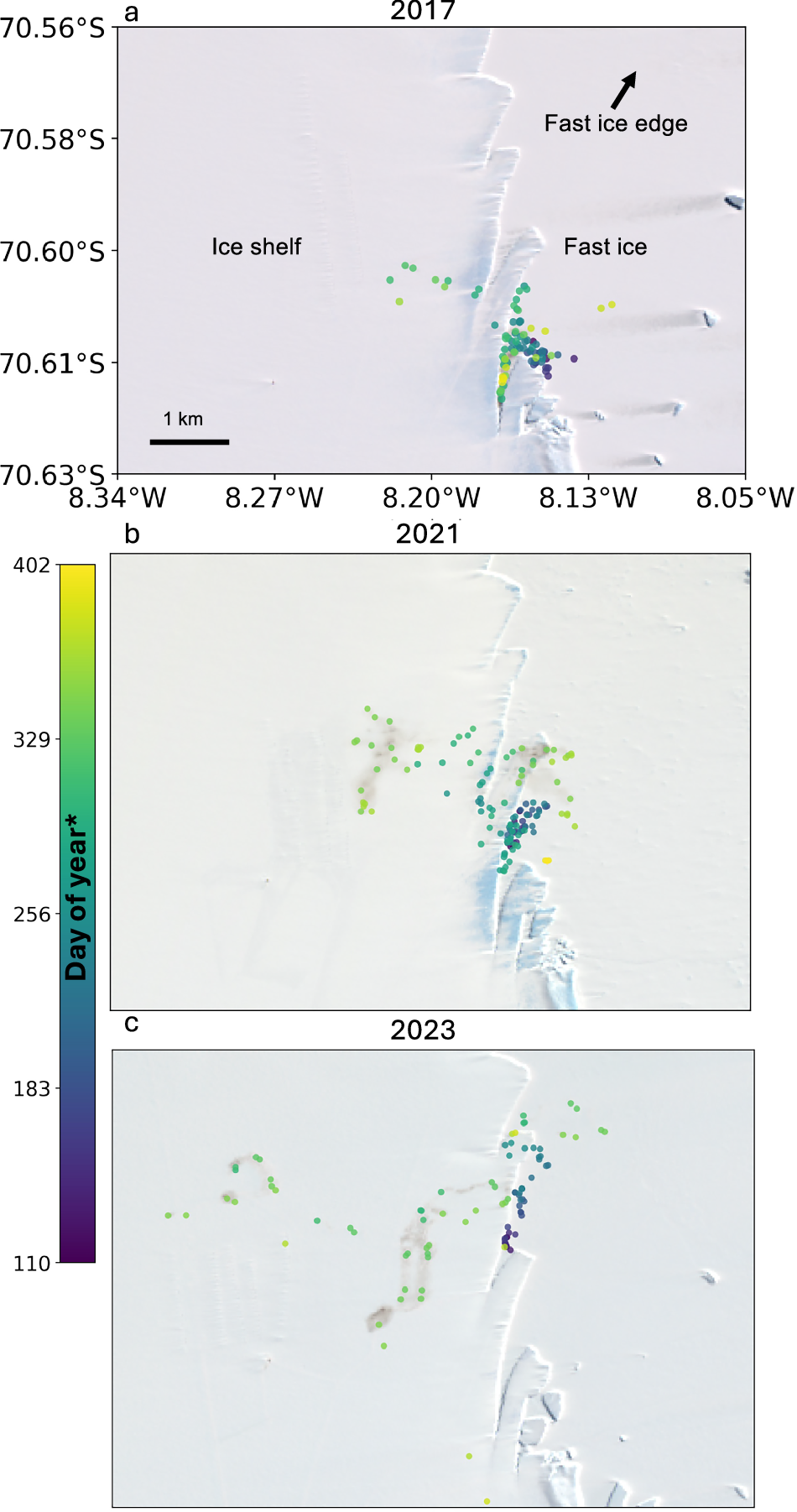
They then tracked three colonies at Atka Bay, Coulman Island and Cape Washington across eight breeding seasons from 2017 to 2024, often at sub-weekly resolution, combining winter SAR with summer optical. The behavioural findings are the payoff: colonies move more in winter than expected, sub-groups sometimes move away from the fast ice edge together despite the ice appearing stable, and one colony repeatedly shifted from sea ice onto glacier ice in early spring. The work is in Communications Earth and Environment, and all of it used free, routinely collected data that had been sitting in the archive for years.
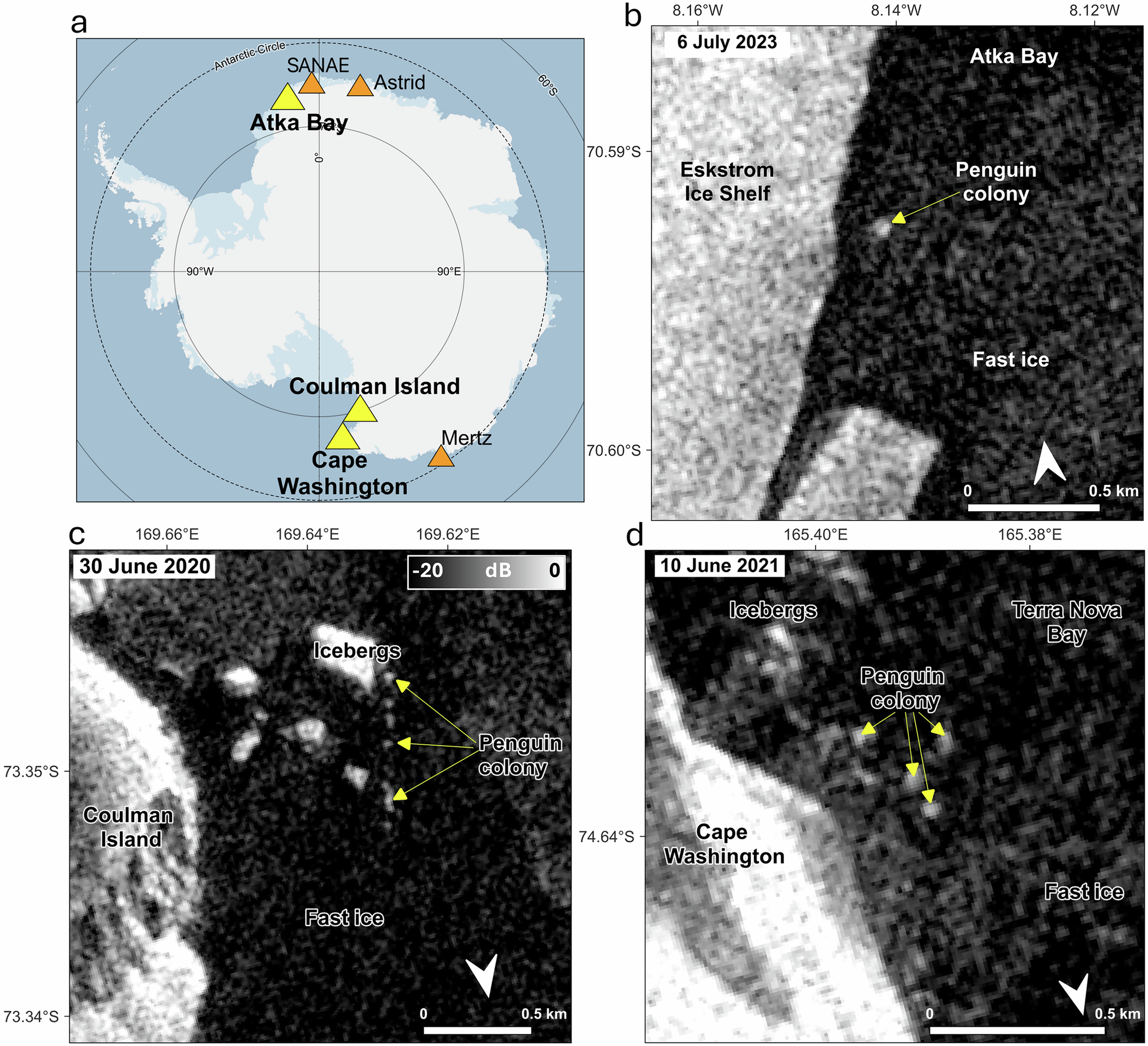
Study sites, and the colonies as they appear in Sentinel-1 SAR at Atka Bay, Coulman Island and Cape Washington: bright clusters against dark, smooth fast ice. Credit: Macdonald et al., Communications Earth and Environment, CC BY 4.0
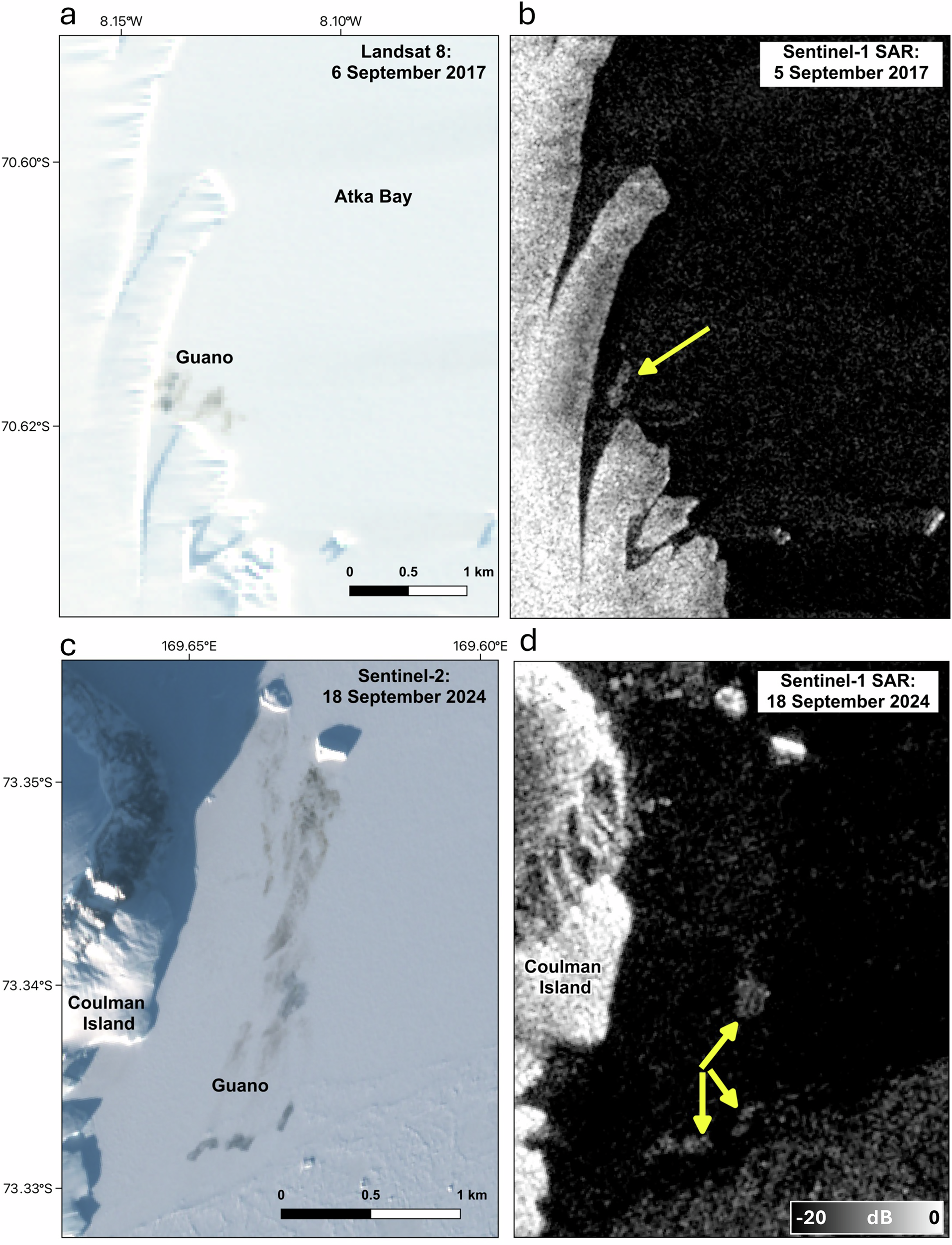
The validation step: optical and SAR of the same spot within a day. Yellow arrows mark the bright SAR returns where guano is visible optically. Credit: Macdonald et al., Communications Earth and Environment, CC BY 4.0
NISAR Watches a Volcano for Nine Months
NISAR imaged Krasheninnikov on Kamchatka on 25 December 2025, while still finishing post-launch checks. Days later the volcano began erupting for the first time since roughly 1550, apparently woken by the magnitude 8.8 earthquake offshore in July 2025.
NASA assembled 17 frames through mid-August into a time-lapse showing lava filling an inner caldera, overflowing into the wider crater, then spreading into a fan. Each pixel covers about 10 by 10 metres, and lava reads brighter than the surrounding snow and rock because it scatters microwaves differently.
The point the science team makes is about consistency rather than any single image. Twice every 12 days, in high-resolution mode, from two look directions, over a volcano that nobody was monitoring closely because it had been quiet for five centuries. As Cornell’s Matthew Pritchard put it, there are volcanoes worldwide that have never had eyes on them like this.
Seventeen NISAR frames from December 2025 to August 2026. Credit: NASA’s Scientific Visualization Studio
The Month in Pictures
A few more frames from the month that did not fit above: the launch that put two Earth observation missions up at once, the valley in Nepal before it was destroyed, and eight winters of penguins.


Tools and Data
A few releases worth knowing about. Mapbox introduced location infrastructure aimed at AI agents rather than human map users, which is a telling shift in who the customer is. Vexcel launched UltraCam Condor 5.0, claiming the largest aerial camera footprint available. EarthDefine released a 3D building footprints API. And on the open side, Overture shipped its September data release.
From the LinkedIn feed, two open-source items stood out: GeoLibre, a free GIS that runs across platforms, and a walkthrough of turning 2D building footprints into 2.5D cityscapes. There was also a genuinely useful explainer on coordinate systems versus projections, which remains the single most common source of confusion for people starting out, and a list of 48 remote sensing definitions worth bookmarking.
Worth a Look
NASA opened the Earth Modeling Nexus and detailed the Hamaq mission. USGS on Landsat products supporting water management worldwide. ESA’s Biomass mission imaged mangrove degradation in the Niger Delta, and Sentinel-3 caught Anak Krakatau erupting. NOAA’s summer drought summary in 12 maps is a good example of communicating a slow hazard. Esri opened the 2026 StoryMaps competition and published a guide to visualising time in Map Viewer. GIJN put out a course on geospatial data investigations for reporters. On the lighter side, PetaPixel on the first autumn colour of 2026 seen from orbit, Google Maps Mania on this year’s foliage map, and La Brujula Verde on the Tabula Peutingeriana, the only surviving road map of the Roman Empire.
Compiled by the Geoawesome team. Got something we missed? Reach out, we read everything.
Did you like this post? Read more and subscribe to our monthly newsletter!


#News
Next article
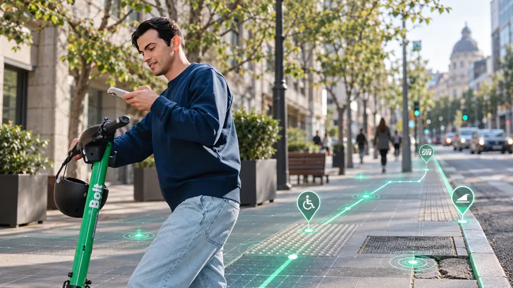
Bolt has demonstrated that a shared scooter can be more than a vehicle. It can also be a mobile geospatial sensor.
During its Wheels4Wheels pilot in Tallinn, Estonia, the company used sensors already installed in its scooters to assess pavement conditions, curb transitions and other features affecting wheelchair users and people with reduced mobility.
Bolt says the project covered approximately 550 kilometres across all eight Tallinn districts, producing 40.5 million accelerometer readings and more than 66,000 surface-quality assessments. The resulting information was contributed to OpenStreetMap, according to Bolt’s accessibility programme page.
Publishing the results as open data makes the project more significant than a conventional corporate mapping exercise. Municipalities, routing applications and accessibility services could all potentially use the observations.
The larger opportunity is the conversion of commercial vehicle fleets into continuously operating urban-observation networks. Thousands of scooters already traverse city streets during everyday operations, potentially detecting damaged surfaces and deteriorating infrastructure without requiring a dedicated municipal survey.
According to Geo Week News, Bolt combined GPS with accelerometers, gyroscopes and cameras. The company reports that the pilot increased available surface-quality data in Tallinn by 26%. These figures have not been independently audited.
The difficult step is converting motion signals into reliable accessibility information. A vibration could represent broken pavement, cobblestones, a drainage channel or an abrupt rider manoeuvre. Results may also vary with speed, tyre pressure, weather and scooter model.
Coverage presents another limitation. Scooters primarily travel where their use is permitted and commercially viable. They may miss residential streets, pedestrian paths and disconnected sections that create the greatest problems for wheelchair users.
Each observation therefore needs provenance, a confidence level and an effective validation method. The most important validators should include wheelchair and mobility-aid users, who can determine whether a detected anomaly represents a genuine barrier.
Wheels4Wheels complements rather than replaces existing accessibility platforms. Wheelmap maps the accessibility of public places, while Project Sidewalk combines crowdsourcing, machine learning and street imagery to identify curb ramps and obstacles. Bolt adds passive, recurring fleet sensing.
A future workflow could use scooter telemetry to flag anomalies, imagery to classify them and local contributors to confirm their significance before the information enters OpenStreetMap.
Public discussion of the project has also highlighted a contradiction: poorly parked scooters can themselves block sidewalks and curb ramps. Bolt’s accessibility strategy must therefore address parking and obstruction management alongside data collection.
If the company can demonstrate reliable classification, transparent data handling and meaningful participation by accessibility users, Wheels4Wheels could evolve into more than a mapping experiment. The sensing capacity already exists. The next challenge is turning it into trustworthy, routable and genuinely inclusive geospatial infrastructure.