
Tech for Earth: Explaining the Planet, On the Ground and in Orbit

This spring the foundation models that interpret satellite imagery stopped being a research curiosity. Earth Index opened to anyone with a browser, a Google model let analysts map palm oil mills at country level from a laptop in an afternoon, and NASA’s Prithvi became the first geospatial foundation model to run in orbit. On the ground, NISAR returned its first map of Mexico City sinking into its old lakebed, and Europe closed the books on its hottest, most fire-scarred year on record.
A Search Engine for the Planet Opens to Everyone
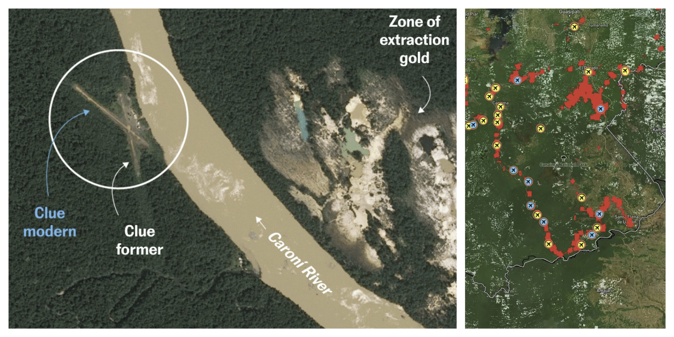
The idea of searching the Earth like a database has been around for years. Earth Index, built by the nonprofit Earth Genome, makes it practical. You highlight an example on the map, a clear-cut, a mine, a trawler, an airstrip, and the system finds places that look like it across the archive. The matching runs on foundation models trained on large volumes of Earth observation data, so the tool recognises patterns across regions and years. Until recently this kind of analysis needed a specialist team, a custom model, and weeks of compute. Mongabay’s reporters used an earlier version to find unreported narcotrafficking airstrips in the Peruvian Amazon. As of late April, Earth Index is open without a waitlist: a free tier gives global access and the core features, while heavier usage, API access, and a more demanding Deep Search sit behind a paid tier. The imagery is mostly public and moderate resolution, so it suits mapping and investigation rather than live monitoring, and results still need a human to check them.
Related reading: how environmental reporters are using the same tools
Embeddings Reach the Field, and Orbit
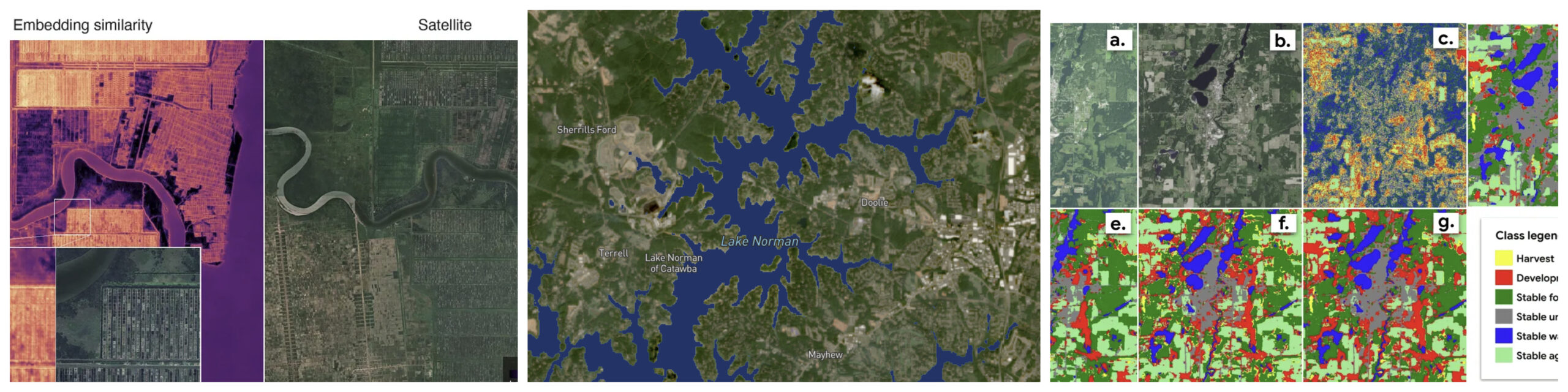
The same approach is showing up in day-to-day analysis. In a case study for Google Earth AI, the team at Epoch Blue used AlphaEarth Foundations satellite embeddings to find palm oil mills on Sumatra. Starting from 50 labelled examples, they detected close to 70 percent of the island’s known mills in a single afternoon. The reason it works is that the embeddings already encode what the land looks like as vectors, so a simple linear classifier can pick out a target. Scoring roughly 75 million vectors across Sumatra took 174 seconds on a consumer laptop. Their wider analysis tied just 5 percent of facilities to 73 percent of post-2020 deforestation in the region. The models are also leaving the data centre. In early May, a research team showed NASA and IBM’s open-source Prithvi geospatial model running on two in-orbit platforms, the first time a geospatial foundation model has done inference in space rather than on the ground. The point is to cut the gap between a satellite collecting data and someone acting on it. Planet made a similar case at NVIDIA’s GTC conference, describing a GPU-native pipeline that moves processing next to the sensor so wildfire insights arrive in seconds instead of hours.
Further reading: how you compare satellite embeddings changes what you detect
NISAR Reads the Ground Sinking Under Mexico City
NISAR, the joint NASA and Indian Space Research Organisation radar satellite launched in July 2025, returned one of its first subsidence maps, and it picked a hard target. The map of Mexico City covers October 2025 to January 2026, the dry season, and shows parts of the metropolitan area dropping by more than 2 centimetres a month, marked in dark blue. The cause is familiar to anyone who works on basin or deltaic cities. Mexico City sits on an old lakebed, and more than a century of groundwater pumping, combined with the weight of the city itself, has compacted the ground beneath it. An engineer first flagged the problem in 1925. By the 1990s and 2000s some districts were sinking around 35 centimetres a year, cracking roads, buildings, and water lines, and damaging the Metro. The Angel of Independence monument has had 14 steps added to its base as the land around it drops. What makes NISAR useful here is its L-band radar, which sees through cloud and vegetation and works day or night. It carries two radar instruments at different wavelengths and a 12-metre antenna reflector, and it revisits the same ground twice every 12 days. The longer L-band wavelength should help in places that are hard to measure from space, including vegetated coastal areas where sinking land and rising seas stack on top of each other.
Learn more about the NISAR mission.
Europe’s Hottest, Driest, Most Fire-Scarred Year
The European State of the Climate 2025, published in late April by ECMWF’s Copernicus Climate Change Service and the WMO, reads as a list of records. At least 95 percent of Europe saw above-average temperatures. Sub-Arctic Norway, Sweden, and Finland went through a three-week heatwave in July, with temperatures topping 30°C inside the Arctic Circle and peaking at 34.9°C in Frosta, Norway. The cold side of the ledger shrank. March snow cover was about 31 percent below average, Iceland recorded its second-largest glacier mass loss, and the Greenland Ice Sheet shed 139 billion tonnes of ice. At sea, the regional surface temperature was the highest on record, with strong marine heatwaves across most of the area. Wildfires burnt around 1,034,550 hectares, the largest area the report has logged, and 70 percent of rivers ran below their average annual flow. One number points the other way: renewables supplied 46.4 percent of Europe’s electricity, with solar reaching a record 12.5 percent. EUMETSAT’s imagery of the 2025 fire season is a good companion to the report if you want to see what those hectares looked like from orbit.
IRIDE Keeps Growing
Italy’s IRIDE programme added seven more satellites to its Hawk for Earth Observation constellation on 3 May, launched on a Falcon-9 from Vandenberg. That brings IRIDE to 31 satellites in orbit. The HEO satellites, built by Argotec, carry high-resolution multispectral optical sensors, and the first eight are already returning data. IRIDE is funded through Italy’s post-pandemic recovery plan and run with ESA and the Italian Space Agency. It is built to track ground motion, land cover, hydrogeological resources, fires, coastal change, and air quality, and to feed both public services and commercial applications. A separate group of 16 Eaglet II satellites adds multispectral imaging and vessel tracking, with more launches planned this year.
Landsat Works the Night Shift
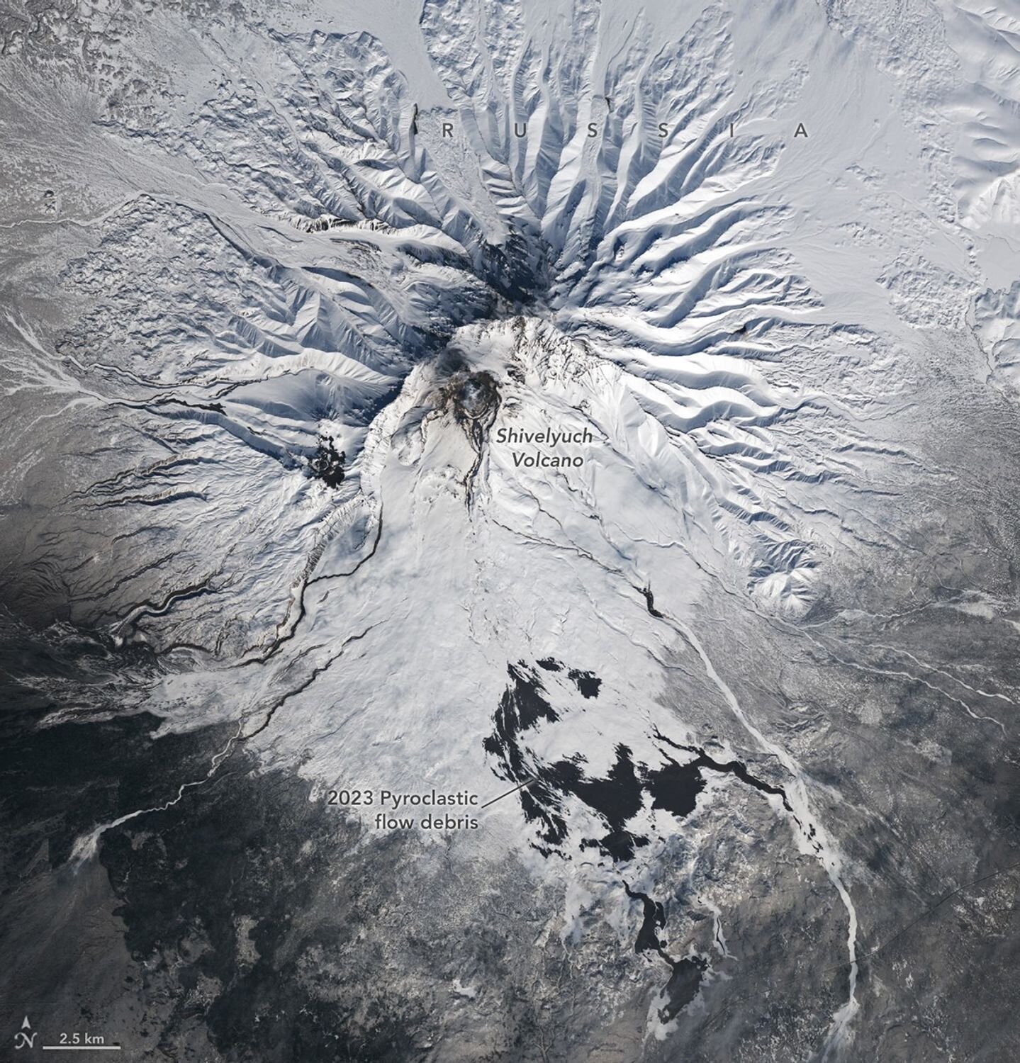
Landsat has imaged the sunlit side of Earth for more than 50 years. Lately Landsat 8 and 9 have been working their ascending, night-side orbit for special requests. The visible bands are not much use in the dark, but the thermal infrared sensor is, so the night passes pick up heat: active volcanoes, wildfires, city and power-plant hotspots, and ice shelves. The USGS EROS team laid out the science case for these collections in mid-April. For a recent daytime example, Landsat caught Russia’s Shiveluch, one of Kamchatka’s most active volcanoes, mid-eruption.
NVIDIA’s Earth Day, the Harder Problems
NVIDIA’s Earth Day roundup had the usual model announcements, but two projects stood out. The first is tsunami warning. A team from UT Austin, UC San Diego, and Lawrence Livermore won the 2025 ACM Gordon Bell Prize for a method aimed at the Cascadia fault off the Pacific Northwest, where a rupture would give the coast as little as 15 minutes. They precompute the expensive physics once per seafloor sensor, so when a real rupture hits, only a fast calculation remains. It finishes in under two-tenths of a second on GPUs and returns both a forecast and its uncertainty, which can be the difference between minutes of warning and none. The second is closer to conservation. Researchers in Borneo and Sumatra trained models to spot orangutan nests in drone imagery, processing 1,800 images in under five minutes on a single GPU where a person would need about a minute per image. All three orangutan species are critically endangered, and faster surveys mean more time spent acting on the results rather than reviewing photos. NVIDIA also highlighted AMP, which uses AI and robotics to pull recyclables out of waste streams and says it has diverted more than 2 billion pounds of material from landfills.
Maps Worth Your Time
A few cartography items from the past month. CORRECTIV.Europe published an interactive scrollytelling map of population change across roughly 100,000 European municipalities from 1961 to 2024, built on new Joint Research Centre data. The headline finding: half of all towns and communes have fewer residents than 60 years ago, even as the continent’s total population grew. The map shows two patterns clearly, rural emptying (one village in La Rioja lost about 98 percent of its people) and post-1990 decline across the former Eastern Bloc and East Germany, where 88 percent of municipalities shrank. EU population is expected to peak around 2029. On the lighter side, John Nelson and Peter Atwood reviewed the maps that show up in movies, from Indiana Jones to Harry Potter to the Goonies, judging them on accuracy and craft. It is exactly as nerdy as it sounds, and worth a watch.
NASA also released a small interactive that spells your name using Landsat imagery of landscapes shaped like letters, a reminder that the archive is large enough to find an alphabet in it. And for something more contemplative, designboom looked at Ursula K. Le Guin’s hand-drawn maps of her invented worlds.
Worth a Look
A few more links for the toolbox: Esri on the skills GIS students need before they graduate, ESA Academy’s Earth observation satellite systems design training, Apache Sedona on AWS Glue for processing billions of geospatial points a day, interpolating borehole data into aquifer top and base surfaces in ArcGIS Pro, water-body extraction with SAM3, and Esri’s look at GIS for deep-sea mining.
Compiled by the Geoawesome team. Got something we missed? Reach out, we read everything. Did you like this post? Read more and subscribe to our monthly newsletter!

#Deep Tech

Next article

For many GIS teams, spatial data still begins in a database. Parcels, roads, buildings, utility networks, and field edits are stored, checked, and served from systems that many people can use at the same time. In this world, PostGIS became one of the most trusted foundations for operational GIS.
That role is still important. PostGIS is excellent when the task requires live multi-user editing, strict spatial constraints, and safe, concurrent transactions. It helps teams maintain authoritative data and serve low-latency spatial queries to applications. If a city is editing road closures or a utility company is updating pipe networks, PostGIS is still a strong choice.
But analytical GIS has a different shape. It is less about editing one feature and more about scanning millions or billions of rows to find patterns. Teams may want to compare historical building footprints, join national-scale mobility data, or prepare spatial features for machine learning. For these workloads, repeatedly loading everything into a transactional database can become slow, expensive, and unnecessary.
That pressure is showing up in how tools are being combined. Even PostGIS-focused companies are now exploring ways to connect PostGIS with DuckDB and GeoParquet for analytics. Other comparisons make a similar distinction: PostGIS is usually stronger for shared operational systems, while DuckDB Spatial is useful for lightweight analytical work.
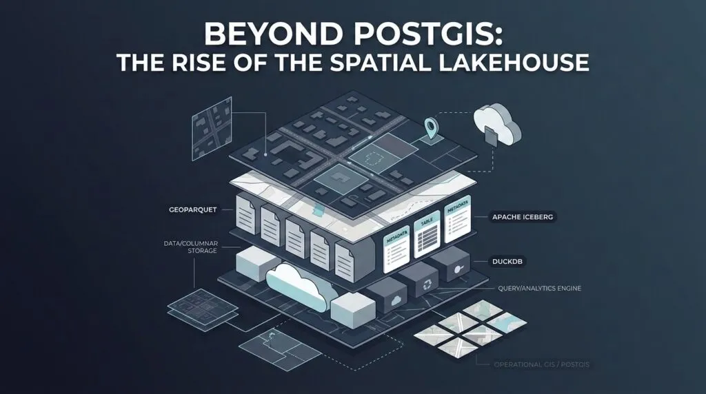
The future is not PostGIS versus the lakehouse. It is a hybrid. PostGIS remains the system of record for live operational GIS, while GeoParquet, Apache Iceberg, and DuckDB support analytical spatial data stored directly on cloud object storage.
This article looks at why traditional analytical GIS workflows are breaking, how the spatial lakehouse stack works, what performance details matter, and where PostGIS still fits in the hybrid GIS future.
Why Analytical GIS Breaks Traditional Workflows
Traditional GIS analytics often begins with a long detour. A new dataset lands in cloud storage. Before anyone can ask a spatial question, the file is downloaded, converted, reprojected, loaded into a database, indexed, queried, and often exported again for another team. The workflow is familiar, but it creates friction at every step.
The first problem is duplication. The original files still exist in cloud storage, while the copied database tables exist somewhere else. This increases storage cost and creates confusion about which version is current. The second problem is slow ETL (Extract, Transform, Load ). Analysts may spend hours preparing data before running the first query. For fast-moving work, that delay matters. The third problem is scaling. A database often couples storage and compute more tightly than a lakehouse-style architecture. As datasets grow, teams may need larger database instances even when the data is only queried occasionally. The final problem is staleness. Once data is exported into local files or side databases, teams can easily end up analyzing old copies instead of the source.
This is where zero-copy data sharing becomes useful. Zero-copy does not mean zero data engineering. It means avoiding unnecessary copying before analysis.
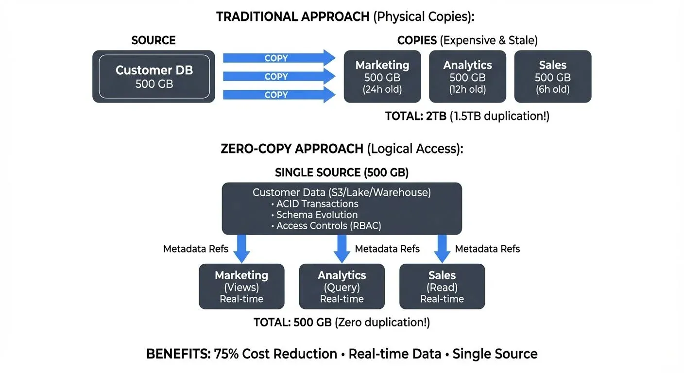
Traditional vs. zero-copy data sharing. Source: Conduktor
In a zero-copy spatial workflow, geospatial data stays in cloud object storage in an optimized format. Multiple tools can then query the same files through governed access, rather than creating new copies for every workflow. DuckDB’s spatial extension and cloud-native geospatial tools show why this is becoming practical: analysts can run spatial SQL closer to the files, without always turning the database into the first stop.
The Three-Part Spatial Lakehouse Stack
A spatial lakehouse is easier to understand if we think of it like a book.
GeoParquet is the pages. It stores geospatial data in the Parquet format, which is column-oriented. Instead of reading every attribute in every row, an analytical engine can read only the columns it needs. If a query only needs geometry and population, it does not have to scan long text descriptions, timestamps, or other unused fields. GeoParquet also adds spatial metadata, so tools can understand geometry columns in a standard way.
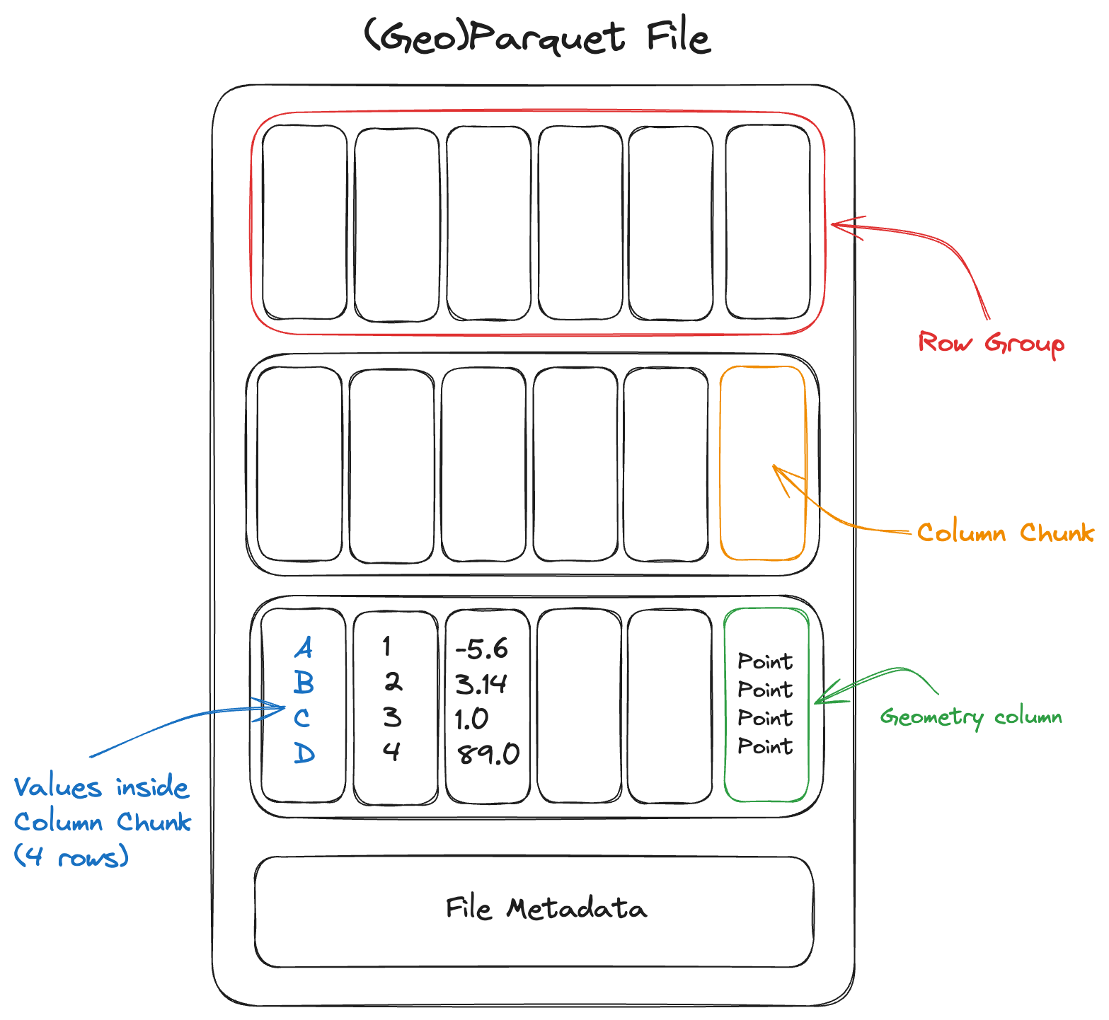
Parquet file layout. Source: Cloud Native Geo
Apache Iceberg is the table of contents. A large spatial dataset may not be one file. It may be thousands of Parquet files spread across cloud object storage. Iceberg organizes those files into reliable analytical tables. It tracks snapshots, schema changes, partitions, and metadata, so different engines can read the same table without losing consistency. This is important when teams need versioned analytical data rather than loose folders of files.
DuckDB is the reader. It is an in-process analytical database that can query files directly using SQL. With the DuckDB Spatial extension, analysts can run spatial operations from a laptop, notebook, or lightweight workflow without maintaining a separate database server. For many exploratory tasks, this makes spatial analytics feel much closer to working with files than managing infrastructure.
In practice, GeoParquet stores the spatial pages efficiently, Iceberg keeps the table organized and versioned, and DuckDB reads the data and runs the queries.
DuckDB has one limitation: scale. DuckDB is excellent for local and embedded analytics, but it is not the only reader. For very large distributed workloads, the same Iceberg tables can also be queried by engines such as Spark, Trino, Snowflake, Databricks, Dremio, or Apache Sedona.
That is the real value of the lakehouse pattern. The data stays in open formats, while different engines can read it depending on the size of the job.
Fast Queries Require Good Layout
A spatial lakehouse is not automatically fast just because the data is stored in the cloud. Cloud storage is cheap and flexible, but it does not know on its own which files are useful for a spatial query.
Imagine a city has millions of building footprints stored across thousands of files. If an analyst asks, “Which buildings are inside this flood zone?”, the system should not open every file in the dataset. It should first identify which files are likely to contain buildings near that flood zone, and ignore the rest.
This is where file layout matters. Iceberg can help by organizing files into partitions, such as country, region, or date. Parquet can store simple statistics about each file or row group. GeoParquet can add spatial metadata, such as bounding boxes, so engines can quickly check whether a file overlaps the query area.
Spatial clustering makes this even better. If nearby features are stored close together, the engine can read less data. Methods such as Z-order and Hilbert curves help arrange spatial data so that nearby locations in the real world are also stored closer together in the file layout. Some platforms also use approaches such as liquid clustering to improve data skipping without depending only on fixed partitions.
Fast lakehouse queries depend on good metadata and good organization. DuckDB, Sedona, Spark, or any other engine can only skip data if the files give them enough information to skip safely. Apache Sedona’s GeoParquet workflow shows how spatial filters can use bounding-box metadata before reading full geometry payloads.
So the lakehouse does not remove data engineering. It changes the work. Instead of spending most of the effort importing files into a database, teams spend more effort organizing files, metadata, and layouts so queries can avoid reading unnecessary data.
The Hybrid GIS Future
The future is not a clean break from PostGIS. It is a better division of labor.
PostGIS remains the operational layer: the place for live editing, spatial constraints, web applications, concurrent users, and transactional safety. The spatial lakehouse becomes the analytical layer: the place for large scans, historical datasets, cloud-native files, and machine learning pipelines. This split is already visible in practice. CARTO is working with major platforms to support Iceberg and GeoParquet as open foundations for cloud-native spatial analytics.
A recent spatial SQL article makes this difference easier to understand using NYC open data. In a spatial join that counted building polygons inside neighborhoods, SedonaDB finished in 0.24 seconds, compared with 6.4 seconds for PostGIS and 43.1 seconds for DuckDB. In a distance query that counted buildings within 200 meters of fire hydrants, SedonaDB took 1.3 seconds, PostGIS took 21.8 seconds, and DuckDB took 41.5 seconds. In a K-nearest-neighbor task that searched for the five closest hydrants to every building, SedonaDB finished in 1.8 seconds, PostGIS took 83.3 seconds, and DuckDB ran into a memory error. The article is worth reading directly because it explains the actual query patterns and practical setup behind the numbers.
These results should not be treated as a universal ranking. They show that analytical spatial workloads behave differently from operational GIS workloads. A live editing system, a national-scale building footprint analysis, and a spatial machine learning pipeline do not need the same architecture.
The real change is not that PostGIS is being replaced. It is that analytical GIS no longer has to begin by importing every dataset into a database. Operational GIS can stay close to PostGIS, while analytical GIS moves closer to open files, cloud storage, and engines built for large scans.
Further Resources

