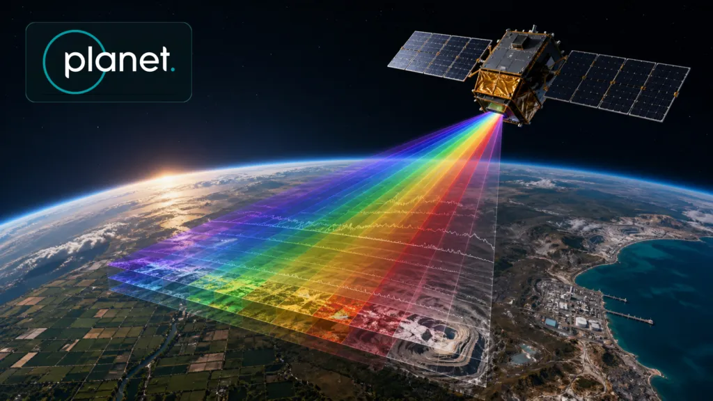
Planet has shipped Tanager-2 and 18 SuperDove satellites to Vandenberg Space Force Base for SpaceX’s Transporter-18 mission. The SuperDoves provide the numerical headline, but Tanager-2 may represent the more consequential shift: hyperspectral Earth observation moving from an impressive single sensor toward a service with operational capacity and useful revisit times.
Planet says a commissioned Tanager-2 would double its hyperspectral capacity and halve revisit times. That remains a forward-looking claim. The spacecraft still has to launch, complete commissioning and demonstrate consistent performance in orbit. Nevertheless, Tanager-1 has already established a credible technical foundation.
Seeing materials, not just colors
A conventional optical satellite measures Earth through a handful of broad spectral bands. Tanager divides reflected light into approximately 426 contiguous bands spanning 380 to 2,500 nanometers. Each 30-meter pixel contains a detailed spectrum that can reveal absorption patterns associated with gases, minerals, vegetation chemistry and other materials.
The distinction is important. Multispectral imagery can show that two fields look different. Hyperspectral data may help determine whether that difference is caused by crop variety, water stress, nitrogen content or disease.
An independent USGS characterization of Tanager-1 examined its geometric, radiometric and spectral performance. It found strong band-to-band alignment while also documenting variations that analysts must understand when comparing Tanager with other sensors. The report validates the instrument’s basic scientific utility, but not every commercial claim made for it.
Methane provides the clearest business case
Tanager’s most mature application is locating methane and carbon dioxide super-emitters. Carbon Mapper reports that Tanager-1 produced 14,400 published methane-plume observations and 3,900 CO₂-plume observations between September 2024 and August 2026. It also says California used Tanager and Carbon Mapper data to identify and mitigate ten oil-and-gas super-emitters. These are mission-partner figures, not an independent audit, but they demonstrate a data-to-action pathway.
For an operator, finding a large leak can reduce lost product, regulatory exposure and reputational risk. For governments, the same observation supports enforcement and emissions inventories. The value therefore comes from identifying the source, estimating its emissions and delivering the result quickly enough for someone to act.
Beyond greenhouse gases
Hyperspectral data could support several other markets. Mining companies can map mineral signatures, monitor waste and identify environmental changes around operations. Agriculture users can distinguish crops, assess plant chemistry and potentially detect stress before it becomes obvious in normal imagery. Water authorities can investigate algal blooms, sediment, chlorophyll and pollution. Conservation teams can classify vegetation communities or monitor coral health. Security users can search for materials or objects whose spectral signatures differ from their surroundings.
Tanager’s 30-meter resolution imposes an important boundary. It is suited to fields, plumes, water bodies, mine areas and other relatively large targets. It is not designed to inspect individual plants, vehicles or pieces of industrial equipment.
The difficult part begins after collection
A hyperspectral scene is a large data cube rather than a familiar photograph. Before analysis, teams may need to correct atmospheric absorption, illumination, viewing geometry, sensor noise and band alignment. A single pixel can contain several materials, creating a mixed signature. Models trained in one season, geography or sensor may fail somewhere else.
Planet offers calibrated radiance and atmospherically corrected surface-reflectance products, while its methane products add plume identification and emissions estimates. That packaging is strategically important. Most customers do not want hundreds of bands; they want a leak alert, mineral map, crop-risk score or API response with known uncertainty.
Hyperspectral AI can accelerate classification, but it does not remove the need for spectral libraries, field measurements and domain expertise. More bands can produce more information, but they also create more opportunities for false confidence.
A competitive market is taking shape
Planet is not alone. Pixxel offers higher-resolution VNIR hyperspectral imagery through Firefly and plans broader VNIR-SWIR coverage with Honeybee. Wyvern emphasizes 5.3-meter, taskable VNIR imagery. Orbital Sidekick targets pipeline monitoring and security with its GHOSt constellation and analytics platform. Kuva Space combines tunable VNIR sensors with onboard AI. In emissions monitoring, GHGSat operates a larger fleet of specialized greenhouse-gas satellites.
Tanager’s position is different: broad VNIR-SWIR coverage, strong methane sensitivity and integration with Planet’s global monitoring business. Planet can use PlanetScope to identify change, Tanager to investigate composition and its software layer to deliver results.
That combination is the potential business. Tanager-2 will matter if it converts spectral richness into reliable, repeatable decisions. Reaching the launch site is progress. Operational cadence, validated analytics and paying customers will be the real test.

#Space
Next article
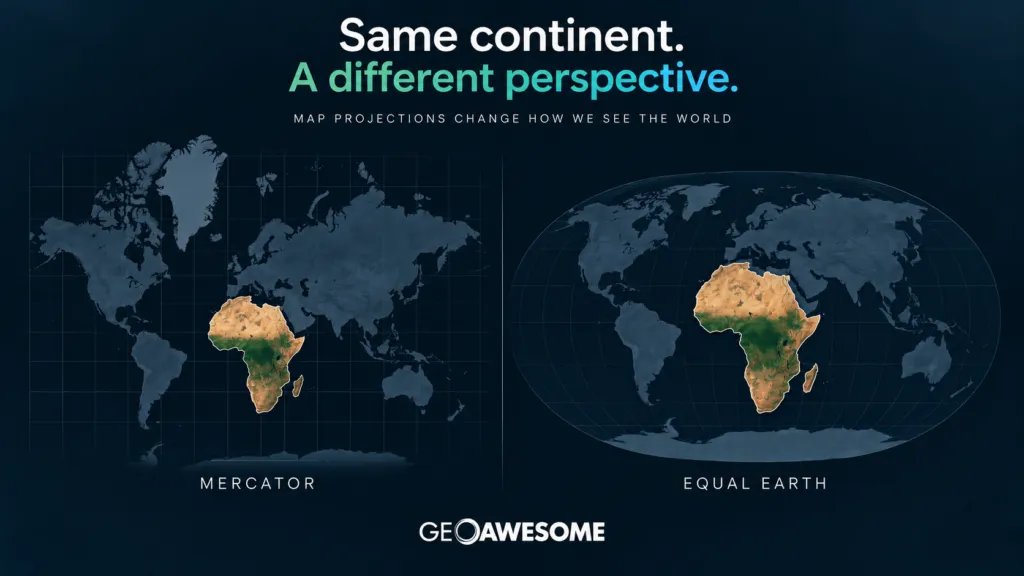
164 countries have backed a UN resolution encouraging the use of the Equal Earth projection. But before we declare the Mercator map dead, there is an important cartographic lesson behind the headlines.
For something most people probably haven’t thought about since geography class, map projections are suddenly making global news.On September 4, the United Nations General Assembly overwhelmingly adopted a resolution called “Correct the Map: Rebalancing Global Cartographic Representation and Promoting Equitable Representation of the World’s Regions, Particularly Africa.”
The vote was striking: 164 countries voted in favor, six abstained, and only the United States voted against. The resolution encourages governments, international organizations, educational institutions and technology companies to consider maps that represent the relative sizes of continents more accurately — with particular attention to Africa. At the center of the discussion is a projection many people outside the cartographic community may never have heard of: Equal Earth.
And behind the political debate lies a fascinating geospatial question:
Can a map ever really show the world as it is?
The problem isn’t that Mercator is “wrong”
Much of the coverage of the UN vote frames the story as an attempt to replace an inaccurate or even misleading Mercator projection. That requires some nuance. Gerardus Mercator introduced his famous projection in 1569. Its purpose was not to create the most geographically representative classroom wall map. It was designed primarily for navigation. And for that purpose, it was brilliant.
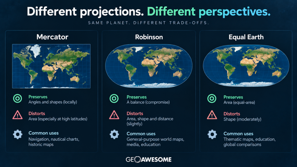
Mercator is a conformal projection, meaning that locally it preserves angles and shapes. A constant compass bearing — a rhumb line — can be represented as a straight line on the map. For sailors navigating across oceans, this was an enormously useful property. The trade-off is area. The farther you move from the equator, the more dramatically Mercator exaggerates the size of geographic features.
That’s why Greenland looks enormous. In reality, Africa covers roughly 30 million square kilometers, while Greenland is around 2.2 million square kilometers. Africa is therefore about 14 times larger than Greenland.
Look at many familiar Mercator-style world maps, however, and the two can appear surprisingly similar in size.That isn’t a mathematical error. It’s the unavoidable consequence of the projection.
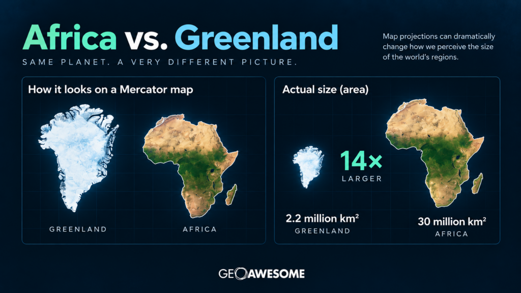
Africa is about 14 times larger than Greenland, although Mercator-style maps can make them appear similar in size.
You can’t flatten a sphere without breaking something
This is perhaps the most important point missing from much of the current debate.
There is no perfectly accurate flat map of the Earth.
Turning the curved surface of our planet into a two-dimensional map inevitably introduces distortion. Depending on the projection, cartographers must compromise between properties such as:
- area,
- shape,
- distance,
- direction,
- and scale.
Different projections make different compromises because they are designed for different purposes. Mercator prioritizes angles. Equal-area projections prioritize area. Other projections attempt to balance several kinds of distortion to produce a visually intuitive representation of the world. So asking which projection is “correct” is often the wrong question.
A much better question is:
Correct for what?
Enter Equal Earth
The projection supported by the UN initiative is called Equal Earth. It is surprisingly new. Equal Earth was introduced in 2018 by cartographers Bojan Šavrič, Tom Patterson and Bernhard Jenny. Their goal was to create an equal-area world map that maintained accurate relative sizes while also looking visually familiar and aesthetically pleasing.
That’s important.
Equal-area projections aren’t new. The Gall-Peters projection, for example, became famous partly because of arguments that conventional world maps visually diminished equatorial regions and exaggerated Europe and North America. But preserving area can result in shapes that look heavily stretched to viewers accustomed to traditional world maps.
Equal Earth tries to find a more visually intuitive compromise. It preserves the relative area of countries and continents while maintaining recognizable continental shapes and a world-map appearance somewhat reminiscent of the Robinson projection. The result is immediately noticeable. Africa becomes enormous. Greenland shrinks dramatically. Europe looks considerably smaller relative to Africa. Canada and Russia no longer dominate the northern part of the planet quite so visually. None of these places have changed size, of course. Only the mathematics used to flatten the globe has changed.
Why Africa pushed the issue
The campaign behind the UN resolution goes beyond cartography. African governments and the African Union have argued that the continued widespread use of Mercator-style world maps creates a distorted perception of Africa’s place in the world. The African Union formally backed the broader #CorrectTheMap initiative in 2025. Togo subsequently led the effort to bring the issue before the United Nations.
Supporters argue that maps influence how generations of students perceive geography, power and importance. When Europe, Greenland, Canada and Russia appear disproportionately large while Africa appears relatively small, those visual relationships can shape people’s mental model of the world. Togo’s Foreign Minister Robert Dussey has connected the initiative with a broader effort to challenge historical and colonial perceptions of Africa.
Following the UN vote, Togo said it plans to introduce updated geographical materials in its schools and promote wider adoption internationally. The campaign is also expected to engage companies providing digital mapping and location services. And that’s where this story becomes particularly interesting for the geospatial industry.
Does this mean Google Maps is going to change?
Probably not in the way some headlines might suggest. The UN resolution is not legally binding. It doesn’t ban Mercator. It doesn’t require every map to use Equal Earth. And importantly, it explicitly recognizes that different projections are appropriate for different applications. During the UN debate, Canada, Australia and New Zealand emphasized that the resolution should not affect established cartographic practices used for navigation.
Modern digital maps add another layer of complexity. Most web mapping platforms have historically relied heavily on Web Mercator (EPSG:3857) because it provides an extremely convenient global coordinate system for tiled web maps. It became fundamental infrastructure for web GIS. But today’s digital maps are no longer necessarily flat.
Major mapping platforms increasingly render the Earth as a 3D globe at small scales before transitioning toward planar representations as users zoom in. That largely eliminates the bizarre visual effect of Greenland appearing comparable to Africa when viewing the entire planet. So replacing Web Mercator across the global geospatial technology stack would be neither straightforward nor necessarily useful.
The more realistic impact of the UN initiative is likely to be elsewhere: education, printed maps, media graphics, institutional maps and global-scale thematic visualization.
The really interesting question is visualization
For the geospatial community, the debate should probably go beyond Mercator versus Equal Earth.
Think about a global map showing:
- population
- GDP
- climate vulnerability
- forest loss
- food production
- conflict
- satellite coverage
- renewable energy potential
Projection becomes part of the visualization. If the purpose of the map involves comparing geographic areas, using a projection that dramatically changes those areas can affect how the reader perceives the data. The projection is therefore not simply a technical parameter hidden somewhere inside a GIS project.
It becomes part of the message.
Cartographers have understood this for a very long time.mThe UN vote may finally bring that idea into mainstream discussion.
Mercator isn’t going anywhere
Despite some dramatic headlines, September 4, 2026 probably won’t be remembered as the day the world abandoned Mercator. Nor should it. Mercator remains extremely useful for the purposes for which its geometric properties make sense. Web Mercator remains deeply embedded in geospatial infrastructure. Equal Earth won’t suddenly replace EPSG:3857 across millions of web maps. But something significant has happened nonetheless. A subject that usually belongs in GIS textbooks and cartography conferences has reached the floor of the United Nations General Assembly.
164 countries effectively agreed that the way we choose to represent the planet matters.
And perhaps that’s the most interesting part of this story.Maps have never simply been pictures of geography. They are mathematical models of geography — built from choices about what to preserve, what to distort and what information matters most. For hundreds of years, one particular view of the world became so familiar that many of us stopped noticing it was a projection at all.
The UN’s “Correct the Map” resolution is a useful reminder that every flat world map is an interpretation.
The question isn’t whether our maps distort reality.
They all do.
The question is whether we’re choosing the right distortion for the story we’re trying to tell.