164 countries have backed a UN resolution encouraging the use of the Equal Earth projection. But before we declare the Mercator map dead, there is an important cartographic lesson behind the headlines.
For something most people probably haven’t thought about since geography class, map projections are suddenly making global news.On September 4, the United Nations General Assembly overwhelmingly adopted a resolution called “Correct the Map: Rebalancing Global Cartographic Representation and Promoting Equitable Representation of the World’s Regions, Particularly Africa.”
The vote was striking: 164 countries voted in favor, six abstained, and only the United States voted against. The resolution encourages governments, international organizations, educational institutions and technology companies to consider maps that represent the relative sizes of continents more accurately — with particular attention to Africa. At the center of the discussion is a projection many people outside the cartographic community may never have heard of: Equal Earth.
And behind the political debate lies a fascinating geospatial question:
Can a map ever really show the world as it is?
The problem isn’t that Mercator is “wrong”
Much of the coverage of the UN vote frames the story as an attempt to replace an inaccurate or even misleading Mercator projection. That requires some nuance. Gerardus Mercator introduced his famous projection in 1569. Its purpose was not to create the most geographically representative classroom wall map. It was designed primarily for navigation. And for that purpose, it was brilliant.
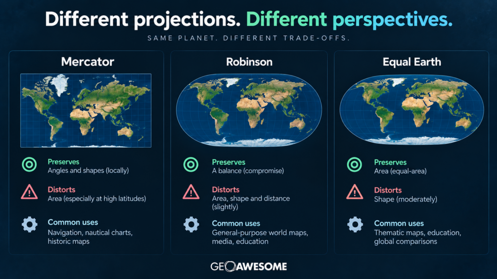
Mercator is a conformal projection, meaning that locally it preserves angles and shapes. A constant compass bearing — a rhumb line — can be represented as a straight line on the map. For sailors navigating across oceans, this was an enormously useful property. The trade-off is area. The farther you move from the equator, the more dramatically Mercator exaggerates the size of geographic features.
That’s why Greenland looks enormous. In reality, Africa covers roughly 30 million square kilometers, while Greenland is around 2.2 million square kilometers. Africa is therefore about 14 times larger than Greenland.
Look at many familiar Mercator-style world maps, however, and the two can appear surprisingly similar in size.That isn’t a mathematical error. It’s the unavoidable consequence of the projection.
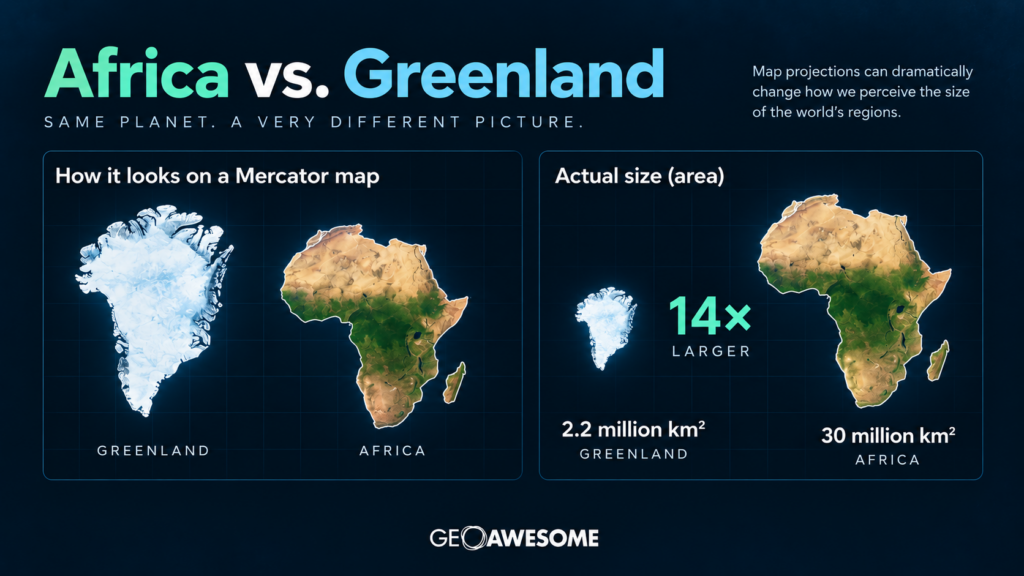
Africa is about 14 times larger than Greenland, although Mercator-style maps can make them appear similar in size.
You can’t flatten a sphere without breaking something
This is perhaps the most important point missing from much of the current debate.
There is no perfectly accurate flat map of the Earth.
Turning the curved surface of our planet into a two-dimensional map inevitably introduces distortion. Depending on the projection, cartographers must compromise between properties such as:
- area,
- shape,
- distance,
- direction,
- and scale.
Different projections make different compromises because they are designed for different purposes. Mercator prioritizes angles. Equal-area projections prioritize area. Other projections attempt to balance several kinds of distortion to produce a visually intuitive representation of the world. So asking which projection is “correct” is often the wrong question.
A much better question is:
Correct for what?
Enter Equal Earth
The projection supported by the UN initiative is called Equal Earth. It is surprisingly new. Equal Earth was introduced in 2018 by cartographers Bojan Šavrič, Tom Patterson and Bernhard Jenny. Their goal was to create an equal-area world map that maintained accurate relative sizes while also looking visually familiar and aesthetically pleasing.
That’s important.
Equal-area projections aren’t new. The Gall-Peters projection, for example, became famous partly because of arguments that conventional world maps visually diminished equatorial regions and exaggerated Europe and North America. But preserving area can result in shapes that look heavily stretched to viewers accustomed to traditional world maps.
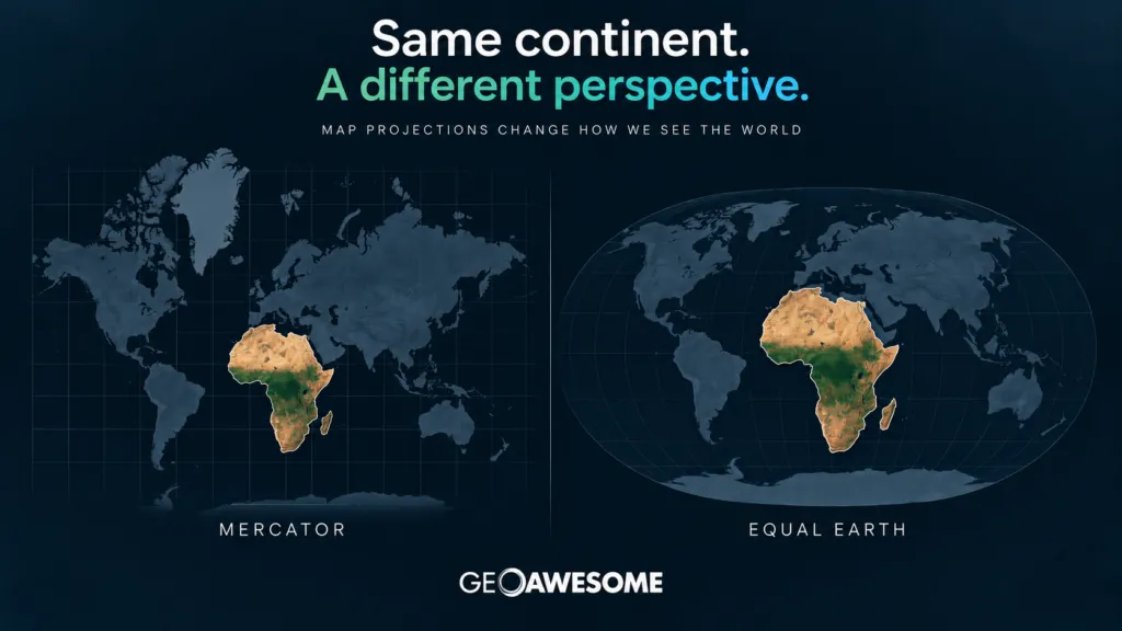
Equal Earth tries to find a more visually intuitive compromise. It preserves the relative area of countries and continents while maintaining recognizable continental shapes and a world-map appearance somewhat reminiscent of the Robinson projection. The result is immediately noticeable. Africa becomes enormous. Greenland shrinks dramatically. Europe looks considerably smaller relative to Africa. Canada and Russia no longer dominate the northern part of the planet quite so visually. None of these places have changed size, of course. Only the mathematics used to flatten the globe has changed.
Why Africa pushed the issue
The campaign behind the UN resolution goes beyond cartography. African governments and the African Union have argued that the continued widespread use of Mercator-style world maps creates a distorted perception of Africa’s place in the world. The African Union formally backed the broader #CorrectTheMap initiative in 2025. Togo subsequently led the effort to bring the issue before the United Nations.
Supporters argue that maps influence how generations of students perceive geography, power and importance. When Europe, Greenland, Canada and Russia appear disproportionately large while Africa appears relatively small, those visual relationships can shape people’s mental model of the world. Togo’s Foreign Minister Robert Dussey has connected the initiative with a broader effort to challenge historical and colonial perceptions of Africa.
Following the UN vote, Togo said it plans to introduce updated geographical materials in its schools and promote wider adoption internationally. The campaign is also expected to engage companies providing digital mapping and location services. And that’s where this story becomes particularly interesting for the geospatial industry.
Does this mean Google Maps is going to change?
Probably not in the way some headlines might suggest. The UN resolution is not legally binding. It doesn’t ban Mercator. It doesn’t require every map to use Equal Earth. And importantly, it explicitly recognizes that different projections are appropriate for different applications. During the UN debate, Canada, Australia and New Zealand emphasized that the resolution should not affect established cartographic practices used for navigation.
Modern digital maps add another layer of complexity. Most web mapping platforms have historically relied heavily on Web Mercator (EPSG:3857) because it provides an extremely convenient global coordinate system for tiled web maps. It became fundamental infrastructure for web GIS. But today’s digital maps are no longer necessarily flat.
Major mapping platforms increasingly render the Earth as a 3D globe at small scales before transitioning toward planar representations as users zoom in. That largely eliminates the bizarre visual effect of Greenland appearing comparable to Africa when viewing the entire planet. So replacing Web Mercator across the global geospatial technology stack would be neither straightforward nor necessarily useful.
The more realistic impact of the UN initiative is likely to be elsewhere: education, printed maps, media graphics, institutional maps and global-scale thematic visualization.
The really interesting question is visualization
For the geospatial community, the debate should probably go beyond Mercator versus Equal Earth.
Think about a global map showing:
- population
- GDP
- climate vulnerability
- forest loss
- food production
- conflict
- satellite coverage
- renewable energy potential
Projection becomes part of the visualization. If the purpose of the map involves comparing geographic areas, using a projection that dramatically changes those areas can affect how the reader perceives the data. The projection is therefore not simply a technical parameter hidden somewhere inside a GIS project.
It becomes part of the message.
Cartographers have understood this for a very long time.mThe UN vote may finally bring that idea into mainstream discussion.
Mercator isn’t going anywhere
Despite some dramatic headlines, September 4, 2026 probably won’t be remembered as the day the world abandoned Mercator. Nor should it. Mercator remains extremely useful for the purposes for which its geometric properties make sense. Web Mercator remains deeply embedded in geospatial infrastructure. Equal Earth won’t suddenly replace EPSG:3857 across millions of web maps. But something significant has happened nonetheless. A subject that usually belongs in GIS textbooks and cartography conferences has reached the floor of the United Nations General Assembly.
164 countries effectively agreed that the way we choose to represent the planet matters.
And perhaps that’s the most interesting part of this story.Maps have never simply been pictures of geography. They are mathematical models of geography — built from choices about what to preserve, what to distort and what information matters most. For hundreds of years, one particular view of the world became so familiar that many of us stopped noticing it was a projection at all.
The UN’s “Correct the Map” resolution is a useful reminder that every flat world map is an interpretation.
The question isn’t whether our maps distort reality.
They all do.
The question is whether we’re choosing the right distortion for the story we’re trying to tell.


#Fun

Next article
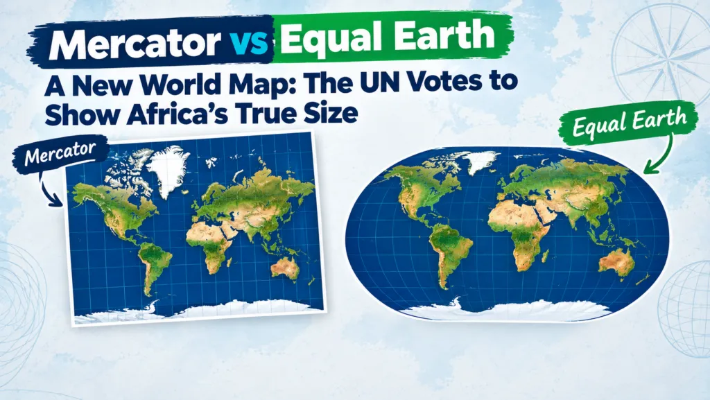
The General Assembly has voted 164 to 1 to steer the world away from the 456-year-old Mercator projection and toward equal-area maps, led by Togo on behalf of the African Union. Here is what the resolution actually says, why it happened now, and what it means for anyone who makes maps for a living.
The resolution does not ban the Mercator projection or force anyone to use a single map. What it does is encourage governments, schools, international organisations and technology companies to reach for an equal-area projection, chiefly Equal Earth, whenever the size of a country or continent actually matters. It also explicitly keeps Mercator’s licence for maritime and aerial navigation, where preserving angles and bearings is the whole point.
In practice, that shifts the default mental map most people carry around: one that inflates Europe, North America and Russia at high latitudes, toward one that preserves area and makes Africa, Latin America and South Asia look far closer to their true proportions.
What exactly changed
The UN did not mandate a single map for everyone. Instead, the resolution:
- Encourages governments, schools, international organisations and tech companies to use equal-area projections, such as Equal Earth, whenever representing geographic size matters.
- Recommends Equal Earth, launched in 2018 by an international team of cartographers, as the preferred alternative for general-purpose world maps.
- Acknowledges that Mercator remains appropriate for maritime and aerial navigation, where preserving angles and bearings is critical.
Why now: the politics behind the projection
The resolution was put forward by Togo on behalf of the African Union, following the AU’s own adoption of the Equal Earth map earlier in 2026. Sponsors argue that the Mercator projection has caused a lasting, symbolic minimisation of Africa and other equatorial regions in the public imagination, a distortion they say has subtly shaped perceptions of development needs, investment potential, geopolitical weight and even environmental responsibility.
“A fair world begins with a fair map.”
Robert Dussey, Togolese Foreign Minister, at the UN General Assembly
France’s Foreign Minister, Jean-Noel Barrot, announced that France would abandon Mercator in official communications in favour of more accurate representations.
“Changing the map obviously doesn’t change the world. But correcting a representation that distorts it is already an act of truth.”
Jean-Noel Barrot, French Foreign Minister
The United States cast the sole vote against the resolution. Its mission to the UN called the debate a distraction from “genuine problems of international peace, prosperity, or good relations” and objected to the resolution’s language of “cognitive justice” and reparations.
Mercator vs Equal Earth
Gerardus Mercator designed his projection in 1569 for one job: keeping compass bearings straight for sailors. To do that, it stretches land the further it sits from the equator and compresses land near it. The best-known result is that Greenland appears almost as large as Africa on a standard Mercator map, when Africa is in fact roughly 14 times larger.
Equal Earth, introduced in 2018 by cartographers Bojan Savric, Bernhard Jenny and Tom Patterson, takes the opposite priority: it preserves each landmass’s area relative to the others, while keeping shapes recognisable enough to still look like a normal world map rather than an abstract distortion. On it, Africa and South America expand toward their true scale, and Greenland and other high-latitude landmasses shrink to size.
| Mercator (1569) | Equal Earth (2018) | |
|---|---|---|
| Designed for | Marine and aerial navigation; preserves angles and compass bearings | General-purpose world maps; preserves relative area |
| What it distorts | Area, especially far from the equator | Shape, especially near the poles |
| Africa vs Greenland | Look similar in size | Africa renders roughly 14× larger, matching reality |
| UN’s recommended use | Navigation only | Education, media, policy, general reference |
How big are these landmasses, really?
Actual land area, not screen area. This is the ranking that Mercator’s projection obscures and Equal Earth is built to preserve.
Land area figures are standard geographic reference values, rounded to the nearest 0.1 million km².
What this means for geospatial practice
For GIS and Earth observation professionals, the resolution puts high-level political weight behind something the field has known for a long time: no projection is neutral. Every one of them encodes a choice about what to preserve, whether that is navigation, area, shape, distance or direction. Equal-area projections should be the default whenever a map is communicating size, density or distribution, such as population, emissions or land cover. Mercator and Web Mercator remain genuinely useful for web basemaps and navigation, but they should be labelled as fit for that purpose rather than presented as a “true” picture of the world.
Three things worth doing this week
- Audit which projection your public-facing maps use versus what you use internally for analysis. A projection chosen for a GIS workflow is rarely the right one for a slide or a press release.
- Produce Equal Earth versions of your key global figures for papers, posters and outreach, alongside whatever projection the analysis itself required.
- Document projection choices explicitly in captions and methods sections, rather than leaving readers to assume the map is a neutral representation.
What happens next
The resolution is non-binding, but it sets a clear normative direction.
Sources
- CNN: UN votes to adopt new map that makes our world look very different
- BBC: UN votes to adopt new world map to reflect Africa’s true size
- RTE: UN adopts map reform to show true scale of continents
- UPI: U.N. to vote to adopt new, more accurate world map
- The National News: US opposes UN adoption of map showing Africa’s true size
- WTAQ: UN approves resolution in support of map that shows Africa’s true size
Did you like this post? Read more and subscribe to our monthly newsletter!