Avoidance Mapping: What It Is & Where It Fits in the Cartography Cube
“… we all try to steer clear of certain places and people, whether we’re aware of it or not.” (Source)
Currently, my preferred route home is through a residential estate. Its definitive characteristic is close-knit houses, children playing outside and a few ‘vibandas’ (makeshift stalls). Perhaps it’s the sense of community that draws me here. Or maybe it’s because after so many years, the place remains unchanged.
Unlike me, not everyone prefers this route. Some avoid it despite—or perhaps because of—the things that draw me. While our routes change based on different circumstances, the common ground is that they’re determined by the things we’re trying to avoid.
Avoidance Mapping – Mapping the Things We Avoid
What if we could create a map of the routes we follow and the people/ things we avoid?
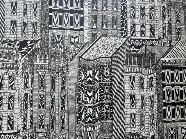
Well, that is what members of the Perfect City working group did. At a workshop, they asked people living in New York City (NYC) to draw maps of what, whom, or where they avoided. The result? Avoidance Maps.
I first heard about avoidance mapping on episode 034 of Isn’t That Spatial podcast.
The idea of creating maps based on people’s experiences with navigating the city intrigued me. For some reason, it made me think about the cartography cube, and the space avoidance maps occupy therein.
But I’m getting ahead of myself.
Why Produce Avoidance Maps?
Maps help people see what isn’t obvious from tables/ text. But what would make someone spend their time and effort producing avoidance maps?
In this case, creating avoidance maps made the participants understand who they were in NYC in a new way. Specifically, the avoidance maps were:
- Useful in seeing how the ability to navigate a place successfully depended on knowledge of the place and the feeling of belonging
- Provocative because they showed that what/ whom you avoid says as much about you as avoidances themselves
- Creative because they led to formation of new narratives about the city from different points of view
Above all, the maps helped to see how gender, race, class, and geographic backgrounds inform “belonging” in the city.
“It turns out mapping what we avoid also shows us where we feel we belong.” (Source)
Understanding the Cartography Cube
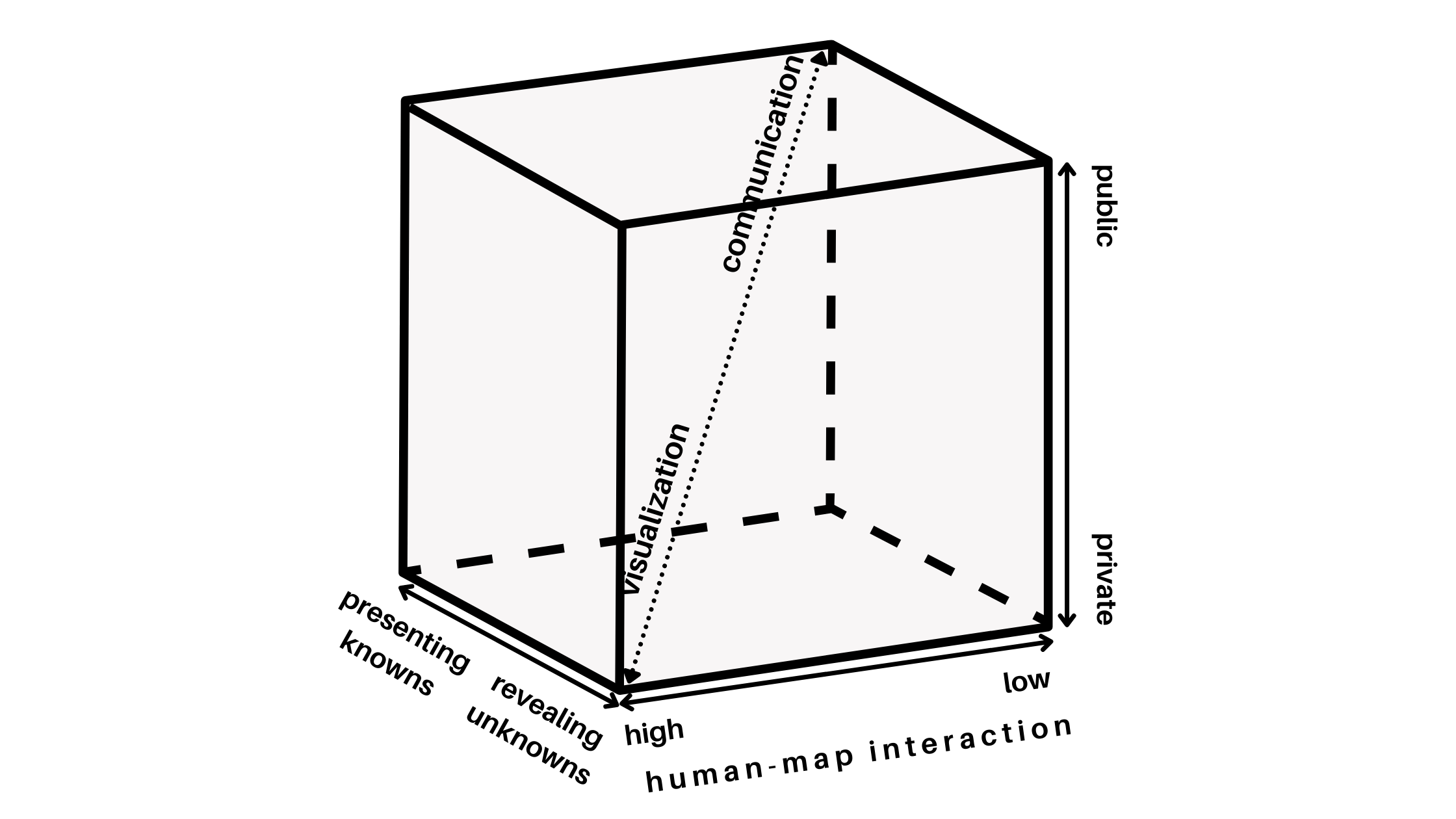
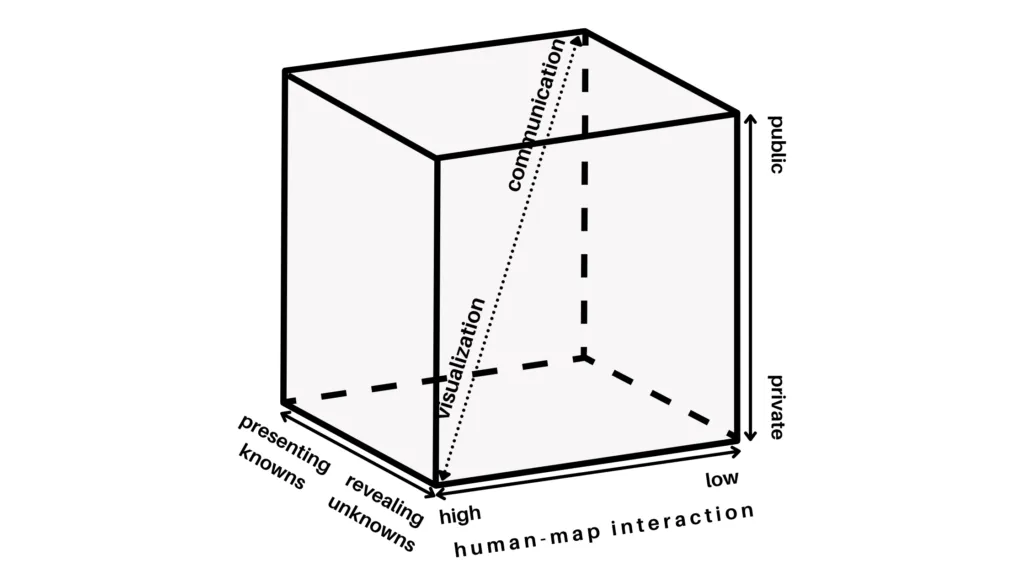
In response to the divergent definitions and views of visualization by cartographers, Professor Alan M. MacEachren formulated a graphic representation of visualization. It was based on treating cartography as a cube, hence ‘cartography cube’.
The cartography cube deals with kinds of map use—and not kinds of maps. Therefore, based on how a map is used, it may occupy any space within the cube.
“The fundamental idea is that map use can be conceptualized as a three-dimensional space. This space is defined by three continua: (1) from map use that is private (where an individual generates a map for his or her own needs) to public (where previously prepared maps are made available to a wider audience); (2) map use that is directed toward revealing unknowns (where the user may begin with only the general goal of looking for something “interesting”) versus presenting knowns (where the user is attempting to access particular spatial information); and (3) map use that has high human-map interaction (where the user can manipulate the map(s) in substantive ways – such as effecting a change in a particular map being viewed, quickly switching among many available maps, superimposing maps, merging maps) versus low interaction (where the user has limited ability to change the presentation).” (MacEachren 1994, p. 6-7)
There are two extremes in the cube. Geographic visualization on one corner and cartographic communication in the other. While all maps contain both visualization and communication, the major difference is the emphasis on visualization or communication at various locations within this space. Emphasis is determined by the primary use of the map—which affects the approach to map design.
Where Does Avoidance Mapping Fit In the Cartography Cube?
Looking at where the avoidance maps by NYC residents fit on each axis of the cartography cube:
Private vs public map use
I would say that avoidance maps occupy the private map use space. This is because the maps were used to help individuals/ small groups of individuals to think spatially. In this case, the maps helped residents, urban planners and architects think spatially about belonging in the city.
Map use directed towards revealing unknowns vs presenting knowns
The avoidance maps were meant to show what it looks like steering clear of certain places and people. It was an exercise designed to lead to conversations about gentrification and displacement, safety and perception. It’s a lens through which to look at bias, belonging, and other subjects.
By mapping the things people avoid, the maps reveal how different people experience and access urban space. Therefore, avoidance maps are directed towards revealing unknowns.
Map use that has high human-map interaction vs low interaction
According to MacEachren, map use can’t take place without some level of interaction. Furthermore, while the use of a computer increases the level of human-map interaction and hence visualization with maps, it isn’t always necessary. Maps can be interactive if they’re drawn in a way that aids visual thinking/ mental visualization. Nevertheless, computer tools expand the possibilities for interaction and hence visual thinking.
Even though the avoidance maps were two-dimensional images hand drawn on paper, they were nonetheless interactive in the sense that they enabled one to mentally visualize the things/ places being avoided.
Note that I don’t dispute that if the maps were represented on a computer, they would be more interactive—and even allow for integration of additional data such as imagery. What I’m saying is that their display on paper doesn’t make them non-interactive.
Other Thoughts…
When I first read about avoidance maps, my first thought was how great it would be if everyone shared their avoidance map publicly. What would we learn about urban spaces? Would we discover issues we didn’t know existed before and therefore deal with them?
On further reading, I realised that while mapping represents reality, it also affects how we construct this reality. Sparke called this the proleptic effect of mapping which he defines as: “the way maps contribute to the construction of spaces that later they seem only to represent.”
Making me pose the question: “If people in my (your) community publicly published their avoidance maps, would this affect the things and places I (you) avoid?” My answer is yes. I’d avoid things and places avoided by the majority—a case of a map affecting the reality it represents. What would this mean for urban spaces?
What does your avoidance map look like? Where would you place it in the cartography cube and would you be for or against publicising avoidance maps?
References
- Isn’t That Spatial podcast episode on Belonging (and Avoidance)
- Urban Omnibus/Architectural League article on the Perfect City Working Group’s Avoidance Mapping project
- Book by Alan M. MacEachren and D.R. Fraser Taylor: Visualization in modern cartography: Setting the Agenda
- The Role of Maps in Virtual Research Methods accessed via Google Scholar
- Journal article by Mathew Sparke: A Map that Roared and an Original Atlas: Canada, Cartography, and the Narration of Nation
This article has also been posted on Geohub blog.
Did you like the article on avoidance mapping? Read more and subscribe to our monthly newsletter!

