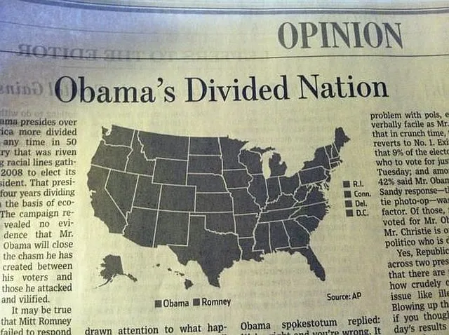
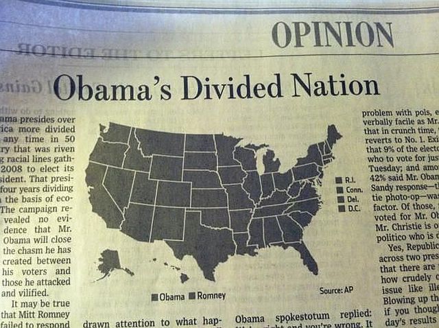
Cartographic design is something I see being overlooked quite often. Maps contain so much information; they can tell us a story, understand the world better, and help us make better decisions. Most of it seems straight forward, and with the development of new technologies, practically anybody can make a map. Like many things, good cartography is something that you learn by practicing and getting feedback so that the fundamentals become intuitive. As we get thrown into other tasks, it’s easy to focus on other aspects more and forget what and how you are trying to communicate with to the audience. Take for example 27 Hilariously Bad Maps that Explain Nothing. We will go through a few free resources to make sure that we don’t make the same mistakes! There will also be links to design resources as well.

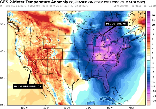
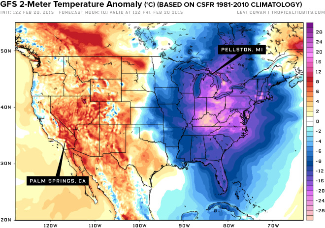
This shows why colour theory is important!
Here are a few favourites from GIS Lounge
GIS Lounge is one of my the best websites to get GIS knowledge from.
1. Ten Things to Consider When Making a Map
2. Principles of Cartographic Design
3. TypeBrewer helps you save time when thinking of the typography on your map!
4. Relief Shading gives a plethora of information about shaded relief.
Here are a few favourites from ESRI Mapping Center
1. ColorPicker is great when you want to choose a spectrum of colours
2. ScaleMaster contains a very useful Excel file (scroll to the bottom) to help you plan out scale factors when making a map.
3. A Periodic Table of Visualization Methods is a fun and interactive way which uses visuals to teach you about visuals (it’s better to see it than read about it!)
Penn State offers part of their Cartography and Visualisation course online
There cannot be proper cartography without Geography! Geography Now is a relatively new Youtube channel that attempts to go through the geography of each country by alphabetical order. It goes from explaining the flag, physical and human geography, culture, demographics… and it’s filled with fun animations! I highly recommend you to check it out.
Karen Kavett does a variety of Youtube videos about graphic design, art, and DIY projects. In her large selection of videos, she goes through concepts such as typography, colour theory, and graphic design.
Smashing Magazine is practically a bible when it comes to coding and design. There is a lot of reference material but also articles to make you think critically about your work.
That’s probably enough to keep the aspiring cartographer busy for a while. That being said, don’t be intimidated! The big takeaway should be that you should step back to see if the map makes sense or ask somebody – especially a non-cartographer! Don’t have the tools? Try Datawrapper for free. It’s an open source program that many outlets use to create visuals and maps.
