Tube Heartbeat: Visualising London’s pulse
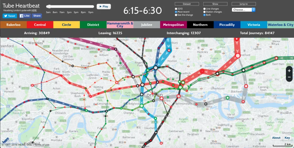
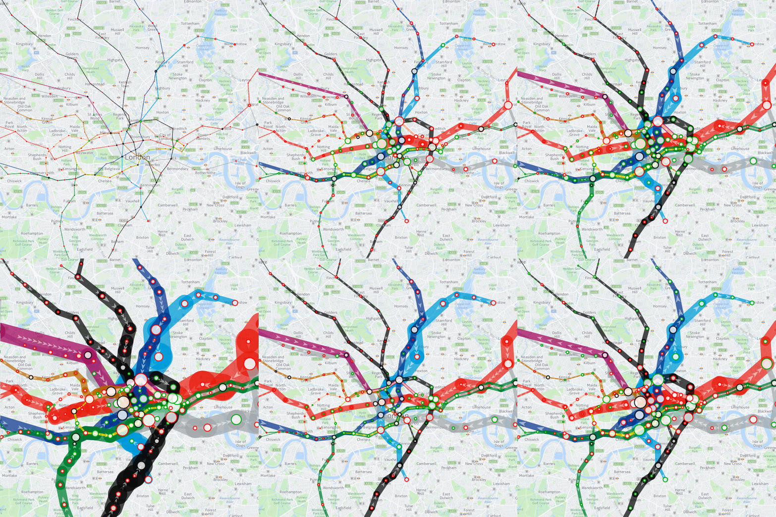
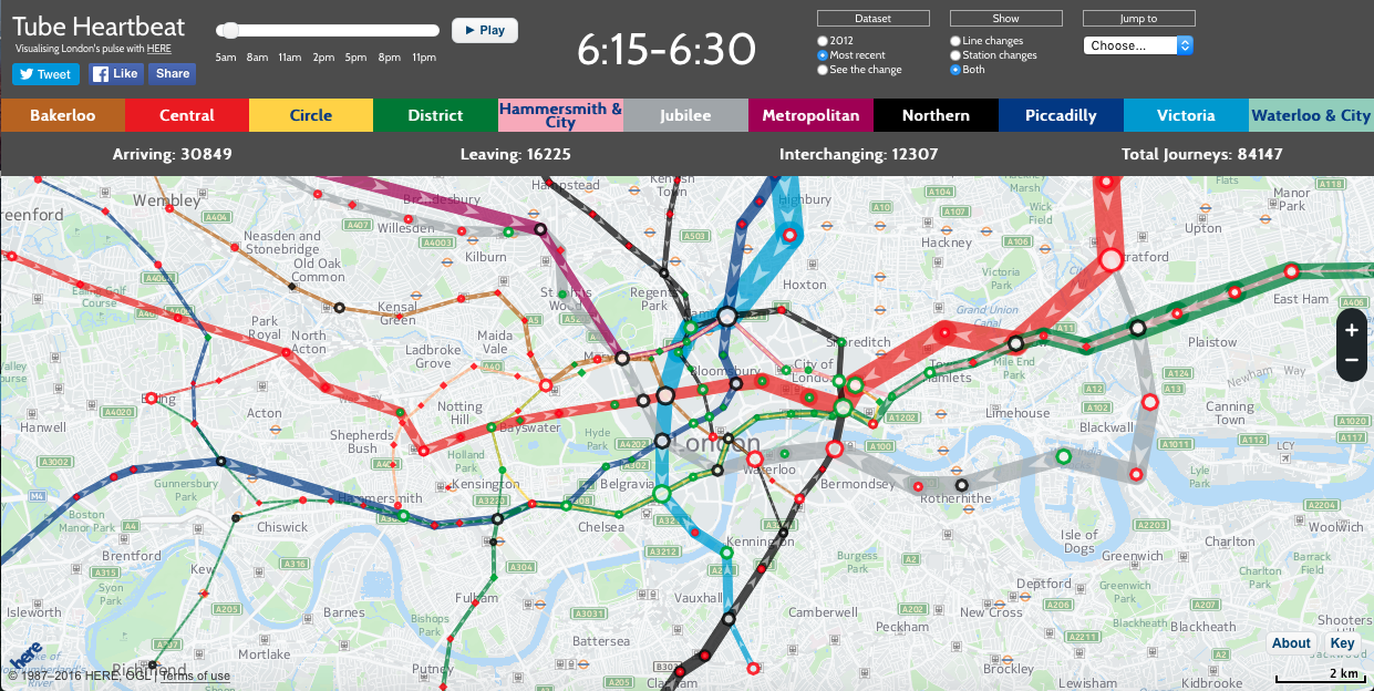
Public transportation data can reveal a lot about a city and is tremendously useful if you are an urban planner looking to understand the city’s transportation needs better. The data when visualised (in the right manner) can reveal some interesting patterns that you possibly couldn’t see otherwise. Like for example, how London’s tube network usage really (and surprisingly) resembles a beating heart.

Tube HeartBeat
The project adeptly titled “Tube HeartBeat” by created Oliver O’Brien (Senior Research Associate at University College London in a commission by HERE) uses the Rolling Origin Destination Survey data from Transport for London (TfL). For more details about the project, check out the blog from HERE 360.
A really cool visualisation of London’s tube network usage that surprisingly resembles a beating heart! How cool it is that? #Geoawesomeness

Dataset
“The data includes, in fifteen-minute intervals throughout a weekday, the volume of tube passengers moving between every adjacent pair of stations on the entire tube network – 762 links across the 11 lines. It also includes numbers entering, exiting and transferring within each of the 268* tube stations, again at a 15 minute interval from 5am in the morning, right through to 2am. It has an origin/destination matrix too, again at fine-grained time intervals….” – Oliver O’Brien’s Blog
The data is available under the UK Open Government Licence (OGL v2). The project is a good example of what is possible when governments decide to open up their data repository for public use, something that Javier Tresoldi and many others at the OSM community have been passionately campaigning for (Related: The good news of Open data and OpenStreetMap Evangelisation).


