A decade ago, Strava started out as a basic activity-tracking app. Today, with more than 47 million users, it has become a raging social network for the fitness community where cyclists, runners, and sports enthusiasts go to record activities, track performance stats, and compete mercilessly with friends.
In the mapping community, Strava got noticed through its awesome heat maps of athletic activity. And now, the fitness network is making us go ga-ga all over again with stunning cartography and amazing use of minimalism.

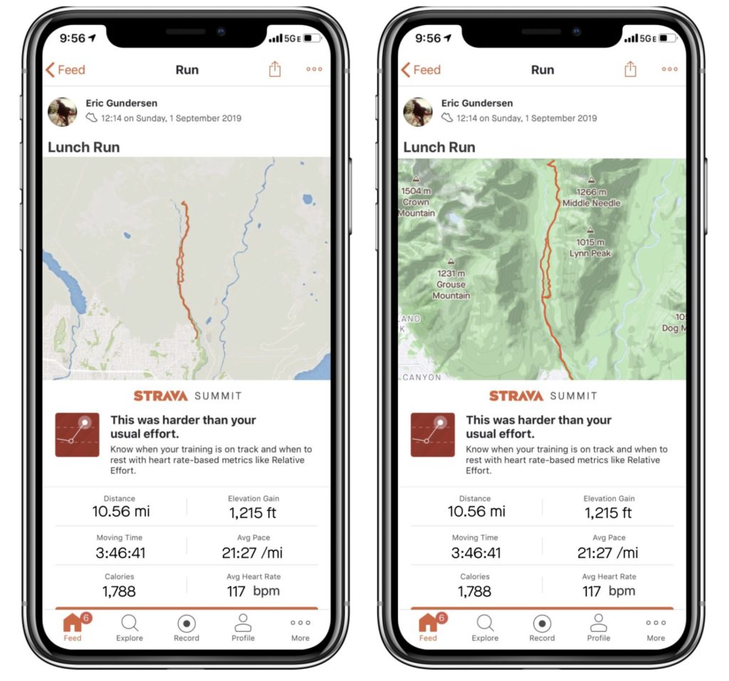
Left: Strava’s previous Feed maps | Right: New maps in the Feed
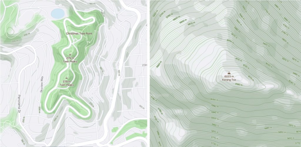
Strava has just updated its in-app global static maps. Developed in collaboration with Mapbox, these maps are designed specifically for athletes’ needs. Instead of focusing on car-oriented features, such as highway numbers, these maps highlight landscape features like terrain shading, elevation contours, and peaks – providing just the context necessary for cyclists and runners to orient themselves. Points of interest are also focused on parks and other outdoor areas, rather than shops.
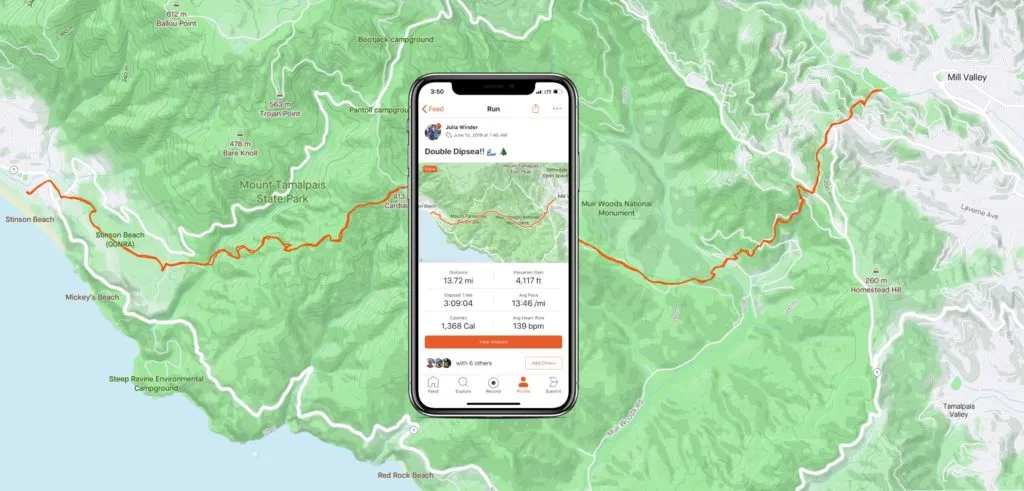
Strava CEO James Quarles had a clear goal: When an athlete looks back at the map journey, it should be evident when they powered up a steep hill, ran by the edge of a river, through a canyon, or along the beach. The map should both inspire Strava users to be outdoors more and make it easier for them to visually share the stories of routes, terrains, and wins.

This is why, to remove any distractions from the athlete’s journey, Mapbox Designer Madison Draper put a great deal of thought into the map colors.
In the new outdoor maps by Strava, contour lines are styled as a gradient of light grey for lower elevation to rich green for elevations 300 meters and higher. Dark and light greens were used for the shadows and light-facing parts of mountains. GPS activity is overlaid on the map as a bright orange line.
As Madison points out, “Using the right set of colors better defines locations on a map and gives a more accurate view of the route. Athletes shouldn’t have to guess where they went. This map should have athletes asking, ‘Where next?’”


 Featured Job: Fullstack Developer at Mapz