Real time air pollution map of the world: The World Air Quality Index project
 Air pollution is a serious issue in many parts of the world, especially in countries with rapid urban expansion and industrialization. In the last few years, there have been some really interesting projects like AirCasting and the Aclima-Google partnership where Google Street View cars were used for mapping air pollution. In some sense, these projects are limited in their geographic reach as they either relied on crowd-sourced data from sensors or Street View cars.
World Air Quality Index
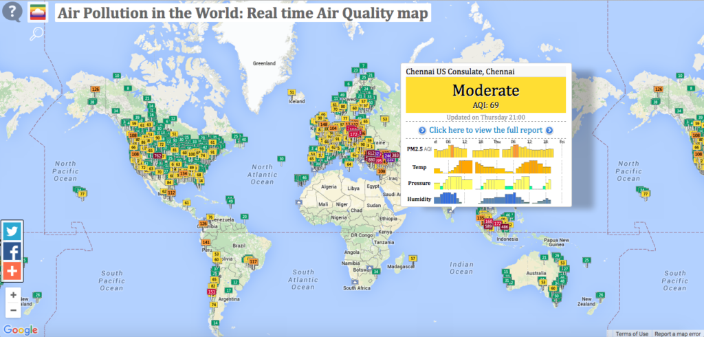
The World Air Quality Index project is a real-time air pollution map of the world – South America and Africa are not covered well though. The project uses data from more than 16,000 monitoring stations in over 60 countries. Here’s the complete project overview.
The map has a lots of useful information and is definitely worth taking a look. The first thing I did was to check out the air pollution in my home town 🙂
If you are interested in contributing to the project, here’s the link to their contact page. If there is one thing that this project can benefit from, it’s a new map design!


