#Featured #Ideas

PokeVision: The real-time Pokemon Go map you’ve been wanting

Yes, we are still talking about Pokemon Go! So now that we got that out of the way, here’s something that most of us missed – a real-time map of the Pokemon Go universe (at least I didn’t know one existing until this afternoon)!

[Update: Pokevision isn’t working since a while (Ninatic closed their APIs). Check out PokeRadar – a really cool crowdsourced real-time PokemonGo map 🙂 ]

Poke´Vision – The real-time map of the Pokemon GO universe

PokeVision uses the API from Niantic (the folks behind the game) to get the location of all the Pokemon near you (or the world if you prefer) and shows them on a map with a nice little timer to show you how long you have before the Pokémon disappears. The map tiles and Geocoder for PokeVision are based on Esri tech and the tiles seem to be rendered using Leaflet JS.
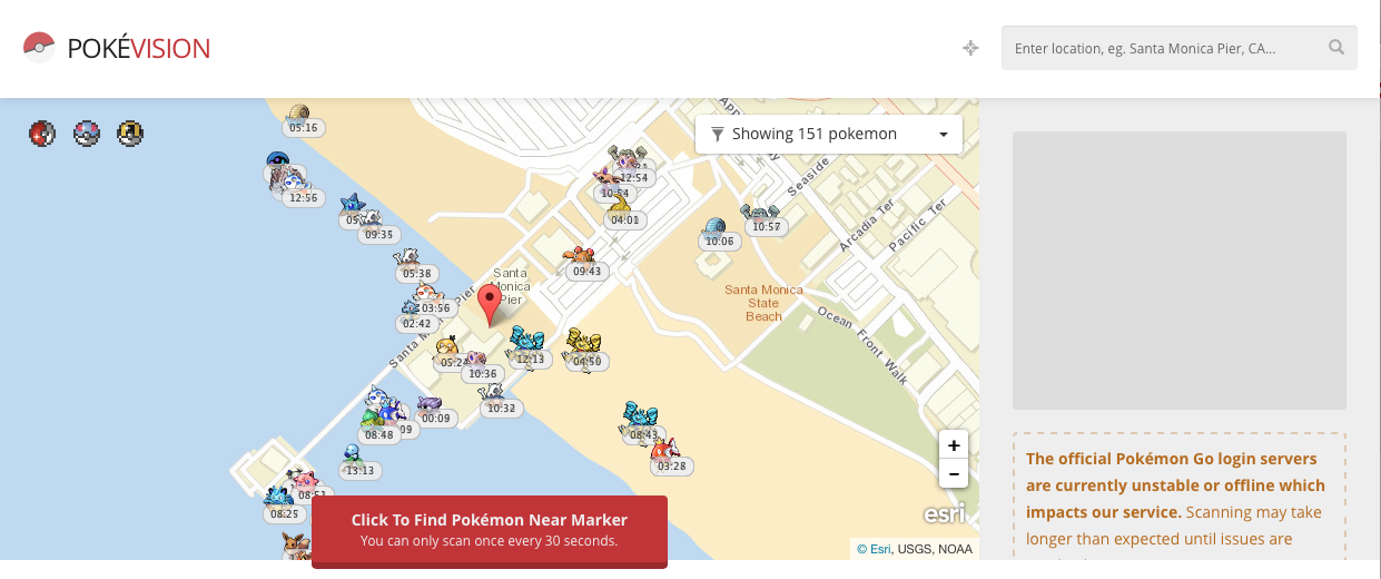
PokeVision

Pokemon GO has been plagued by so many server outages because of the massive popularity of the game that its possible that map is broken when you try to check it out. Case in point –

PokeVision is certainly worth checking out! But then Map or no map, Gotta catch em all, right? 😉


Update

After a recent update by Niantic the PokeVision and other Pokémon map tools stopped working. Read more here.

Say thanks for this article (2)
The community is supported by:
Become a sponsor
#Featured
#Business #Events #Featured
The Future of Navigation: How Satellite Data Shapes Map Innovation
Avatar for Muthukumar Kumar
Muthukumar Kumar 10.29.2024
AWESOME 1
#Business #Featured
Global Top 100 Geospatial Companies 2025
GeoawesomeTeam 09.23.2024
AWESOME 5
#Business #Featured
Call for nominations: Global Top 100 Geospatial Companies 2025 Edition
Avatar for Muthukumar Kumar
Muthukumar Kumar 10.1.2024
AWESOME 1
Next article
#Business #Ideas

Google Maps gets a new cleaner look. Small changes that make a difference.

Cartography is all about small details that make a huge impact on the visualisation. When looking at map design of the companies like Google, HERE or TomTom you can clearly see the differences but it’s hard to indicate what would you change to make it look better. Nowadays cartography of mature navigation providers is all about tiny changes to the font size, playing with shades, and icons or adding one pixel to the road width. It’s also about showing relevant content and seamless generalisation.

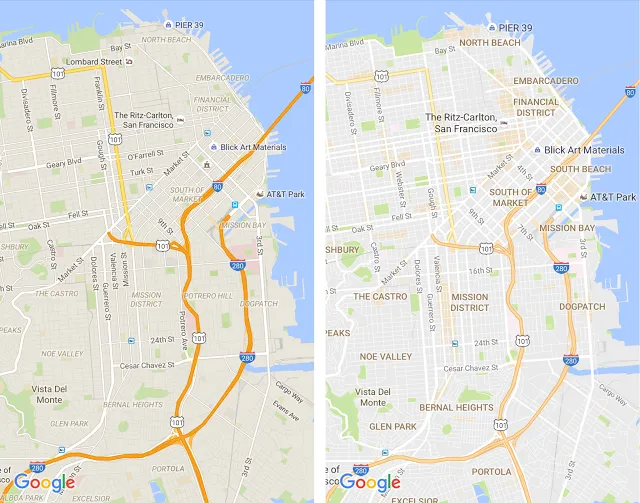
Today Google announced a series of small design changes that will significantly improve your map experience.

New Google Maps desgin - Geoawesomeness

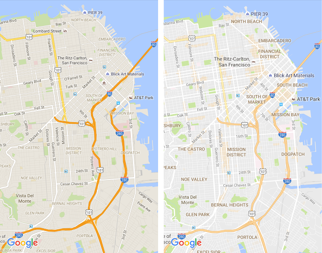
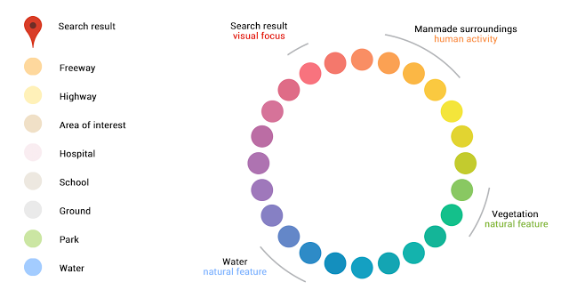
On the left you can see the old design and on right the new one. The first thing you’ll notice is that the new, subtle colour palette is a little bit brighter, making it easier to read the text. The new colour scheme makes it also easier to differentiate between man-made or natural features, and quickly identify places like hospitals, schools or highways. The design got cleaned also by removing unnecessary elements like road outlines.

Another thing that you’ll notice is improved typography of street names, points of interest, transit stations, and other to make them more distinguishable from different things on the map. It also makes it look consistent as the district names are finally not in an italic font. The fonts are bigger and therefore more readable.

Google Maps Color Palette

Google Maps Color Palette

The changes are really small but at the end we get a significant improvement. The design is cleaner and more user-friendly.

Read on
Search