Geography of Emotions: Mapping emotions across the World
Geography and Maps have been used to depict a lot of information these days which traditional would have made it to a tabular list. I must admit some of this information have been really interesting to know. Yeah, I do have doubts about the inferences the authors make but nevertheless it is always interesting to see the research being depicted using maps.
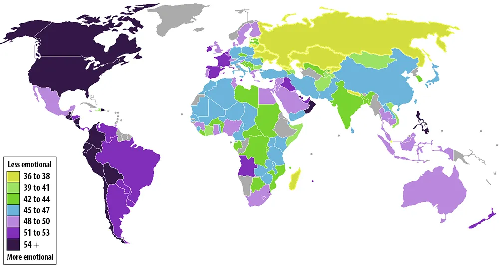
The Gallup polling firm has come out with an interesting research regarding “How emotional are people in your country are?” The research was started in 2009 and people from 150 countries were asked about their daily emotional experience among other things that are considered pointers to your emotional thinking.
The Survey had five questions, meant to gauge whether the respondent felt significantly positive or negative emotions the day prior.
” The more times that people answer “yes” to questions such as “Did you smile or laugh a lot yesterday?”, the more emotional they’re deemed to be. Gallup has tallied up the average “yes” responses from respondents in almost every country on Earth. The results, which I’ve mapped out above, are as fascinating as they are indecipherable. The color-coded key in the map indicates the average percentage of people who answered “yes.” Dark purple countries are the most emotional, yellow the least. Here are a few takeaways. “
If you are interested in the number and the exact questions, here you go!
Well, all I can say is “Interesting, but I am not too certain about the emotional outcome”. What do you think? Do you agree that your country is more “Emotional” than the others or vice versa…
P.S: I always thought Asian Countries are more emotional.. But, maybe I was wrong or am I?!
Geography of emotions! Let us know what you think!
Source: Washington Post


