Forests on diet – the map of global forest extension

A new high resolution map of global forest extension covering the time span 2000 – 2012 was recently presented by Department of Geographical Sciences, University of Maryland, US. The time series is based on 654.178 LANDSAT images resulting in a global wide map displaying forest change at a never seen spatial detail of down to 30m. Thus, the map entails globally ‘consistent but locally relevant information’, according to a geographer of University of Maryland. Indeed, the map is useful for extracting information on local forest change, while potentially every corner of the globe may be entered. The huge amount of data processing was possible only through cloud computing.

Methodologically, forests were considered as all vegetation taller than 5m and are expressed as a percentage per output grid cell as ‘2000 Percent Tree Cover’. ‘Forest Loss’ is defined as a stand-replacement disturbance, or a change from a forest to non-forest state. ‘Forest Gain’ is defined as the inverse of loss, or a non-forest to forest change entirely within the study period.

The new forest map reveals that between 2000 and 2012 2.3 millions km² of forest have vanished. To present the gain and loss more clearly I am going to state the raw numbers:

2000 – 2012 global forest dynamics

  • Gains:        800.000 km²
  • Losses: 2.300.000 km²
  • Loss and Re-gain:     200.000km²

The greatest amount of loss still occurred in the tropics that count for 32% of all losses. While in Brazil due to political efforts the rate of loss reduced slightely (though after 2012 the restrictions for deforestation were loosened up again), the deforestation rate in Indonesia doubled after 2003 from 10.000 km² to more than 20.000 km² forest cut per year. Considerable are also the losses in the Canadian and Russian boreal forests.

Forest monitoring belongs to one of the highly significant topics of today. Initiatives such as UN’s REDD+ highlight the need for information upon forest change and biomass. Forests impact the climate (CO2 household), biodiversity of plants and animals, but also the humans in a positive manner. A researcher of the mapping team found out that tree cover correlates with human health as people living close to forests eat a healthier diet than people in other environments do (FAO article1, FAO article2).

In an increased situation of urbanisation, loss of biodiversity and enhanced consumption of resources the protection of forests as ecological regulators is of great importance. As political desicions for stopping deforestations unfortuantely need hard facts those forest and biomass monitoring programs in my opinion are strongly necessary in order not to experience forests being on diet themselves!
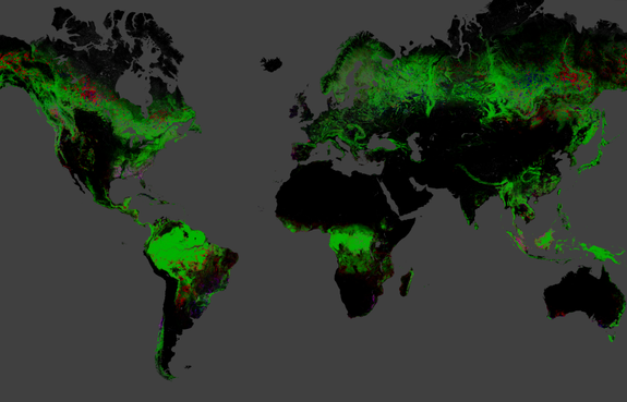
A new global map of deforestation reveals 888,000 square miles (2.3 million square kilometers) lost between 2000 and 2012.

The new global map of deforestation reveals 2.3 million square kilometers lost between 2000 and 2012. Red shows losses, blue gains, purple loss and gain.
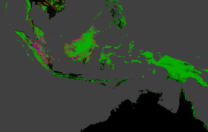
Indonesia lost forests the fastest of any nation between 2000 and 2012. Credit: Image courtesy Matt Hansen, University of Maryland

Indonesia lost forests the fastest of any nation between 2000 and 2012. Red shows losses, blue gains, purple gain and losses.
Credit: Image courtesy Matt Hansen, University of Maryland
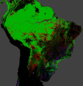
 

Forest losses in tropical South America between 2000 and 2012. Particularly at the Southern edge of the Amazonian Basin, in Bolivia, Paraguay the loss of forest is obvious.

Forest losses in tropical South America between 2000 and 2012. Particularly at the southern edge of the Amazonian Basin, in Bolivia, Paraguay the loss of forest are considerable. Red shows losses, blue gains, purple losses and gains.
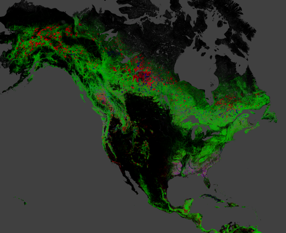
 

A map of change in North American forests between 2000 and 2012. Red is loss and pink represents areas of loss and gain. Credit: Image courtesy Matt Hansen, University of Maryland

A map of change in North American forests between 2000 and 2012. Red is loss and pink represents areas of loss and gain.
Credit: Image courtesy Matt Hansen, University of Maryland
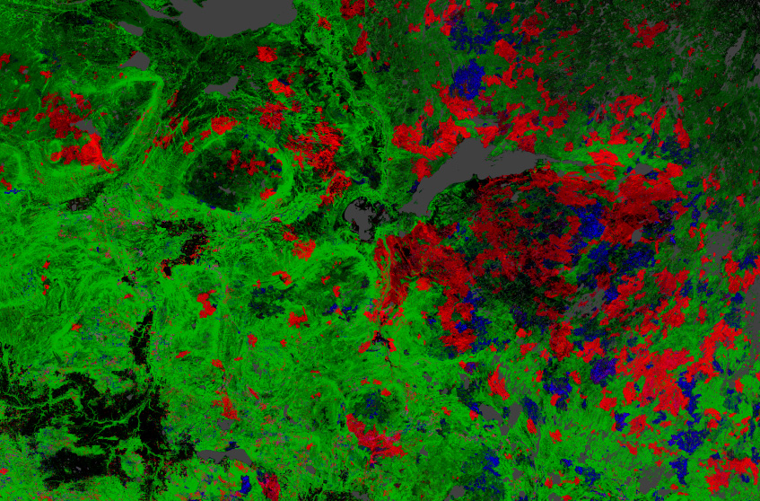
Losses in the Canadian boreal forests in a more detailed view.

Losses in the Canadian boreal forests in a more detailed view. Red shows losses, blue gains, purple losses and gains.
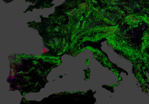
Forest change in Europe: A wind storm in 2009 leveled a forested area in South-west of France. Portugal exhibits a strong dynamic of forest loss and gain.

Forest change in Europe: A wind storm in 2009 leveled a forested area in the south-west of France. Portugal exhibits a strong dynamic of forest loss and gain. Red shows losses, blue gains, purple losses and gains.


Did you like this post? Read more and subscribe to our monthly newsletter!


Say thanks for this article (0)
The community is supported by:
Become a sponsor
#
#Agriculture #Business #Construction #Data processing #Energy #Environmental Protection #ESG #Financial Services #Geospatial analytics #Geospatial for Good #Government #Health Care #Military #Natural Resources #Real Estate #Transportation
Making Sense of Satellite Imagery: How Can We Process Data at Scale?
Avatar for Barry Morisse
Barry Morisse 05.13.2024
AWESOME 2
#Agriculture #Construction #Energy #Environment #Environmental Protection #Financial Services #GeoDev #Government #Humanitarian #Ideas #Natural Resources #Orthorectification #Satellites #Transportation
Why Orthorectification is Key for Real-World Terrain Mapping and How To Use It
Nikita Marwaha Kraetzig 10.14.2024
AWESOME 2
#Construction #Featured #Real Estate #Transportation
Urban Planning’s New Frontier: The Transformative Power of Satellite Imagery
Avatar for Barry Morisse
Barry Morisse 11.14.2024
AWESOME 1
Next article

Explanation for the Output of the Iasoberg Model

Iasoberg Model

Instead of a Legend for the interpretation of the displays of the output of the Iasoberg Model, a detailed description of the elements of the model will provide the observer with a more comprehensive understanding of what the elements represent.

It would be very useful for the reader to take the time to view The Allias Effect – The Iasoberg Model – The Future presentation and read the paper on the Papua New Guinea and Western South American Terrestrial Gravitational Anomaly Plane to gain a reasonable understanding of the Allais Effect and the Iasoberg Model.  The links to these two documents are below:

https://www.facebook.com/download/573397696054233/The%20Allais%20Effect%20The%20Iasoberg%20Model%20The%20Future%20Webinar%201.ppt

https://www.facebook.com/download/414664981993270/PNGWSATGAPlaneandAllaisEffectFinaldoc.pdf

There are 4 Iasoberg Model spatial configurations that are generated by various algorithms (programs) and displayed on most graphs and charts.  The iasobergs (3 band 3xred and 3xgreen bands) and the celestial subpoints (sun – red, blue – moon and green – center of the galaxy) are essentially fixed as the Earth rotates through them in a 24 hour period.  The other 2 configurations, ie the PNGWSATGA Plane and the boundaries of the tectonic plates obviously rotate with the Earth.

So let’s start with the iasobergs.  The term iasoberg, was a term coined as the generic descriptor of the regions where the Iasoberg Model output intersect the Earth’s surface to indicate the influence of the Allais Effect.  Initially, an iasoberg was displayed as a line on the Earth’s surface to indicate its location. This early model consisted of 4 iasobergs (lines), two associated with the Sun and 2 with the two with center of the galaxy.  The solar iasobergs were focused at the barycenter of the Earth Moon system and the anti-barycenter, which is a point on the Earth Moon axis opposite to the barycenter and at the same distance from the center of the Earth to the barycenter.  The galactic iasobergs were configured similarly to the solar iasobergs.

Prior to a study of severe wind events in August 2008, 2 additional iasobergs had been developed to provide additional intersections on the Earth’s surface for investigating links between event(s) and the output of the model.  These two additional iasobergs were styled the Solar and Galactic Earth Centric Iasobergs focused at the mass center of the Earth. The geometry of these Iasobergs was as per the initial 4.    The lines were further developed into 3 bands for each iasoberg.  The 3 band iasoberg was developed as an exploratory representation of the observations recorded in the Saxl and Allen experiment (1970) and the 3 clusters of severe events described in the severe wind study.  All the work and results presented in Note 4, a study on severe wind events in August 2008 in continental USA, were based on the current versions of the model and its associated software, the Iasoberg Model algorithms.  The current set of 6 iasobergs are configured with 3 bands (3 iasobergs are linked to the Sun and are displayed with red dots and lines, and 3 linked to the center of the galaxy – similarly displayed in green).

The 3 solar linked iasobergs are shown with red dots and vertical lines on various maps and charts.  The 3 bands of dark red dots indicate the iasoberg focused at the Earth Moon System barycenter styled the Solar Fundamental Iasoberg.  The 3 bands of vertical lines indicate the iasoberg focused at the center of the Earth styled the Earth Centric Solar Iasoberg.  And the 3 bands of light red dots indicate the iasoberg focused at the anti barycenter styled the Solar Mirror Image Iasoberg. The galactic/green iasobergs are configured and styled similarly as the solar iasobergs, except they are linked to the center of the galaxy.

Next, we have 3 points which are included in all displays; they are the subpoints of the Sun (red), Moon (blue) and center of the galaxy (green).  The subpoint is where the axis between the above celestial body and the center of the Earth intersects the surface of the Earth.  We have found in some of our work that their location in conjunction with the iasobergs have correlated with observations/reports of various geophysical events.

Thirdly, we have the elements associated with PNGWSATGA Plane (great circle shown as a red line) and iasospots (Iasospot 1 – PNG Magenta polygon – Iasospot 2 – WSA cyan polygon) which are shown in all maps/charts.  The polygons represent two regions of the earth where there are significant terrestrial gravitational anomalies. Two additional elements have been included to the PNGWSATGA Plane configuration as a result of severe weather event observations.  They are planes that are orthogonal to the PNGWSATGA plane and intersect the PNGWSATGA plane at the centroids of the PNG and WSA polygons.

Finally, in some maps you will also see lines of yellow dots which represent the boundaries of Earth’s tectonic plates.

At this stage there is no rationale for the distortion of the solar and galactic gravitational fields focused at the barycenter and anti barycenter of the Earth Moon system and mass center of the Earth.  However, if the above fields are distorted, as hypothesized , that is one way field theory can accommodate non homogeneous gravitational vectors on the Earth’s surface that emanate from the above points within the Earth.  iasoberg.com have a series of algorithms (programs) developed by my brother and myself, which can generate the locations for these ‘hypothesized’ distortions very accurately for any instant of time  between 2500BC to 2500AD.

All the features presented on maps reflecting the output of the Iasoberg Model are subject to the dynamics of gravity.  The iasobergs (hypothetical distorted gravitational potentials), the subpoints and regions near them (m1 x m2/r2), the TGAs because of more mass in those regions of the Earth and the tectonic plates which indicate the boundaries of large masses near the Earth’s surface are dynamically linked. It is my contention that these elements contribute to the dynamics that influence our terrestrial environment. It is important to note that some of these elements are constantly moving relative to each other, in some instances in excess of 1600 km/hr!!!!

Related Articles on Iasoberg Model


Did you like this article? Read more and subscribe to our monthly newsletter!

Read on
Search