What Are Flow Maps?
Flow maps are a special kind of map that visualize the movement of elements like water, air, or traffic across different areas. For example, in hydrology flow maps illustrate the flow of rivers and ocean currents. This information helps us understand how they behave and interact, providing insights into their dynamics.
How Do Flow Maps Work?
Flow maps combine spatial and temporal data to depict movement across a landscape. They use lines or arrows to yyyindicate direction and flow magnitude, with varying thickness or color representing intensity or volume. Animated flow maps incorporate time-series data to display changes in flow patterns over time, offering a dynamic way to visualize movement.
Creating Animated Flow Maps: A Step-by-Step Guide
- Data Collection: Gather spatial data (e.g., river paths, ocean basins, wind direction) and flow data (e.g., water velocity, discharge rates, wind power) from reliable sources.
- Data Integration: Combine information about location and movement in a GIS to understand the connection between geography and movement.
- Data Visualization: Implement animation techniques. Symbols like arrows or streamlines show the direction and speed of the flow. For animations, the data is sequenced to show changes over time in the flow patterns.
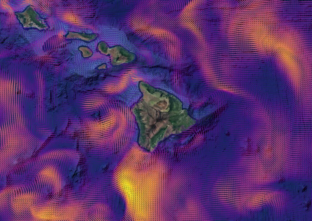
Wind vector map based on mesh, location: Hawaii Islands
Examples of Flow Map Visualizations
Several online resources showcase compelling flow map visualizations:
1. Visualizing the World’s Watersheds
This project uses animated maps to trace water flow from upstream locations to where rivers meet the oceans. It provides a cleardepiction of watershed dynamics, helping users understand how water moves across landscapes.
2. NASA’s Ocean Flow Vignettes
Created by NASA’s Scientific Visualization Studio, these visualizations highlight ocean flows in various regions, such as the US East Coast, central Pacific, and southeast Asia. They demonstrate the complexity of ocean currents and their role in global sea-level changes.
3. Mapping France’s Rivers with Adobe After Effects and GEOlayers
A tutorial demonstrating the creation of animated river maps using GIS data and animation software, providing insights into the mapping process.
4. Windy.com
Windy.com is an interactive platform that visualizes real-time ocean currents, wind patterns, and weather conditions. It allows users to explore global flow dynamics in an intuitive and dynamic way, making it easier to understand complex environmental phenomena.
 |
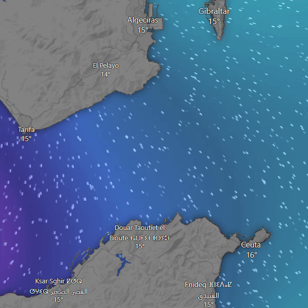 |
Windy.com: Wind and Waves Visualizations
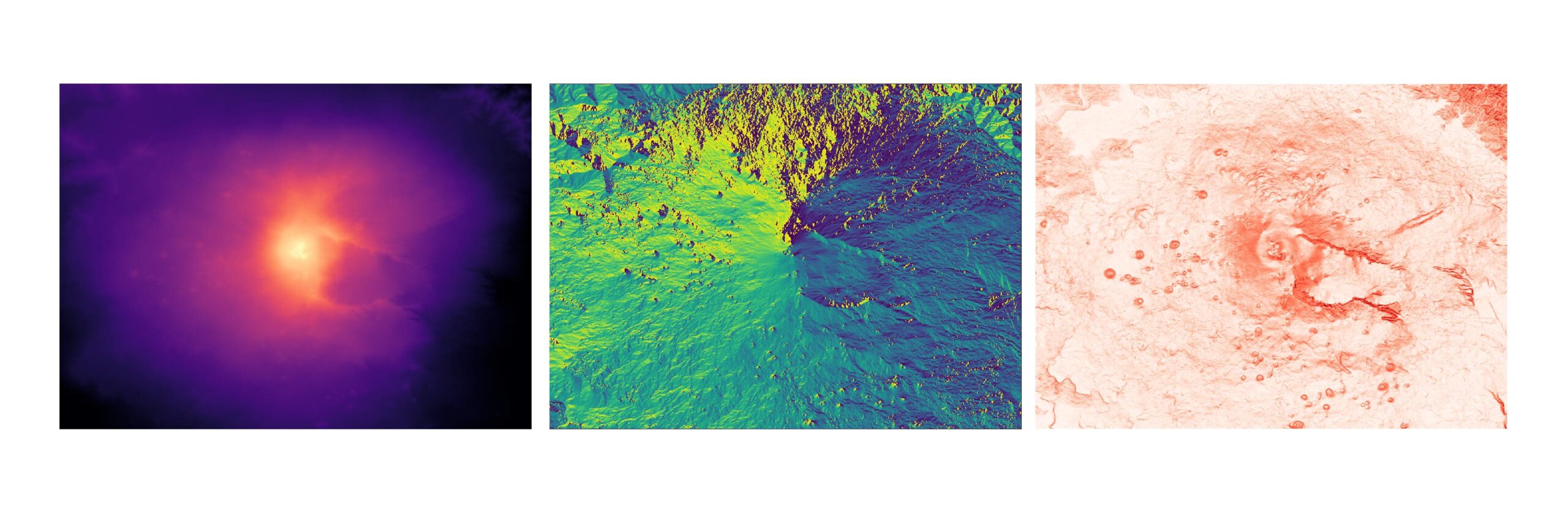
Case study: Creating A Simple Animation Using DEM
In this case study, we’ll showcase steps to create a flow on the slope of Mount Etna. This technique can help identify potential sites for massive lava flows or areas susceptible to rapid water surges during heavy rainfall.
1. Data Acquisition
To begin, you’ll need a DEM for your area of interest. One of the best free data sources is OpenTopography. It’s a free, public platform that provides high-quality topographic data, including LiDAR and DEMs, for geospatial analysis and research. You can also get slope and aspect information based on the area you’re interested and download DEMs in formats like GeoTiFF.
Case study: Height maps vs. Aspect vs. Slope
2. Data Preparation
Once you have your DEM, prepare it for use in a GIS environment. This may involve converting the DEM into a format suitable for your software, such as QGIS or ArcGIS. =
A) Ensure all layers are loaded into the GIS software, such as QGIS
B) (Optionally) If you downloaded only DEM raster, create aspect and slope maps
C) Use the “Raster pixels to points” tool to convert a raster layer (e.g., a height map) to a vector layer.
D) Sample raster values for other raster layers, including aspect and sloper rasters.
3. Visualization Setup
E) Go to the point layer Properties and select the Symbology Choose the graduated style and select slope as the value.
F) Click on the Symbol option and select Font Marker as a Symbol layer type.
G) Adjust the size using the Data defined override. In the expanding list, select Flow type: int, double, string, and choose Slope.
H) Use the Data defined override to adjust the rotation. In the expanding list, select Flow type: int, double, string, and choose Aspect.
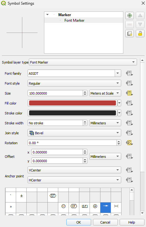
Symbol settings
4. Animation Creation
Almost ready. Divide the points by height. Using on/off layers, starting with the highest layers, you are able to see what the rainwater run-off is.
By following these steps, you can effectively create simple, animated flow maps in QGIS to visualize wind, water, rivers, or ocean currents dynamically.
Case study Visualizing water flow based on DEM
Summary
Flow maps are used to visualize movement across geographic space, such as river currents, ocean flows, traffic, or migration patterns.
They play a key role in understanding trends, and making data-driven decisions in fields, including hydrology, urban planning, and logistics.
Flow maps offer a clear and intuitive way to analyze dynamic processes by representing direction and intensity through arrows or streamlines.
This article was inspired, among others, by open.gis.lab blog. Feel free to read more details on the website.
Do you like this article? Read more and subscribe to our monthly newsletter!