Christopher Columbus set sail from Spain on August 3, 1492, hoping to find a trade route to Asia. After spending more than two months at sea, Columbus landed on an island in the Bahamas. But the Italian explorer thought he had reached Japan, the land of gold – because that’s what the map he was using as a reference was telling him.
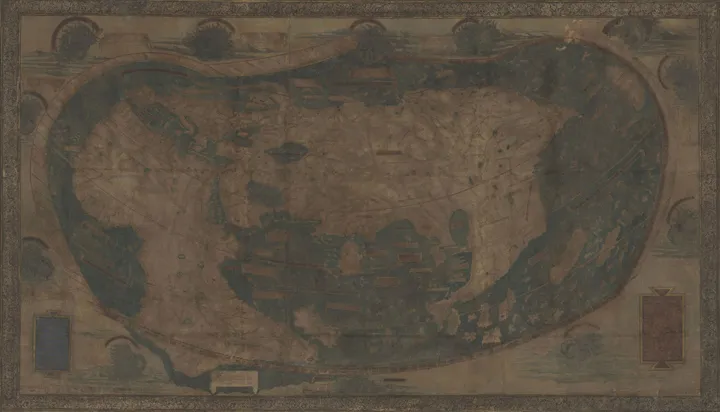
Columbus is thought to have been guided by a copy of the 1491 map of the world, created by German cartographer Henricus Martellus. Measuring about 4 feet by 6.5 feet, this map showed the entire world as it was known to 15th century Europeans at that time. Likely commissioned by a royal family, the Martellus map was hand-painted on paper and glued to a canvas backing.

The Martellus map under natural light
Above, you can make out an oddly-shaped Africa to the left, a more or less accurate Europe and the Mediterranean Sea, and the large mass of Asia with Pacific islands to the right. The ‘New World’ was yet to be discovered by the Europeans and it wouldn’t be until 1507 that the famous Waldseemüller map would use the term ‘America’.
The Martellus map drew its influences from Marco Polo’s voyages and the trips of Portuguese explorers around the Cape of Good Hope. Unlike most other maps from that era, it did not showcase any sea monsters – thus providing a unique view into Renaissance cartography. Instead, it was loaded with text labels and descriptive legends in the Latin language.
Yale University received the Martellus map in 1962 through an anonymous donation. By that time, much of the text had become illegible, courtesy fading, water damage, over-painting, and palimpsesting. This limited the map’s research value significantly. With attempts to clean and restore the map not yielding desired results, Yale hung the papyrus outside the reading room of the Beinecke Library, where it stayed unobtrusively for years.
Then, in 2014, a team of researchers and imaging specialists set out to reclaim the lost information with cutting-edge technology. Scanning the map with 12 different types of lights, ranging from ultraviolet to infrared, the team captured hundreds of overlapping images, or tiles, of the Martellus map.
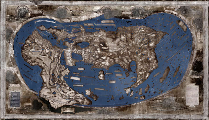
The Martellus map enhanced with multispectral imaging
After months of image processing and analysis, the multispectral images rendered most of the previously illegible text on the map legible. The National Geographic describes some of the legends in an article:
Here are found the Hippopodes: they have a human form but the feet of horses,” reads one previously illegible text over Central Asia. Another describes “monsters similar to humans whose ears are so large that they can cover their whole body.” Many of these fantastical creatures can be traced to texts written by the ancient Greeks
The detail in which the interior of Africa was described geographically was particularly surprising for the researchers. They also discovered that Waldseemüller’s map of the world had borrowed its text liberally from the Martellus map – a practice not uncommon for those days.
Essentially, these findings provide us with enough clues to suspect that when Columbus sailed across the Atlantic, he pictured himself sailing down the coast of Asia as shown on the Martellus map.
Did you like this post? Read more and subscribe to our monthly newsletter!

