What’s Powering Your Phone Battery in Different Parts of the Country?
Because I worked for an electric utility company during an era of dramatic change in the industry, I was interested in understanding how the generation mix of the United States was evolving and if it was keeping up with technologies that would enable renewables. Also, as a millennial, I take a deep personal interest in anything remotely related to my phone and its battery. So, given the convergence of these two critical issues, I took a look at the U.S. Energy Information Administration (EIA)’s data on power plants. It turns out depending upon where you live, work, study, or travel in the country, you will be hailing Uber, browsing Facebook, or swiping right using a different mix of renewables and fossil fuels power.
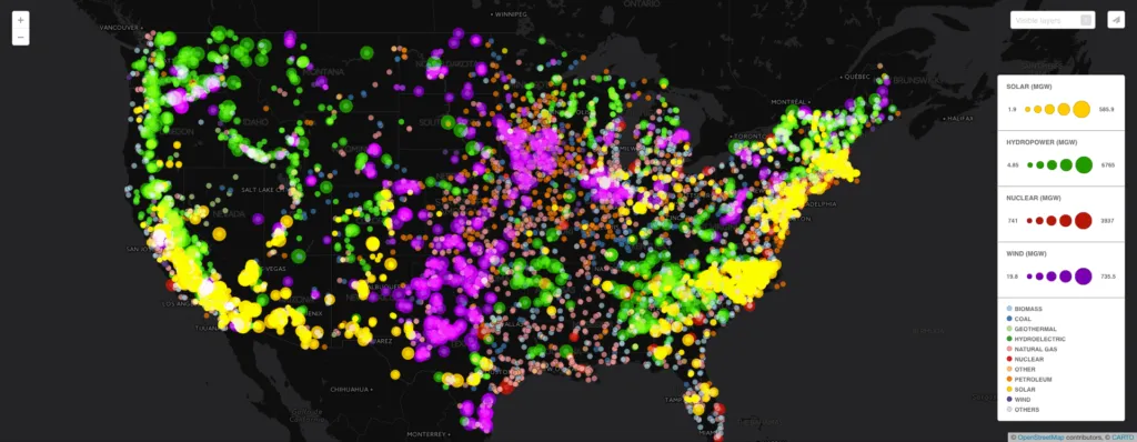
What did I find? First off, not all clean energy is created equal. One megawatt of solar powers about 165 homes, versus about 220 homes from one megawatt of wind, or 750 to 1,000 homes from one megawatt of hydro. The actual capacity of these power plants varied by source as well, with the largest hydro plant producing up to 6.77 kilowatts and wind and solar maxing out around 735 and 585 megawatts, respectively. This seems logical since wind and solar are more intermittent and emerging forms of generation whereas hydro is more established and continuous and supplies about six percent of the country’s total energy.
But where in the U.S. are the renewables? According to this map of power plants in the U.S. by primary generation source, they’re all over the place, although, the specific type of energy varies based on location. Wind generation is most prevalent in Texas and the midwest where Tornado Alley is located. This means that if you live in Kansas you can harness the same wind power that helped Dorothy defeat the Wicked Witch of the East to scroll and double tap through Instagram all day guilt-free, knowing you’re using renewables. The yellow brick road of solar, on the other hand, seems to lead to California, the northeast, and North Carolina, where the tech industry is most advanced. Finally, hydropower is most popular in the great lakes region, northwest, northeast, specifically Maine, New Hampshire, Vermont, and upstate New York as well as some parts of the south and rocky mountains where mountains and bodies of water are located.
For non-renewables, coal is concentrated in the midwest focused around Kentucky and Illinois. Natural gas is most prevalent in the midwest and south between Chicago and Houston as well as near and between major metro areas in the northeast from D.C. to Boston. Petroleum seems to be prominent in the midwest centered around Iowa. Coal and natural gas each supply about 33% of the country’s power with petroleum adding 1%, meaning fossil fuels still provide about two-thirds of the nation’s energy.
Overall, this energy mix makes sense based on how various natural and technological resources are allocated throughout country. What surprised me, though, was just how immediately apparent this became when visualizing power plant data spatially, magnifying areas of high renewable generation, and zooming out to a thousand foot view. In particular, I was shocked by just how starkly the solar-dominated power plants followed the outlines of North Carolina, New Jersey, and Massachusetts. I’m guessing this phenomenon is supported by specific policies in these states to encourage solar production. Perhaps these east coast congresspeople never forgot the Sunny Delight commercials they were bombarded with as children and personally took it upon themselves as adults to “unleash the power of the sun” through clean energy legislature. That’s my guess anyway. Is your phone solar, wind, or hydro-powered?

