#Environment #Ideas

This video shows what the Earth would look like if all the ice melted

Today is the last day of 2015 UN Climate Change Conference in Paris. Leaders from all around the world where discussing policies that could reduce global warming but still allowing country economies to grow.

Why it is important to act and why the world leaders suddenly started to care about it? Earlier this week we’ve written about a striking visualisation showing how will your city be affected by the rising sea level. Another visualisation below puts it in a global perspective…

It’s been predicted that the oceans will rise by around 65.8 metres (216 feet) if all ice on the planet were to melt completely. As National Geographic reported back in 2013, it would probably take at least 5,000 years to melt all five million cubic miles of ice on Earth, but some cities like Venice, Calcutta, Shanghai of most of the Florida could be under water much sooner.

If we don’t start to act now some changes will be irreversible and will even accelerate. So let’s start from our own backyard and start be more ‘ecological’ every day.

Source: Business Insider

Say thanks for this article (0)
The community is supported by:
Become a sponsor
#Environment
#Environment #Fun #Ideas #Satellites #Science
Using Principal Component Analysis (PCA) in Satellite Imagery: A Concise Guide with QGIS Application
Sebastian Walczak & Nikita Marwaha Kraetzig 09.11.2024
AWESOME 0
#Environment #Fun #Satellites #Science
Exploring the World of Google Earth Engine Through Time-Series Visualizations
Sebastian Walczak 06.5.2024
AWESOME 2
#Environment #News
London Gatwick Airport Launches a New Geospatial Platform to Manage Buried Assets and Support Biodiversity
Nikita Marwaha Kraetzig 04.18.2024
AWESOME 4
Next article
#Ideas

The story of global migration visualised on a single map by Esri

International migration is a hot topic and a global phenomenon that is growing in scope, complexity and impact. It can be a positive force for development when supported by the right set of policies but performed unreasonably migration can cause short-term or long-term issue swhich is the case in couple of European countries.

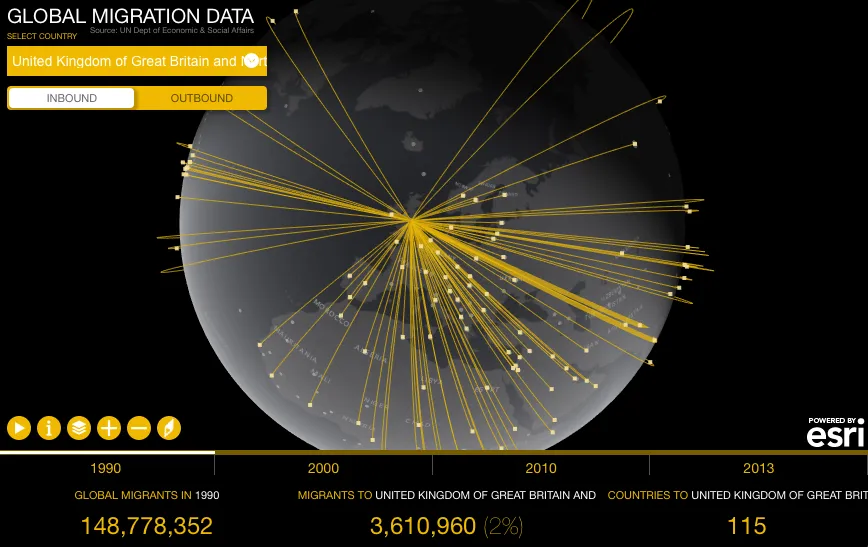
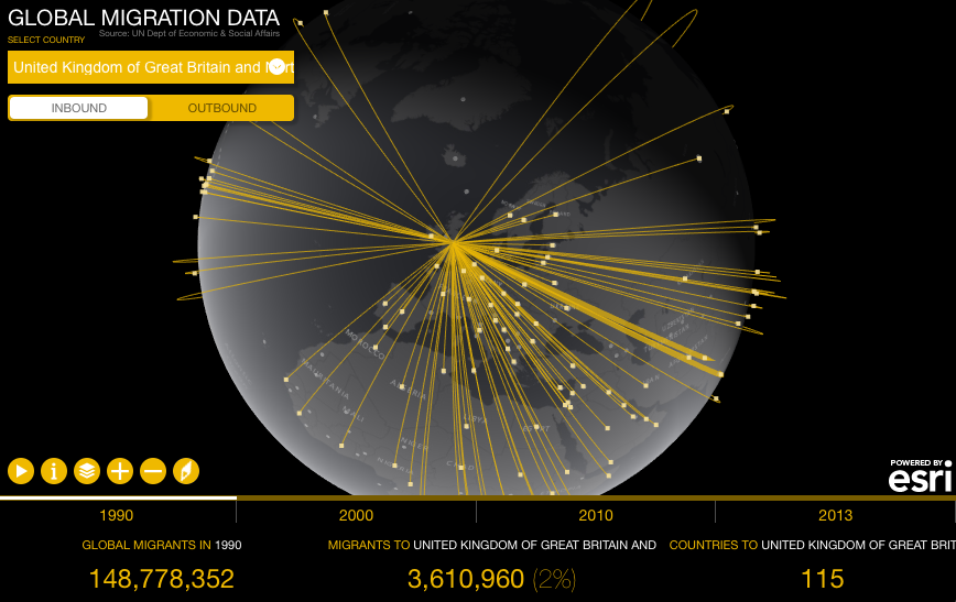
Understanding global mobility patterns and its impact on countries is very difficult without a great map… but don’t have to worry about that any more as Esri has launched a new cool tool where you can visualise global migration country by country. The project is called Global Migration Data and it shows estimates of the number of international migrants by destination and origin. The data comes from the UN Department of Economic & Social Affairs for the years 1990, 2000, 2010 and 2013.

Global migration trends - Esri Geoawesomeness

The map is very easy to use. On the top left menu you can select a country as well as its incoming or out coming migration. Below the map you’ll find a timeline where you can select years you wish to visualize on the globe. On the bottom of the website you’ll find the total number of migrants globally, per selected country as well as the number of countries migrants are from or the number of countries migrants moved to.

Cool project and a nice show case of what can be done using Esri web tools.


Read on
Search