RTI International (Research Triangle Park) developed a web-based service that enables the visualisation of census data of US population. The data set comprises information on households like income, race, age and household size for any location in the US. The ‘synthetic population viewer’ enables a fine-scale look on multidimensional demographic patterns and micro communities. Variations between different cities can easily notices. Technically, the data set relies on the American Community Survey from 2005 – 2009 and represents more than 112 million households and more than 280 million individuals. Hence, the data characterize the reality of US household population very well. The single households are marked by single points on the maps that zooming out reveal a wealth pattern. Due to privacy policy points do not represent actual households in their exact position.
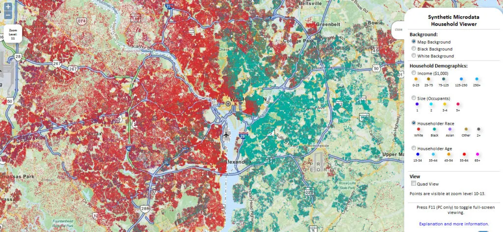
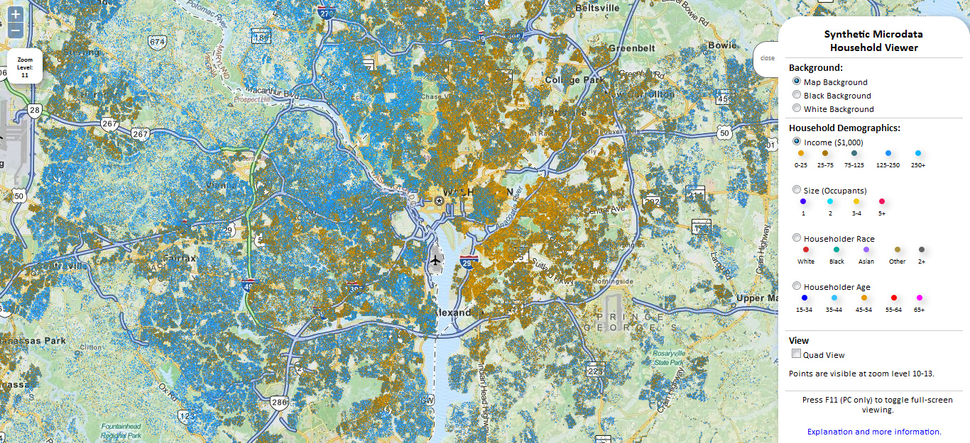
The tool is powerful to show social differences in US households as subtile shifts in income and stark racial boundaries, which become evident in many US cities. In the example below I am presenting the income and race patterns in the Washington D.C. area: apparently black population (turkish colour) rather lives in the eastern parts of Washington while white inhabitants (red colour) settled in the west. The income in the east is noticeably lower (yellow/ocher) than in the west (blue).
Washington D.C. area: The map at the top visualizes household races and the map at the bottom shows the income situation of households.

