Uber’s approach to Cartography
Uber is a great example of a company that has built an incredible business using the core competencies of GIS at the backend and a very straightforward and intuitive UX. Their business models and other aspects of their business are up for debate but its hard to deny that they have an amazing user interface (and a great design team to thank for that).
Uber and Maps
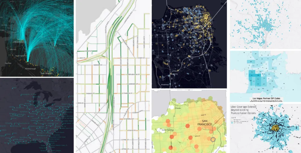
Uber has been using maps since their inception for a wide variety of applications ranging from visualization your uber ride on the map, to helping cities understand traffic patterns better, to map road conditions.
But how does a company like Uber approach mapping & visualization? Do they have a unified outlook towards Cartography or is it more tuned towards the application? What tools do they use?
Erik, the lead of the Data Design Team at Uber, wrote an engaging blog post on “Crafting Data-Driven Maps” that answers all of these questions and more! It’s totally worth your time – do check it out.
https://medium.com/uber-design/crafting-data-driven-maps-b0835b620554


