#Business #GeoDev

Uber launched a new service that could help cities master their traffic

Traffic and transportation planning is a tricky business. Local governments have been struggling for years to make good, data-driven decisions to transform cities into more livable places… And many times they failed primarily due to lack of data and means to use it.

In the era of the Internet of Things the lack of data shouldn’t be a problem anymore. Companies like Google, Uber, TomTom, Here, Apple or Inrix have real-time data about traffic flows for hundreds of cities. The challenge is however how to transform this data into applicable knowledge that will improve urban mobility. This is were Uber decided to look deeply into its location-based Big Data and came up with a project called Movement, that is supposed to help cities better understand their traffic patterns.

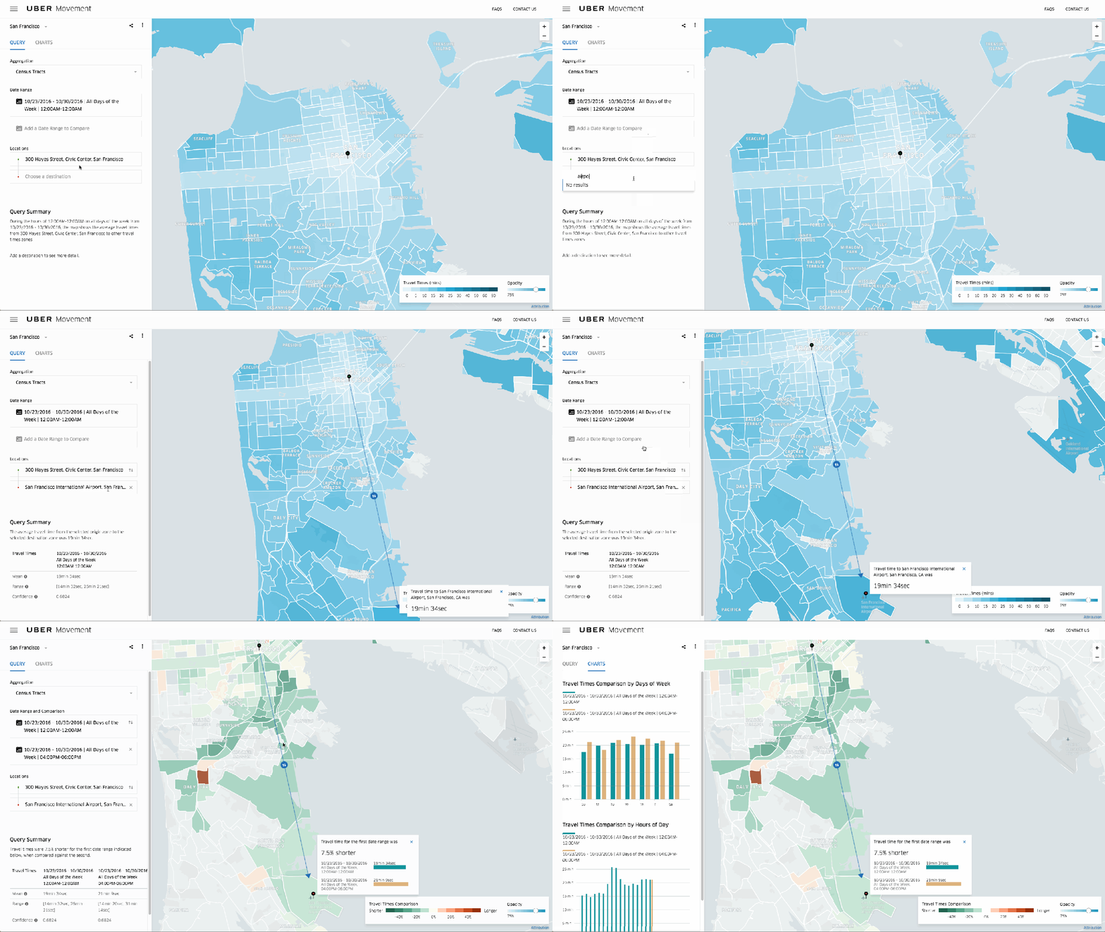
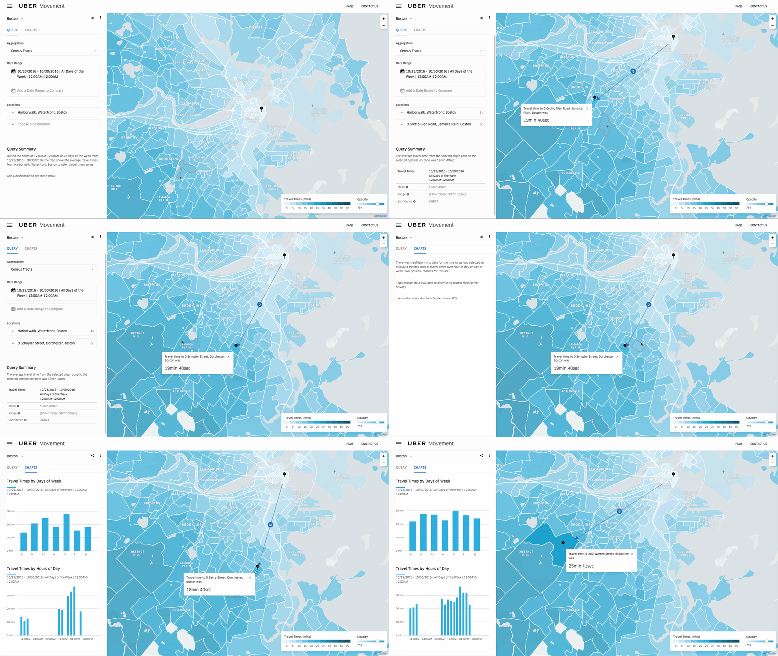
The Movement website gives you access to information based on analysis of billions of rides that Uber has completed in over 450 cities for 6 years so far. Uber says it was looking at all that data and began to realize that it could be used for public benefit. Built by a team of 10 engineers over the past 9 months, Movement now offers traffic patterns and travel time information for Manila, Sydney, and Washington, DC with dozens more cities to come before it launches to the public in mid-February.

The data is anonymized by dividing cities into smaller segments by region and time. If there’s not enough data for a given set of parameters Movement will gray out the region rather than risk exposing individual data. Another benefit, is that the data allows to see, how big events, road closures have an impact on travel time. Awesome!

So why Uber is actually sharing this data? On one hand this will allow Uber to build a better relationship with municipal governments that might be helpful as its business matures and in the future it could potentially bring an additional revenue stream. On the other hand better managed traffic is beneficial for Uber users, drivers and for everyone else, so storing it internal would be a terrible wastage of a great resource. In that sense other companies should learn from the ride-hailing startup.

Great project Uber!

Say thanks for this article (0)
The community is supported by:
Become a sponsor
#Business
#Business #Featured
Global Top 100 Geospatial Companies – 2024 Edition
Avatar for Muthukumar Kumar
Muthukumar Kumar 01.31.2024
AWESOME 10
#Business #Featured
Demystifying satellite data pricing: A comprehensive guide
Aleks Buczkowski 11.9.2023
AWESOME 7
#Business #Ideas
Urban Digital Twins in China: A Smart Gadget or a Decision Support Tool?
Nianhua Liu 03.28.2024
AWESOME 4
Next article
#Featured #GeoDev

How to make awesome interactive map using Google Sheets in under 1 minute?

From time to time you need to very quickly make a choropleth map based on a spreadsheet. There are a lot of different ways to do it but most of them require registering in one of the mapping services, having Excel plugin or a GIS software installed.

The easiest, fastest and free environment allowing you to make a simple and interactive map is Google Sheets (web-based competitor to MS Excel offered by Google). The map below shows data about life expectancy per country in 2015 and it took me around the 30 seconds to make it (hover over to see that data per country):

LIFE EXPECTANCY AROUND THE WORLD IN 2015

Here is how you do it:

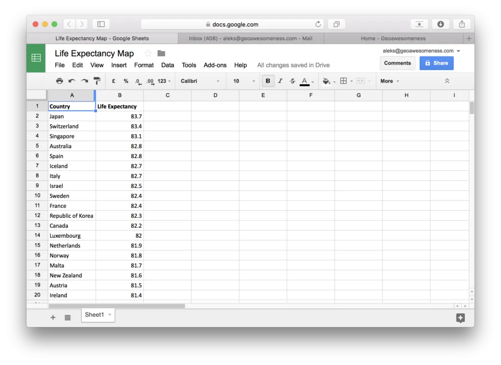
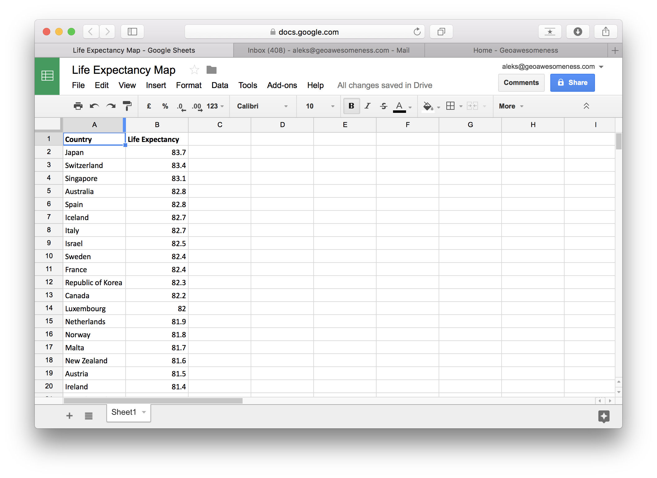
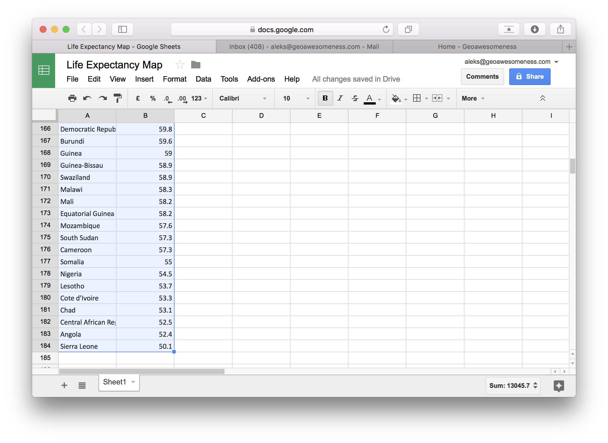
The first step is getting your data to Google Sheets. I’ve copied and pasted my data from Wikipedia. You need to have two columns: the first one with a geographic reference and the second one with data. The geocoding (matching the name with a geographic location or area) works well with countries and cities. interactive map using Google SheetsOnce you have your data ready in a spreadsheet you can start making your map. Start from selecting your data:

interactive map using Google Sheets

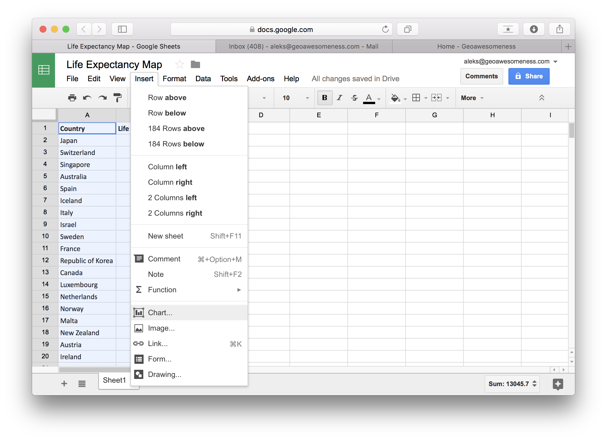
Than go to Insert and select Chart:

interactive map using Google Sheets

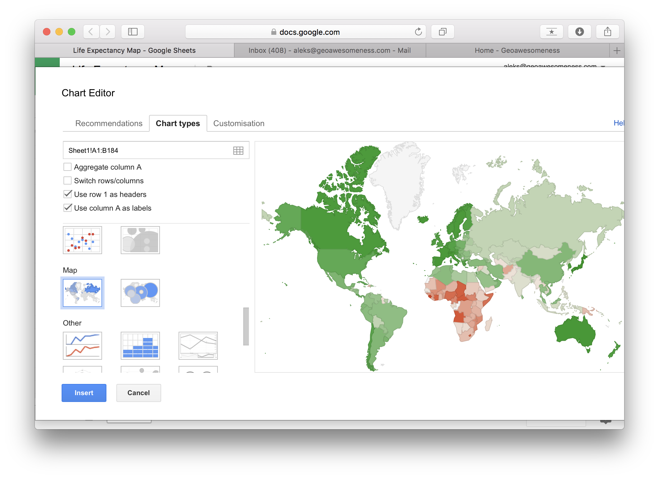
In Chart Editor go to Chart types and scroll down to Map and select choropleth or bubble map.

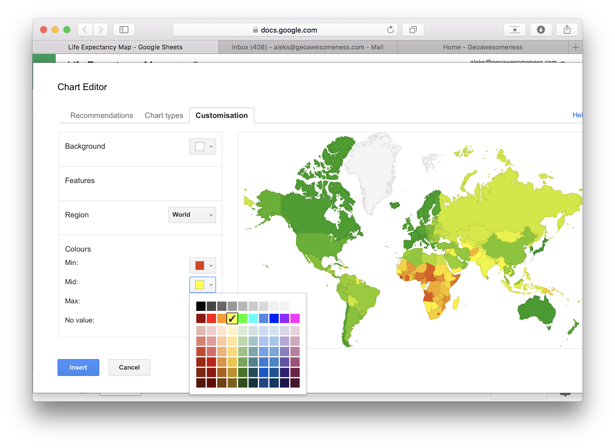
Move to customisation menu in order to edit the map. You can select only free colours that will represent the minimal value, median value and maximum value. All other colours will be automatically spread in between and there is no way to customise it.

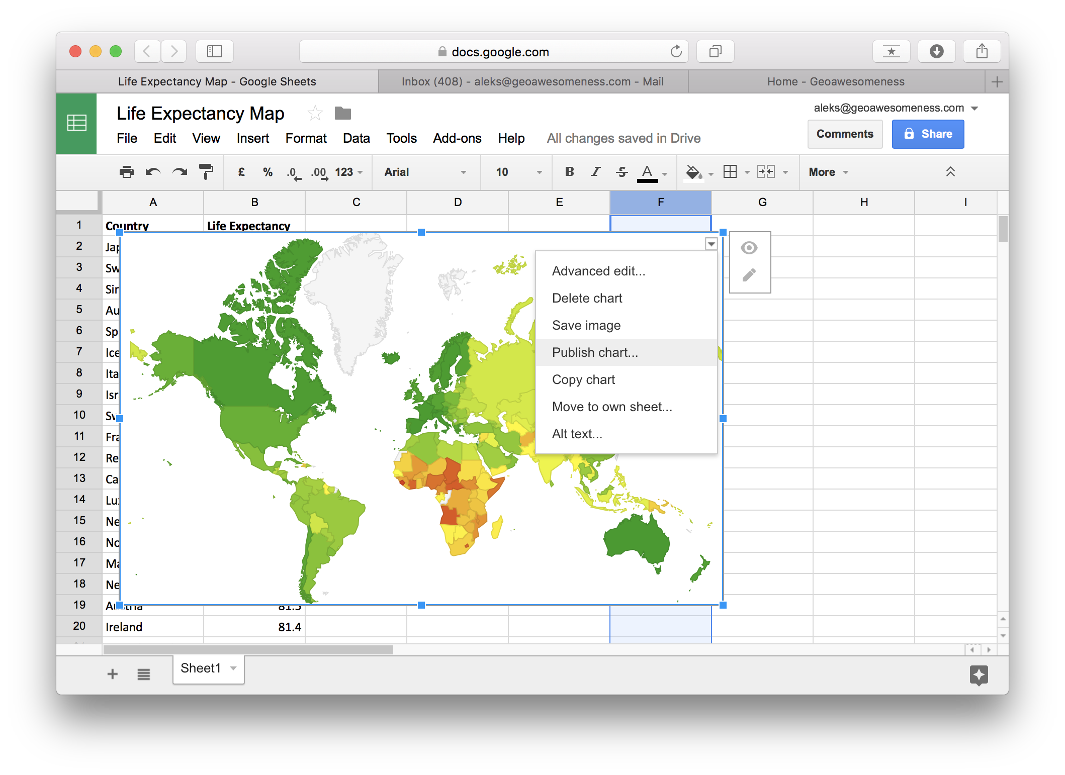
Once you insert the map, you can save it as image but you can also publish it in order to add it your website:

Also see: Free online GIS courses to help you upskill

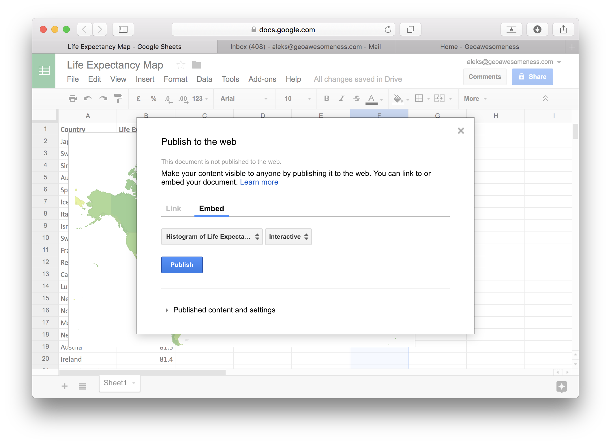
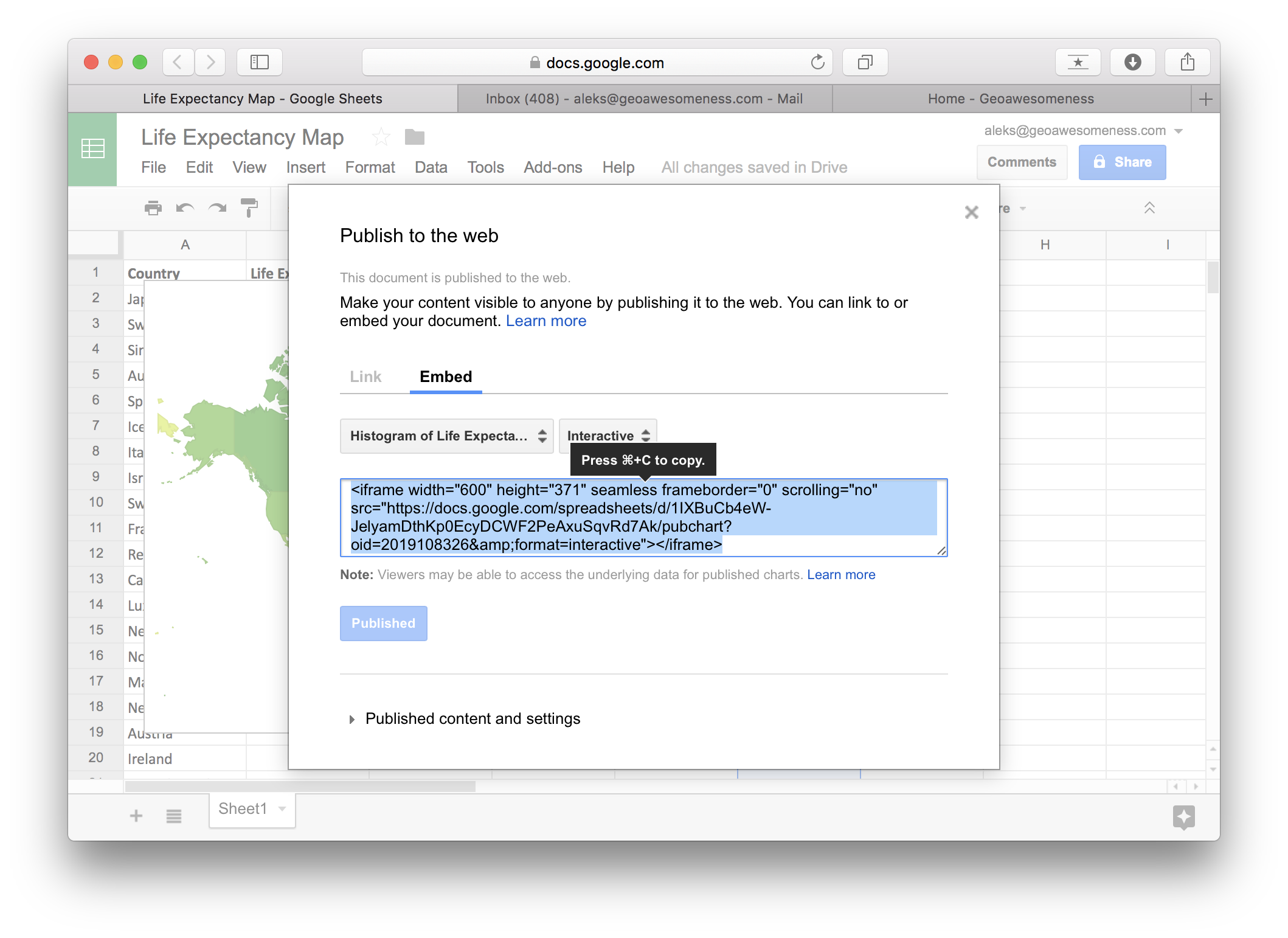
In order to embed it to your website select Embed and Publish:

Now all you need to do is to copy and paste the iframe code to your website.

Maybe the final effect is not as astonishing and less customizable as in other solutions but you can make it in literally less than 1 minute which makes it the fastest environment to map your data based on a spreadsheet.

Try it yourself!


Did you like this post on creating the interactive map? Read more and subscribe to our monthly newsletter!

Read on
Search