
The British royal family has long been a source of fascination for the entire world. No other monarchy of any other nation sparkes the same level of excitement. This set of maps and charts will help you understand the phenomenon of the British royal family.
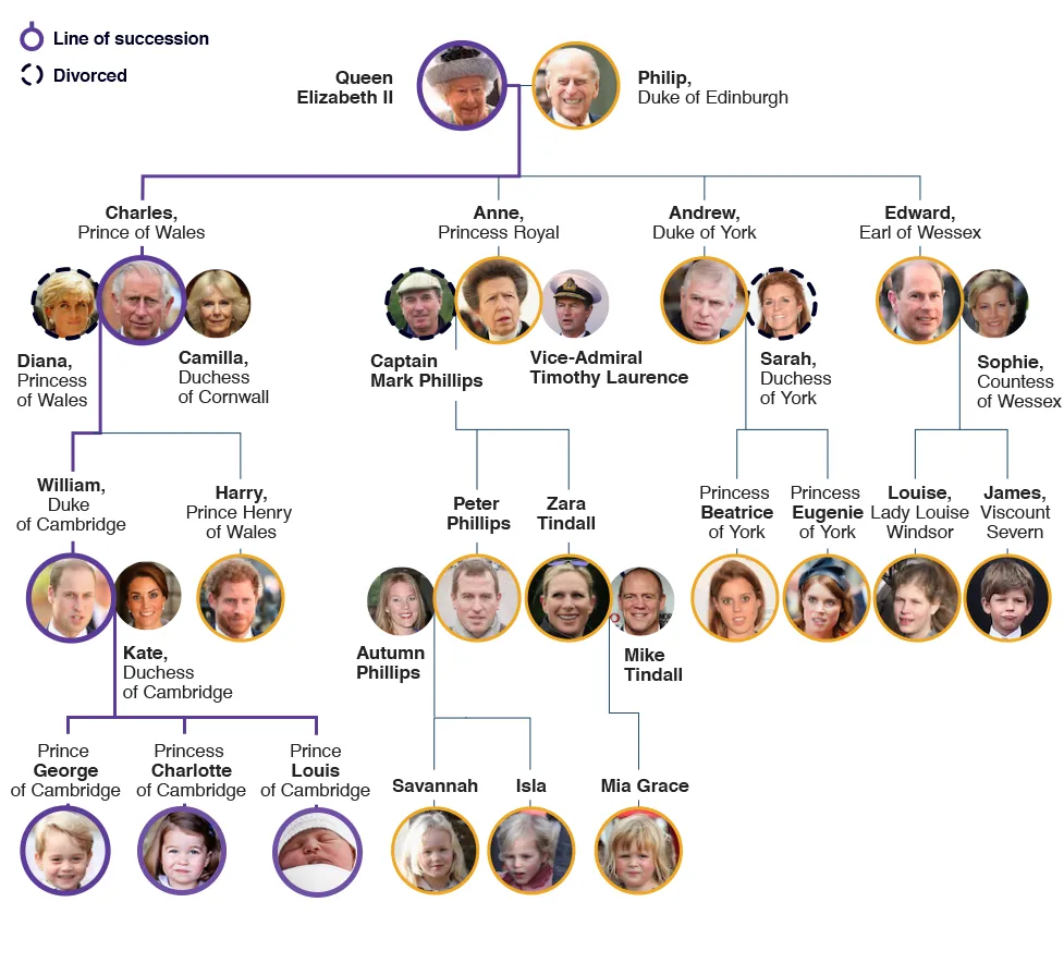
1. Royal Family tree and line of succession
Royal Family – family tree and line of succession
source: BBC
2. The popularity of British Monarchy
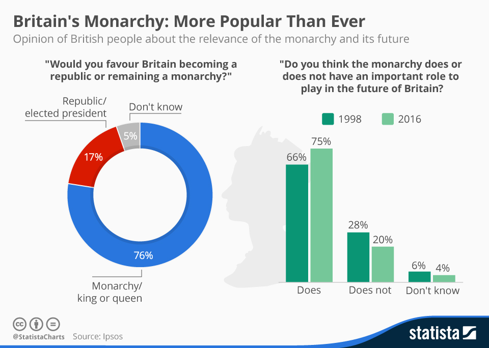
Royal Family – popularity
source: Statista
3. Does the monarchy benefit the UK’s economy?
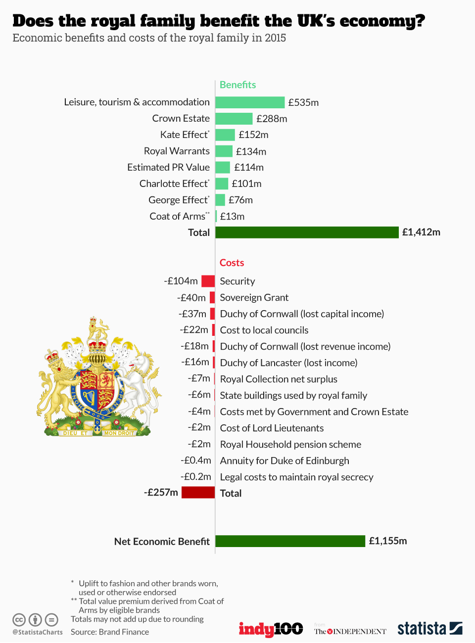
Royal Family – Benefits vs. Costs
source: Statista
4. The Queen and the Commonwealth
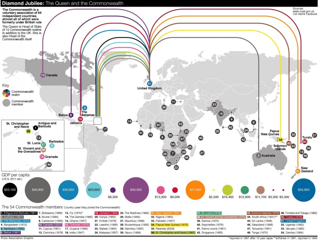
Royal Family – empire
source: Visual.ly
5. Map of The British Commonwealth Of Nations
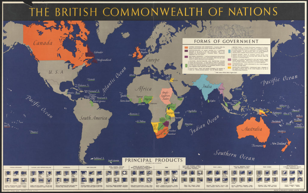
Royal Family – commonwealth
Update: Please note that the map is dated from 1942 when Ireland was still in the Commonwealth.
source: Digital Commonwealth
6. Map of Royal Residencies
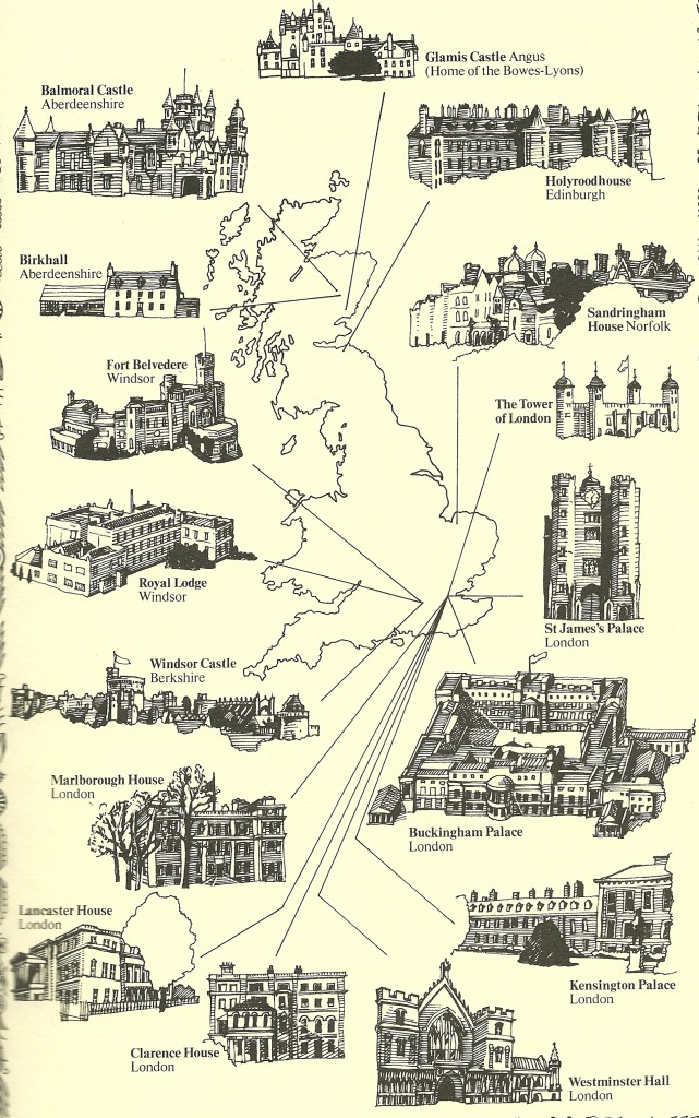
Royal Family – royal residents
source: Tes
7. The world’s 26 remaining monarchies
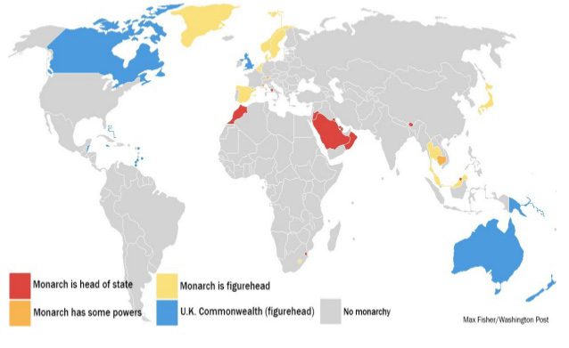
Remaining monarchies
source: Washington Post
8. Royal wedding vs average wedding
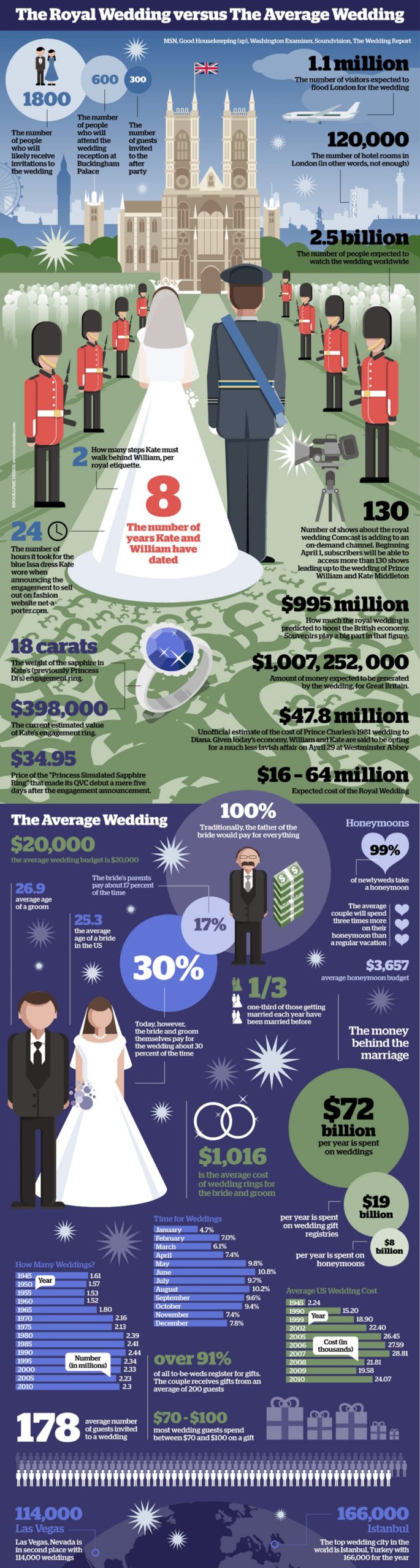
Royal Wedding
source: Visual.ly
9. 2011 Royal Wedding social media reach
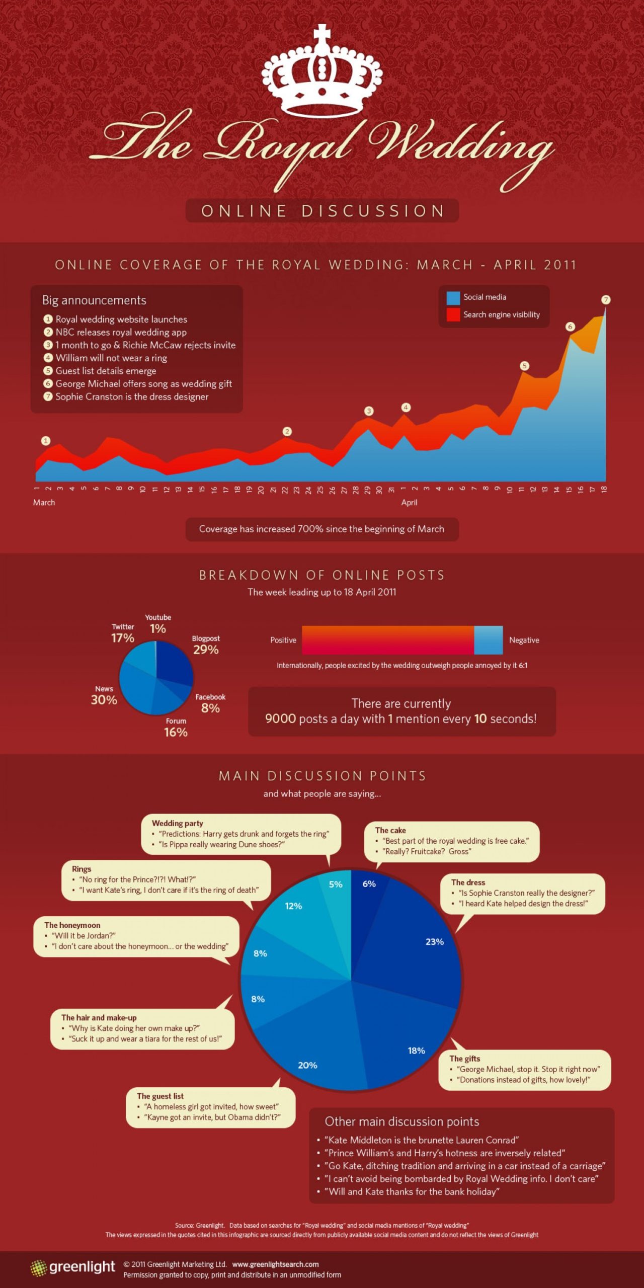
Social media reach
source: Visual.ly
10. British royal babies at birth
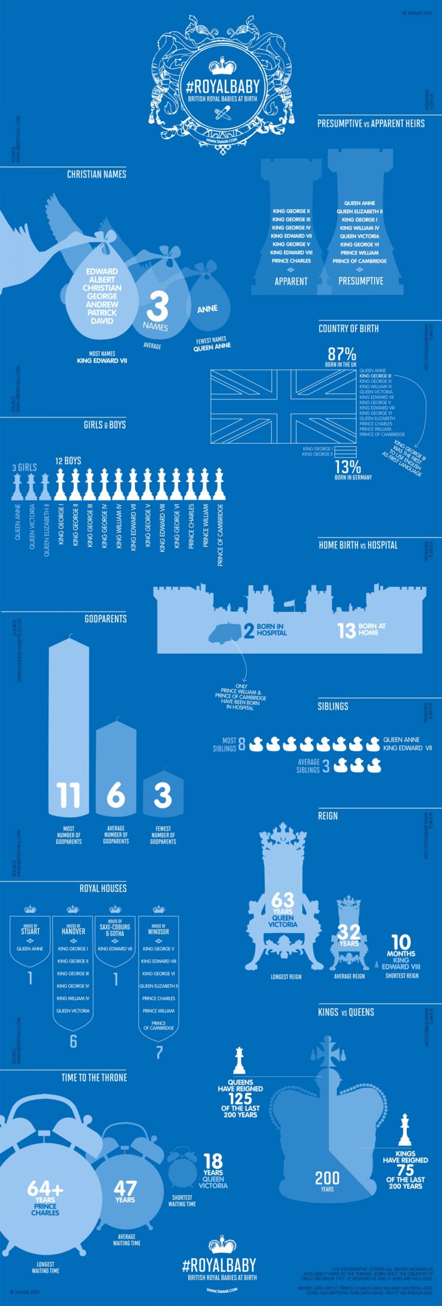
Royal babies
source: Visual.ly
Did you like this post on British Royal Family? Read more and subscribe to our monthly newsletter!

#Featured

Next article
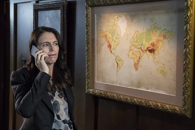


You probably didn’t even notice it till we brought it to your attention, but the problem is real, y’all. People just keep forgetting to put New Zealand on the world map. The Smithsonian Natural History Museum has done it. As have Central Park Zoo, Ikea wall stickers, and Starbucks. Why, there’s a whole website dedicated to all the world maps that have cruelly left New Zealand out.
Now, anyone who has ever taken a vacation on the island nation will tell you New Zealand is a secret worth keeping, but a tongue-in-cheek video released by the country’s tourism department earlier this month has comedian Rhys Darby exploring the various reasons behind this obstinate omission.
The video shows Darby alerting Prime Minister Jacinda Ardern to the conspiracy “bigger than the moon landing and the Loch Ness combined”. He says, “Australia wants our tourists, England wants to get rid of the All Blacks [rugby team], and the wine industry, they can’t beat our Pinot [Noir] or Sav [Sauvignon Blanc].”
And lest the prime minister had forgotten, “we’re quite a fiddly-looking shaped country, a bit like a half-eaten lamb chop,” he reminds her. “Perhaps people are just leaving us off, thinking we’re a mistake?” How else do you explain this Reddit board with 42,000 subscribers and thousands of examples of maps that don’t feature poor ol’ NZ?
But, well, now that Arden is on the case, the video has gone viral and #getNZonthemap has found its moment on Twitter. Some are asking for printed NZ stickers, so they can correct the mistake wherever they spot one, with several others vowing to champion for the cause. We know, we would hate it if our country was collectively ignored by cartographers around the world. So guys, please, #getNZonthemap!
Here’s the cheeky video in its full glory:
And tell us, does New Zealand feature on your map? Send picture proofs in comments!

