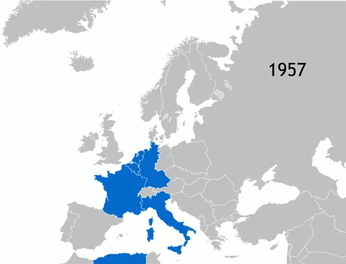

What is the current state of Europe and European Union? On March 25, 1957, leaders of six countries – Belgium, Germany, France, Italy, Luxembourg, and the Netherlands – met in Rome and signed two treaties that established the European Economic Community (EEC) and the European Atomic Energy Community, later transformed into the European Union.
Although Europe is experiencing growing turbulence related to migration crisis, terrorist attacks, and Brexit, among others, the EU project is still the best thing that happened to the continent after The World War II. It allowed keeping peace and wealth for long years and we hope that it will stay that way for the next generations.
These maps and charts try to explain the sense of European Union and Europe.
1. History of the European Union
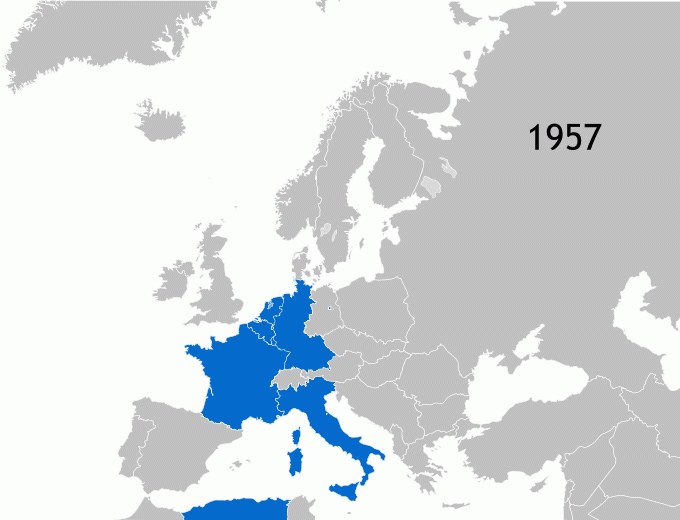
source: Wikipedia
2. EU member states as of 2023
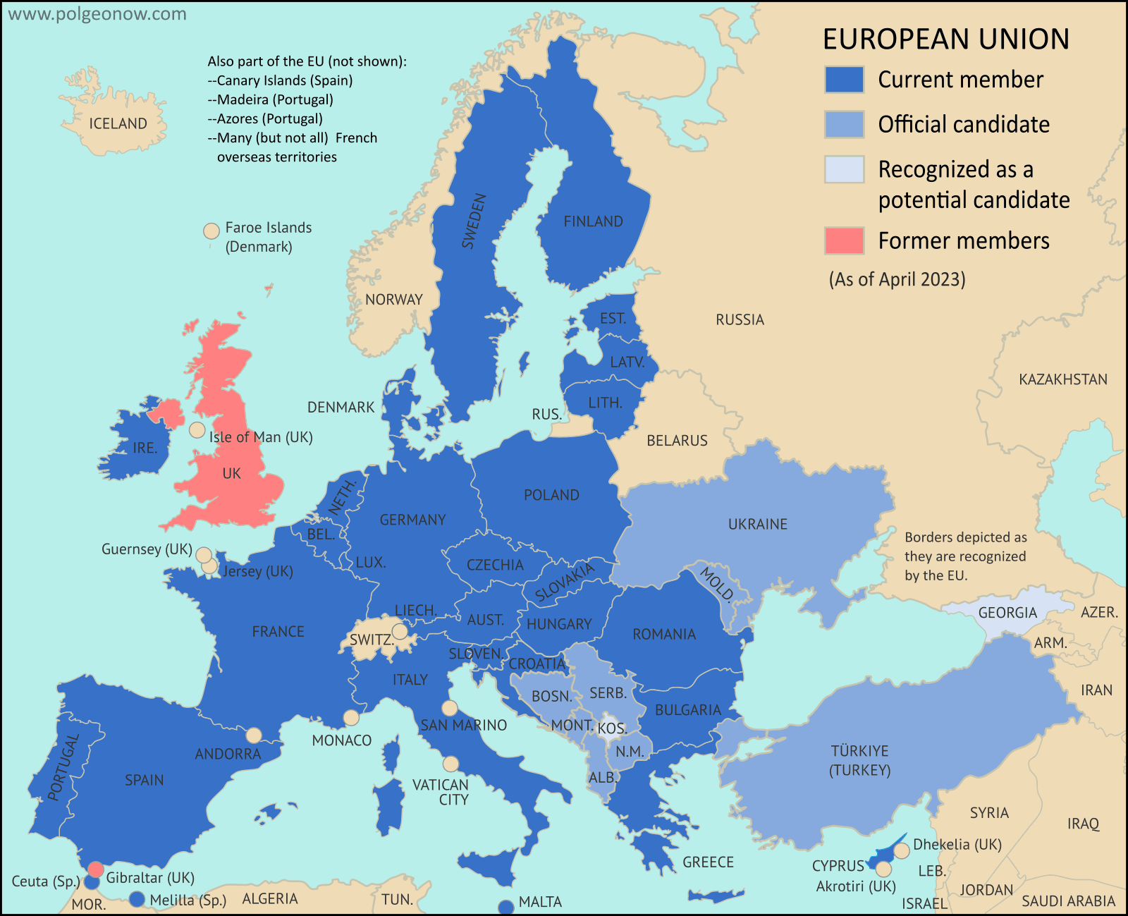
source: Political Geography Now
3. Europe Physical Map
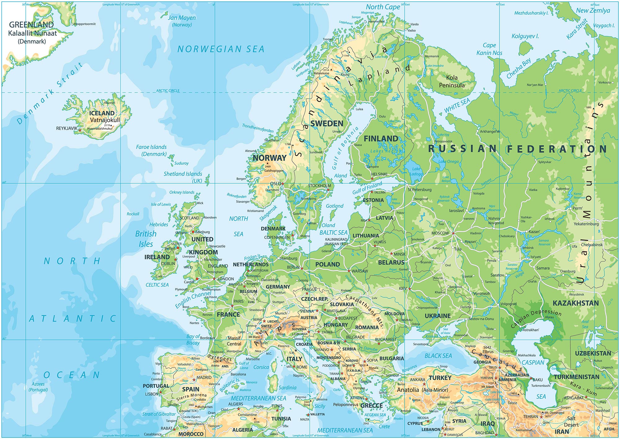
source: GIS Geography
4. Parliamentary Seats in UE in 2024
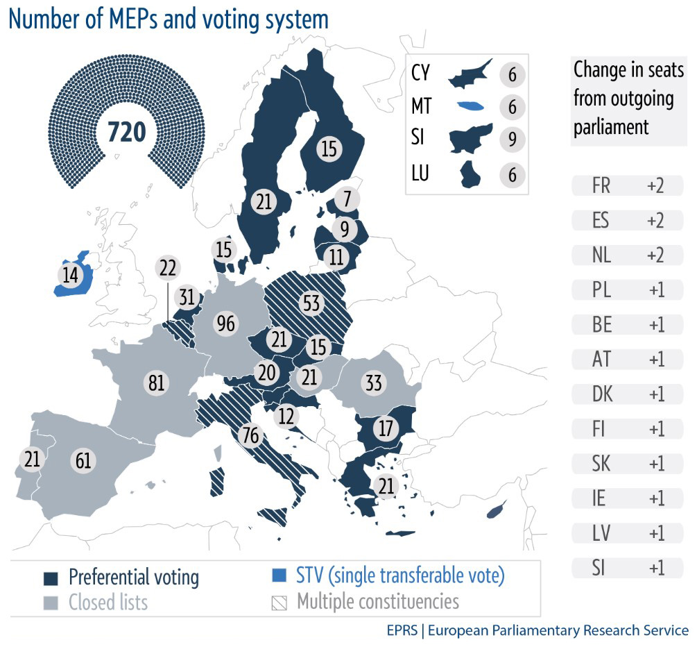
source: La Moncloa
5. The map of Europe by how right- or left-wing the government is in 2022
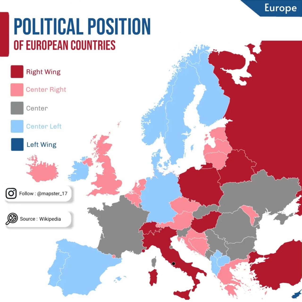
source: Instagram
6. EU Institutions
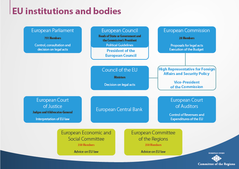
source: EU
7. Corruption in EU in 2023
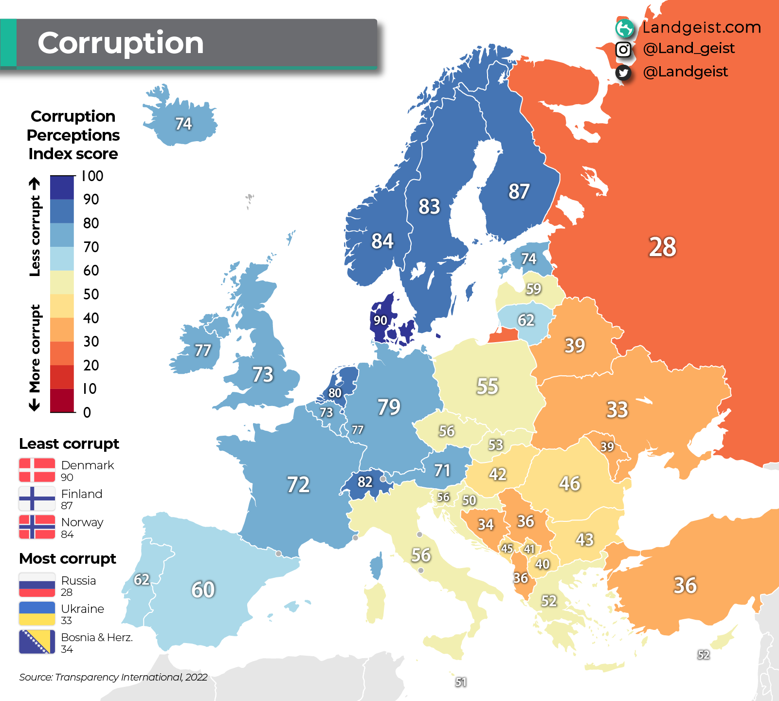
source: Landgeist
8. 2024 GPD forecasts
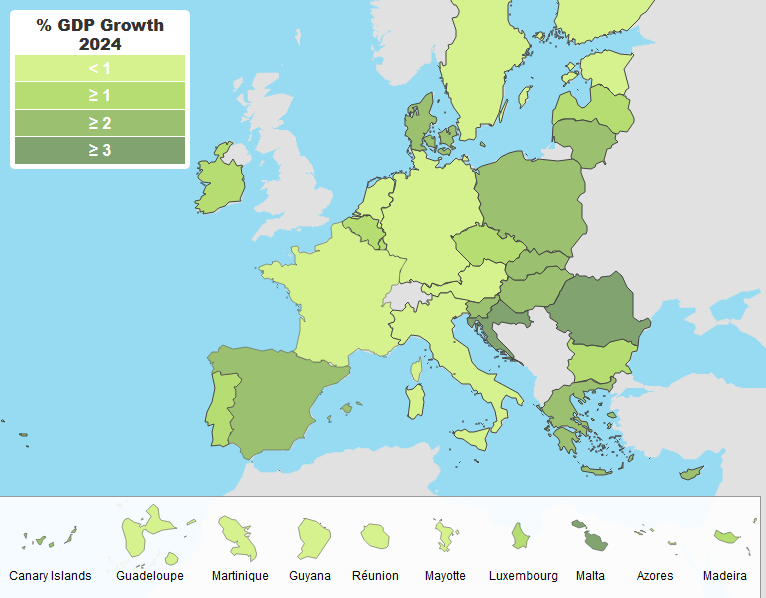
source: europa.eu
9. Net average monthly salary
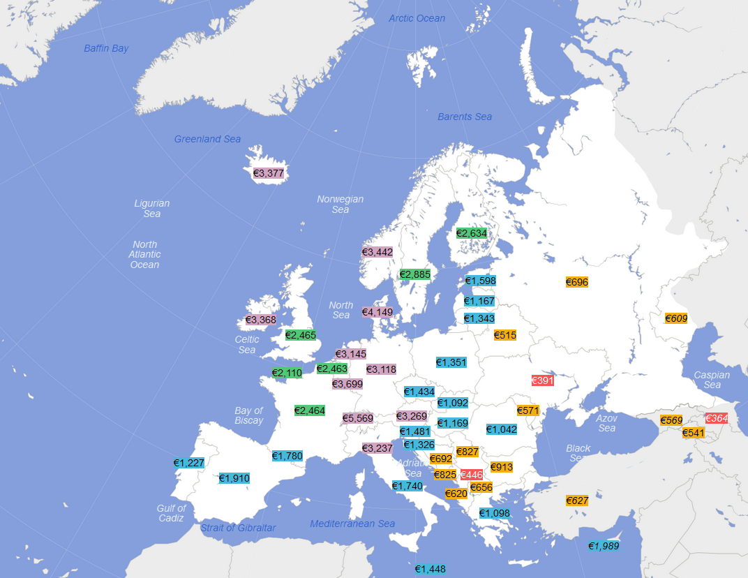
source: Wikipedia
10. Currencies in EU in 2023
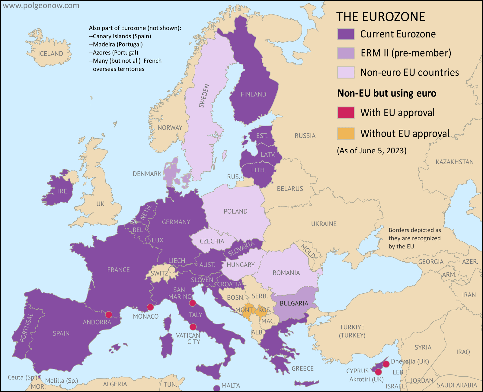
source: Political Geography Now
11. Europe’s unemployment in 2022
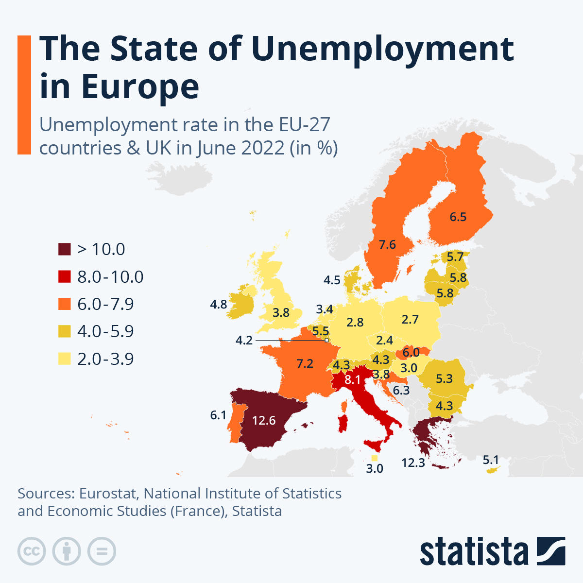
source: Statista
12. Youth Unemployment in Europe in 2023
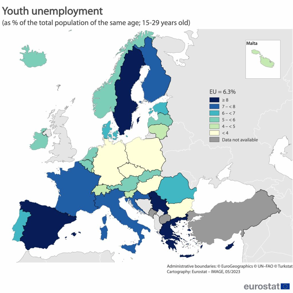
source: Eurostat
13. Europe’s ageing problem in 2020
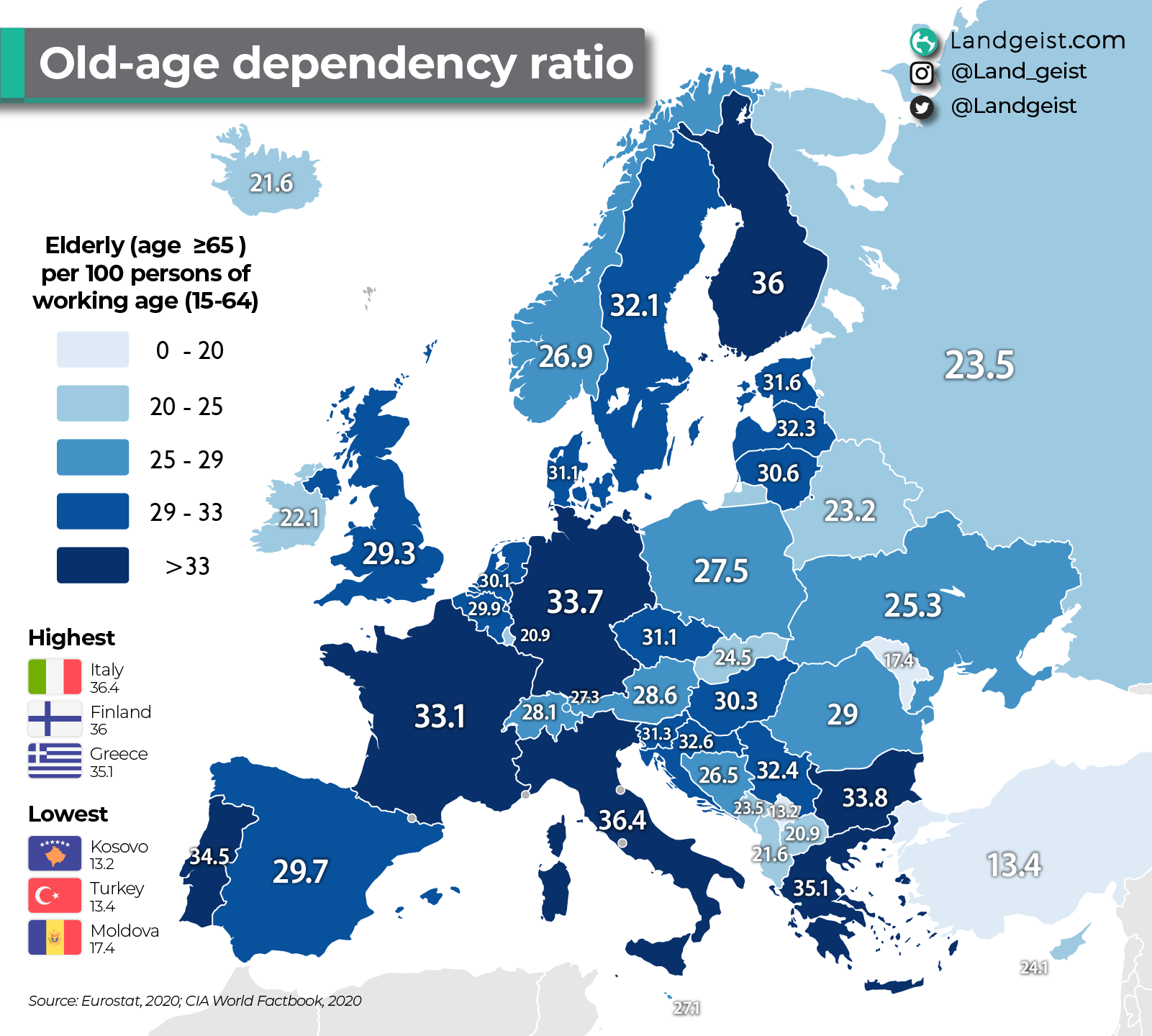
source: Landgeist
14. Share of population over 65 in 2023
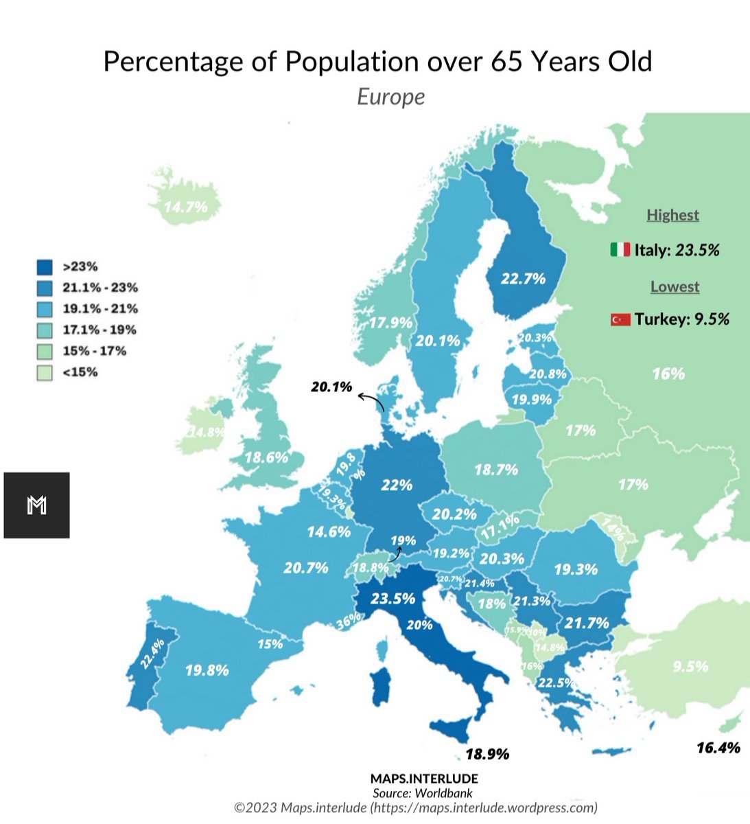
source: Maps on the Web
15. Map of Europe’s population shifts
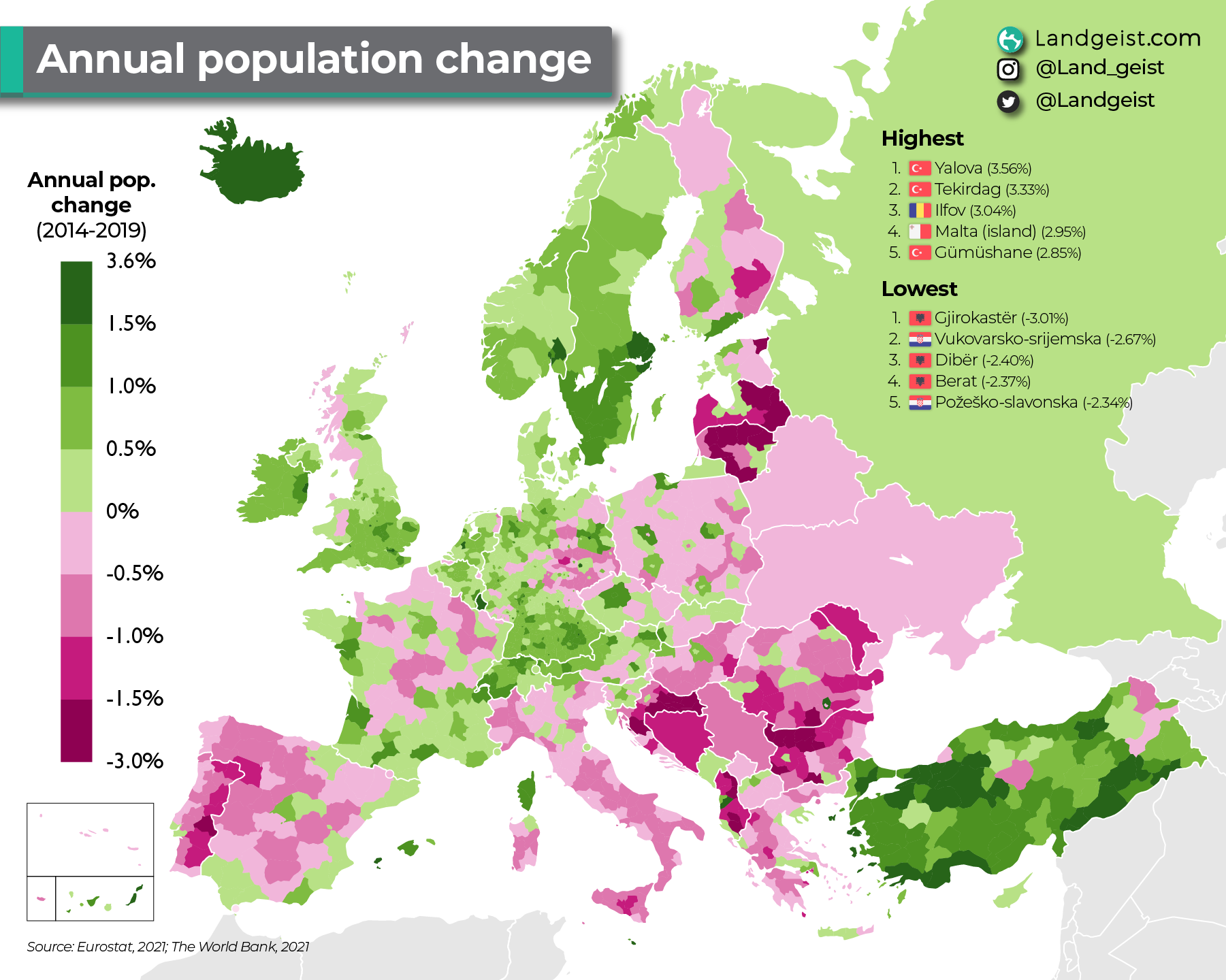
source: Landgeist
16. Immigrant Population in Europe in 2021
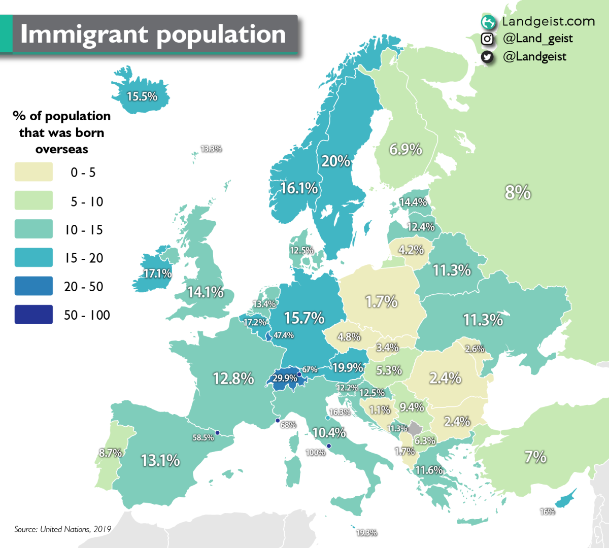
source: Landgeist
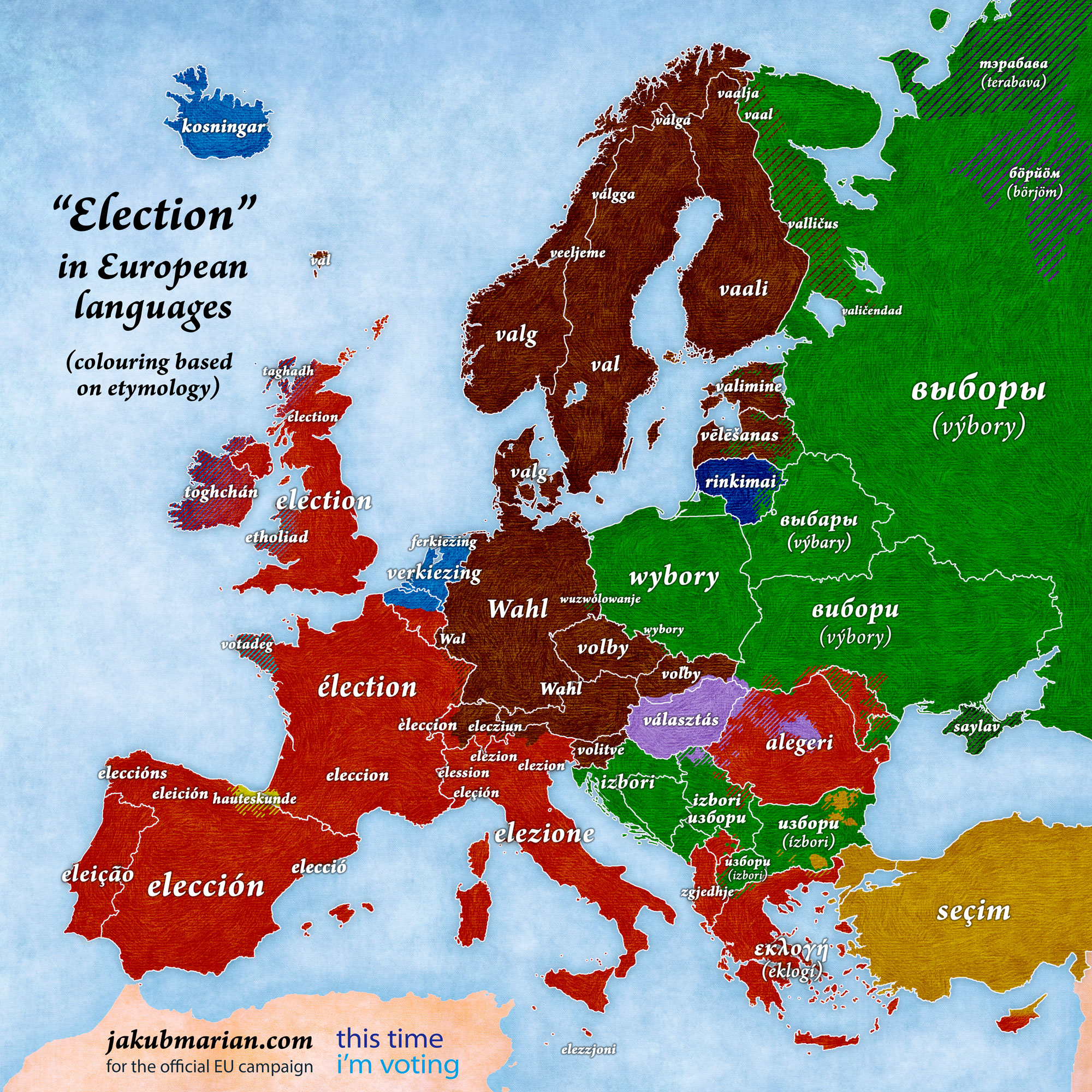
17. “Election” in European languages
18. Life expectancy in Europe in 2021
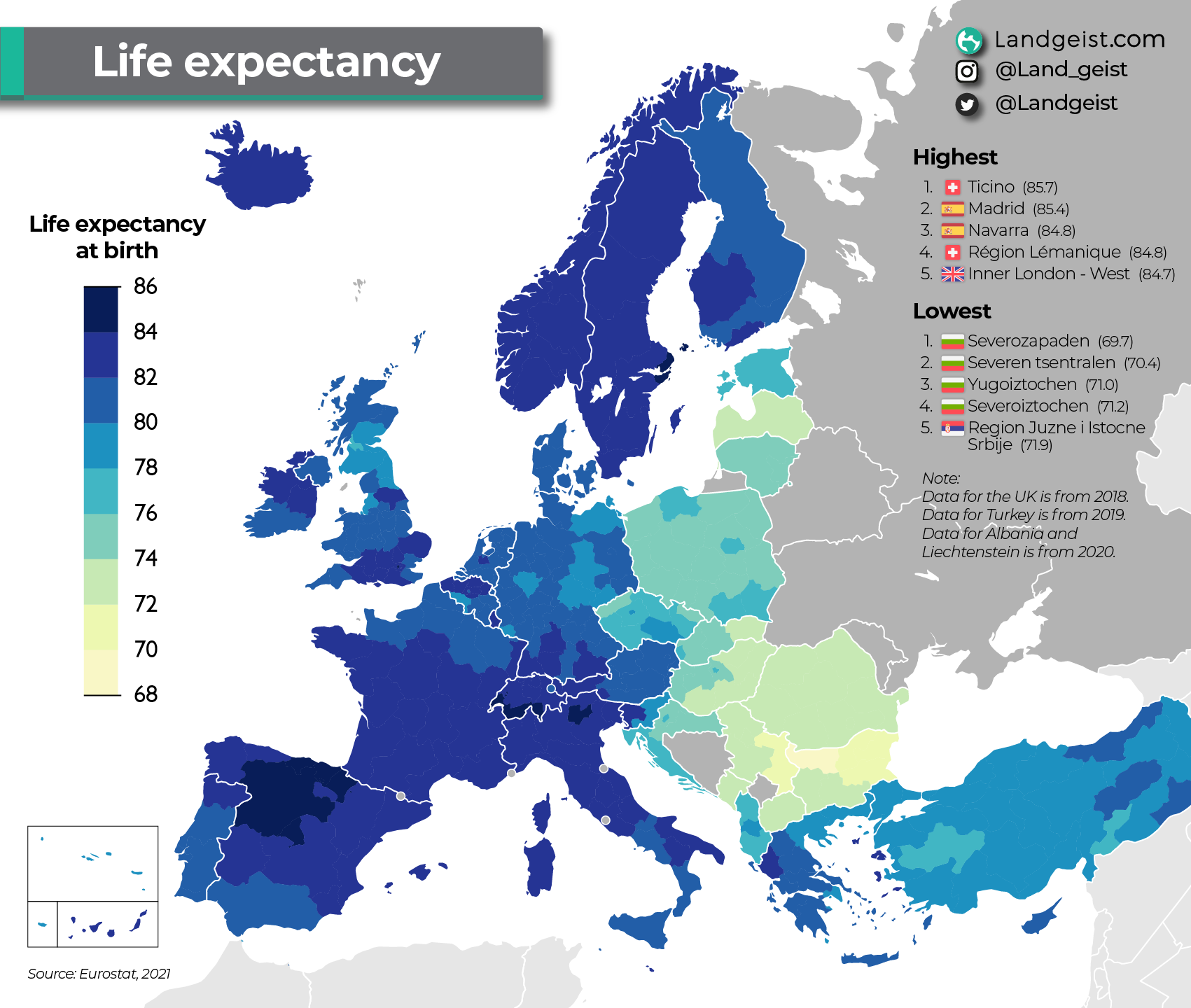
source: Landgeist
19. EU member states and NATO in 2024
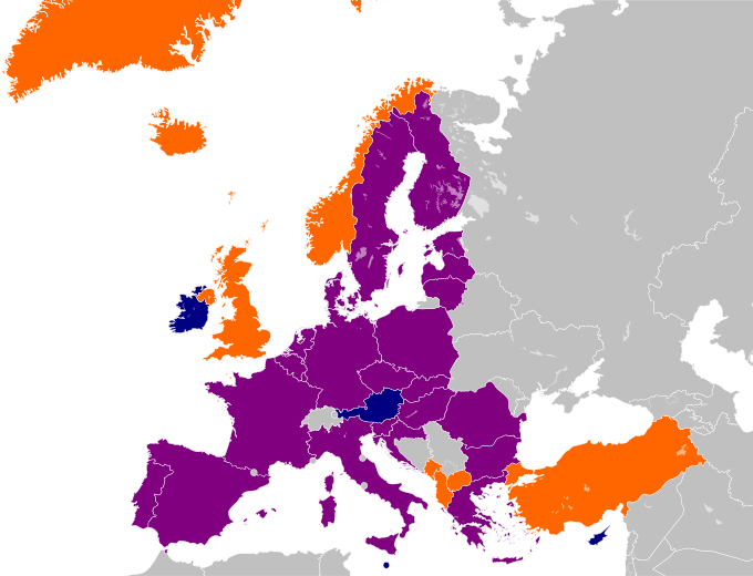
A map showing European membership of the EU and NATO
EU member only
NATO member only
Member of both
source: Wikipedia
20. Daily Alcohol Consumption in Europe in 2019
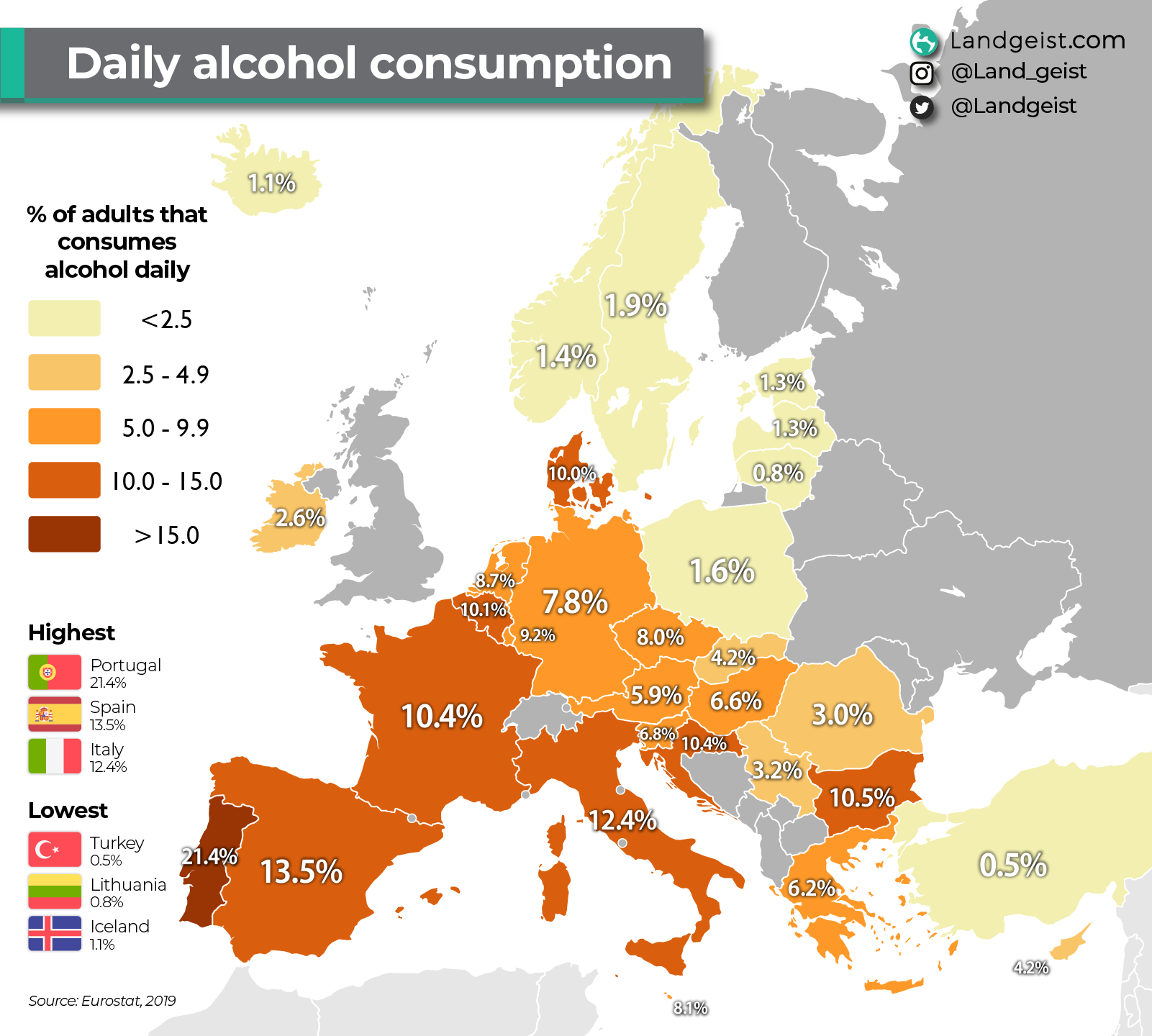
source: Landgeist
21. Europe country most valuable export goods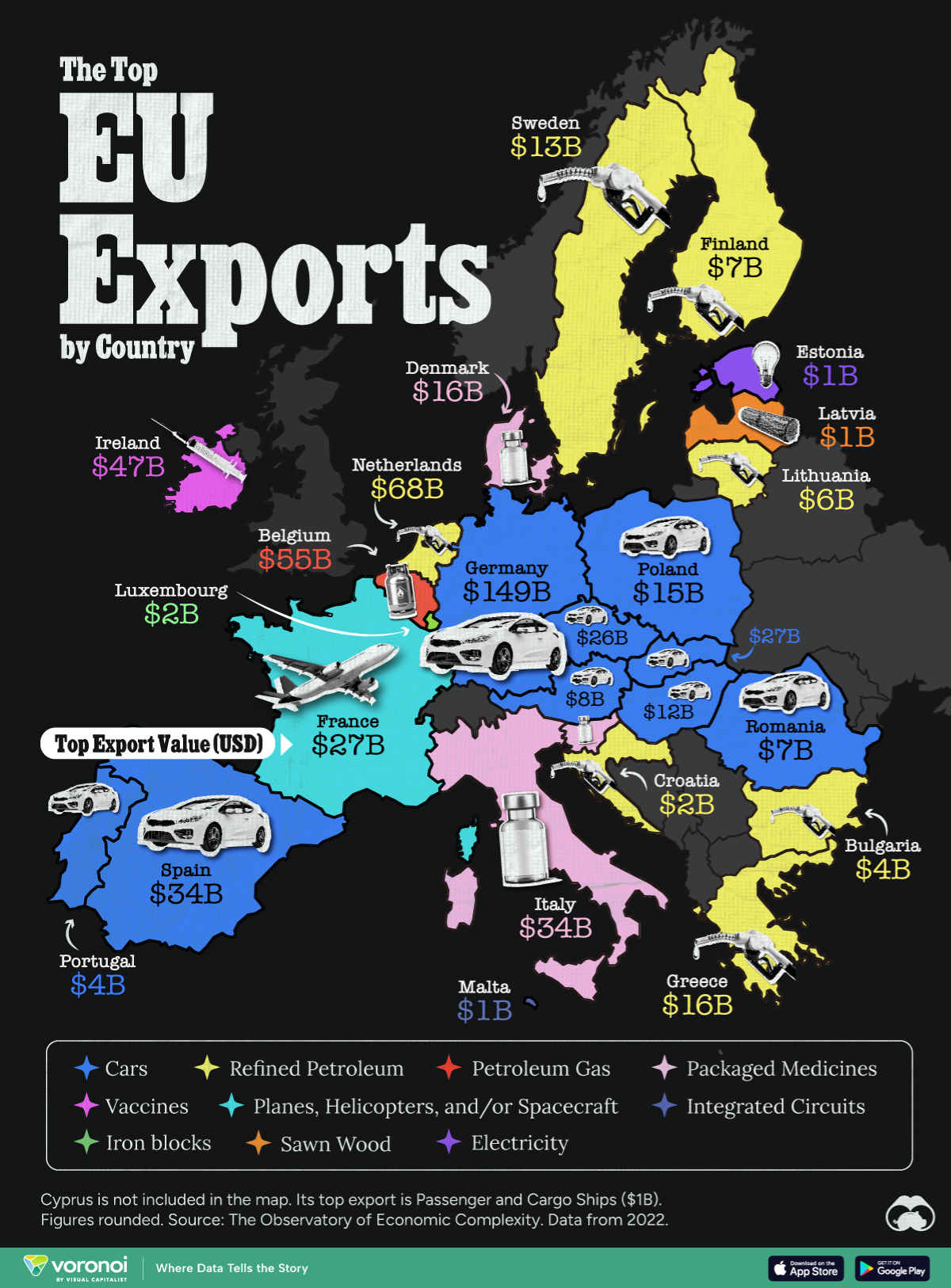
source: visualcapitalist.com
22. Map of Schengen Area
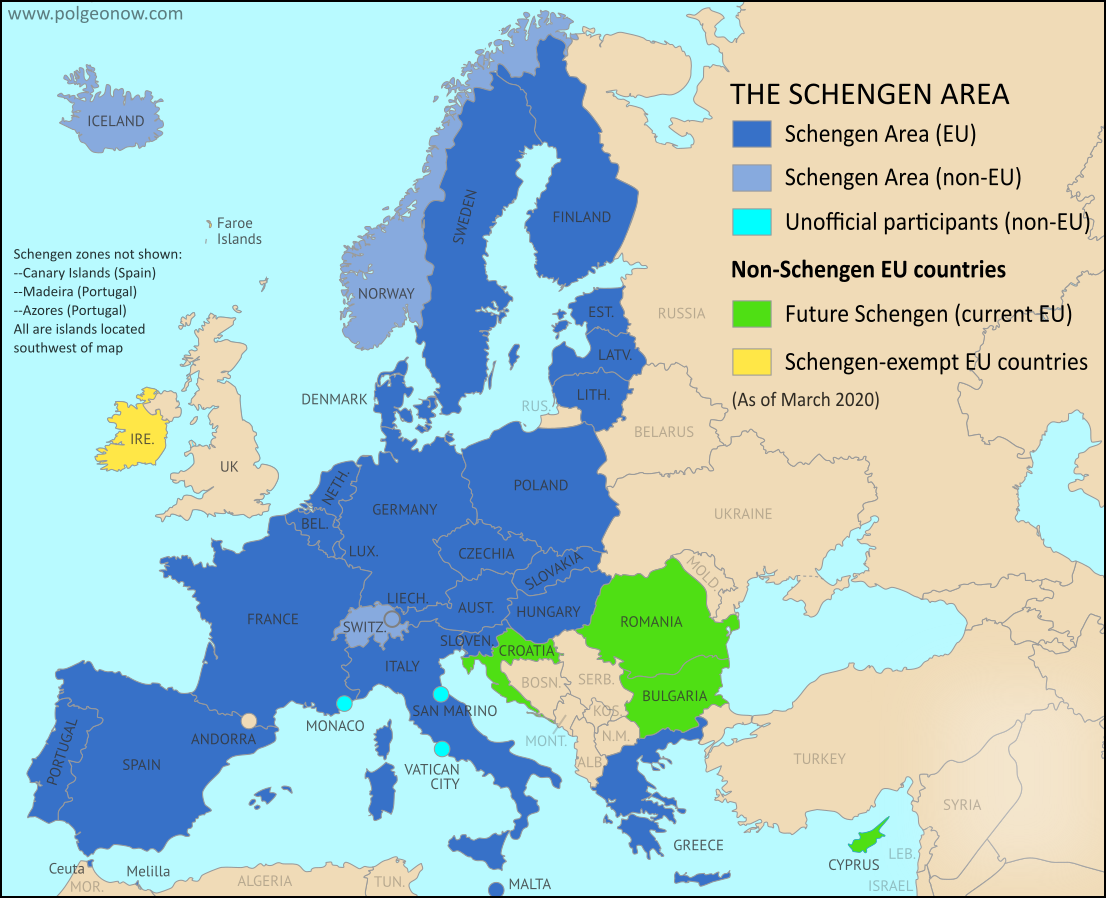
source: Political Geography Now
23. Europe’s 100 Busiest Airports
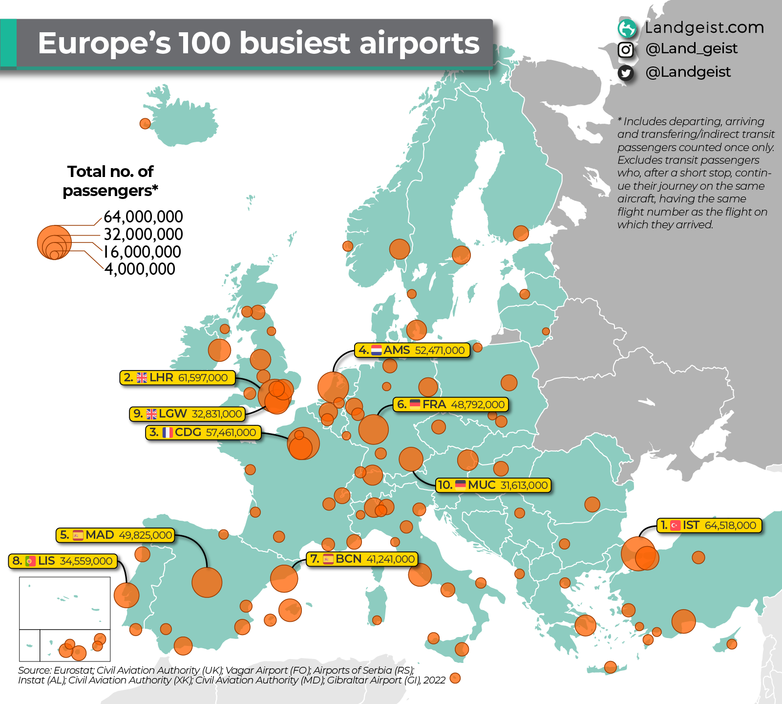
source: Landgeist
24. Annual Working Hours in Europe
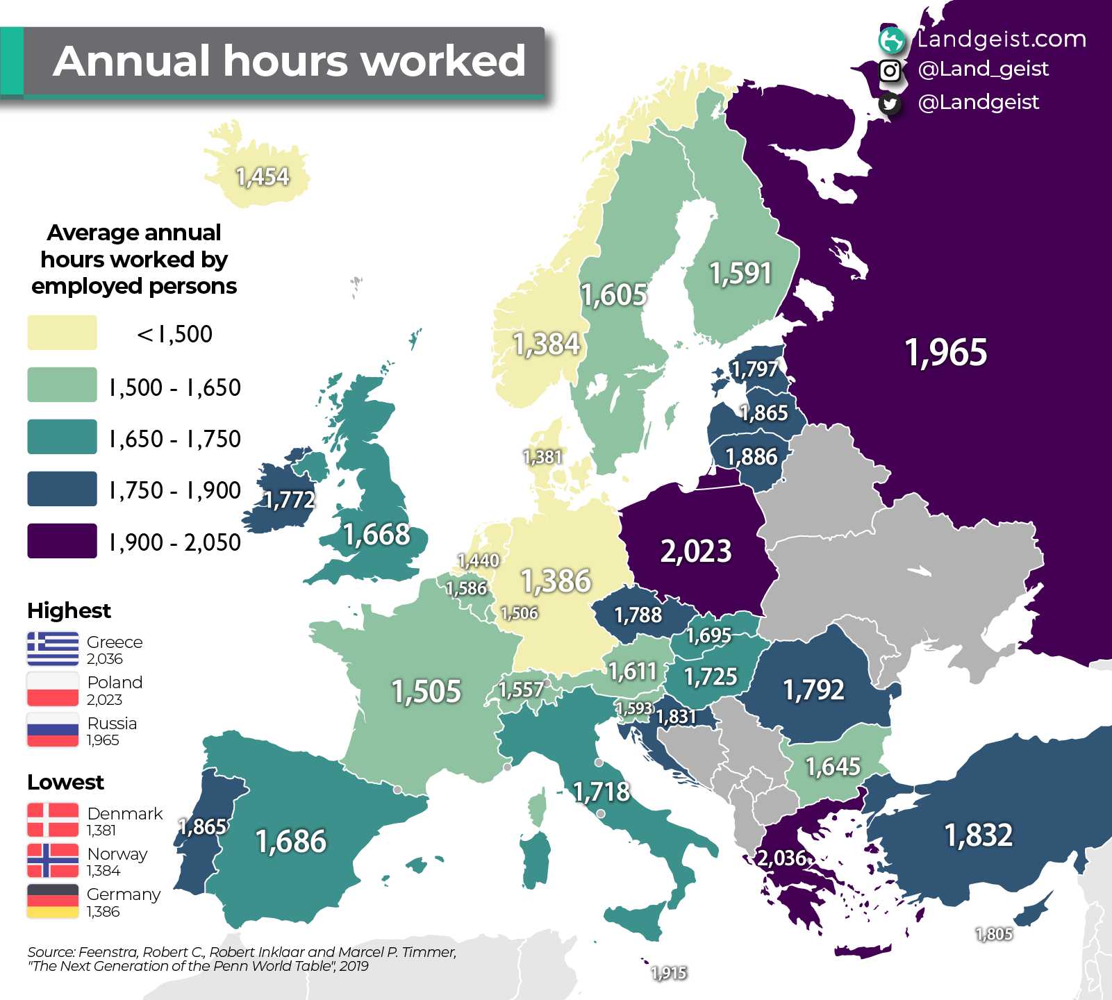
source: Landgeist
25. LGBT Rights in Europe in 2024
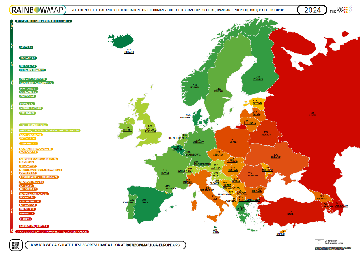
source: rainbowmap.ilga-europe.org
26. The Largest Trading Partner of European Countries
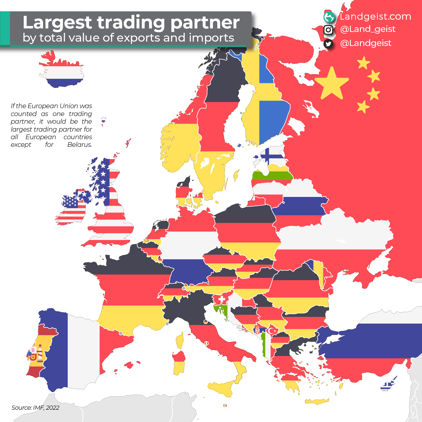
source: Landgeist
27. Average elevation above the sea level
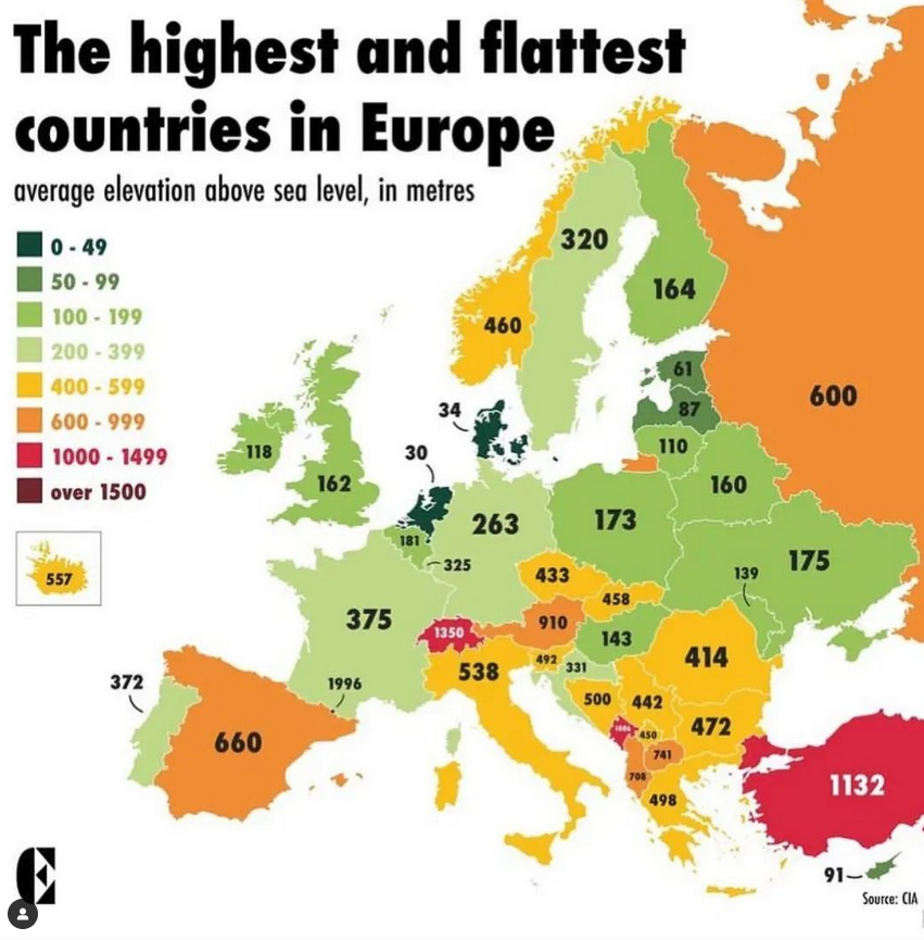
source: Instagram
28. European Transport Corridors
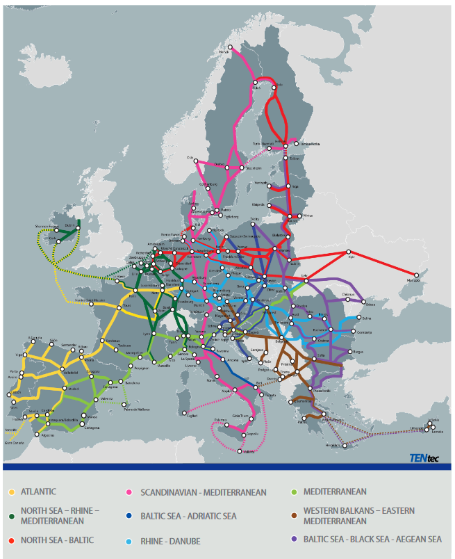
source: europa.eu
29. Terrorism in Europe in 2022
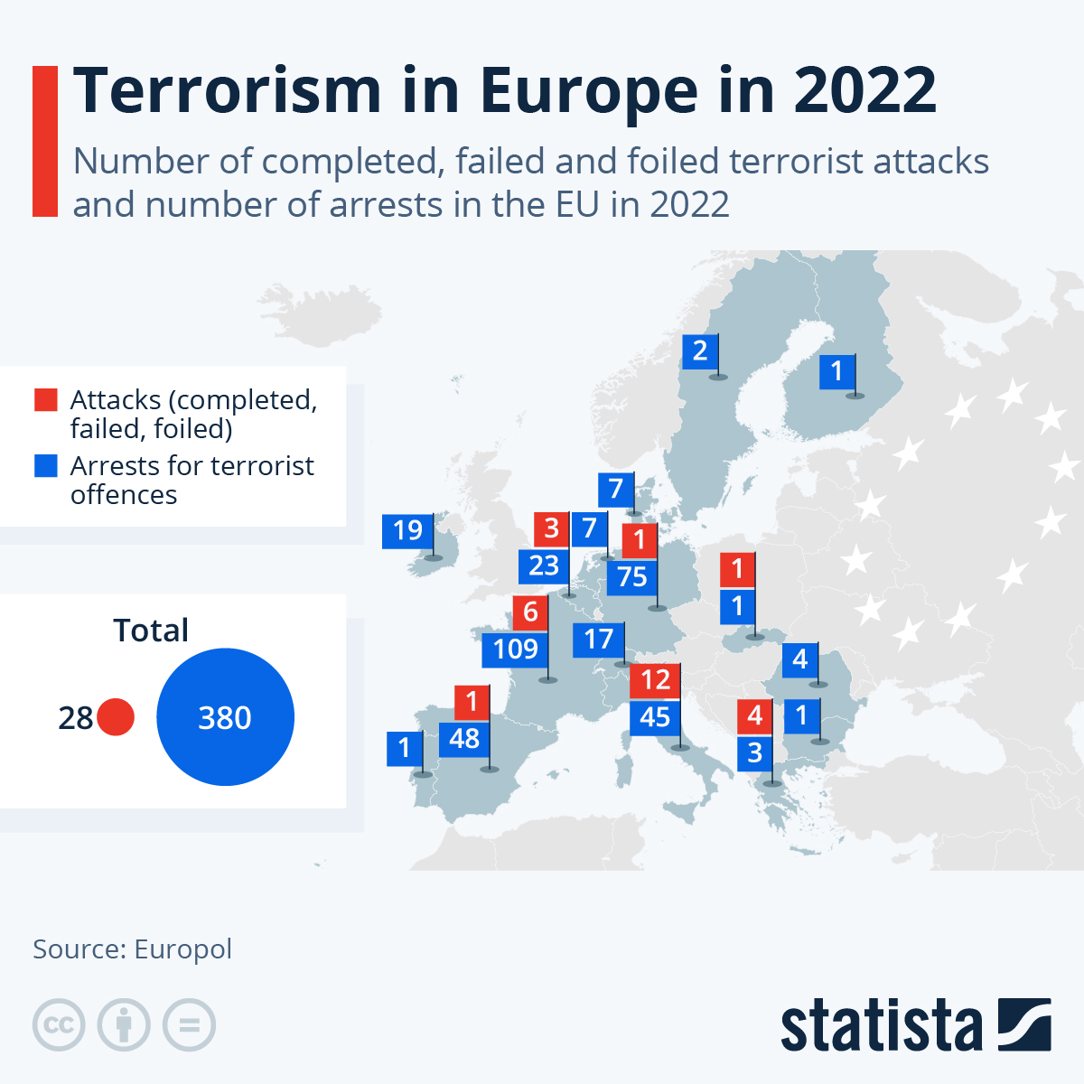
source: Statista
30. Europe’s Most Common Livestock
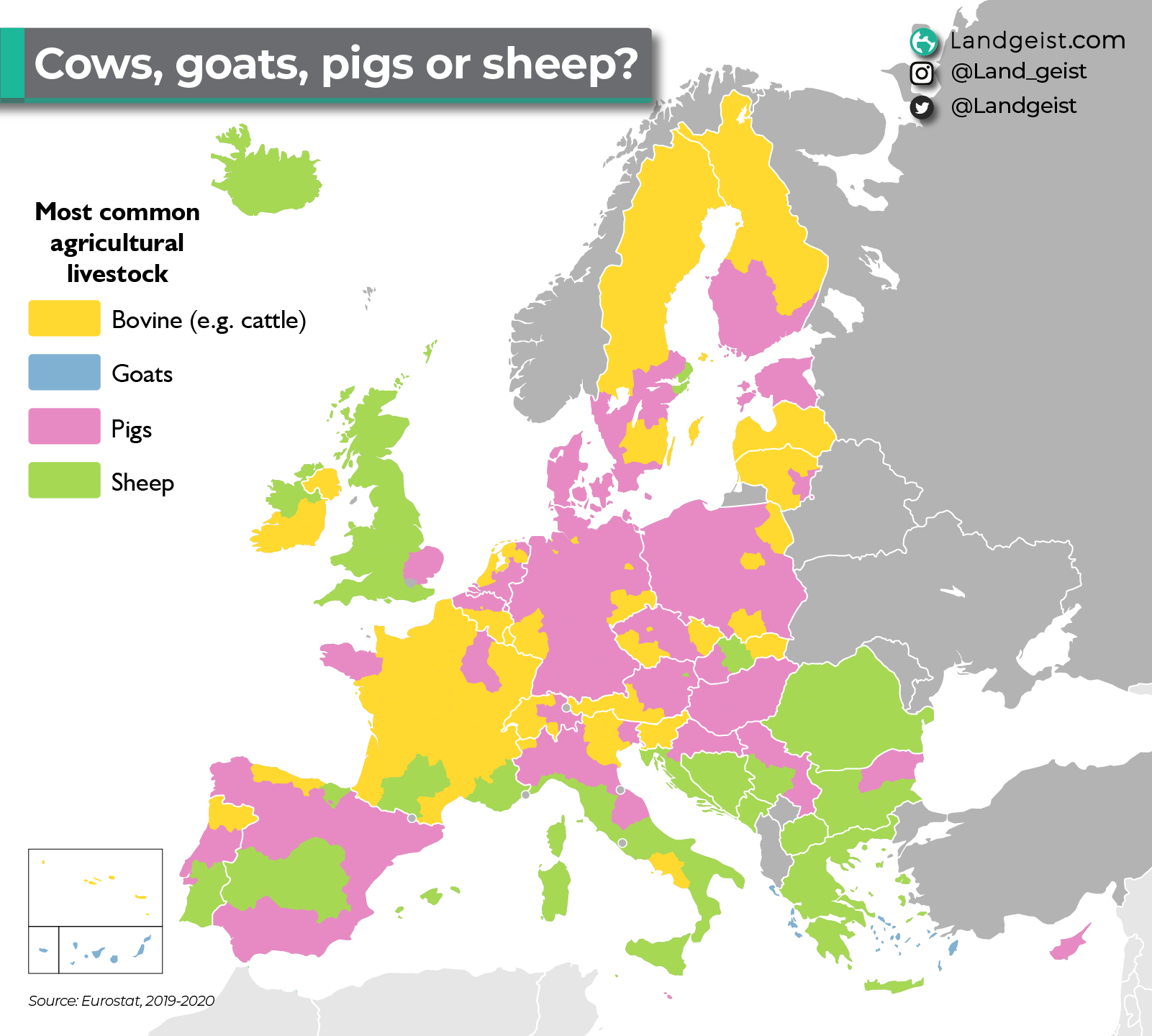
source: Landgeist
Did you like this post? Read more and subscribe to our monthly newsletter!

#Featured


Next article

When faced with a power outage, the last thing I want to do is to figure out the customer service number of the Utility company, press a million numbers and wait on the line for half an hour. Simply because no one likes to hear the automated message “All our customer service executives are currently busy, we will be with you shortly”.
Somewhere in the middle of trying to Google their number, my mind is going to wander into Twitter-Universe trying to figure out the best way to rant about the outage and to figure out if there is already a good hashtag for it.
Surely, there must be a better way for Utility companies to keep track of outages without having to wait for customers to actually call and vent out their issues! That’s exactly what the folks at DataCapable have built – a data-driven mechanism for intelligent outage detection and reporting.
Using Geosocial intelligence for actionable insights
Back in 2013, Zac Canders and Peter DiSalvo, the founders of DataCapable realized that the social media is changing the way customers and companies are interacting. When they tried to use this new-age approach to contact their Utility company in vain, they figured out that these companies simply did not have the right type of tools to analyze social media (rants) and turn them into actionable intelligence. And that is exactly what they set out to built with UtiliSocial.
It’s easy to draw parallels between the PetaJakarta project which uses tweets to create a real-time flood map of Indonesia and DataCapable. DataCapable’s algorithms mine data from Twitter, Facebook and Instagram to understand and deliver situational awareness to Utility companies.
In addition to that, in collaboration with New York University Stern School Of Business, DataCapable is working on developing an analytics tool to anticipate and help prevent issues before they occur.
Make Maps Social
It’s interesting to see how analytics is helping Utilities companies connect with their customers and vice-versa but the most interesting aspect of DataCapable is how all of this information from social media gets a whole new capability when you geo-tag it.
When talking to Zac about DataCapable, he mentioned that their main mission for 2017 is to “Make Maps Social”. Zac isn’t satisfied by just displaying power outage and other geotagged information on a map, he wants to make use of the all the capabilities of GIS. They have partnered with Esri to make use of the ArcGIS platform for their GIS analysis and are an Esri Emerging Business Partner.
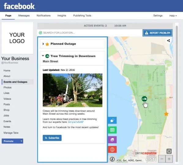
EventCast
Earlier this year, they launched the first (and only) ArcGIS Facebook adapter for Utilities – EventCast. EventCast allows Utility companies to embed “Event Maps” into their existing Facebook pages (saving users from having to click endlessly for the same information).
It might seem like a normal map but the fact that you can now display a Event Map created with ArcGIS directly inside Facebook is something that will definitely help Utility companies.
Source: Esri Startups Twitter Account
DataCapable’s foray into GIS doesn’t just stop with EventCast, they are also integrating Esri’s analytics into their predictive analytics and have already incorporated weather and other geotagged sensor data into their tool.
It’s amazing to see social media analytics seamlessly fuse together with what you might call traditional GIS analysis to provide business intelligence in a manner that we could have only dreamt of a few years ago. 2017 is the year that Zac envisions as the year where DataCapable “Makes Maps Social” and we are certainly rooting for them at Geoawesomeness to do exactly that 🙂

