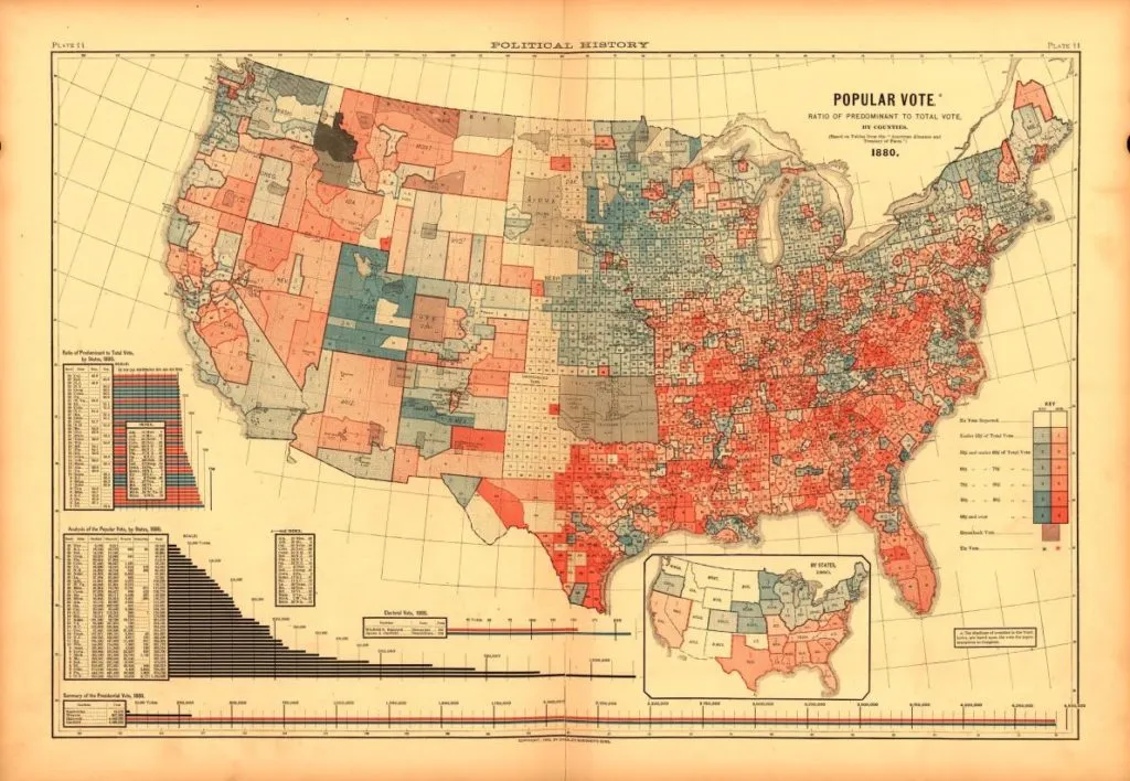
On Tuesday, November 8, 2016, America will choose their next president. For most of people this means a lot of emotions but for GeoGeeks it also means a lot of election maps. Over the years we’ve seen a lot of bad and boring electoral cartography. Below you’ll find a couple of examples showing that election maps can actually be pretty cool.
Have a cool map that was not featured here? Share it in comments!
First electoral map from 1883
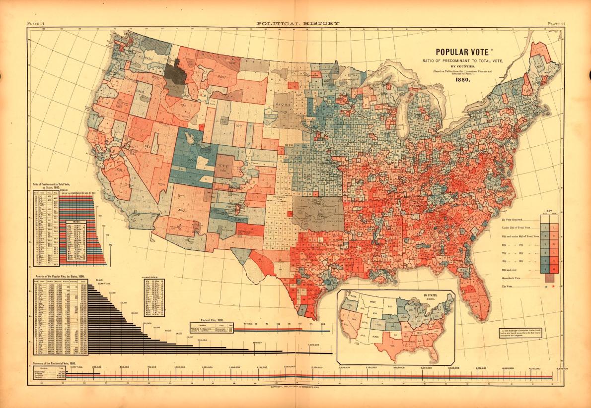
One of the first election maps has been published in the 1883 Statistical Atlas of the United States. It is based on the publication of county election returns from the 1880 presidential election. The map paved the way for most of the future electoral maps.
source: Mapping the Nation
Cartograms
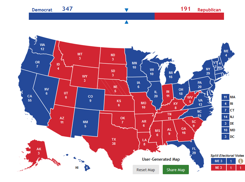
A cartogram is a type of map that depicts spatial phenomena per geographic area unit. Above you can see a pretty standard cartogram but the line chart above the map helps to understand the final results.
source: 270ToWin
3D cartogram
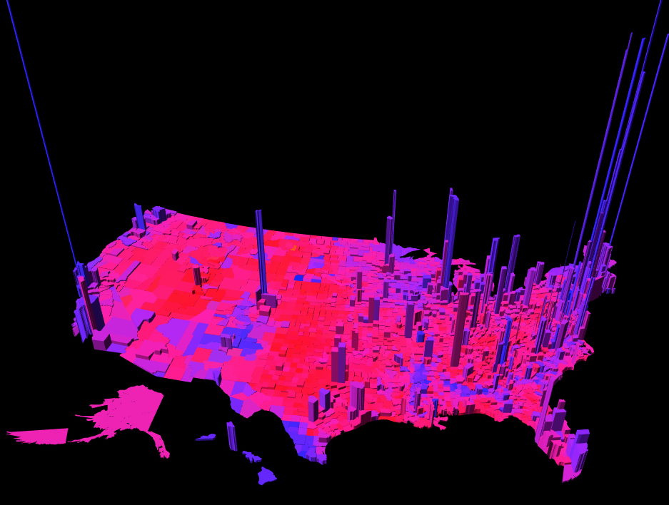
If you think that your cartogram is boring you can always elevate it.
source: Princeton
Demers cartogram
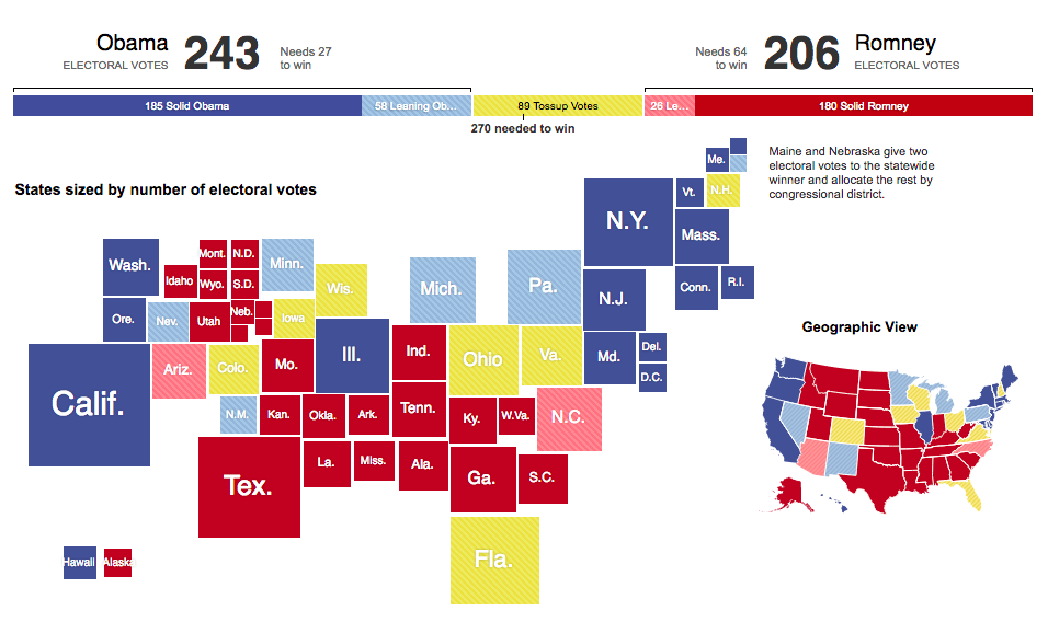
The Demers Cartogram uses squares to represent the phenomena. It maintains neither shape, topology or object centroids. It is fully abstract representation of the spatial pattern of the phenomena being mapped but it’s visually very strong.
source: NY Times
Dorling cartogram
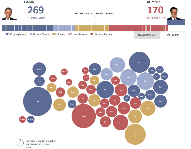
Another type of cartograms are Dorling cartograms. Similarly to Demers cartogram it doesn’t maintain shape, topology and centroids but instead of squares it uses circles. It is also a fully abstract representation of the spatial pattern of the phenomena but in certain cases they do the job well.
source: Huffington Post
Other way to look at cartograms
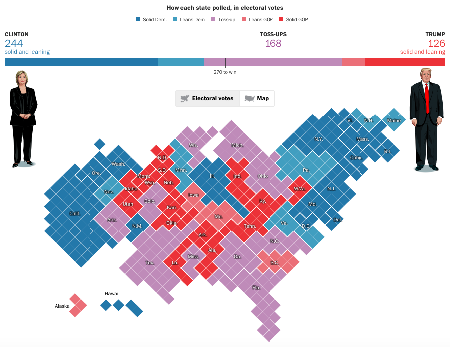
Cartograms allow you to be creative.
source: Washington Post
And one more cartogram
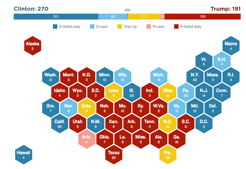
Simple forms can be more readable than complex graphs.
source: NPR
Twitter Political Engagement Map
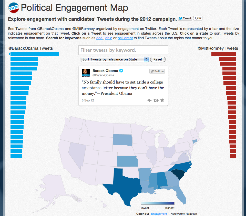
Elections are not all about votes. This project by Twitter illustrates people’s reaction to and engagement by state to Tweets from Romney and Obama.
source: Twitter
Dot election map
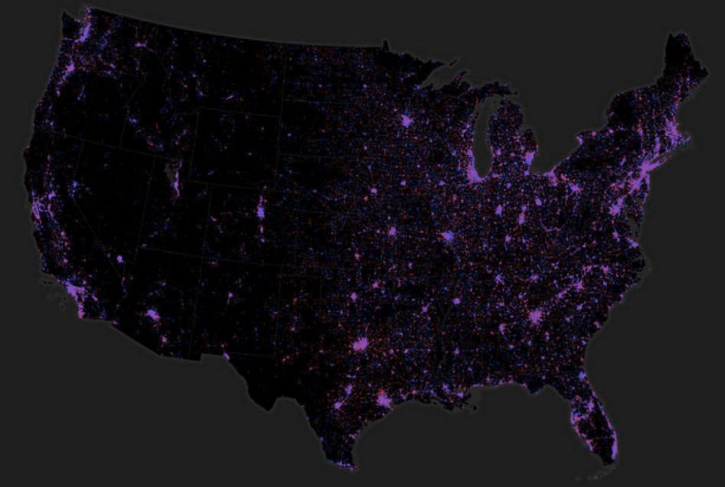
On this map of the 2012 presidential election, each dot represents 1,000 votes.
source: Ken Field, Esri
Votes are not distributed evenly
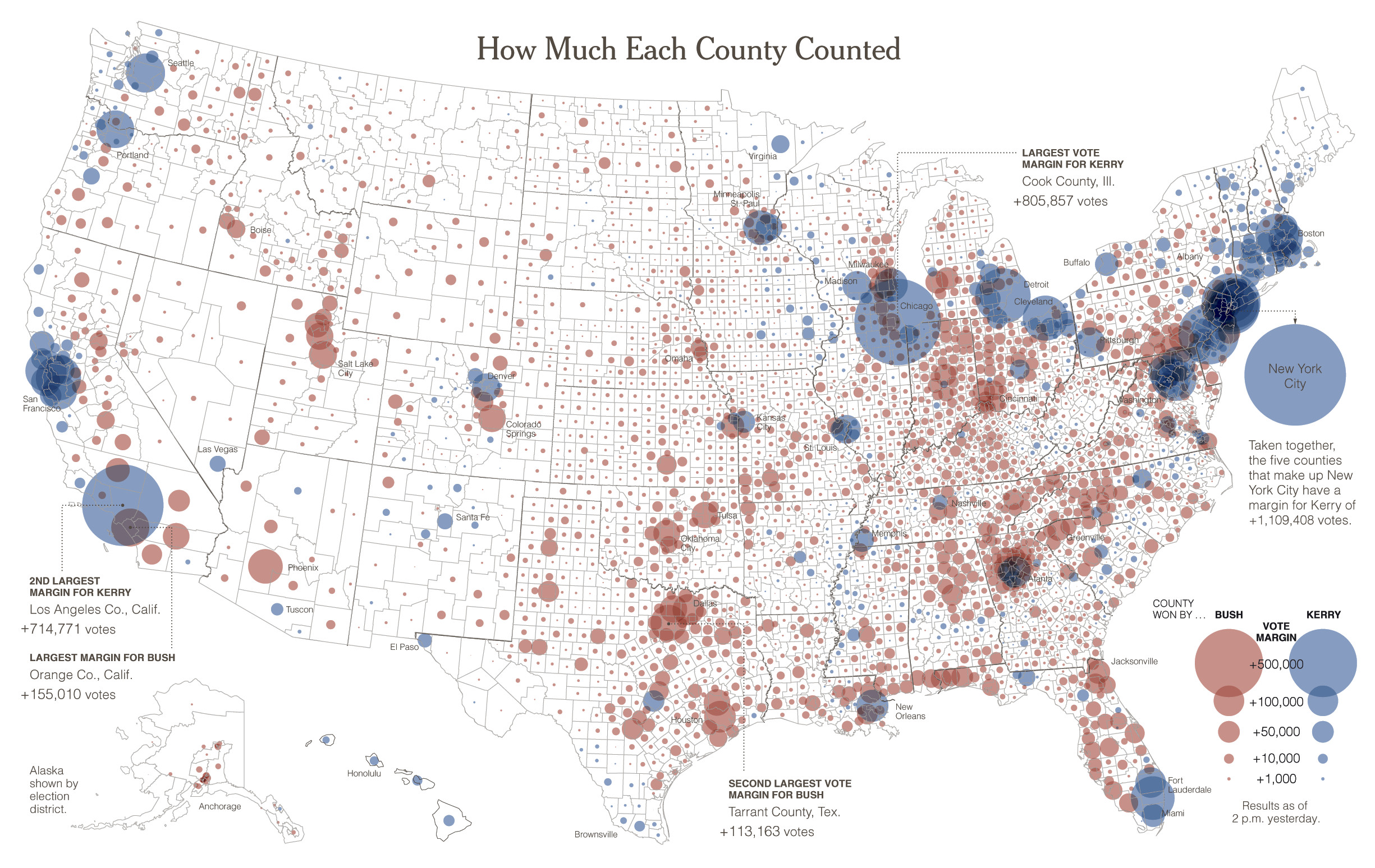
In the US presidential elections although Americans vote directly for their chosen candidate the president is elected by the institution called the Electoral College. It is quite possible that a candidate wins the popular vote (i.e. gets more votes over all) and yet loses the presidential election. You can show it on a map.
source: New York Times
Area distorted cartograms
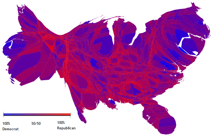
Area cartograms also known as the Gastner-Newman Cartogram or a population-density equalising cartogram is a technique for representing data for areas that modifies the size of the area depending on the chosen attribute. It can be pretty cool.
source: Wikipedia
[td_smart_list_end]


