
The most accurate map projection is a concept that cartographers have pursued for centuries. In this article, we will explore the world of map projections, focusing on their accuracy, applications, benefits, and limitations.
The Art of Map Projection
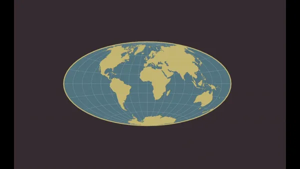
Map projection is the method of representing the curved 3D surface of a sphere, such as the Earth onto a flat 2D plane or map. This process is necessary because it’s impractical to use a globe to represent the entire planet or large portions of it.
The main reasons for using map projections are:
- To represent the spherical Earth onto a flat surface for both visualization and analysis.
- To minimize distortions of certain properties like area, distance, shape, or direction depending on the map’s intended use.
- To transform geographic coordinates (latitude and longitude) to planar coordinates (x and y) for creating maps.
It is impossible to flatten a sphere while accurately representing all properties of the spherical Earth without some distortion. These distortions can affect distance, area, and angle, posing significant challenges for cartographers. Each map projection attempts to minimize these distortions in specific ways, depending on its intended use.
Why do we have so many map projections? The answer is simple, each map projection focuses on a specific area, for instance, a country, and tries to minimize all distortions in its area. Different projections are chosen based on the region mapped and the purpose of the map.
That’s why it’s not recommended to use the wrong projection for your processing. The result of such an approach may look like in the image below. While the LAEA coordinate system is dedicated to topographical maps in Europe, using for example the Australian coordinate system may lead to huge angle, area, and distance distortions.
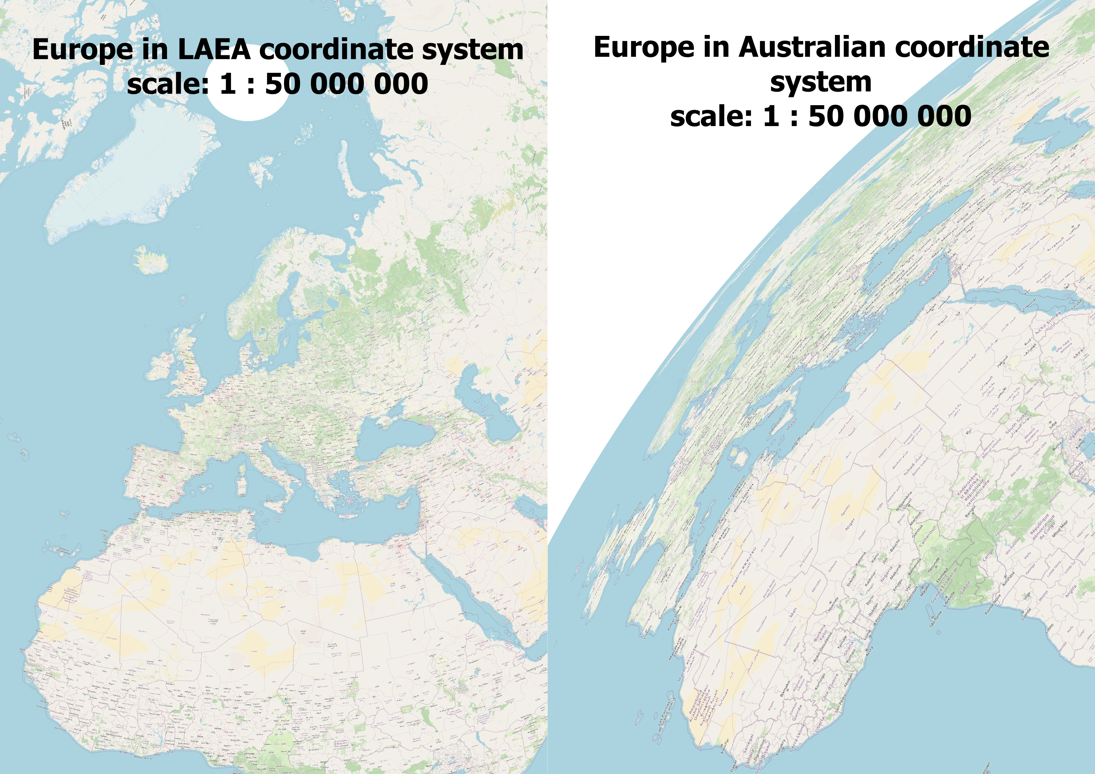
Example of using the wrong map projection
Exploring Various Map Projections
There are numerous map projections, each with its unique approach to dealing with distortion. Let’s explore a few notable ones:
1. Mercator Projection: Introduced by Gerardus Mercator in 1569, this cylindrical projection preserves angles, making it useful for navigation. It became the standard map for this purpose due to its unique properties of representing north as ‘up’ and south as ‘down’, while preserving local directions and shapes. However, it has a major drawback – it inflates the size of landmasses the further they are from the equator. This severely distorts areas, particularly near the poles, making Greenland appear as large as Africa, which is far from the truth.
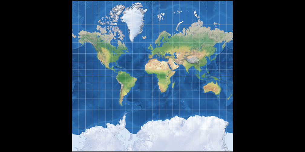
Mercator Projection. Source: map-projections.net
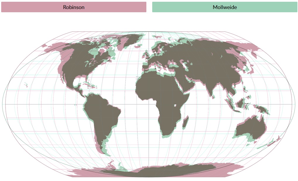
2. Robinson Projection: Arthur H. Robinson developed this projection in 1963 as a compromise. It aims to strike a good balance between area, shape, and distance distortions for world maps. This projection creates visually appealing maps by moderately distorting all properties (distance, area, and angle), making it ideal for world maps.
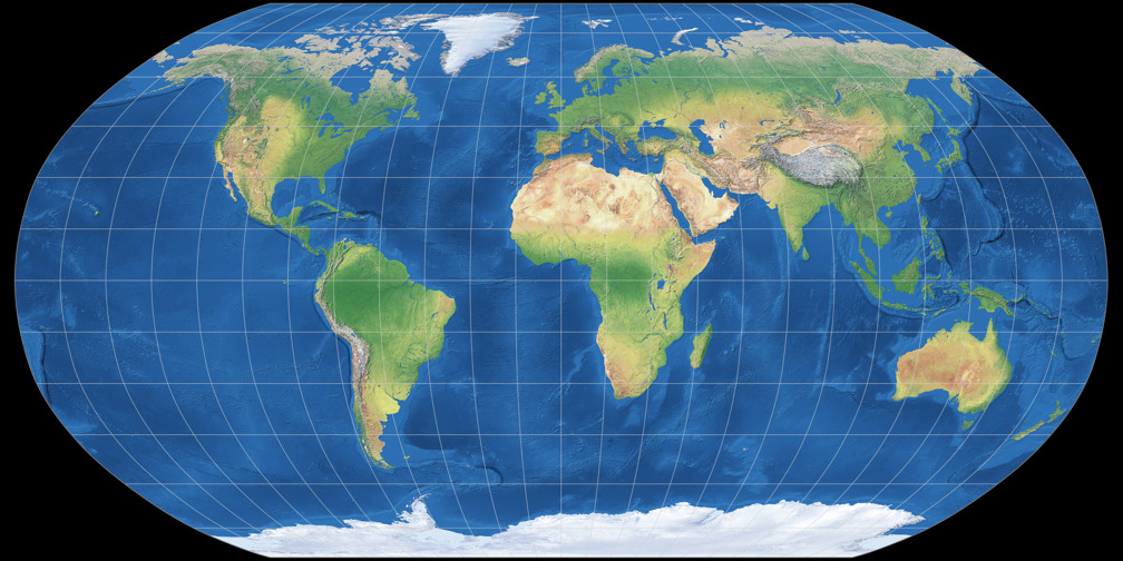
Robinson Projection. Source: map-projections.net
3. Equal-Area Projections (e.g., Albers and Mollweide): These projections preserve the relative sizes or areas of features on the map, accurately representing their true proportional areas on the Earth’s surface. As a result, equal-area projections are widely used for thematic mapping of quantitative data like population, economic activity, etc. where accurate area representation is crucial. However, they often distort shapes and angles, especially at higher latitudes.
Mollweide Projection. Source: map-projections.net
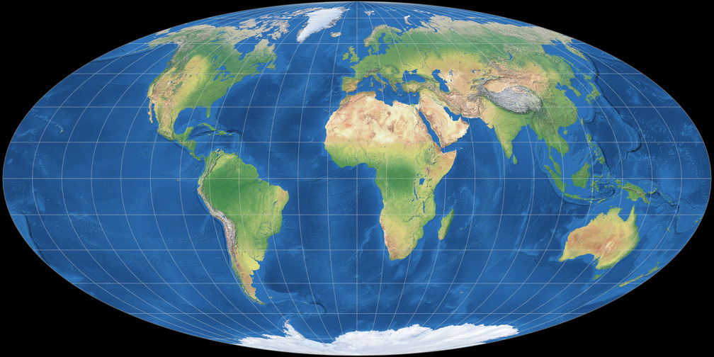
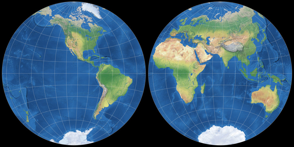
4. Azimuthal Projections (e.g., Lambert Azimuthal Equal-Area): These are a category of map projections where the surface of a sphere or ellipsoid (like the Earth) is projected onto a plane from a point or a line. Azimuthal projections display true directions (azimuths) from the center point or line to any other point on the map. This makes them useful for navigation and mapping areas such as polar regions. With azimuthal projections, distortion increases further from the center.
Lambert Azimuthal Equal-Area Projection. Source: map-projections.net
When comparing map projections, you can see differences in the shape and size of objects on the map. This fact has been used many times in the past for manipulation and even propaganda.
For example, Nazi Germany used the Mercator projection in maps like “A Study in Empires” to make the size of Germany appear insignificant compared to the vast British Empire, to argue that Germany could not possibly be an aggressor (Monmonier 1996). Countries often use map projections that depict disputed territories as being under their control, such as India’s political maps claiming the entirety of Jammu and Kashmir (Carnegie Ethics Online, 2018).
Comparison of different map projections. Source: map-projections.net
These 4 websites are useful for understanding map projections:
- Projection Wizard: Projection Wizard helps users select appropriate map projections based on the specific geographic area of interest and the distortion properties they want to minimize.
- Jason Davies Map Projection Transitions: This site provides interactive visualizations of transitions between different map projections, demonstrating how geographic shapes and areas transform.
- Compare Map Projections: This website allows users to compare different map projections side by side to understand their relative distortions and visual differences.
- World Map Generator: World Map Generator enables users to create and download customizable vector world maps for various uses.
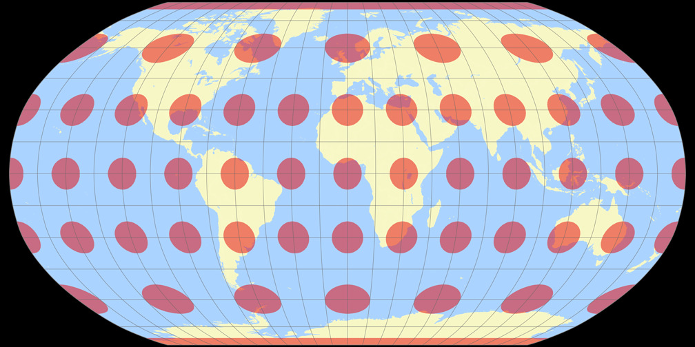
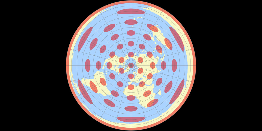
The Dance of Distortions
Every map projection must contend with distortion. We can present the scale of distortions on the map using an ellipse of distortion, known as Tissot’s indicatrix This is a valuable tool for visualizing and understanding the distortions introduced by different map projections.
It consists of small circles drawn on a globe or spherical model of the Earth at regular intervals of latitude and longitude. When these circles are projected onto a flat map using a particular projection, they become distorted ellipses called indicatrices (plural of indicatrix). The shape, size, and orientation of these ellipses reveal the type and degree of distortion at that point on the map projections.
For instance, the Mercator projection excels in angle preservation but fails in area accuracy – that’s why in distortion map we can notice gradual enlargement of circles towards the poles. The Robinson projection offers a balanced view but compromises on precise measurements. Understanding these trade-offs is crucial for choosing the right projection for specific tasks.
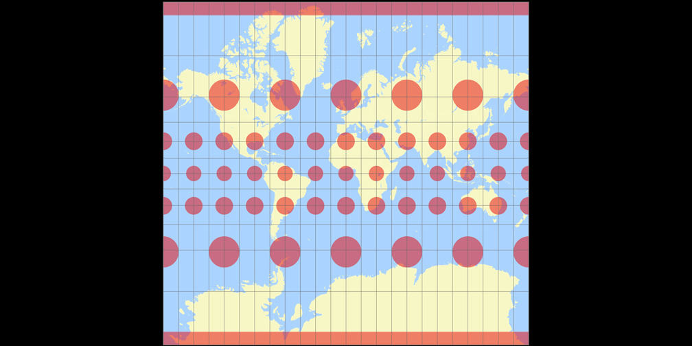
Distortions in Mercator projection. Source: map-projections.net
Distortions in Robinson projection. Source: map-projections.net
Choosing the Wrong Map Projection
Imagine a cartographer using QGIS to map a new city plan. They choose a projection without considering the nature of their data. As theyloads the layers, the streets and landmarks appear misplaced—buildings meant to align with roads float in disarray. This mishap occurs because each data type has its projection, and using the wrong one causes layers to misalign.
To avoid such errors, cartographers rely on EPSG codes—a standardized set of codes representing various coordinate systems and projections. Using the correct EPSG code ensures that the data aligns perfectly on the map.
EPSG Codes
EPSG codes, named after the European Petroleum Survey Group, are numerical identifiers for coordinate reference systems. For example, EPSG:4326 refers to the WGS 84 coordinate system, commonly used in GPS. EPSG codes simplify the selection of the appropriate projection, ensuring accuracy and consistency in mapping.
A list of all coordinate systems ought to be accessible in each GIS software. Additionally, on several websites, it’s possible to search through map projections or to make transformation from one coordinate system to another.
Applications and Limitations
Different map projections serve various applications. For global navigation, the Mercator projection’s angle preservation is invaluable. In contrast, equal-area projections are essential for demographic studies, where accurately representing population density is crucial.
However, no single projection is perfect. Cartographers must weigh the benefits and limitations of each, considering the purpose of their map. For instance, while the Mercator projection is excellent for navigation, its area distortion renders it unsuitable for educational purposes where size comparisons are essential.
The Role of Area Zero in Map Projection
In map projections, the term “area zero” refers to points where distortion is minimal. For example, in cylindrical projections like Mercator, the equator serves as the area zero. In the case of azimuthal normal projections, the place of zero distortion is the point of contact of the projecting plane with the Earth’s sphere.
Understanding these reference points helps cartographers optimize their maps for specific regions.
The place of zero distortions for the Azimuthal Equidistant Projection is the North Pole. Source: map-projections.net
Conclusion
The quest for the most accurate map projection is a journey without a definitive end. Each projection offers a unique lens through which to view our world, balancing distortions to serve specific purposes. Cartographers must navigate these choices, guided by their understanding of distortions, EPSG codes, and the intended use of their maps.
As technology advances, new projections and tools emerge, promising even greater accuracy and versatility. Yet, the fundamental challenge remains: transforming our three-dimensional Earth into two-dimensional maps that best serve our needs. This art and science continue to evolve, driven by the timeless human desire to chart and understand our world.
In another article, we considered the advantages and disadvantages of several map projections. Check it out!
Did you like the article? Read more and subscribe to our monthly newsletter!

#Science

Next article
Introducing Planet Insights Platform: Easier, Faster, and More Cost-Effective Insights

At Planet, we recently unveiled our new all-in-one platform for multidimensional Earth insights: Planet Insights Platform. We celebrated by inviting the global Planet community to a virtual event to explore how Earth data, analytics, and powerful tools come together in the platform to monitor and understand change.
At the event, Planet co-founder and CEO, Will Marshall, shared, “You can think of Planet Insights Platform as your central hub for a vast array of data and tools that can provide new capabilities, create new insights, and build innovative products. [It] is the all-in-one place where you can achieve multidimensional Earth insights.”
You can watch a recording of the event, which includes presentations and demos from Planet experts. Or, keep reading — this article provides an overview of Planet Insights Platform and how to get started.
What to Expect From the Planet Insights Platform: Easier, Faster, and More Cost-Effective Insights
During the virtual event, Troy Toman, Senior Vice President of Product and Software Engineering at Planet, shared, “We’ve unified our core offerings into a powerful set of APIs and tools that provide access to multiple data sets and powerful analytics. This breaks down the conventional barriers to leveraging the power of Earth observation data while laying the foundation for future cutting-edge capabilities that make it easier for our partners to build solutions and our customers to get the answers they need.”
Today, the platform brings together new capabilities that dramatically improve customers’ capacity to analyze and orchestrate large volumes of Earth data, reduce upfront development and maintenance costs, and focus on differentiation. These updates include:
- A unified account experience across Planet and Sentinel Hub: By linking the two platforms, users will now be able to access cloud hosting and imagery analysis tools from Sentinel Hub through a single login.
- Enhanced Analysis-Ready PlanetScope data: Analysis-Ready PlanetScope uses proprietary AI to create harmonized, cloud-masked, and spatially consistent daily stacks of images, which enable time-series analysis and machine learning applications.
- Updated global Road and Building Change Detection: Our Road & Building Change Detection AI-based models point to where development is taking place across country-wide areas, on a weekly basis. This can help users clearly understand how and where the places they care most about are evolving.
- New and improved Planetary Variables: Field Boundaries trace the boundaries of agricultural parcels, giving insights into different crop types and growth throughout the season. Additionally, Crop Biomass Planetary Variable now integrates Planet’s daily, global PlanetScope data, offering a cloud-free, analysis-ready data product for monitoring agricultural fields.
- Time series and statistical analysis: Within the Planet Insights Platform, users can efficiently translate imagery into formats best suited for advanced data science and machine learning models.
With Planet Insights, users can build insights and solutions, make decisions, and act faster. Planet customer Valentin Louis, of the UK Rural Payments Agency, shared, “We needed fast and quick access to satellite data that helped reduce the time spent on downloading and pre-processing. That’s where Planet Insights Platform comes in. It helped us quickly distribute data and insights across our agency by integrating seamlessly in our current software ecosystem.” You can hear even more from Valentin in this spotlight video.
Monitor. Identify. Analyze: A Platform for All Users
We believe that what truly sets Planet Insights Platform apart is its accessibility and ease of use. Whether you are new to Planet or an advanced user, our goal is that you can easily access all of our products and derive meaningful insights from the data.
A few highlights:
- Data archive: Planet Insights Platform has a 7+ year archive of near-daily data. This dataset can help users understand unforeseen events or establish baselines of activity and is a fundamental part of our unique broad area management offering.
- Access for universities and social impact organizations: Education and Research users can access the Planet Insights Platform for free! First, apply to our Basic Education & Research Program. Once you have an account, you can learn how to get started with Planet Insights Platform.
- Easy navigation for previous users of Sentinel Hub: Planet Insights carries over a similar user experience as EO Browser in Sentinel Hub – the login is now unified. By consolidating the datasets and tools into one Platform, customers no longer have to spend time managing multiple systems.
Whether you are new to Planet or an advanced user, our goal is that you will be able to navigate the platform easily and derive meaningful insights from the data. We provide you with a wide range of enterprise support and services, including training and online resources to maximize the value of the platform.
Get Started With Planet Insights
If you’re new to Planet, you can learn more about the Planet Insights Platform by watching the virtual event on-demand or by exploring the Planet Insights Platform homepage. When you’re ready, reach out to begin your journey with Planet.
Already a Planet customer? Get started with Planet Insights Platform or join the Sentinel Hub forum on Planet Community to connect, ask questions, view product announcements, and learn more.
Author: Madeline Dahm
Author bio: With a background in science writing, Madeline creates multimedia content to showcase the value of Planet data for a range of applications and use cases.
Did you like this article? Read more and subscribe to our monthly newsletter!

