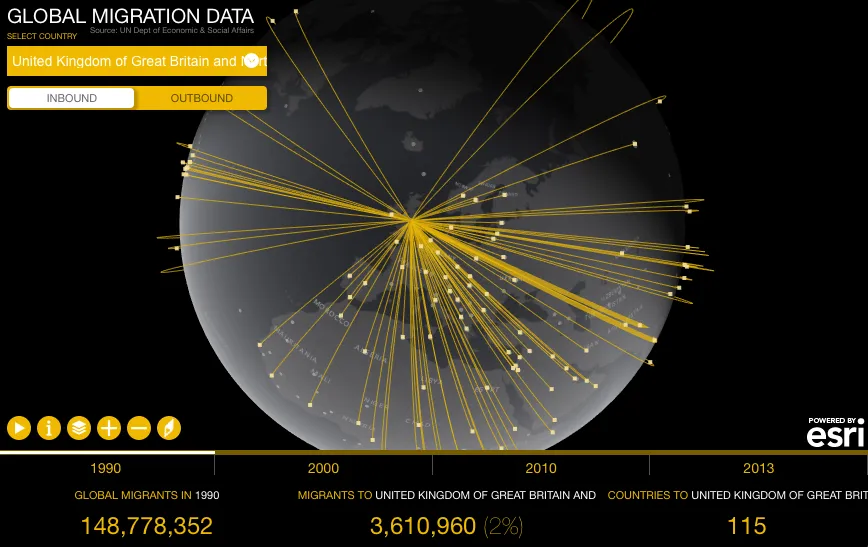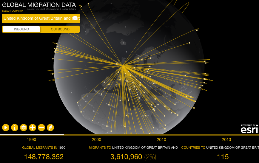
The story of global migration visualised on a single map by Esri
International migration is a hot topic and a global phenomenon that is growing in scope, complexity and impact. It can be a positive force for development when supported by the right set of policies but performed unreasonably migration can cause short-term or long-term issue swhich is the case in couple of European countries.
Understanding global mobility patterns and its impact on countries is very difficult without a great map… but don’t have to worry about that any more as Esri has launched a new cool tool where you can visualise global migration country by country. The project is called Global Migration Data and it shows estimates of the number of international migrants by destination and origin. The data comes from the UN Department of Economic & Social Affairs for the years 1990, 2000, 2010 and 2013.

The map is very easy to use. On the top left menu you can select a country as well as its incoming or out coming migration. Below the map you’ll find a timeline where you can select years you wish to visualize on the globe. On the bottom of the website you’ll find the total number of migrants globally, per selected country as well as the number of countries migrants are from or the number of countries migrants moved to.
Cool project and a nice show case of what can be done using Esri web tools.


