Searching for isolation with GIS
Searching for the nearest neighbor is a classic GIS question. What is the nearest bar from my location? How close is the nearest entrance to the metro from this road? When comparing the distance between two objects (source and target), with modern GIS tools it is relatively simple to calculate the distances and sort the results.
What if you first have to find the target point and just have a source point and an empty plane? Obviously, the closest target is at the same location as the source, but what about vice versa?
What place is furthest from all objects, but still inside the area boundaries (= Where is the most isolated point)?
In this case objects are buildings. That is the kind of question I started to investigate after chatting with Maarten. He had seen my previous blog post about PostGIS and thought that PostGIS might be a good tool to answer a question he had been pondering for a while: where is the location furthers away from any building in Flanders, Belgium? Flanders is very densely populated built area, so comparing the results to a place like Finland would be really interesting.
Probably a similar analysis has been done before and maybe there’s even a tool for this (please send me a link if someone has already explored this!), but I found this SQL task intriguing and wanted to answer the question. It was like a contrary analysis for Alasdair Rae’s great The Most Densely Populated Square Kilometre in 39 European Countries.
The approach
So how to calculate this? My first idea was to split the country in to grid cells, then check which grids have buildings in them and then iterate further in to smaller cells until I would’ve found the optimal location. This could’ve been a possible solution, but would require several iterations and still the location would be somewhat an estimate.
Then I thought of Voronoi analysis. With some minor tweaks, that’s a ready solution for this! Good old Wikipedia defines Voronoi’s as follows:
In mathematics, a Voronoi diagram is a partitioning of a plane into regions based on distance to points in a specific subset of the plane. That set of points (called seeds, sites, or generators) is specified beforehand, and for each seed there is a corresponding region consisting of all points closer to that seed than to any other. These regions are called Voronoi cells.
In this case I wasn’t interested in the Voronoi regions, but instead the points at the edge of those regions. I was interested in the vertex points which are on the edges of the Voronoi cells, which form the polygons. Confused? I try to explain it in a picture below.
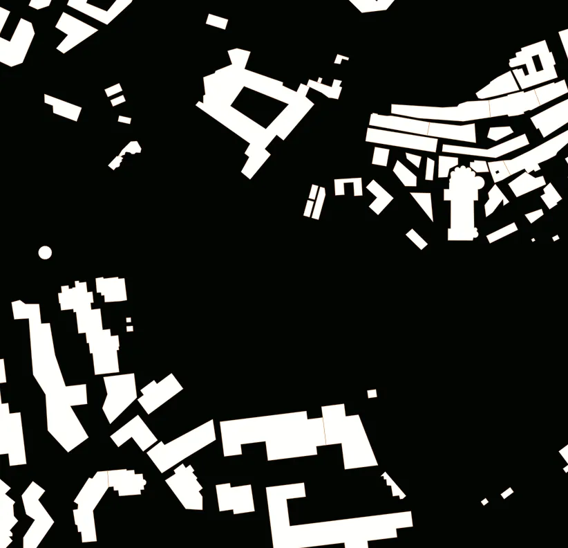
Building (white polygons) centroids (orange points) would act as seed points. The point at the edge of the Voronoi regions (blue points) with the biggest distance to a nearest (orange) neighbor would be the most isolated point from the closest buildings!
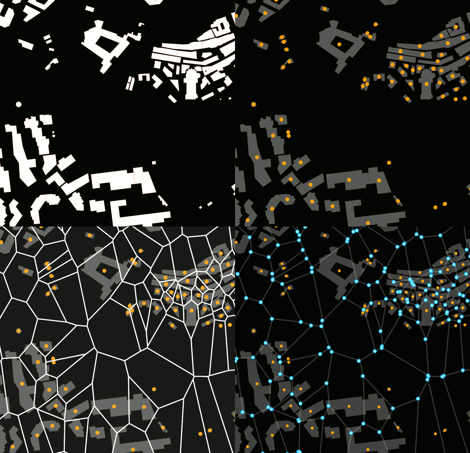
There are a few caveats in this approach. Firstly the building centroids might be tens of meters away from the corner of the building, so just comparing the points doesn’t give you the closest corner of the building. Secondly in some cases the most isolated point would be on the border of the area. As we don’t know what’s on the other side of the border (especially in highly populated Flanders area), it might not be the reality. Unless you are doing the analysis for an island.
But I went on a quest to get those blue points!
The execution
I did the analysis with PostGIS and I’m sharing most of the necessary SQL here (not every single join and filtering), but most importantly I want to share the approach. Surely you can use the same analysis also with other tools.
Firstly, I needed the following data:
- Boundary of the area being examined. I loaded the boundary from OSM via Overpass API. National datasources always have this available too.
- Building centroids. The seed points. For Flanders I got the building footprint data from Maarten, which I converted to centroids with simply ST_Centroid in PostGIS.
- A grid. I would use the grid to check for clearly empty areas, so I would’t have to do the analysis for the whole area.
- Voronoi vertices. These would be the candidate points, for which the nearest neighbor analysis would be done.
First I created a grid with QGIS (Processing toolbox → Create grid) to cover the whole area. I did some estimations by browsing through the building dataset to create a grid with the right size. For Flanders I used a cell size of just 250 meters, but for something like Finland, 1 km was enough. The key in choosing the right was to get a cell size where you would get several empty grids next to each other in the empty areas, but still can clearly filter out the areas with high building density. It’s like creating a mask layer for the densely built areas. This filtering with make the Voronoi creation muuuuuch less intensive.
After creating the grid and the centroids from the foorprints, I calculated the number of buildings in each grid (for ~200 000 grid cells and ~5 million buildings my laptop finished this in 7 minutes).
SELECT grid.geom, grid.id, count(building.geom) AS total
FROM grid
JOIN buildings
ON st_contains(grid.geom,building.geom)
GROUP BY grid.id
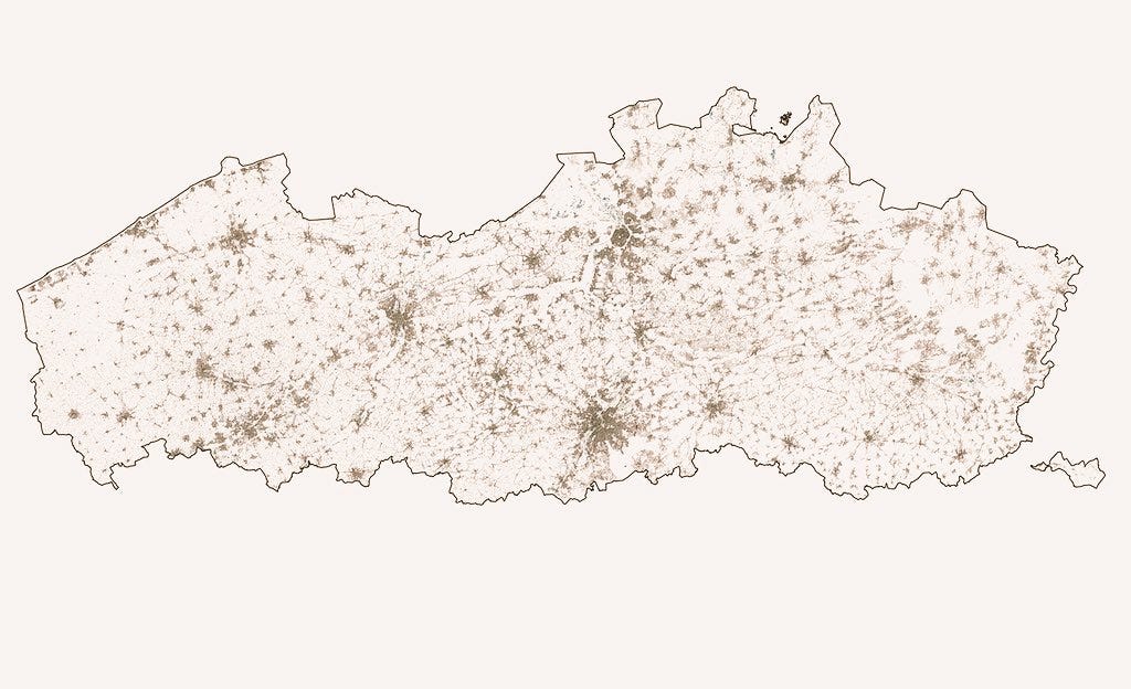
Like mentioned, I was doing this phase, so that I wouldn’t have to generate Voronoi’s for all the five million buildings. Already from the map below you can get a good idea where the most isolated point could be, so doing the calculations for all buildings e.g. in the south-west part of the region or in the center of Brussels isn’t really necessary. Just a waste of precious time.
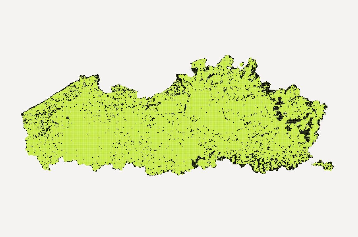
After having the building count in each grid, I could filter the results further. With the following SQL I dissolved the individual empty cells in to larger multipolygons, calculated their area. Then I could filter out the ones which are clearly too small.
CREATE table emptyareas
as
SELECT path,geom, st_area(geom) AS area
FROM(SELECT (a.geom).path[1] AS path,(a.geom).geom AS geom
FROM(SELECT st_dump(st_union(geom)) AS geom
FROM grid where total = 0) AS a) AS foo
After this I create a small buffer around these largest empty areas, which is then used to select the seed buildings. I did this with QGIS, as it needed some iterations to get the buffer size just right and it needed some visual inspections. Also as the data amount had already gone down to a reasonable size that could be handled also without PostGIS.
You could also do it with ST_DWithin and maybe even skip a step, but I think it’s clearer to do it with a traditional buffer. To sum it up, after some tinkering, you should now have:
- merged the empty areas in to multipolygons;
- from those multipolygons filtered out the areas which are clearly too small;
- created a buffer around the larger empty areas and select the seed points,
This might sound a bit confusing, but here’s some more gifsplaining starting from the beginning:
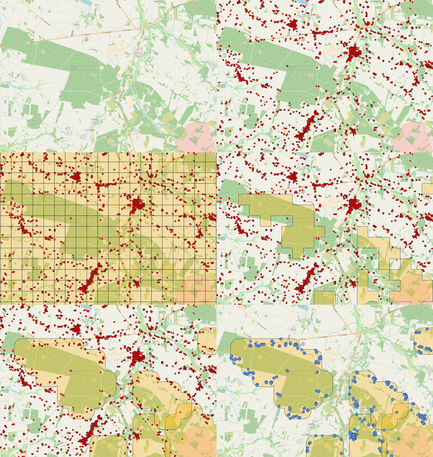
This produced results which seemed be “close enough” after some map panning in QGIS. To create a new table for the buildings inside the buffer area, I simply did it as follows (took around two minutes to execute):
CREATE table seedpoints
AS
SELECT buildings.*
FROM buildings
JOIN buffered
ON ST_Intersects(buffered.geom, buildings.geom)
Now I had the subset of potential seed buildings selected from the 5 million buildings, so I could finally do the Voronoi analysis and find the candidate points.
CREATE TABLE candidates AS
SELECT
geom, row_number() over() AS id
FROM(SELECT (c).geom
  FROM(SELECT st_dumppoints(st_voronoilines(st_collect(geom))) AS c
    FROM seedpoints) AS a
    GROUP BY geom) AS b
For Flanders I ended up having about 50 000 candidates and for Finland even more. This was partly due to the structure of the urban areas. In Flanders the empty areas seemed to create “pockets” surrounded by buildings, whereas in Finland the empty areas ended up cover almost whole Lapland with a multipolygon connected through roads. Still my laptop was able to calculate the Voronoi polygons pretty smoothly for those in around five minutes.
After that I simply deleted the candidate points which end up outside of the empty area multipolygons.
Then what about the distance calculation? Here I did actually calculate the nearest neighbors, but actually I was interested in the candidate point that has the most distant nearest neighbor (duh..). I used this modified example from Paul Ramsey, but ordered them descending and only select the top 50. You could also directly take only one, but I like to do some visual inspection for the 20.
NOTE: Your data shouldn’t be in degrees (EPSG:4326) or this doesn’t give you accurate results!
SELECT
a.id, a.geom, st_distance(a.geom, b.geom) as dist
FROM candidates AS a
CROSS JOIN LATERAL (
  SELECT seedpoints.*
  FROM seedpoints
  ORDER BY
    a.geom <-> seedpoints.geom
  LIMIT 1) AS b
  ORDER by dist desc
  LIMIT 20
Voilà! This returns you the 20 most distant points in a few seconds. From those still I checked that they aren’t too close to the border and don’t end up in a lake or somewhere else really weird.
The results
In Flanders the most isolated point is 1817 meters from the closest building (not 2149 like in the original tweet. Damn you degrees and distance calculations!) at coordinates 5.49955,51.04841.
I calculated the most isolated point in Flanders, Belgium. It’s located a few kilometers north from Genk. The closest building is 2149 meters from this point. pic.twitter.com/AZYgapPf4b
— Topi Tjukanov (@tjukanov) July 1, 2018
I also calculated the point for Finland, where it is (unusprisingly) much more isolated than in Flanders:
This is the most isolated point (25.3838, 68.4960) in Finland. It is 14,1 kilometers from the closest building and located in the Lemmenjoki National Park. pic.twitter.com/m4YyU07Wvw
— Topi Tjukanov (@tjukanov) July 8, 2018
I will add a comparison of a few different countries and regions to my websitelater. If you happen to know countries which have all building locations (or even accurate address points) as open data, I would be happy to hear about it and maybe do the analysis for other places as well.
Lessons learned
While making this I realized how important it is to visualize the results on a map while making the analysis instead of just blindly write SQL. For example creating the buffer for the building points that would eventually be selected as the seed points is very relative. You want to select the “first row” of buildings from the empty areas and not much more.
Secondly It’s always important to use subsets before going full scale. I tried first doing the Voronoi’s for 5 million buildings was a stupid approach. I left the analysis running on my laptop for a whole day, but it didn’t finish. Of course if you have a very powerful machine at hand, you can skip a few stages.
For smaller datasets you can also do the whole analysis with QGIS tools and you don’t need PostGIS at all. All the tools necessary for the analysis are available inside QGIS Processing tools (Grid cration, Centroids, Voronoi, Vertex points, Distance matrix).
But what is the point (sic) in all of this? Could there also be some practical applications for this analysis?
Sure! This could be used to find the optimal place to do nuclear testing, having a massive rave party or just a place to hike and find your zen.
[This article was first published on Medium and been republished on Geoawesomeness]


