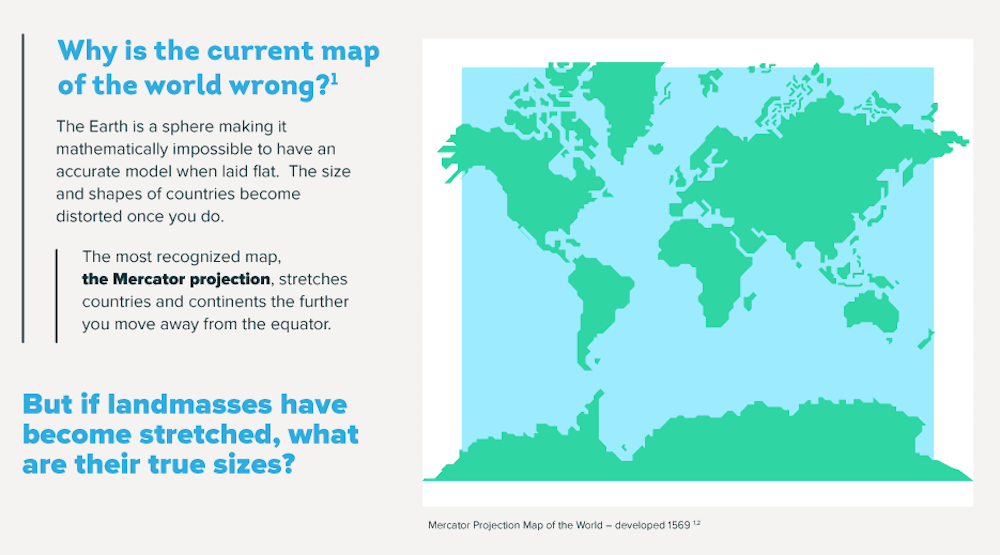
Humankind has always been fascinated with the lay of the land, and as the generations have passed we’ve combined new information with new media forms to create an ever-evolving, shared concept of the way Earth’s land masses and oceans are distributed. The pursuit of a complete map has taken some odd turns over the years, from Kircher’s assertion of a hollow globe beneath us, to notable figures from Homer and Democritus up to NBA star Kyrie Irving that the world is flat.
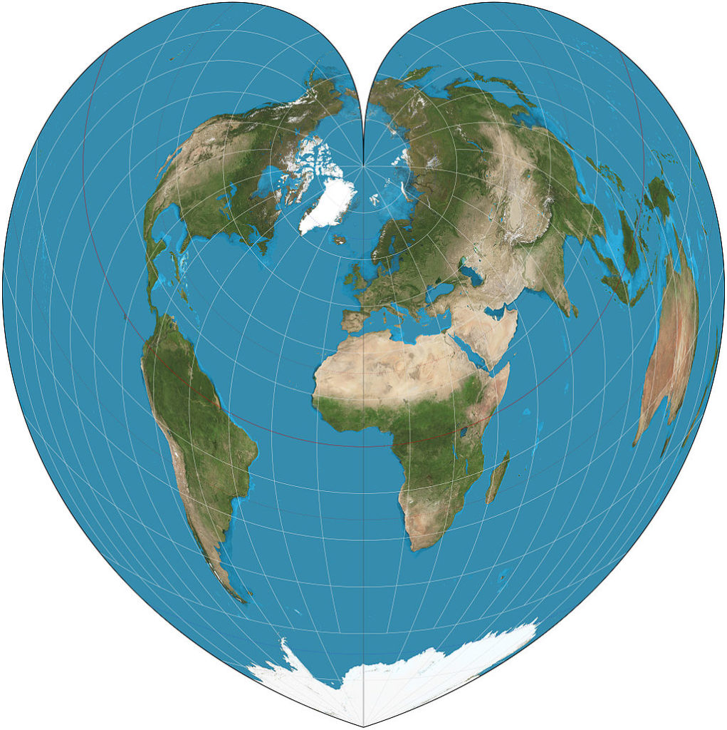
cordiform (heart-shaped) projection
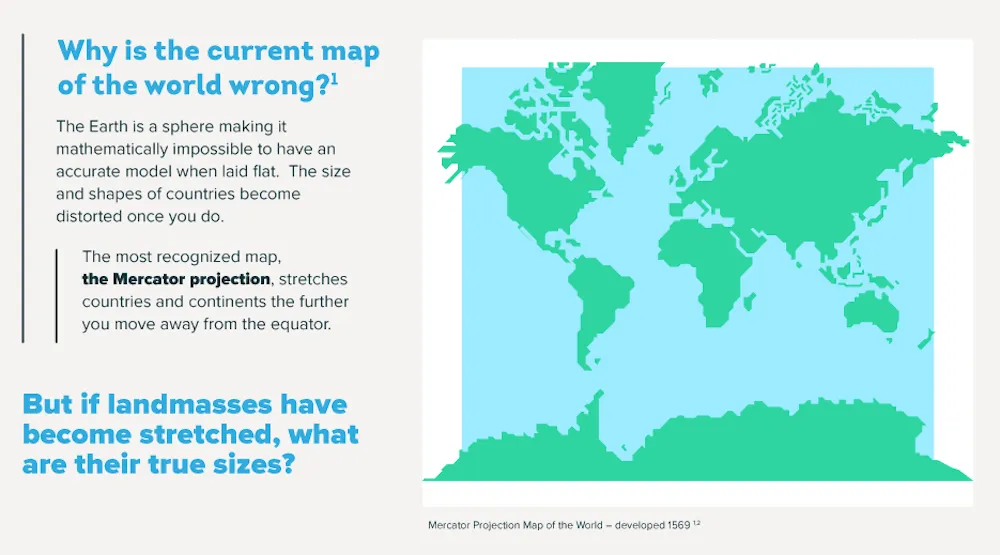
Yet the preference for foldable, pocketable cartography means that 500 years after Gerardus Mercator’s development of his canonic world map, we still rely on a basically misleading document to form our mind’s image of the world around us. Based on accurate rendering of nautical directions rather than precise preservation of the shape and size of land masses, Mercator’s simplification is the reason Colombia and the UK appear roughly the same size (Colombia is in fact over four times bigger), Greenland outsizes the whole of South America (which is eight times bigger), and Antarctica appears to dominate half the globe (it’s pretty big, but still – only twice the size of Australia).
Somewhat inconveniently, our spherical planet refuses to flatten neatly into a 2D representation without compromise. The 16th century cordiform (heart-shaped) maps of Johannes Stabius, for example, are complete only as a triptych, and then only with some overlapping.
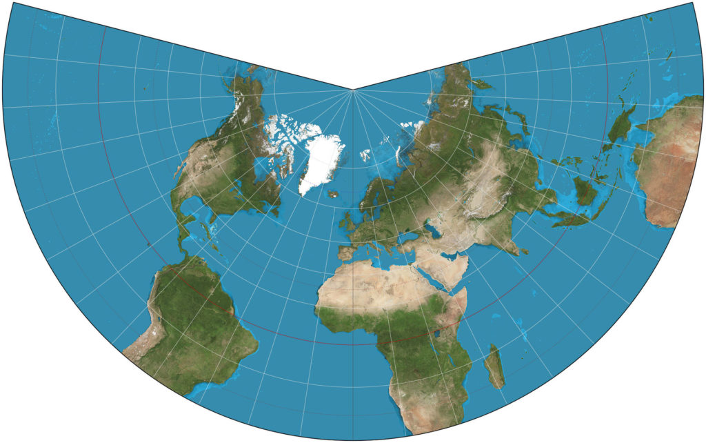
Lambert Conformal Conic Projection
However accurate they may be, they just don’t seem catchy enough to knock Mercator off the top spot. Likewise, Johann Heinrich Lambert’s conformal conic projection is still reinterpreted today for aeronautical charting, but is hardly intuitive enough to appeal to the average tourist, rambler or flaneur.

Gall Peters Projection
One representation that manages to preserve both scale and a handy, smart phone-ready rectangular frame is the Gall-Peters equal projection map. Developed in the 1970s, it was not the first map to attempt such fidelity to scale, and actually gained controversy over the implication that it was. Perhaps this controversy is what helped to gain it wider recognition. It certainly benefitted from good timing – with the changing face of imperialism and widening concern and communication regarding social justice, the map’s apparent fairness to the mainly developing nations that were ‘squashed’ by the Mercator map saw it introduced by progressive organizations such as Oxfam, concerned religious groups, and even a number of British schools.
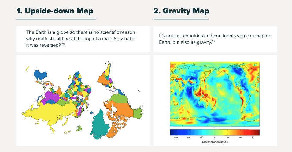
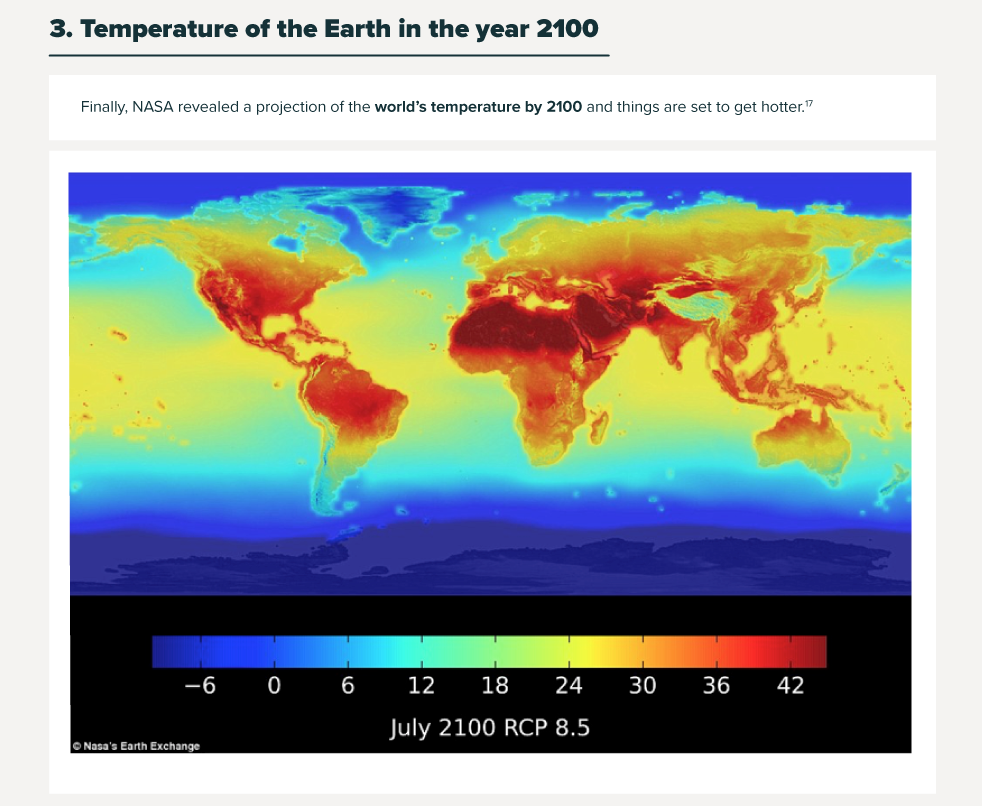
Still, the Mercator projection’s prevalence could be considered self-perpetuating: it has become a standard, and such standards become harder to shake the further they become embedded in our new information age. Perhaps, though, further developments in new media will see new standards emerge in new dimensions: imagine a hologram globe hovering in your leather-tiled study, spinning to the desired point in response to your gestural commands, or manipulable interactive 3D maps experienced through VR goggles.
The new infographic and explainer video from Expedia Canada expand on some of the inconsistencies between the Mercator projection and what we actually know about the world. It includes some interesting variations on how we might look at it – because now and then, it seems we need to be reminded that the Earth is neither rectangular – flat!
About the author: G. John Cole
 John is a digital nomad and freelance writer. Specialising in leadership, digital media and personal growth, his passions include world cinema and biscuits. A native Englishman, he is always on the move, but can most commonly be spotted in Norway, the UK and the Balkans.
LinkedIn: https://www.linkedin.com/in/gjohncole
Twitter: https://twitter.com/gjohncole
Did you like this post? Read more and subscribe to our monthly newsletter!




 The TRON has the capability to carry a payload of up to 2 kilograms, ideal for the three functionalities that Quantum Systems is targeting – security, remote sensing, and 3D construction.