
What you are looking at is the QGIS Expression language. For a geospatial audience, the most useful way to understand it is as a lightweight, map-aware scripting language embedded directly inside QGIS. It allows you to generate geometry, symbols, styles, labels, and derived attributes dynamically, using both feature attributes and spatial properties such as geometry, slope, or aspect.
Conceptually, it sits between classical cartographic rules and full programming. It is more expressive than styling sliders or rule-based symbology, but far simpler than writing a Python plugin. Most importantly, expressions operate at render time. Geometry and appearance do not need to be stored permanently in the dataset; they are generated on the fly from rules you define.
This opens the door to procedural cartography: maps that are defined by behaviour rather than by fixed shapes.
Hachures as a First Example: Geometry Generated from Terrain
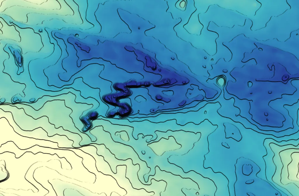
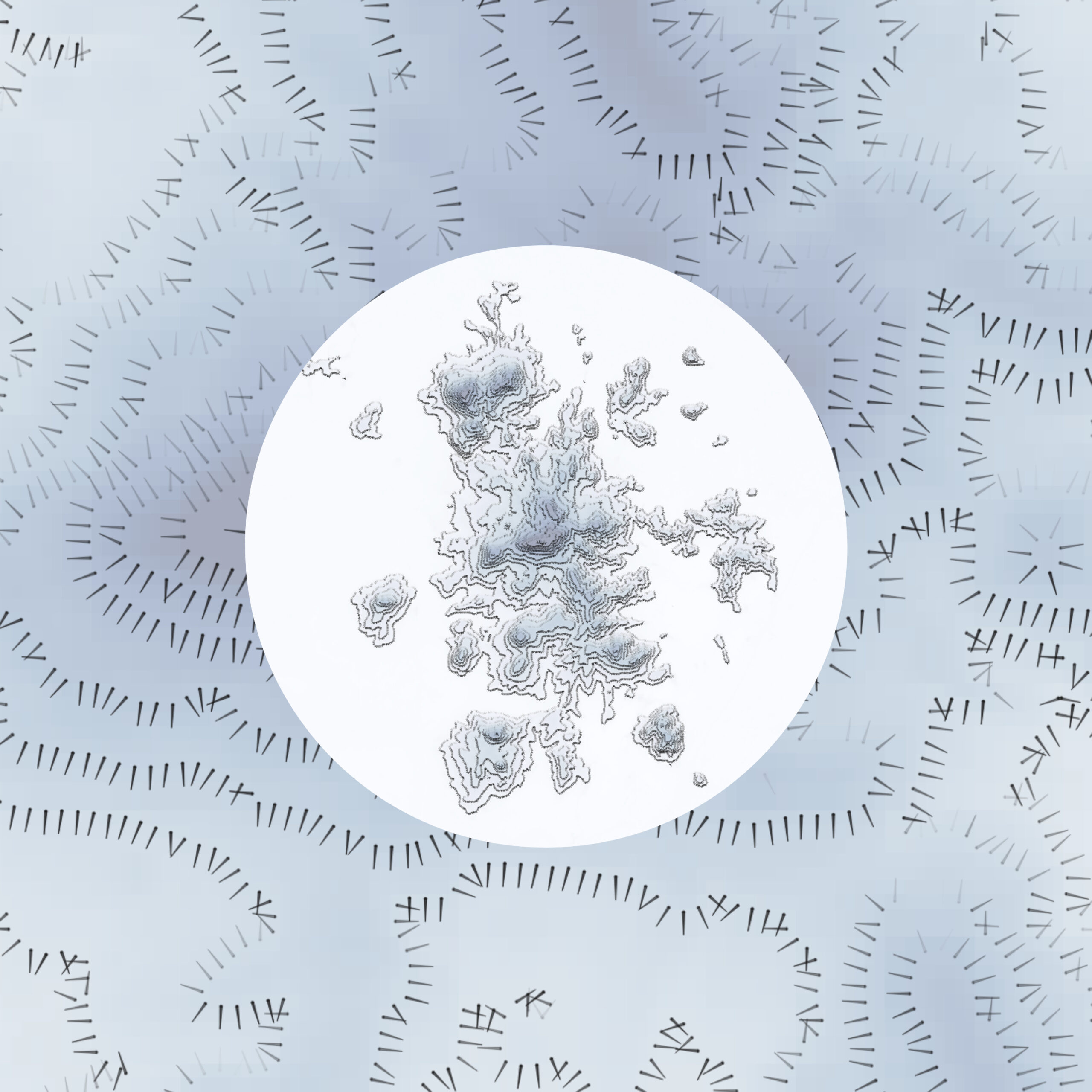
The QGIS Hachure Map Generator plugin is a good illustration of this idea. Instead of merely symbolizing existing features, it uses expressions to generate new geometry at draw time. Hachures are short line segments whose length, spacing, and orientation encode terrain properties such as slope and aspect. In classical cartography this was a manual process. In QGIS, it becomes algorithmic.
A simplified version of a hachure-generating expression looks like this:
make_line(
$geometry,
project(
$geometry,
15 + 100 * “slope_1” / 90,
radians((“aspect_1” – 90) + rand(0, 8))
)
)
Here, make_line() constructs a line from two points. The first point is the feature’s geometry, often a point derived from a raster cell or centroid. The second point is computed using project(), which shifts the geometry by a given distance and direction.
The distance depends on the slope. Steeper slopes produce longer hachures. The direction is derived from aspect, rotated so the line points downslope, with a small random perturbation added via rand() to avoid visual regularity. The result is a field of lines that encodes terrain morphology rather than just elevation.
Visual emphasis can be further modulated by scaling opacity or width based on aspect orientation:
1 – abs(“aspect_1” – 180) / 180
This expression returns values close to 1 for south-facing slopes and closer to 0 for north-facing ones, allowing selective emphasis through line width or opacity. The key point is that geometry and styling are driven by physical terrain properties, not static design choices.
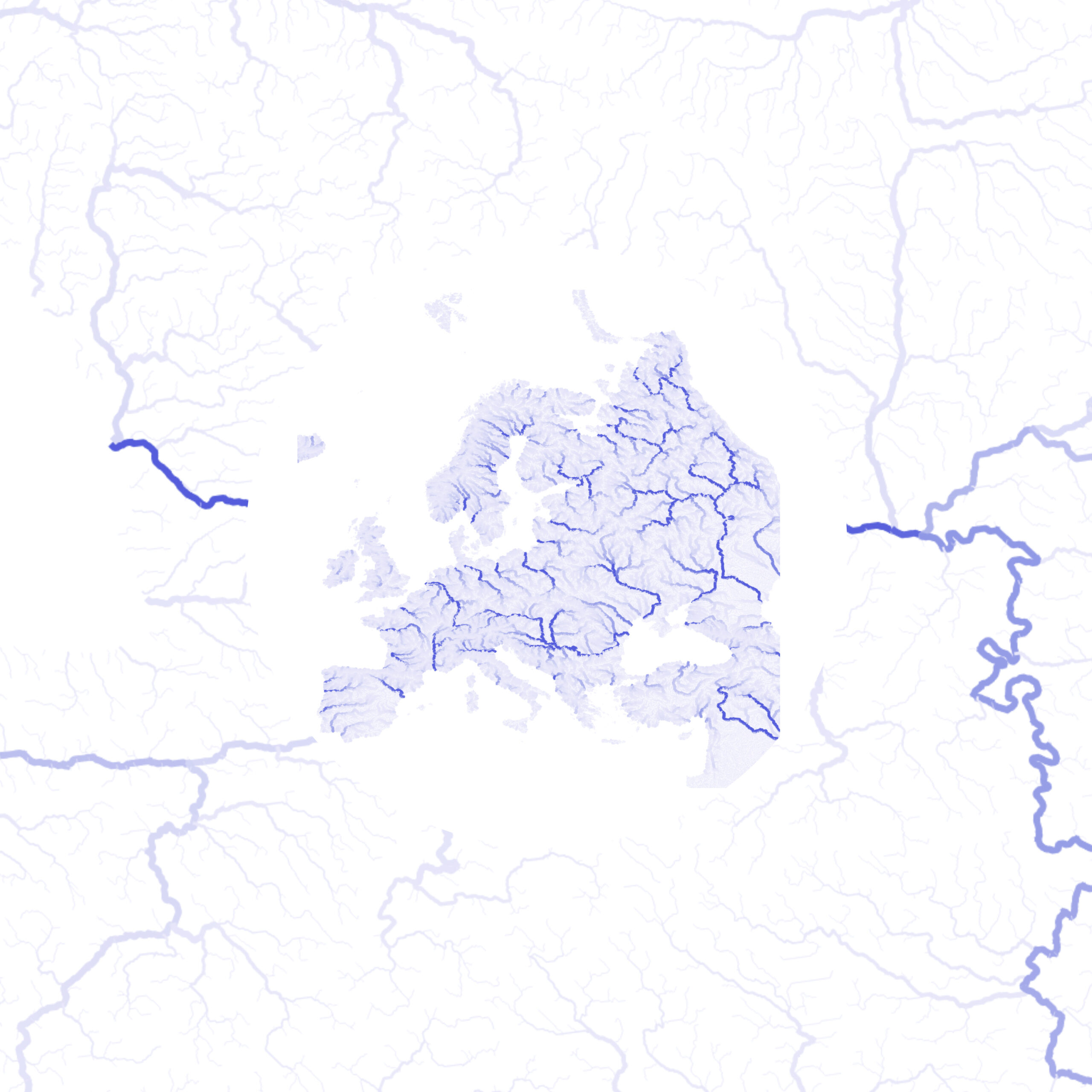
Flow and Movement Mapping
Flow maps are a natural application of expression-driven geometry in QGIS. When you have origin–destination lines or point features with attributes for direction and magnitude, you can create symbols that vary in width, color, and orientation based on your data.
Dataset source: HydroATLAS, HydroSHEDS – provides river networks and discharge values used for flow visualization.
- Line width by flow magnitude:
scale_linear(
“DIS_AV_CMS”,
min_flow,
max_flow,
min_width,
max_width
)
This scales the line thickness according to the discharge (DIS_AV_CMS) value, making larger flows visually more prominent.
- Line color based on magnitude:
You can apply a gradient from light to dark using your chosen palette:
with_variable(
‘val’,
“DIS_AV_CMS”,
color_rgb(
scale_linear(@val, 0, 500, 240, 39), — Red channel
scale_linear(@val, 0, 500, 238, 87), — Green channel
scale_linear(@val, 0, 500, 255, 245) — Blue channel
)
)
This maps low flow to light blue and high flow to dark blue, producing a continuous, data-driven color gradient.
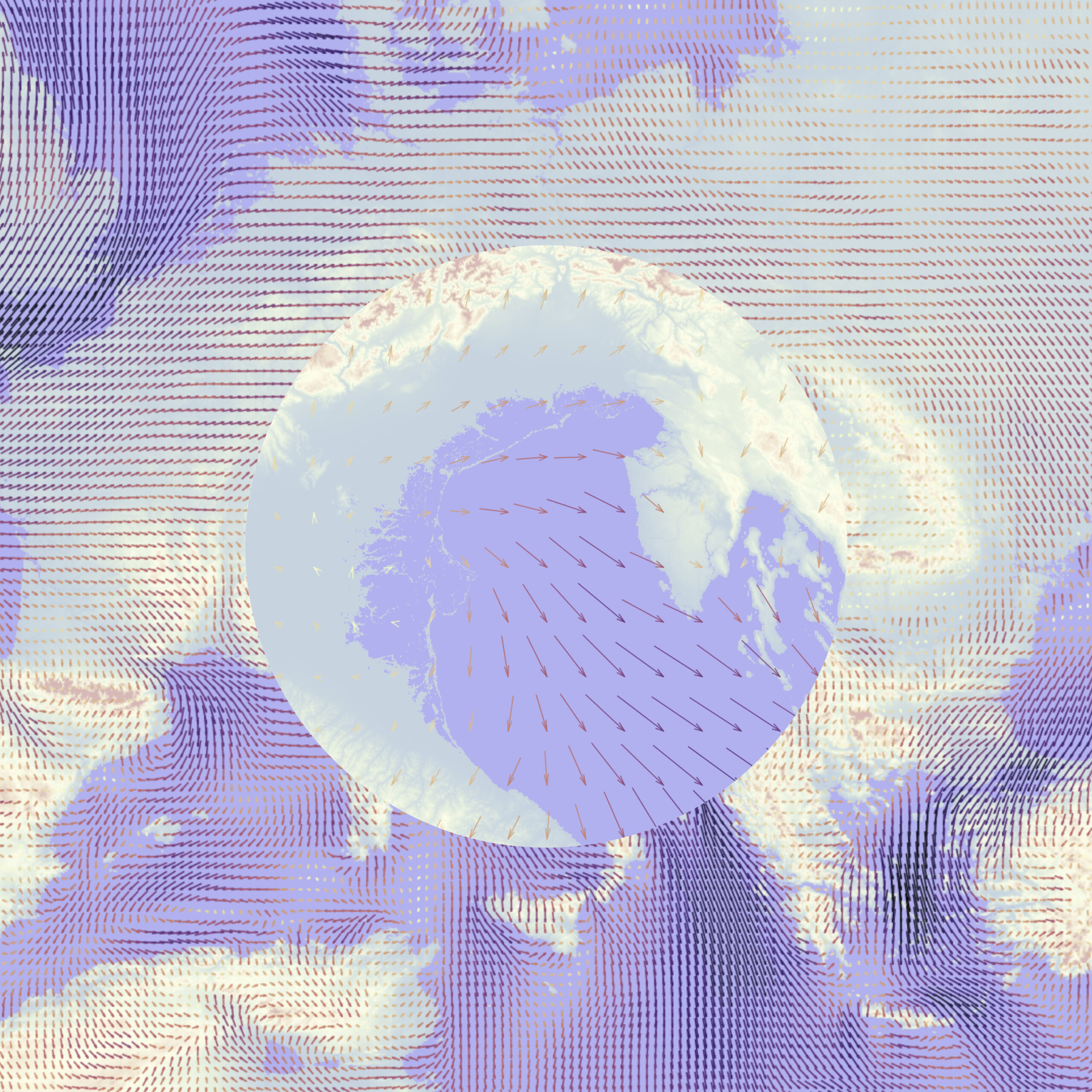
Wind and Current Visualization
Point-based vector fields, such as wind or ocean currents, can be effectively visualized by converting points into oriented arrows. Each arrow’s geometry can respond dynamically to the speed and direction values from the dataset, providing an intuitive representation of flow patterns. Using ERA data, the arrow length is scaled by the wind or current speed, and the orientation is derived from the direction field.
Here’s an example QGIS Geometry Generator expression for creating arrows from ERA dataset:
— Main vector line
with_variable(
‘main’,
make_line(
$geometry,
project(
$geometry,
0.05 * “speed”, — scales arrow length by speed
“direction” * pi()/180 — converts degrees to radians
)
),
— Arrowhead at the tip
collect_geometries(
@main,
make_line(
end_point(@main),
project(
end_point(@main),
0.01, — short length for narrow tip
“direction” * pi()/180 + pi()/12 — left wing
)
),
make_line(
end_point(@main),
project(
end_point(@main),
0.01,
“direction” * pi()/180 – pi()/12 — right wing
)
)
)
)
Procedural Cartography Inside QGIS
Taken together, these examples point to a broader practice that is emerging inside QGIS: procedural cartography. Expressions are used to generate dot densities, sketch-style strokes, irregular buffers, noise-based textures, and data-driven ornamentation. The ideas borrow from computer graphics and scientific visualization, but remain accessible to everyday GIS users.
No external scripting environment is required. Everything happens inside the styling and geometry tools that users already know.
The key idea for a geospatial audience is that the QGIS Expression language turns GIS layers into parametric objects. Geometry is no longer a fixed result stored on disk. Instead, you describe how geometry should behave in response to data. The underlying capability, however, is already available to any QGIS user willing to think a bit more like a cartographer and a bit more like a programmer.
Did you like this post? Follow us on our social media channels!
Read more and subscribe to our monthly newsletter!


#GeoDev

Next article
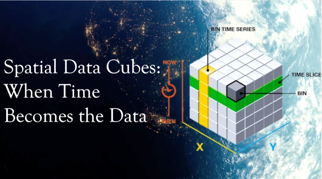
Spatial Data Cubes: When Time Becomes the Data
Anyone working with geospatial or satellite data today faces a clear mismatch. High-resolution Earth observation data is more available than ever, but the infrastructure to work with it has not kept pace. Analysts routinely spend large amounts of time downloading imagery, correcting for atmospheric effects, masking clouds, and aligning pixels before any meaningful analysis can begin. While automation, batch processing, and data access APIs can reduce some of this effort, much of the preparation overhead remains a fundamental bottleneck in Earth observation.
The problem is structural. Most geospatial workflows still treat satellite images as independent files, even though they represent repeated observations of the same locations over time. Spatial Data Cubes (SDCs) offer a structural way out of this problem, shifting geospatial work from a file-centric view of maps as layers to a query-centric view of data as a continuum. This article explains what SDCs are, why they exist, and how they make working with large geospatial datasets more practical.
What Is a Spatial Data Cube?
A spatial data cube is a way to organize geospatial data so space and time are handled together, rather than as separate files.
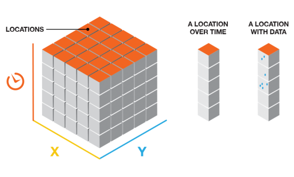
In most GIS workflows, satellite images are treated as independent layers. One image per date – one layer per time step. A spatial data cube takes a different approach. It organizes all observations of the same area into a single multidimensional structure, where coordinates (latitude and longitude or X and Y), and time are treated as equally important dimensions. Instead of working with snapshots, you work with a continuous block of data.
Source: ArcGIS
Conceptually, a spatial data cube extends a traditional map by adding time as a core dimension, often alongside additional variables such as spectral bands, temperature, or precipitation. This makes it possible to analyze how places change, not just how they look at a single moment.
At the architectural level, a spatial data cube is defined by a small number of dimensions:
| Dimension | Identifier | Analytical function |
| X | Horizontal spatial axis (Easting) | Defines spatial position and extent in the X direction |
| Y | Vertical spatial axis (Northing) | Defines spatial position and extent in the Y direction |
| Z / T | Time | Enables change detection and trend analysis |
| B | Bands | Distinguishes physical properties (e.g. NDVI, moisture) |
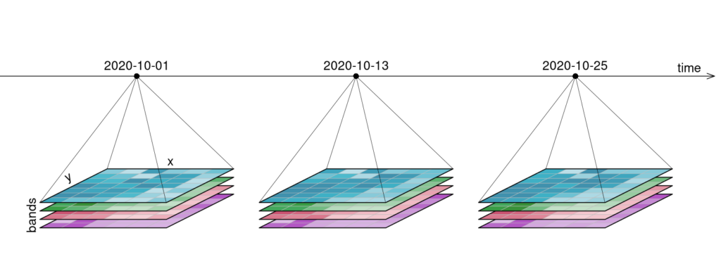
Example of a four-dimensional raster data cube with two spatial axes (X, Y), a temporal dimension (time), and a variable dimension (bands). Source: OpenEO
Similarly, a geospatial data cube organizes data into voxels (volumetric pixels), where each voxel contains a value for a specific point in space and time. This allows for slicing the data in any direction. A horizontal slice through the time dimension provides a standard map of a specific timestep, while a vertical slice through a coordinate provides a time-series graph.
When Time Becomes the Data
Geospatial data became difficult to manage because modern satellites generate observations faster and in greater detail than traditional GIS workflows were designed for.
First, there is velocity. Missions like Sentinel-2 revisit the same location roughly every five days, producing hundreds of observations for the same place over just a few years. Time quickly becomes a dominant part of the dataset rather than a secondary attribute.
Second, there is spectral complexity. Sentinel-2 captures 13 spectral bands at different spatial resolutions, covering visible, near-infrared, red-edge, and shortwave infrared wavelengths. Each observation is no longer a single image, but a stack of variables describing different physical properties.
Third, there is radiometric precision. Modern sensors such as Sentinel-2 use 12-bit radiometry, recording 4,096 intensity levels per band. This improves scientific quality, but significantly increases data volume and processing requirements compared to older 8-bit imagery.
How Spatial Data Cubes Change Analysis
SDCs simplify analysis by changing how geospatial data is structured and accessed. Instead of working with individual files and sensor-specific formats, cubes organize data into a unified grid where space and time can be queried directly. This shifts attention from data preparation to analysis.
One major benefit is working across time. In traditional workflows, calculating long-term averages or detecting anomalies requires loading and processing many separate files. In a SDC, time is just another dimension. Operations such as computing a mean, median, or trend can be applied directly across the temporal axis, which is essential for climate and environmental analysis.
Cubes also make regional comparison straightforward. An urban heat or vegetation analysis developed for Munich can be applied to Paris or Tokyo with minimal changes, since the data is already harmonized on a standardized grid. This reuse is a direct result of multidimensional analysis built into the data structure.
Another key element is analysis-ready data. SDCs are typically built from data that has already undergone geometric and radiometric correction, atmospheric normalization, and cloud masking. This removes repeated preprocessing steps and lowers the barrier to analysis.
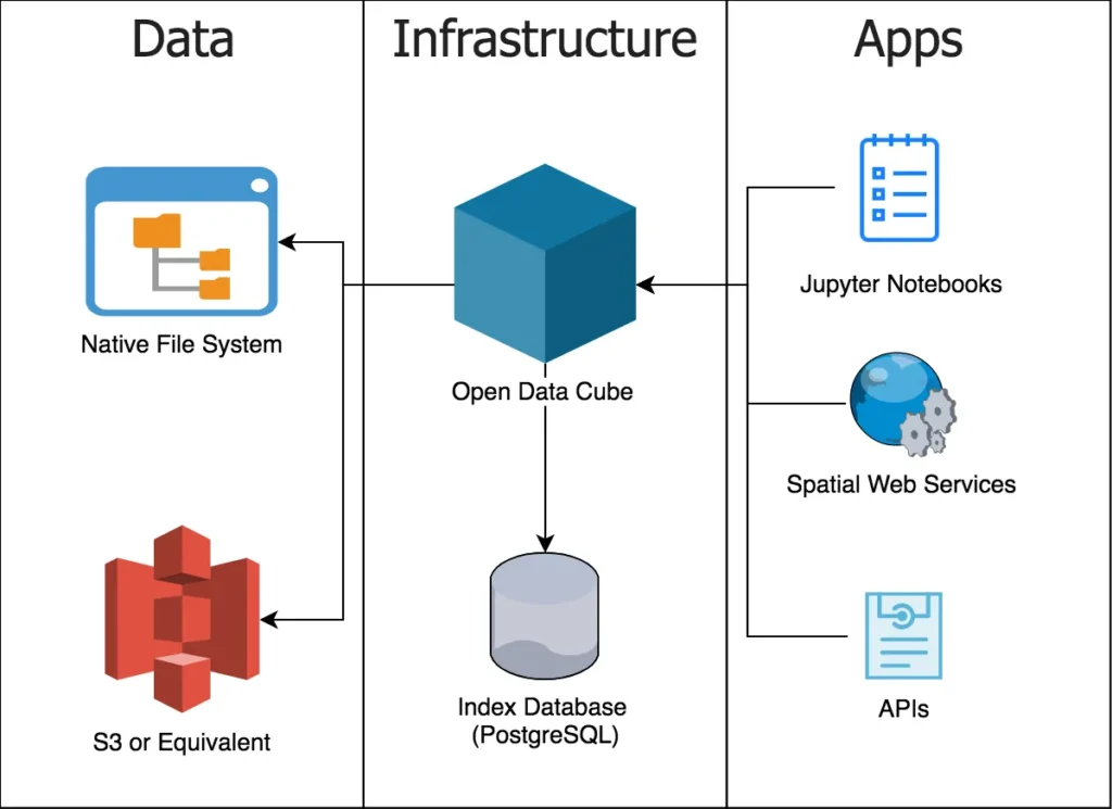
At an architectural level, SDCs move away from file-based GIS. Instead of storing rasters as individual GeoTIFFs, cubes use multidimensional array formats such as NetCDF, HDF5, or Zarr. These formats are cloud-native and support lazy loading, where only the pixels needed for a computation are read from storage instead of downloading entire images.
Traditional GIS vs Spatial Data Cubes:
| Aspect | Traditional GIS workflow | SDC workflow |
| Data structure | Files, layers, tables | Multidimensional arrays |
| Storage formats | GeoTIFF, shapefiles | NetCDF, HDF5, Zarr |
| Time handling | Separate snapshots | Integrated core dimension |
| Data readiness | Manual preprocessing | Analysis-ready data |
| Processing model | Local, hardware-limited | Cloud-native, lazy loading |
| Typical analysis | Single maps | Multidimensional analysis |
The outcome is not just faster processing, but a shift in perspective. Analysts stop working with images and layers and start working with observations and patterns across space and time.
Where SDCs Are Used Today
SDCs are already widely used wherever long-term, large-scale environmental monitoring is required.
At the platform level, national and continental systems provide satellite archives as analysis-ready data cubes. Digital Earth Australia and Digital Earth Africa, using Open Data Cube, offer decades of Landsat data for applications such as agriculture, water monitoring, and drought analysis. In Europe, the Swiss Data Cube supports government monitoring of land use, ecosystems, and biodiversity. Global platforms like Google Earth Engine and the Microsoft Planetary Computer apply the same cube-based principles to planetary-scale datasets.
Cubes are mostly used to climate and environmental analysis. They are used to track long-term processes such as glacier retreat, deforestation, and temperature anomalies, helping identify regions where change is accelerating and informing climate assessments and adaptation strategies.
In cities and during disasters, cubes enable rapid change detection. Urban planners use them to monitor land cover, heat, and vegetation over time, while emergency responders compare pre-event and post-event conditions to map flood extents or damage within hours instead of days.
Across all these cases, SDCs matter because they turn growing satellite archives into structured, queryable datasets that support continuous monitoring and timely decisions.
A Practical Example: An Annual Vegetation Trend
To see how the SDC helps in practice, let’s consider a simple question:
Has the vegetation in Munich changed over the years 2020-2024?
The goal is not to analyze a single satellite image, but to compare many years in a consistent way. With a cube-based workflow, we can treat time as something we query and summarize.
The example below uses Python with the Google Earth Engine Python API to work with Sentinel-2 surface reflectance data. It calculates the mean peak summer NDVI for Munich for each year between 2020 and 2024.
To run it, you need a Google Earth Engine account and a local Python environment with the earthengine-api and matplotlib packages installed. After authenticating once, the script can be executed like any basic Python file or notebook cell. The computation itself runs on Google’s servers, not on your local machine.
The code:
Output
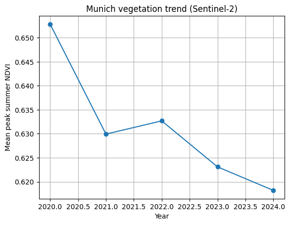
The important part is not the NDVI formula or the plotting code. It’s the workflow. The same structure handles five years of satellite data without looping over files or manually preparing inputs. This is the strength of SDCs. They let you focus on change over time, instead of on data management.
From Cubes to GeoAI
SDCs are not the end of the workflow. They provide the data structure that makes modern GeoAI workflows possible at scale.
Machine learning models require training data that is consistent across space and time. Without spatial data cubes, satellite archives are fragmented into files with different projections, timestamps, and preprocessing steps. Cubes solve this by presenting long, aligned time series for the same locations, which allows models to learn from temporal behavior rather than isolated images.
Cubes also work well with newer ideas like geospatial embeddings. Instead of treating locations as coordinates, embeddings represent places as vectors that capture how they behave over time. When the data is already organized as a cube, learning these representations becomes much easier and more reliable.
This is also why cubes matter for large-scale models. Foundation models for Earth observation are trained on years of satellite data covering the entire planet. Without a cube-like structure underneath, handling that volume and complexity would not be realistic.
Limitations and Why Spatial Data Cubes Still Matter
SDCs are powerful, but they are not a universal solution.
They come with a learning curve. Cube-based workflows often require scripting and data analysis skills, which can be a shift for users accustomed to desktop GIS tools. Most large cubes also depend on cloud infrastructure, raising questions around cost, vendor lock-in, and data sovereignty. And for small or one-off mapping tasks, traditional GIS tools are often still the better choice.
Despite these trade-offs, SDCs represent a shift in how geospatial data is handled. Earth observation systems now collect data faster than file-based workflows can manage. By organizing observations into multidimensional structures, cubes remove much of the preprocessing overhead and make long-term analysis practical.
As shown by examples like multi-year vegetation monitoring, cubes allow complex questions to be answered with relatively little effort. Looking ahead, they form the backbone of modern GeoAI systems that aim not only to observe the Earth, but to detect change and support timely decisions.
Further Resources
- https://www.ogc.org/initiatives/gdc/
- https://www.youtube.com/watch?v=OG_6ZaHJgC4
- https://r-spatial.org/book/06-Cubes.html
- https://www.un-spider.org/links-and-resources/daotm-data-cubes
Did you like this post? Follow us on our social media channels!
Read more and subscribe to our monthly newsletter!

