#Featured #Ideas

What overlaid running paths can say about the city?

Recently I read this cool post on FlowingData blog where the author downloaded openly available running tracks of users of RunKeeper app and overlaid them for different cities. It looks simply beautiful. Geographic data showing human activity is all you need to create a piece of art. But than I started think what can this data say about particular urban area of a city?

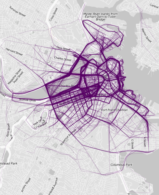
Boston

Boston

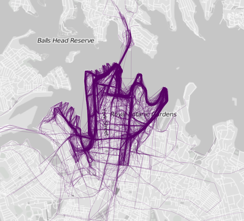
Why people from particular area workout more than their neighbors? Why people choose for running one part of the city over other? What can we say about the city based on running paths of its citizens? Of course we can just assume that the probe of tracks used, represents the whole running community of each city, which we don’t really know. But take a look at map of Boston above. Isn’t it strange that runners choose the city centre over the bank of the Muddy River? I don’t really know Boston but looking at just looking at street view it seems like a perfect place for jogging. Now look at Sydney below. It seems that all paths from the whole city meet in one or two jogging paths. This seems like an example of a perfectly planned jogging track with a proper infrastructure.

Sydney

Sydney

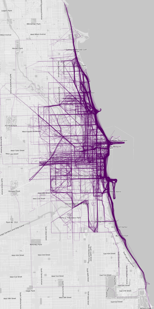
Chicago on the other hand has a quite important bay jogging path but it seems to be less dominant other the city (compared to  Sydney). Running paths seem to be equality distributed over the city which suggests that this part of Chicago is walking and jogging friendly. Some longer straight paths in the direction of the of map centre indicate that people use metro to reach running friendly zones, so there must be some kind of an infrastructure which attracts them.

Chicago1

Chicago

 These are just assumptions made about cities which I have never visited but it’s cool what could be done with more data and local knowledge. Such an openly available social data sets could (or maybe even ‘should’) be used by urban planners. It’s a great source of information about the city and it’s citizens. And it’s so beautiful that you could look at it forever;).

source: FlowingData

Say thanks for this article (0)
The community is supported by:
Become a sponsor
#Featured
#Business #Featured #GeoDev
Geo Addressing Decoded, Part 3: Diving into the Key Features of Precisely’s Geo Addressing System
Aleks Buczkowski 06.29.2024
AWESOME 4
#Business #Featured
How 15 Centimeter Satellite Imagery is Changing the Mapping Game
Aleks Buczkowski 12.2.2024
AWESOME 5
#Business #Featured #GeoDev
Geo Addressing Decoded, Part 4: Exploring the Applications of Geo Addressing Solutions
Aleks Buczkowski 06.25.2024
AWESOME 2
Next article
#Featured #Ideas

How metro maps distort topography?

I love metro maps. I guess it’s due to the fact that they touch the essence of cartography – to show spatial phenomena in the most informative way. They are not about reference systems and projections but rather mental associations around relations in space. Every city has some kind of distinctive topographic element which dominates the geographic urban space. Typically it’s a spatial relation to a main river (or other water bodies), but it could be something else e.g. a park (take a look at Valencia in Spain). This dominant element creates a relative reference system of the city. In Warsaw, Poland – my home town – many street signs have a little icon which indicates if the street is parallel or perpendicular to the Vistula river. Also building numbers grow in the opposite direction from the river.

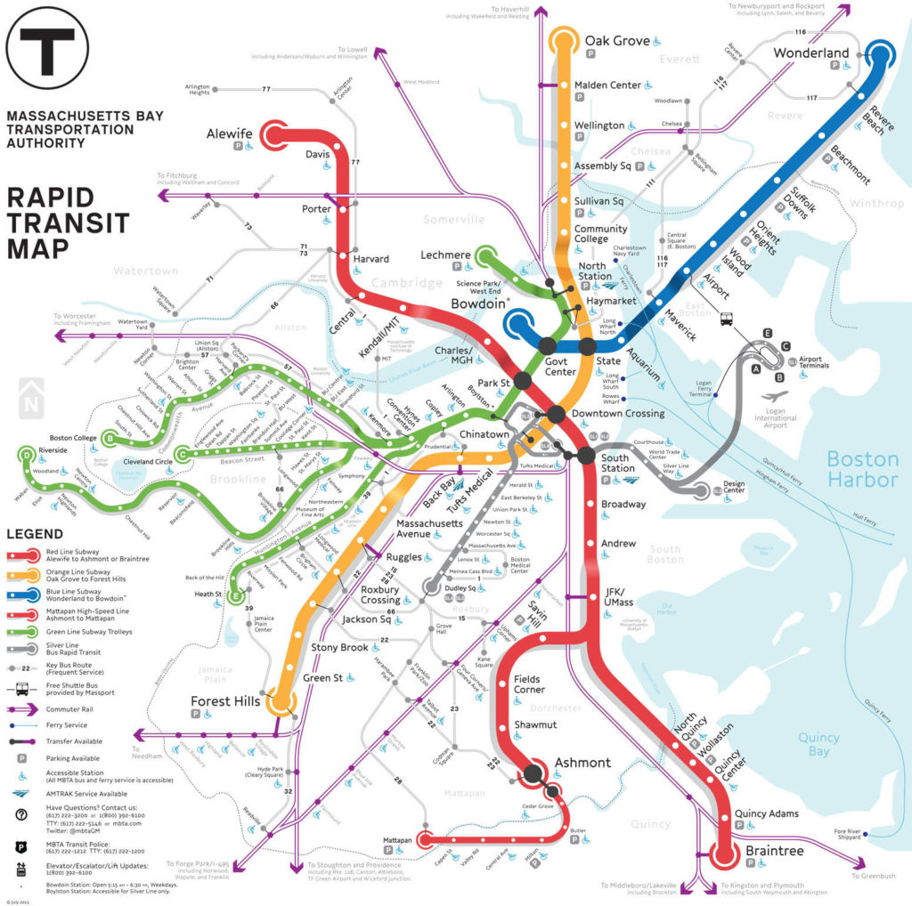
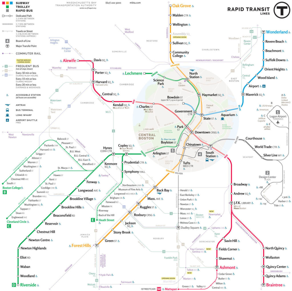
This shows that such an informal reference exists even in the formal world, but what’s more important mental reference systems allow for topographic distortions, where the most important thing is to keep the correct relation to the river. Creating the best topographic model of the reality, typical for most of the maps we know is not that important. Good example is the Massachusetts Bay Transportation System Map Contest 2013. There are several maps which shows the same phenomena in a totally different way. In all examples below the designer’s attitude towards topography is totally different. Have a look:

Geoawesomeness - Survey Map 1

"New Perspectives" T Map Challenge - Classic Tier Submission by Map_D20


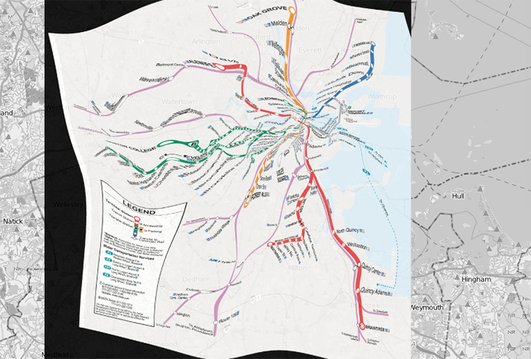
Playing with distortions of geographic space is fascinating but sometimes designers tend to over do it. Now look at currently used in Boston’s MTBA metro map but adjusted to real topography of Boston.

Geoawesomeness - MTBA

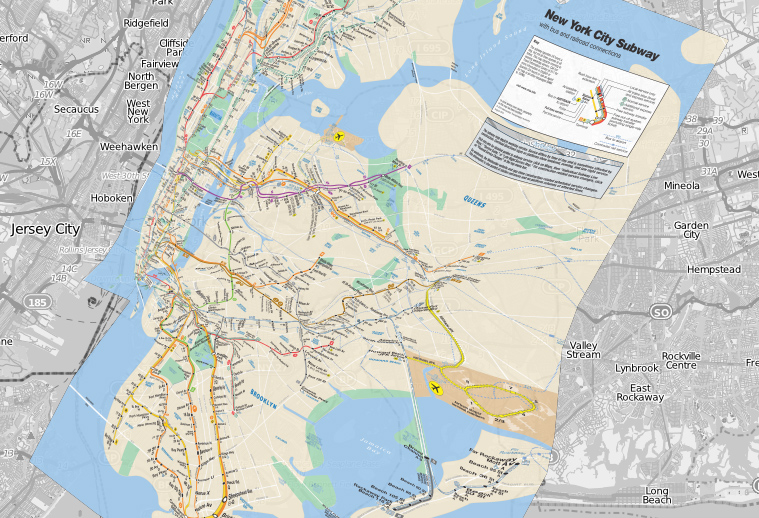
Looks amazing, isn’t it? This is the project created by Benjamin Schmidt, an assistant professor of history at Boston’s Northeastern University. Schmidt overlaid Open Street Map with metro map and added a functionality to play with transparency. It is interesting that regular city grid of New York pushes designers to use much less distortions than in Boston or Washington. Really cool project!!!

3025900-inline-i-2-mta


Read on
Search