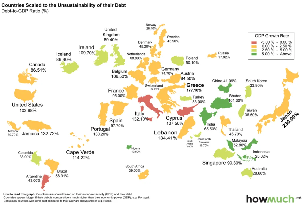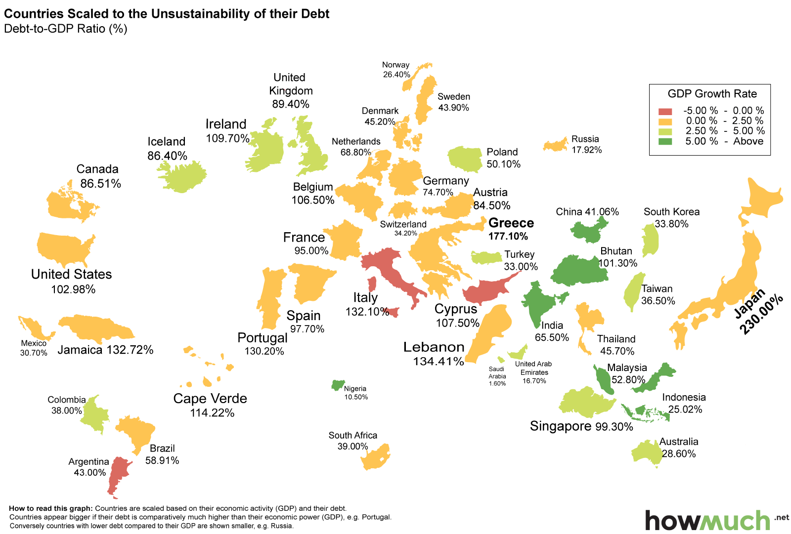
Map that shows debts of countries around the world
HowMuch recently published an interesting map showing the debt-to-GDP ratio to key economies around the world. The ratio is calculated by taking a country’s total debt and dividing it by gross domestic product (GDP). Then the author scaled each country based on the size of its debt compared to GDP and colored them based on their GPD growth rate.
The basic idea of a public debt is that a country with slow economic growth receives less in tax revenue and has to borrow money that accumulates as public debt. This may not be a bad thing unless the future economic wellbeing of a country is at risk. It’s well described by Vox:
But lets look at this map from a cartographical stand point. Frankly speaking it’s a mess. All countries are detached which makes it difficult to read. Moreover the map shows only selected countries which makes the readability even poorer. It is also very difficult to access if the size of a country is bigger or smaller as there is no proper reference to the world map. It is definitely difficult to visualise multiple phenomena on a single cartogram map but this not the best example.


