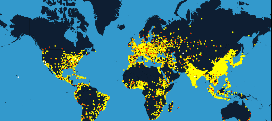
This map will take you to an amazing journey throughout 2000 years of human population
Historical maps never cease to amaze me. The only problem I have with them is that they are mostly static or they are focusing on a single event without showing the full context.
Team from populationeducation.org felt the same way, and they came up with nice project, which meets expectations of many GeoGeeks like you and me. The website called “World Population History” is an interactive map that lets you explore 2000 years of our planet’s population density on the top of other data. Data gathered for this project comes from hundreds of sources that includes, books, articles and online databases. Furthermore, the map show forecasts of for the further population growth in the next 100 years, which is really awesome. The idea for the project came from a popular teaching resource video “dots on a map”, representing population changing through time.
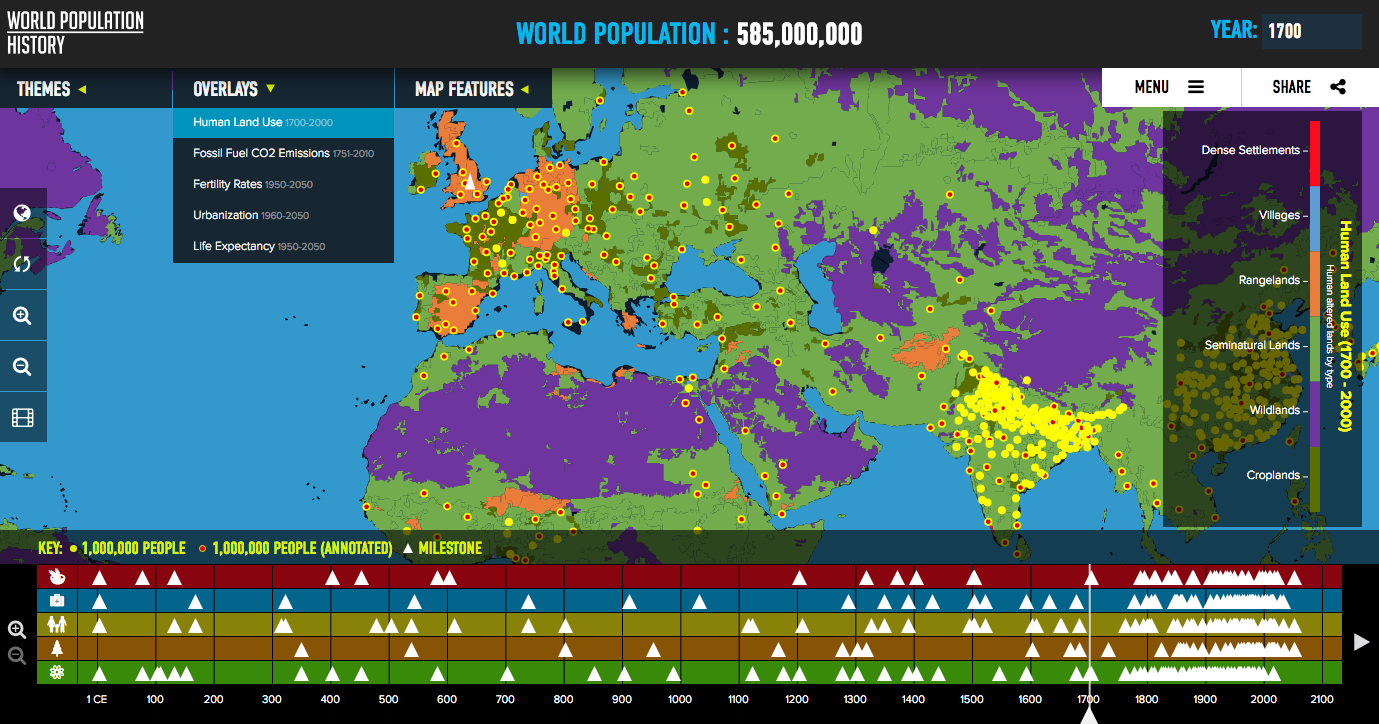
The interactive map presents the human population in a form of yellow or red dots – each representing 1 million people. Red ones are clickable and store additional information about the local population. (Keep in mind that in areas where people do not live in concentration zones, dots are placed in the middle of their approximate range). On the bottom of the map you will find timeline divided into five themes – Food & Agriculture, Health, People & Society, Environment, and Science & Technology with organized and described milestones, marked as white triangles. As you may suspect, almost all milestone events have a location on the map.
It’s a fantastic tool to explore the data. Simple and useful. Additionally, the map offers a set of option to customize themes, features and overlays to your needs. It offers some additional data that allows for further analysis. The data includes: Fossil Fuel CO2 Emissions, Fertility Rates, Urbanization, and Life Expectancy for the last 300 years!
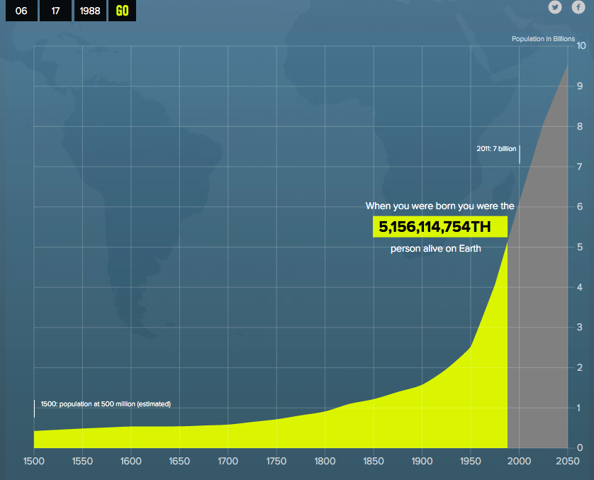
In example above I checked my area (where I was born) at year 1700 and it seems that at that time my land was mostly cultivated. But this is not the end. If you would like to know, how many people lived when you were born, sites offer one of its extra features to do so – interesting …
The authors state, the aim of the project is to provide constructive knowledge to young listeners in the field of geography and history. That is why, they prepared a set of online lessons for teachers, which can be found on this page. After exploring the site, student can participate in knowledge quiz. Awesome!
I must admit that I totally love this project. It shows data that could be perceived as a bit boring in a new, interesting way giving it spatial and temporal context. Amazing!


