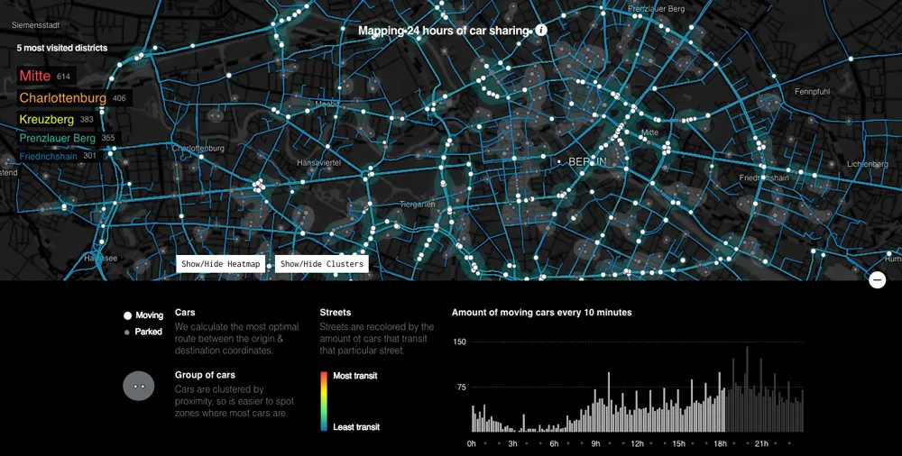


Interesting project by Data Storytelling Group. They got an access to data from German car sharing company DriveNow and created an awesome visualisation of urban mobility in Berlin. DriverNow offer this cool new short-term car renting model where you check and book the nearest car via app and you leave it off wherever you want.
The visualisation has been made based on origin-destination matrix provided by DriveNow. Based on the location and time of the beginning and end of each journey guys from Data Storytelling Group estimated the optimal routes between these two points for each car.
When you start the launch the visualisation it starts from the midnight and goes through 24h of a typical day in Berlin. The timeline on the bottom of the screen shows the time and the number of moving cars every 10 minutes. You can use it also a navigation bar to move forward to a particular moment in time. You can also turn on a heat map feature which will show you how streets are changing colour as the day progresses.
The map differentiates cars which are driving and which are parked. It also shows the top most visit districts on Berlin.
Really cool visualisation.
source: Data Storytelling Group


#Featured


Next article
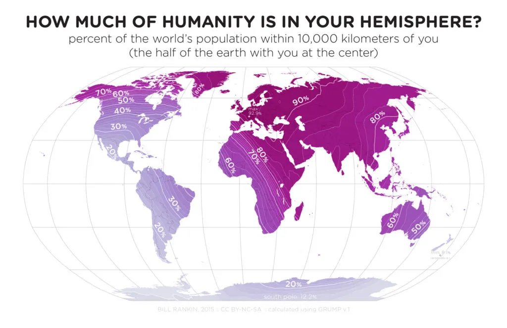
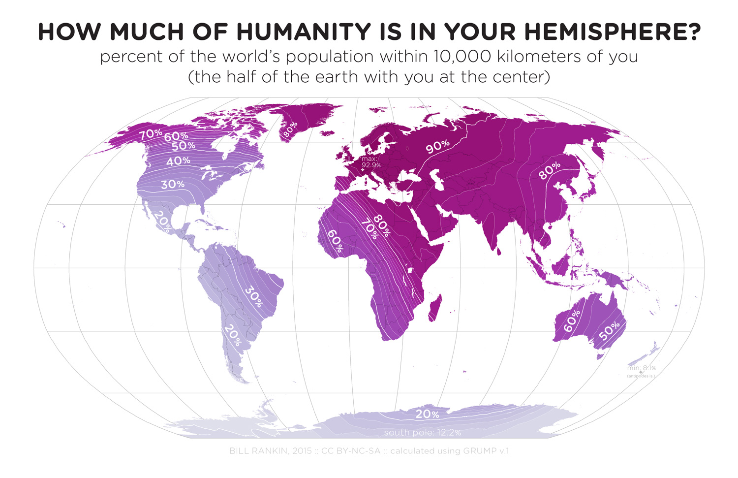
Interesting map by Bill Rankin. It shows what percentage of Earth’s population lives within 10,000 km of you. In order to compute that Bill had to calculate the percent of all humans that live on the half of the globe centered each point of the Earth.
Almost all of Eurasia is above 80 percent, and a majority of Europe is above 90 percent, with the center of the Human Hemisphere at 92.6% somewhere in western Switzerland. This map makes a lot of sense when we look at distribution of Earth’s population per latitudes and longitudes.
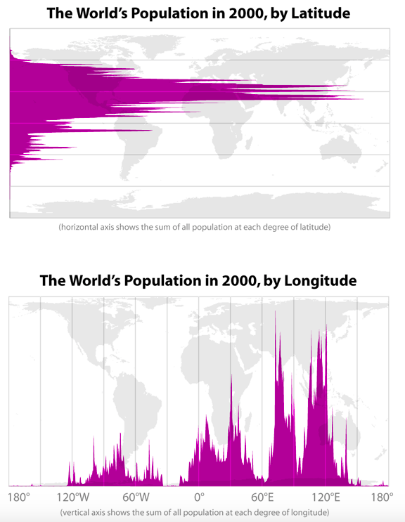
By looking at that graths we can say that roughly 88% of the world’s population lives in the northern hemisphere, and about half the world’s population lives north of 27°N. Looking at that high values in Europe make sense but it’s still striking.
source: Brilliant Maps

