It is a black day for Belgium, Europe and the whole world. A suicide attacks at Brussels airport and metro station killed at least 34 people and left hundreds wounded. As terrorists continue to strike across the globe, the terror threat starts to be one of the most significant problem of our civilization.
According to the Global Terrorism Index report published by the Institute for Economics and Peace last year, the terror threat around the world increased by 80% in 2014 reaching the highest levels ever recorded. With attacks in France, Nigeria, Turkey and today in Belgium we can say that 2015 and 2016 are no better.
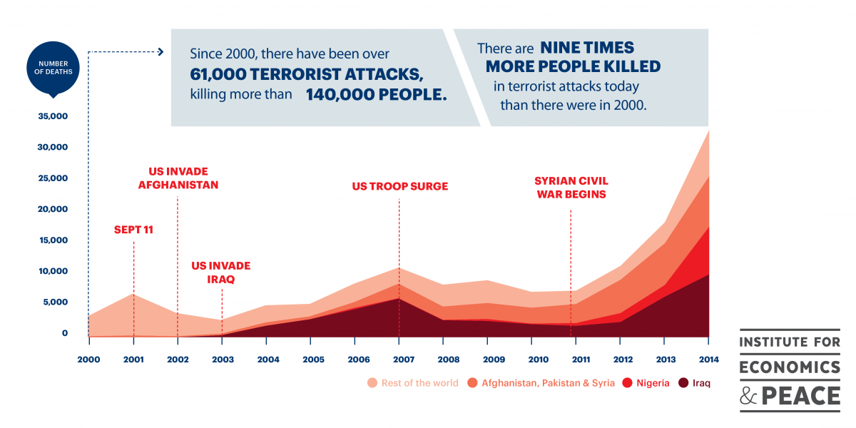
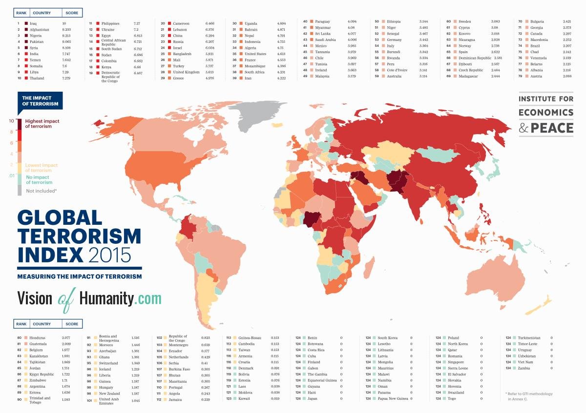
The map above shows the impact of terrorism on particular countries (with the interactive version here). The darker the color the most severe impact. The report says that the most dangerous countries are Iraq, Afghanistan, Nigeria, Pakistan and Syria but many other countries like the US, UK, Belgium and France have high or very high risk of terrorism. Even more terrifying is the graph below.

In the last 15 years over 140.000 were killed in terrorist attacks around the world (with over 32.000 in 2014). The report states that the organizations responsible for a majority of these murders (51%) are Boko Haram, which operates in Nigeria and Central Africa, and ISIS, which operates in Iraq and Syria. If we consider the fact that Boko Haram has sworn allegiance to ISIS and began operating as an extension of ISIS in Africa, in essence ISIS is responsible for most of the deaths due to terrorism in the world.
Today’s events show that the terrorism threat is not going to decrease anytime soon. Our thoughts and prayers are with the families of the victims. We live in dangerous times.
The full Global Terrorism Index report is available here.


