#Business

Map shows all possible impact zones of Hurricane Florence in real-time

The United States is right now bracing for Hurricane Florence, a category 2 storm expected to unleash catastrophic rain on the East Coast. If you have friends or family living in the region or want to see which areas will be impacted by punishing rains and winds, Esri has released an interactive tool that shows the extent of probable storm-surge.

Called Hurricane Florence Error Cone: Projected Impact, the map pulls in forecast storm positions for cyclones in the Pacific, Atlantic, and Indian basins from the National Hurricane Center and the Joint Typhoon Warning Center.

At the time of writing this post, Hurricane Florence was likely to impact 17.3 million residential places and as many as 44.4 million US citizens were in the danger zone. About 125,000 social and health organizations and 39,000 educational institutions also came under the impact area.

Currently, the impact zone looks like this:

The map also provides other helpful insights into the lives of people who would be impacted by Hurricane Florence. And these insights can prove critical for rescue agencies working in the area, allowing them to make the pertinent arrangements in advance.

For example, while the median household income of those being impacted is $52,000, of the 17.3 million houses in the danger zone, 2.2 million live in poverty. This means they will not have enough financial resources to deal with the aftermath of the storm and rebuild their lives. Further, the map reveals that 7.1 million people living in the impact zone are senior citizens, or above 65 years of age. These are the people who may require a higher level of assistance during evacuation or rescue operations.

Say thanks for this article (0)
The community is supported by:
Become a sponsor
#Business
#Business #Featured
Demystifying satellite data pricing: A comprehensive guide
Aleks Buczkowski 11.9.2023
AWESOME 7
#Business #Featured #People
How can we achieve a sustainable, safer and fairer society for all? With trusted geospatial data, says EuroGeographics
Nikita Marwaha Kraetzig 12.6.2023
AWESOME 1
#Business #Environment
Major milestone achieved towards building a green supply chain with the Supply Chain Data Partnership’s new global location register
Nikita Marwaha Kraetzig 12.8.2023
AWESOME 1
Next article
#Fun

Top 11 maps and charts that explain hurricanes

The peak of the hurricane season dates mid-September each year. Although so far it has been a quieter-than-average, the 2018 hurricane season has suddenly erupted with the three hurricanes that are forming in the Atlantic, with Hurricane Florence rapidly approaching the US East Coast.

This collection of maps and charts explains what to expect in the upcoming years regarding the formation and the impact of hurricanes.

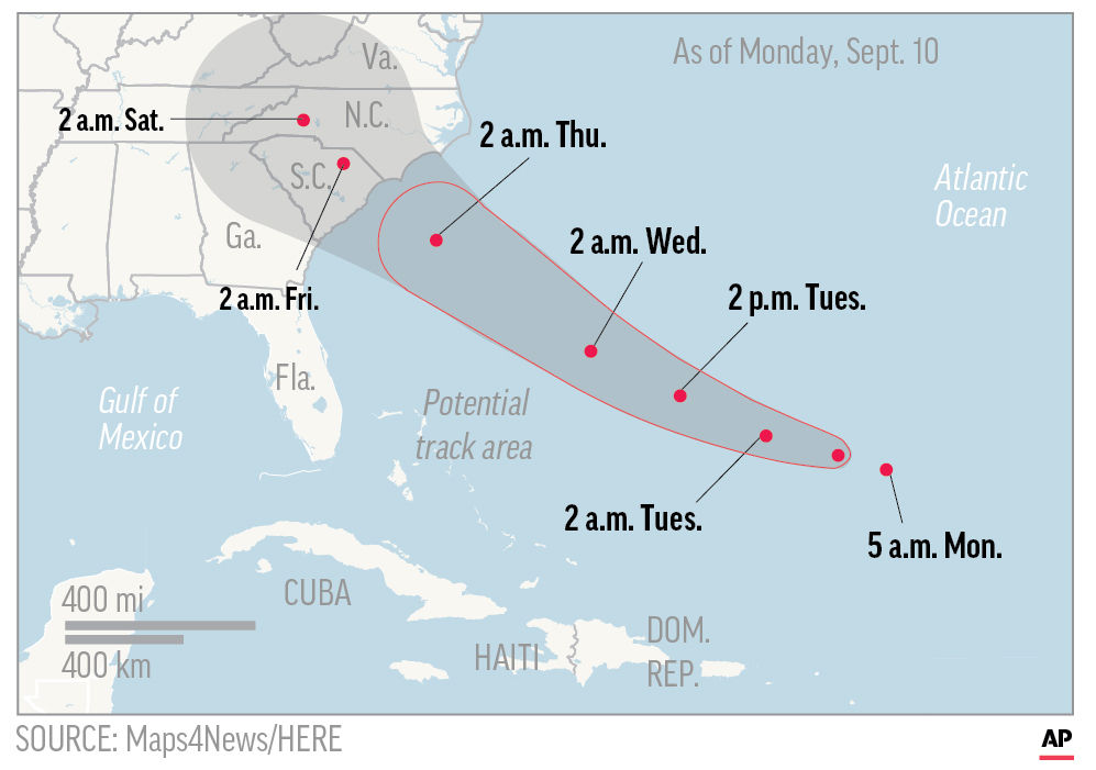
1. The expected path of Hurricane Florance

source: Maps4News

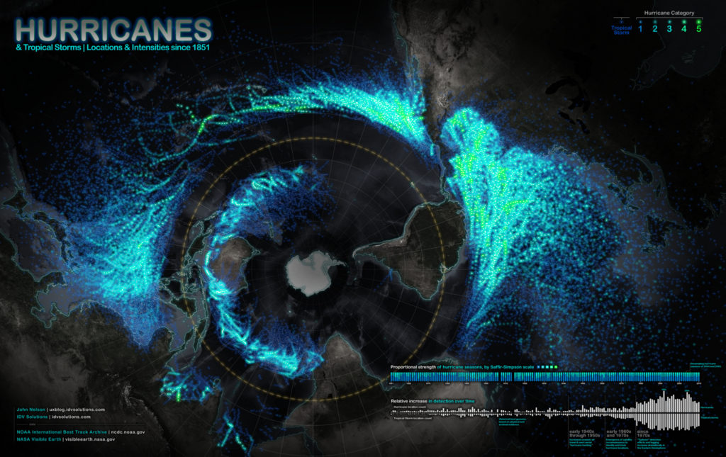
2. Map of all hurricanes and tropical storms since 1851

Source: IDV Solutions 

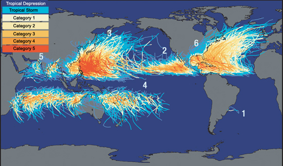
3. Where Do the Nastiest Hurricanes Emerge?

Source: Discover magazine 

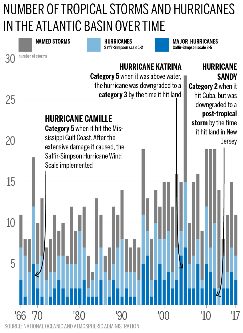
4. Number of hurricanes in the Atlantic over time

Source: Mac Leans

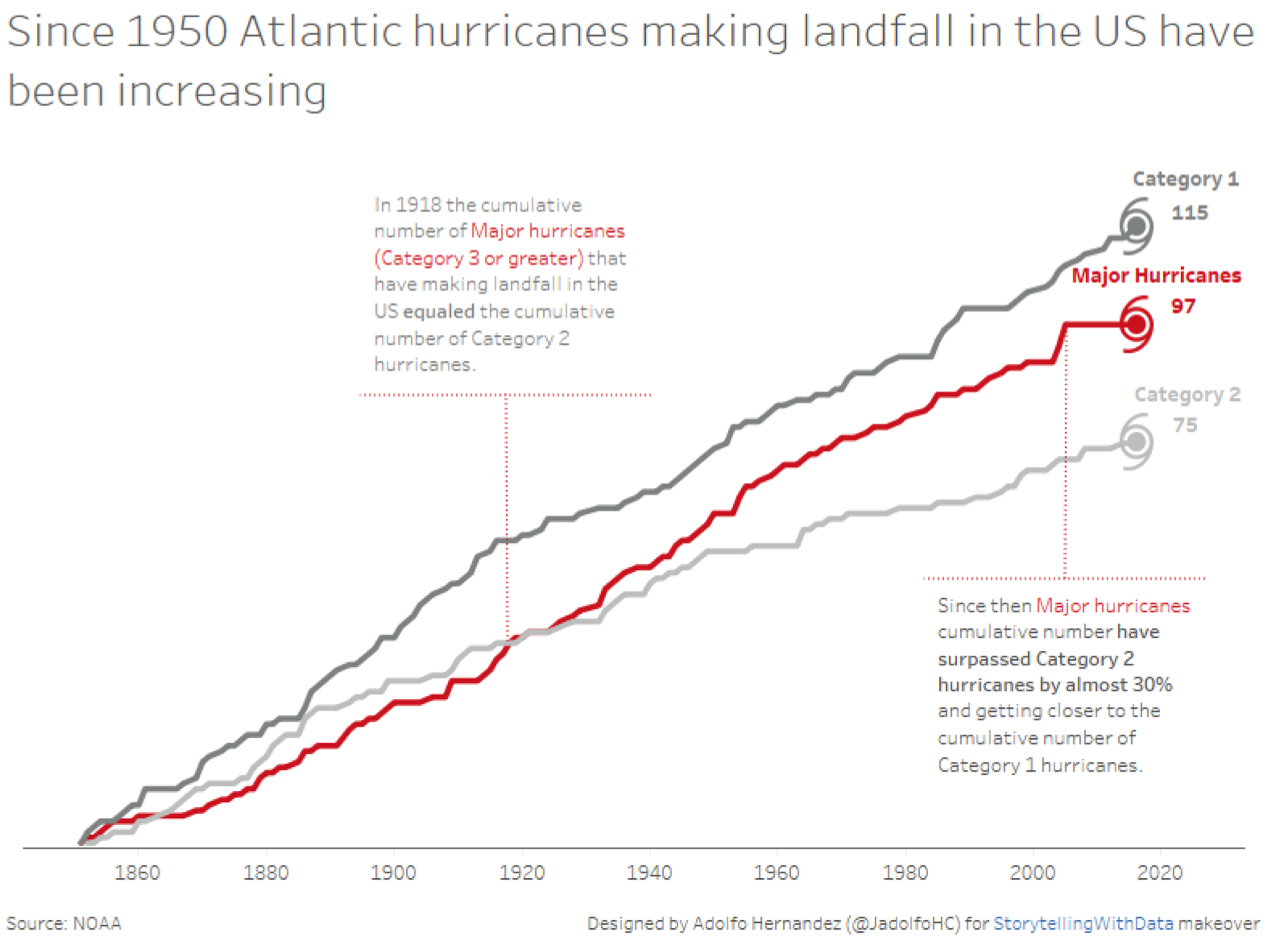
5. The number of strong hurricanes is increasing

Source: StoryTellingWithData

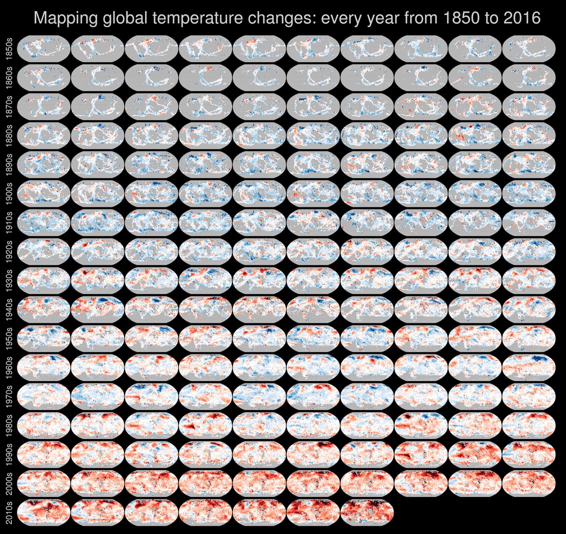
6. Global Temperature Rise

Source: Wired

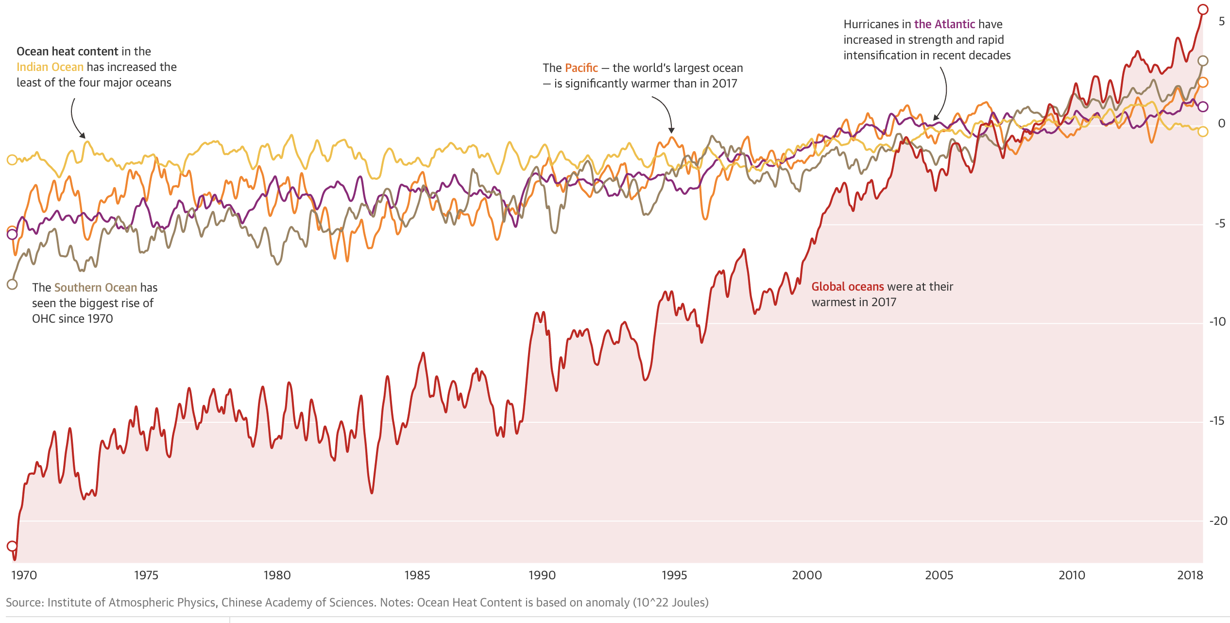
7. Ocean energy is rapidly increasing

Source: The Guardian

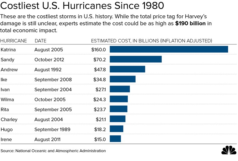
8. The cost impact of US hurricanes

Costliest hurricanes

Source: NBC

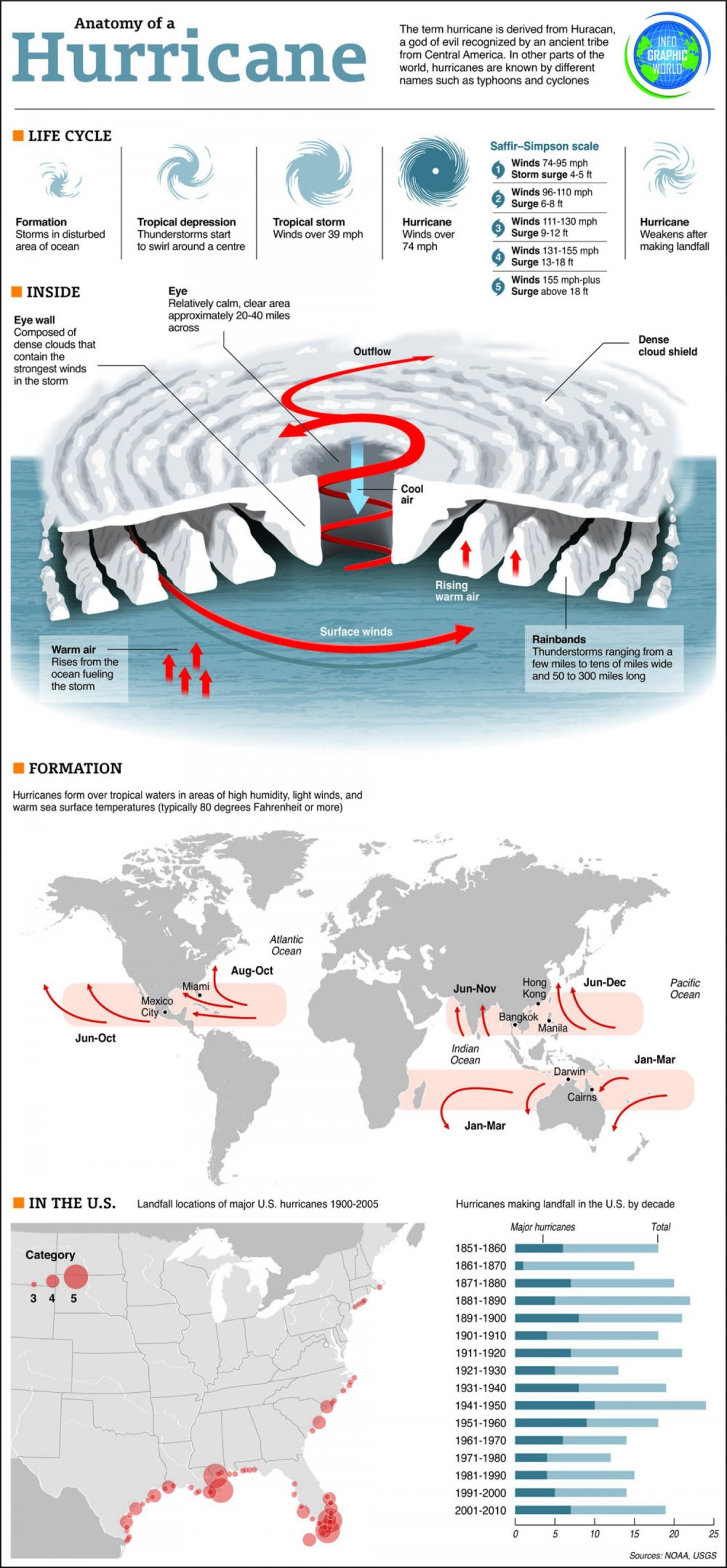
9. Anatomy of a Hurricane

Source: Visual.ly

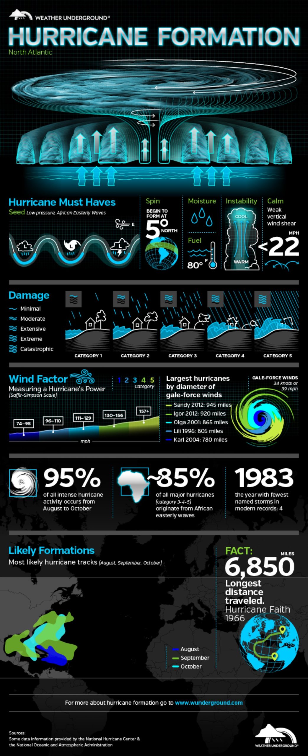
10. “Hurricane Formation” in the North Atlantic

Source: Visual.ly

11. The Deadliest U.S. Hurricanes

Source: Visual.ly

Read on
Search