Impress your Colleagues, Clients, Team Leads or a class presentation with the customised Choropleth map. Furthermore what’s interesting is that creating choropleth map in excel doesn’t require you to be a cartography expert, it is as simple as ‘drag and drop’ and in just 3 minutes.
A picture is worth a thousand words. A simple graph is a way better representation than just random numbers. With the same note, think of visualising all the country based statistical data in the form of choropleth maps, which will promote the understanding of statistical data with accurate and faster decision-making.
Step 1:
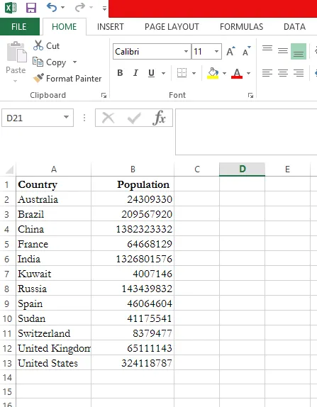
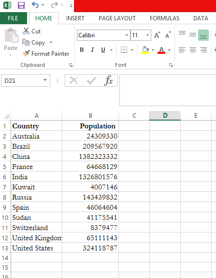
Open a New Excel and feed the necessary data. In this example, Country and its Population are the base data.
Step 2:
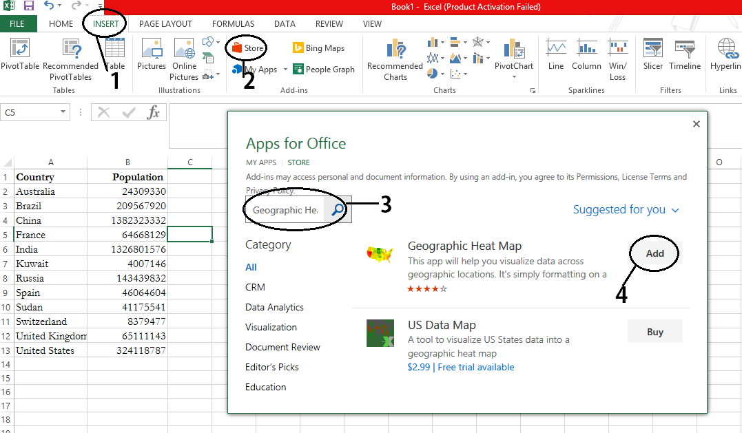
Click on the ‘Insert’ tab, where you will find ‘Store’ in ‘Add-ins’ Section as shown below. Click on the ‘Store’ icon and search for ‘Geographic Heat Map’ and click on ‘Add’.
Step 3:
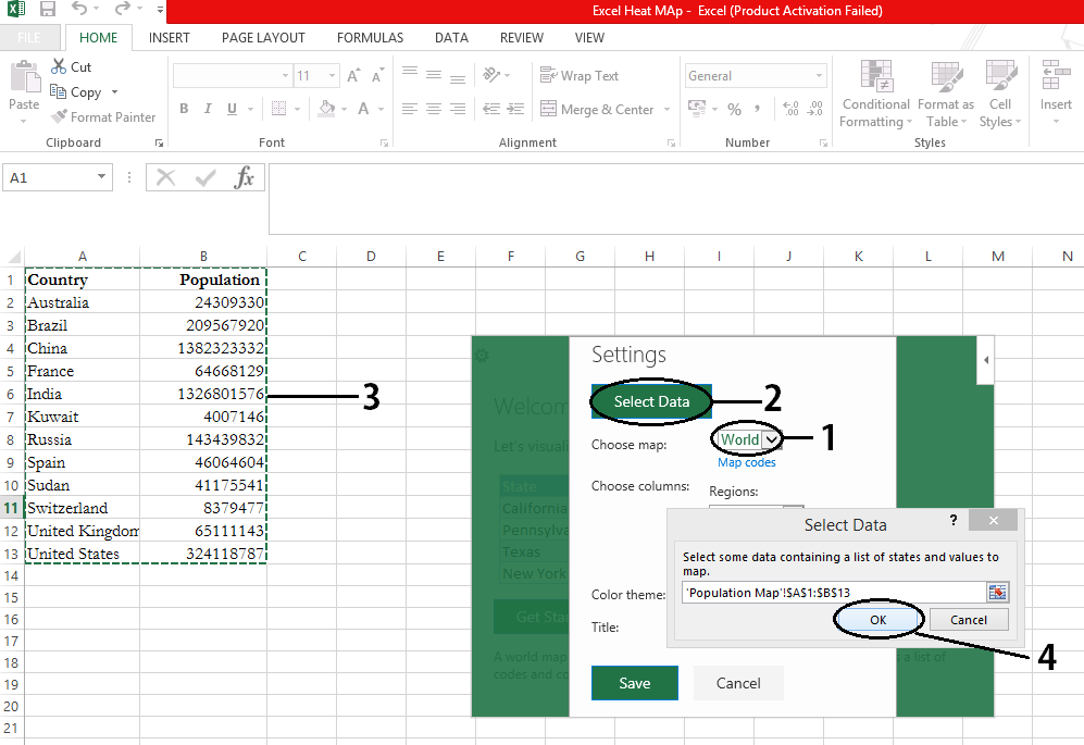
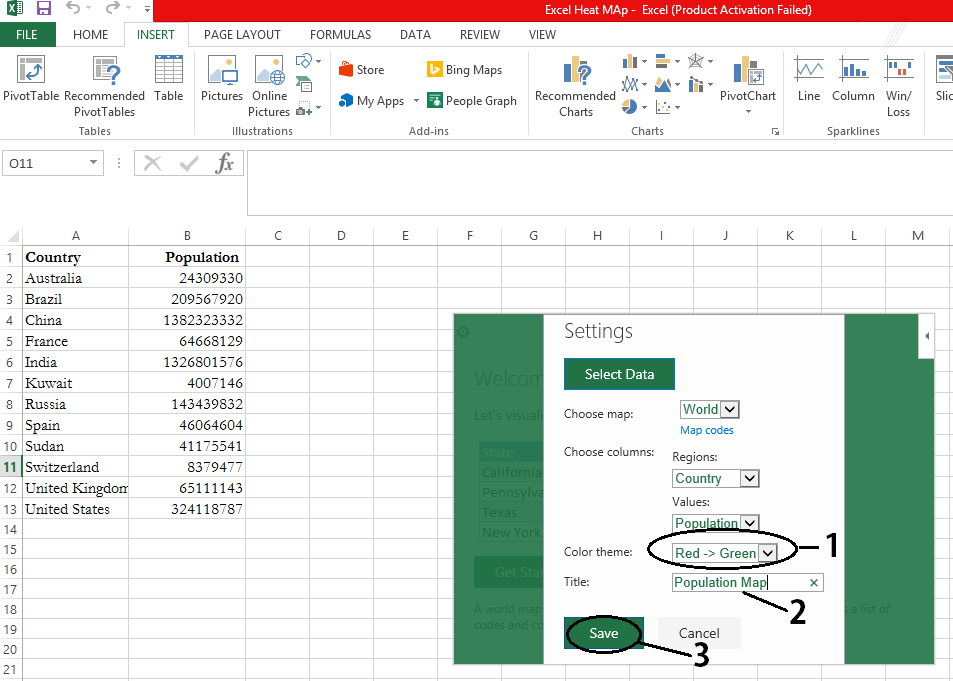
Click on ‘Get Started’ and you are good to go. After which select the appropriate map based on the data you are mapping for. For this example, it will be a ‘World’ map. Now click on ‘Select Data’ and select both the columns i.e., Country and Population.
Step 4:
The ‘Regions’ and ‘Values’ are selected automatically based on the ‘Select Data’ input. Adjust the ‘Colour Theme’ to move from ‘Green to Red’ or ‘Red to Green’. In this case, ‘Green to Red’ is the preferred colour scheme for higher population we prefer red and green for the lower. Give suitable title for the map and click on ‘Save’.
Step 5:
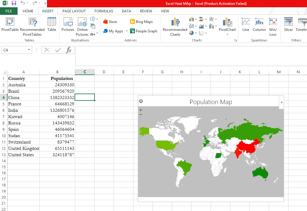
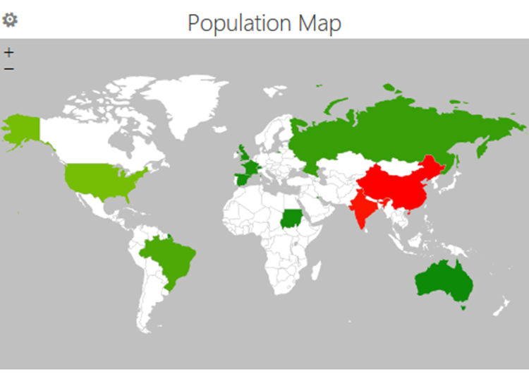
Map will be generated in the range of green to red, from lowest to highest population.
Step 6:
Now Copy and Paste the Choropleth Map in ‘Word’ and then save it as a Picture and inspire your peers every time, by your customised heat map!
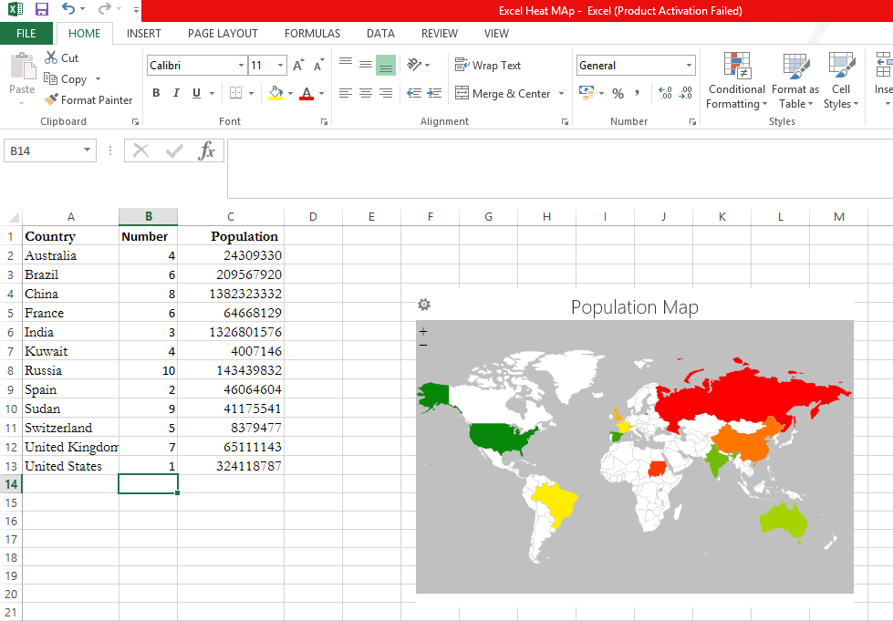
For better understanding of choropleth map, random numbers are included to visualize the colour change based on the values.
Did you like the post? Read more and subscribe to our monthly newsletter!

