How the chances of a White Christmas changed over the last 50 years?
Recently we share a map that shows the probability of your city to have a White Christmas. Guys from Rutgers Snow Lab decided to go one step further and check how have the chances for snowy Christmas changed since their childhood. They’ve used NOAA satellite images and run an analysis of how the U.S. snow extent during the week of Christmas has changed in the past 50 years.
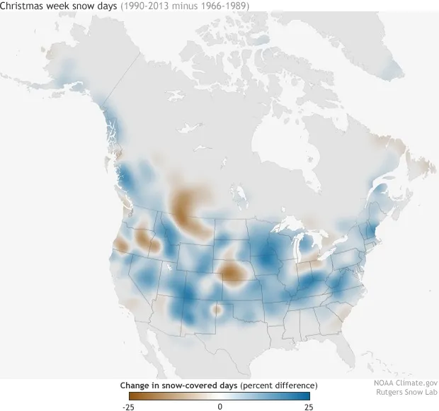
The map above shows the change in the average number of days with snow between the 1990-2013 decades and the 1966-1989 decades for the week of Christmas (the most recent two decades of the time series minus the first two). Places where the ground was snow-covered up to 25% more frequently in recent decades are colored in shades of blue, and places that were snow-covered up to 25% less frequently are colored shades of brown.
In much of the country, the number of days with holiday snow on the ground has actually grown over the past several decades. But in a few regions like the Pacific Northwest, Montana, Nebraska, Alberta, Saskatchewan, and around the lower Great Lakes—it’s become much less common to see snow during Christmas. Of course the scientists emphasise, that analysis of a single winter week isn’t especially meaningful as an indicator of long-term climate change but still it’s cool to know that chances for White Christmas in most if the U.S. are higher… how about in Europe?
source: Climate.gov


