How far could you travel 100 years ago?
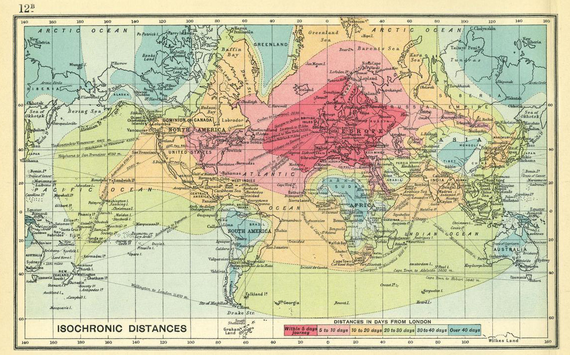
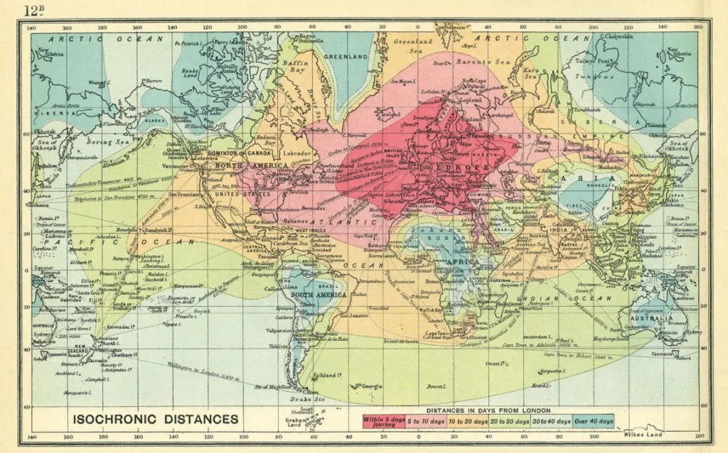
Recently I came across a really interesting map created by British cartographer John G. Bartholomew in 1914 and published as a part of “An Atlas of Economic Geography”. The map shows isochrones of travel from London to locations around the world. The isolines represent distances in days: up-to 5 day, 5-10 days, 10-20 days, 20-30 days, 30-40 days and over 40 days.
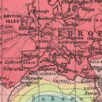 The map shows several interesting facts. First of all you could travel the whole Europe within less than 5 days. It is not surprising as before the First World War the railway in Europe has been already highly developed. You could travel from Paris to Vienna within 24h. 100 years ago it was almost the speed of light.
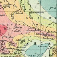 We can also observe an interesting time wrap in Siberia, where the Trans-Siberian Railway project was almost finished after it started 25 years earlier back in 1981. Interestingly if you would like to travel the remaining 120 miles (200km) from the railway to the borders of Mongolia, the journey would take you additional 20-30 days.
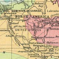 In the XIX/XX century the USA became much closer to Europe than ever before. When on the April 10th, 1912 the Titanic started its journey from Southampton it was supposed to reach New York only 6 days later. From New York you could midwest within 2-3 days and California in 6-7 days of train journey.
This map is something much more than just one of these old maps… It gives you an actual knowledge about how people used to live 100 years ago. Today within 24h you can get to almost any place on the planet. At the beginning of XX century journey from London to Australia would take you a month. The overcoming of space by the increase of travel speeds and the reduction of travel time made the world a much smaller place. The side effect of that change is globalisation that results in the expansion of the western cultural, economic, and political activities across the world…
Amazing map.

