Google Maps gets a color-coded makeover for enhanced location discovery

Google Maps has a long history of surprising and delighting its users with a steady flow of super useful updates, and the newest one is no exception. Google Maps, and all other Google products that incorporate it – Assistant, Search, Earth, and Android Auto – will ring in the New Year with a new look and improved user experience.
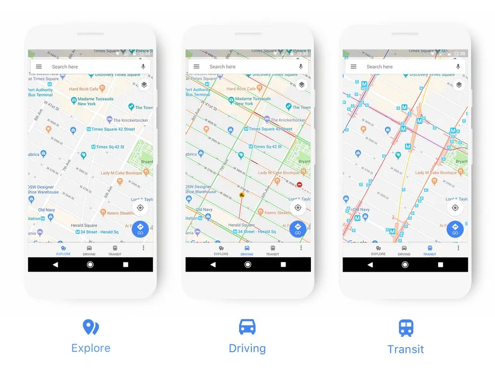
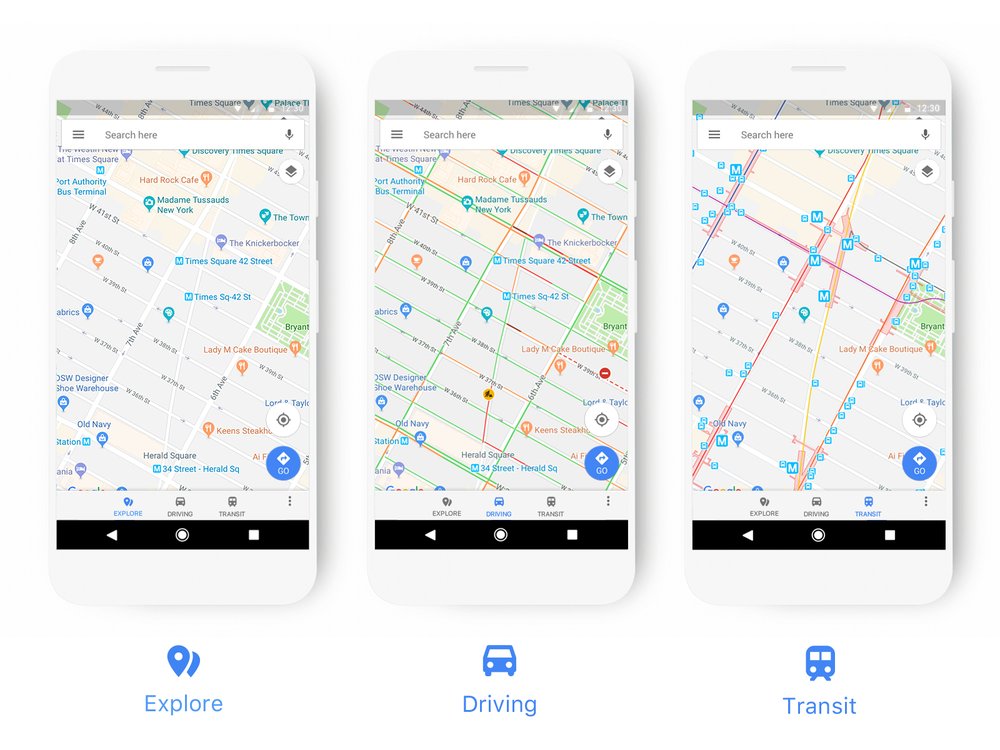
To begin with, driving, navigation, transit and explore maps have been updated so that the information which is most relevant to the user is highlighted better. For example, if you are driving, all nearest gas stations will be shown more prominently. If you use public transport, train stations and bus stops will be better reflected in the map.
Must read: How Google Maps is using machine learning to ease our parking woes
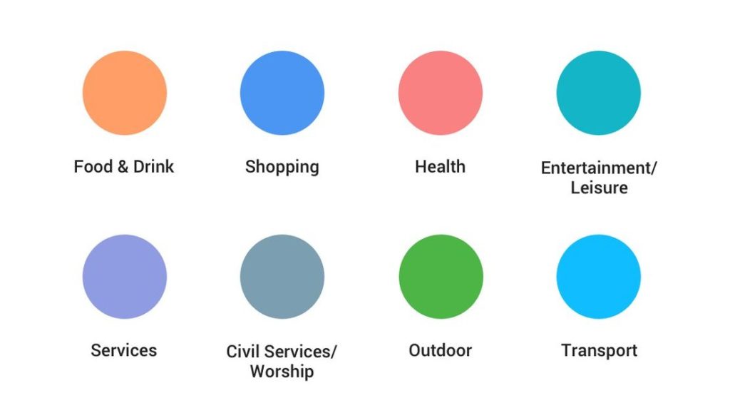
The other major upgrade comes in the form of an updated color scheme and icon menu, where similar kind of places have been clubbed under a common color and icon. So, all places that serve food and drinks will have an orange-colored icon, health facilities will be shown in red, gray icon denotes places of worship or civil services, the dark green icon is for all outdoorsy spaces, and so on. This change seems quite handy, considering earlier all points of interest used to have the same blue icon (that icon is now reserved for shopping centers in the new look).

As Google Maps and the products mentioned before receive these changes over the next few weeks, the company promises that the new upgrade will also be rolled out for the apps and websites that use Google Maps APIs in due course.
On a side note, while users seem suitably impressed with this fresh look and improved UI/UX of Google Maps, iPhone X owners are still waiting for an app update that would optimize the service for their new devices.


