
Google Maps get redesign of the blue dot showing your position
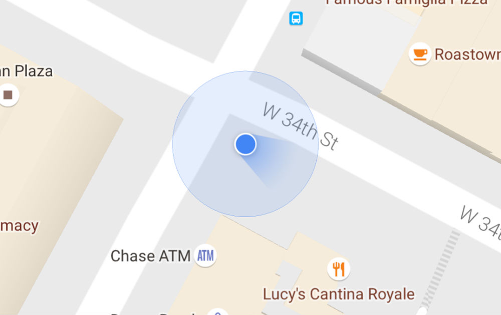 The little blue dot pinpointing my location on the map is one of the first things I remember from my first day with iPhone 3G back in 2008. It was magical. Maybe this was the moment when I became a GeoGeek.
Over the time the blue dot has evolved. It got the positioning accuracy information showed with the light blue circle in the background. The bigger the circle, the lower accuracy. With time the dot got a new flat design. Additionally Google started to show the direction you’re heading with an arrow. It works well when you were moving fast but it tend to be a little bit confusing when you were standing on the street wondering which direction to take.
This week Google Maps for Android got a cool redesign of the blue dot that takes care about this issue. The direction arrow has been replaced with a shining blue beam looking a bit like a flashlight in front of you. What’s awesome about it is that it the beam tells you how accurate your phone’s direction is at any given time.
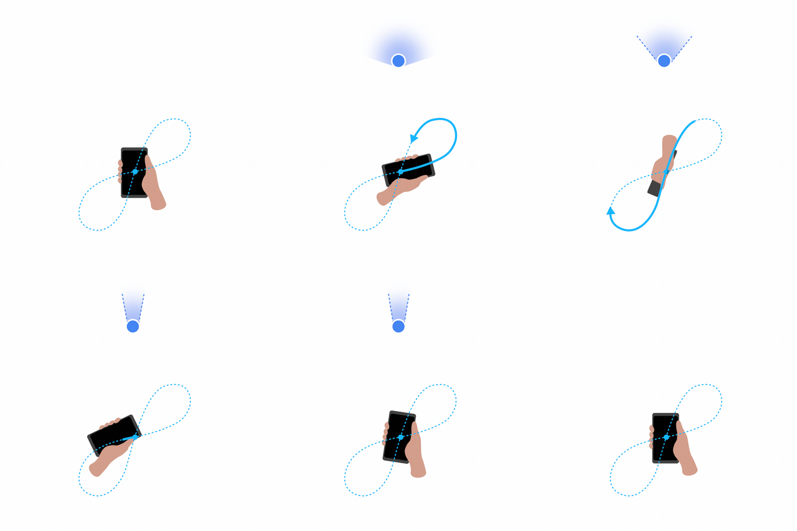
The wider the beam, the more likely it is that your phone’s compass is temporarily uncalibrated which can be caused by anything from charging your phone to walking next a streetlight. In order to improve the accuracy you have to calibrate the compass in your phone by drawing a figure 8 with your device.
Frankly speaking this new design is awesome!


