#Business #Ideas

Google Maps adding indoor plans of the Rio Olympic venues
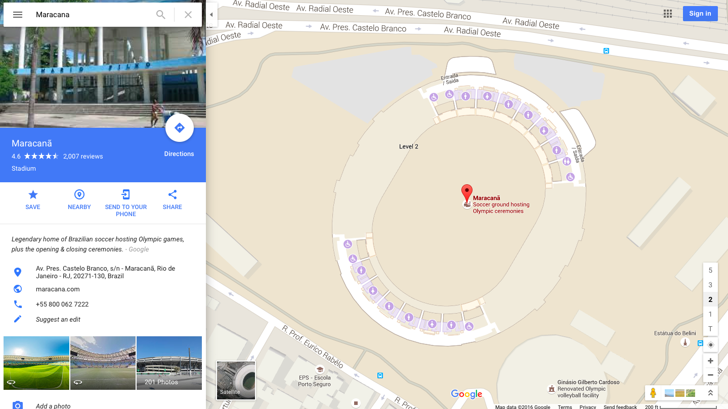
Rio Macarena Stadium Googe Maps

The biggest sporting event on the planet is coming to Rio de Janeiro in August. 10.000 athletes and over half a million travellers are excepted to visit Brasil for the 2016 Olympic Games. Finding your way between 33 olympic venues scattered around the city (and the country) will not be easy but if you’re planning to visit Rio this year Google prepared for you something really useful.

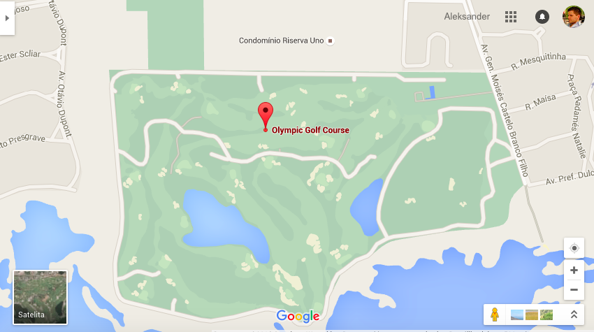
Yesterday the company published indoor maps for 25 official indoor venues and enhanced outdoor maps of 12 official outdoor venues, where you’ll find places like restrooms, concession stands, info desks and ATMs among others. A few weeks ago Google also launched real-time transit service in Rio that will help users travel around the city. Good job!

If you happen to be around Rio anytime soon let us know how it worked.
Screen Shot 2016-05-04 at 23.33.16

Say thanks for this article (0)
The community is supported by:
Become a sponsor
#Business
#Business #Featured #People
Explore the unexplored with Felt: Meet Sam Hashemi, CEO of the online platform making mapping effortless for everyone
Nikita Marwaha Kraetzig 12.7.2023
AWESOME 2
#Business #Featured #Ideas
Why Have Scientific Datasets Been So Widely Adopted in Earth Observation and What Role Does Data Quality Play?
GeoawesomeTeam 07.17.2024
AWESOME 4
#Business #Ideas
Urban Digital Twins in China: A Smart Gadget or a Decision Support Tool?
Nianhua Liu 03.28.2024
AWESOME 4
Next article
#Ideas

This cool map shows energy sources around the world

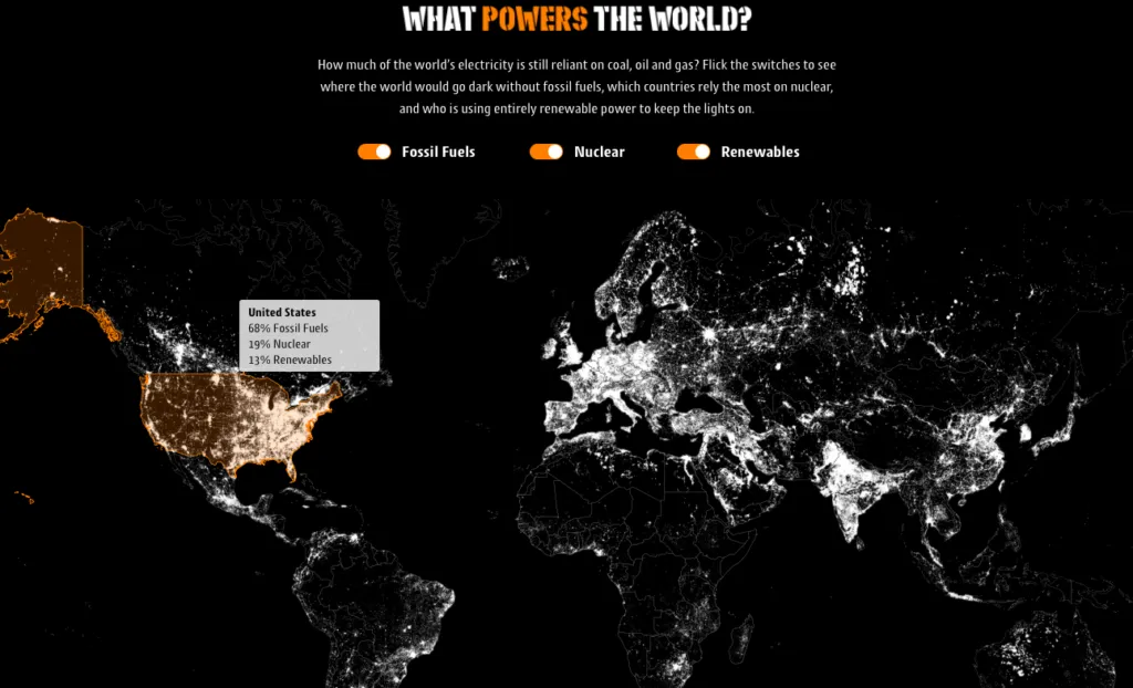
Really interesting map has been recently published by Gocompare.com. It shows how much of the world’s electricity is reliant on fossil fuels (coal, oil and gas), nuclear energy and which countries are using renewable energy.

Energy around the world Geoawesomeness

In order to get the information you need to mouse over a particular country. Based on that we can learn that fossil fuels hold a 68% share of the US energy consumption needs. EU average on the other hand is 45%. Norway is a very interesting case. The country which is one of the largest oil and gas exporters in the world is actually covering its energy needs almost fully using renewable resources. Japan, which prior to the Fukushima tragedy of 2011 drew 30% of its electricity from nuclear power, has reduced that usage to just 1 percent. The map allows you to turn on and of one three listed energy sources. Once you do that, you unlock some additional information layers.

It’s a really good example of a simple mapping project that shows relevant data. From cartographic stand point a lot of things could be improved but the design and ease of use makes it a really solid map.

Read on
Search