How Google and Apple are killing tourism for 2 Australian towns
We are no stranger to map fail stories. Vehicles plunging into water bodies, tourists finding themselves in the middle of nowhere while visiting popular landmarks, motorists driving along railway tracks… Navigation blunder anecdotes are available a dime a dozen on the Internet. But what makes the tale of these two Australian towns unique is the flabbergasting magnitude of the error both Google Maps and Apple Maps have somehow managed to pull off here.
Courtesy: ABC News
Exhibit A: Innamincka
Location: Central Australia, about 1,200 kilometers from Adelaide
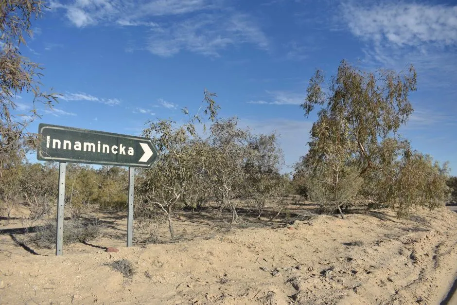
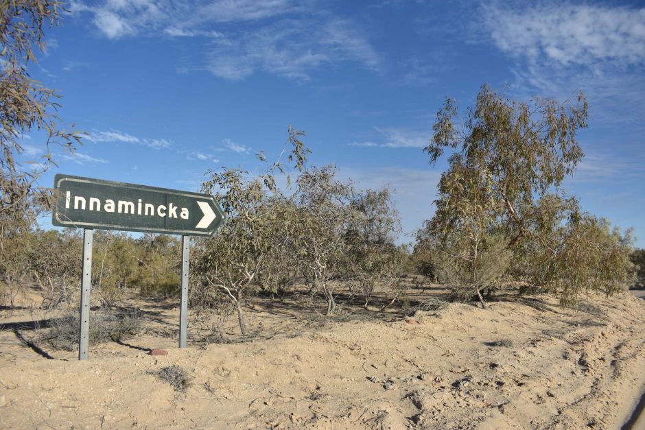
With a population of only 12, Innamincka is a popular outback destination. However, if you were planning to drive down to Innamincka from Adelaide, you will think twice because Google Maps says the journey will take 24 hours. Locals say Google couldn’t be more wrong.
In an interview with ABC News, Innamincka resident Ali Matthews asserts the ride takes only 12 hours, and the inaccuracy on Google’s part is eating into her accommodation business. “People during the holiday periods travelling with kids might see that time and decide it’s just too far; we can’t be bothered,” Matthews laments. “In the tourism season, I get at least two phone calls a week asking about the time and distance… if they weren’t to ring up after looking it up then it would definitely impact the business that we get.”
Once the news broke, Google looked into the situation and revised the travel time between Adelaide and Innamincka to 16 hours.
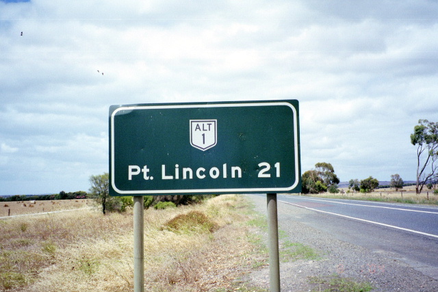
Exhibit B: Port Lincoln
Location: Eyre Peninsula, South Australia
Popularly known as the ‘tuna capital of the world’, Port Lincoln draws in tourists with the rugged beauty of the Eyre Peninsula. But if you were to use Apple Maps to reach the town, you would see the only way you could reach Port Lincoln was if you took a ferry to cross the Upper Spencer Gulf. In reality, National Highway 1 directly links to Port Lincoln.
For locals, what’s even more worrisome is the fact that the ferry in question does not even run regularly. According to Jack Ritchie, Chairman of Port Lincoln’s Chamber of Commerce and Tourism, “[This misinformation] has the potential to impact the choices people make. If they… don’t have a more complete understanding of how to get here, and they find out the ferry isn’t running, it impacts their experience and they are unlikely to look at the option again.”
Apple is yet to rectify its mistake.
If you or someone you know has been impacted by inaccurate satnav directions, tell us about your experience in the comments section below.

