
Geospatial technology is revolutionizing the gaming industry by providing highly detailed maps and 3D models that enhance the realism in virtual environments. This technology also plays a role in VR experiences, allowing gamers to explore lifelike worlds that are accurately modeled after real-world locations.
Fictional cartography refers to the creation and representation of fictional worlds through maps and cartographic techniques. It involves the design and visualization of landscapes, environments, and spatial relationships that do not exist in the real world, but in fictional narratives.
Realism in virtual environments
Virtual environments aim to create highly realistic and immersive digital representations of real or imaginary spaces. In the context of cartography and geographic visualization, realism in virtual environments refers to the pursuit of closely mimicking the real world in terms of spatial accuracy and user experience.
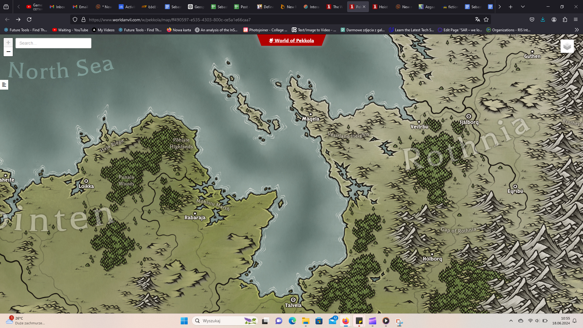
Creating fictional maps has now transcended from a niche hobby to a sophisticated art form, facilitated by advanced online tools that combine user-friendly interfaces with rich geospatial features.
These tools, such as those provided by Campfire Writing, World Anvil, Inkarnate, Azgaar’s Fantasy Map Generator, and Ross Thorn’s Interactive Fantasy Maps, offer a range of functionalities that may be satisfying to both amateur storytellers and professional cartographers. For GIS professionals it’s crucial to create high-quality visualizations and map layouts. Storytellers and enthusiasts of fantasy worlds also have similar ambitions.
Let’s explore the cartographic aspects, geospatial features, symbology, and user-friendliness of these platforms, highlighting how they enable the creation of detailed fictional worlds.
Geospatial Features
1. Terrain and Landforms:
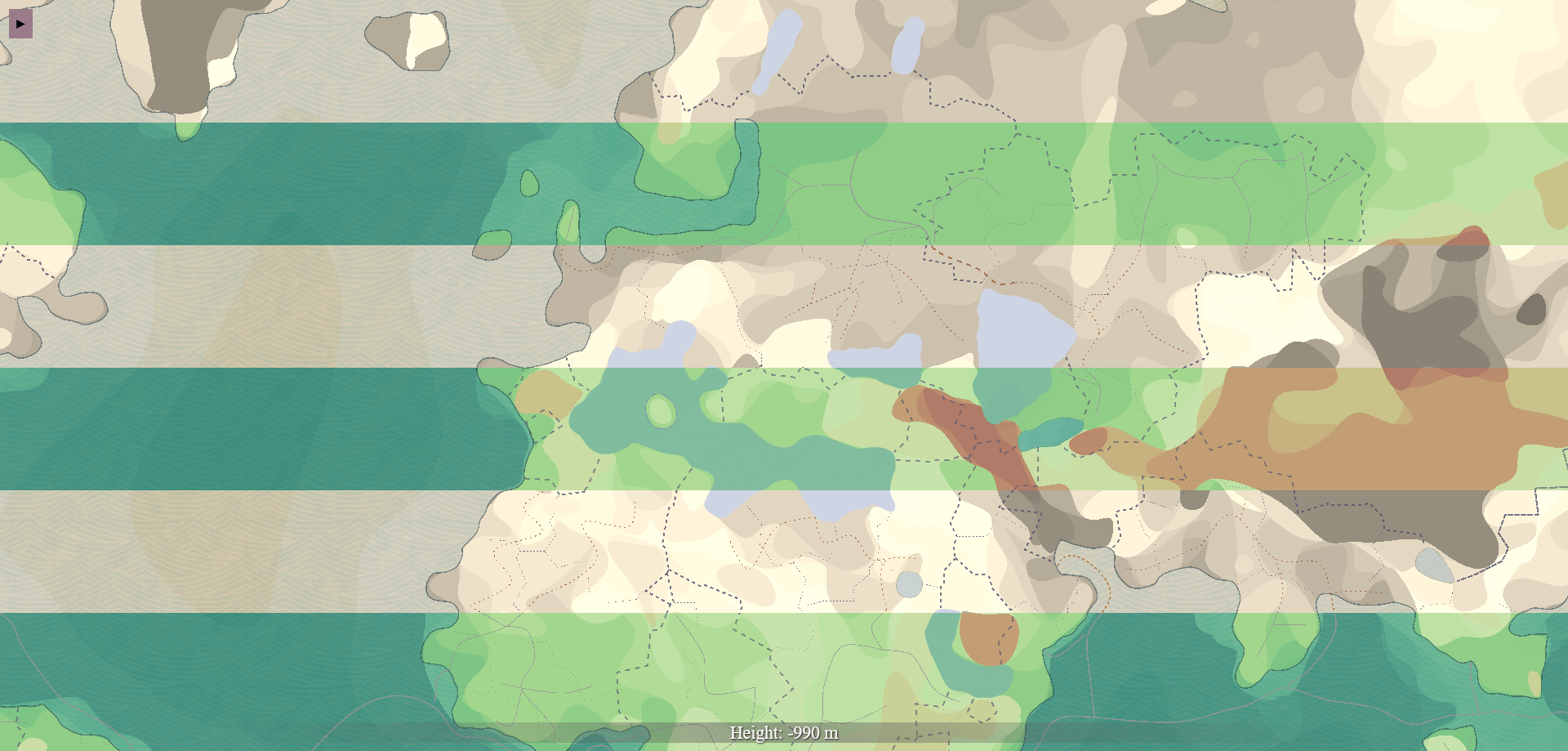
Fictional maps rely heavily on realistic terrain and landforms to create believable worlds. Platforms like Inkarnate and Azgaar’s Fantasy Map Generator provide detailed tools for generating mountains, valleys, rivers, and coastlines. These tools often include height maps and contour lines, allowing users to visualize and manipulate the topography of their fictional landscapes. For example, Azgaar’s generator offers various terrain presets such as archipelagos, peninsulas, and continents, enabling users to create diverse geographical settings with ease.
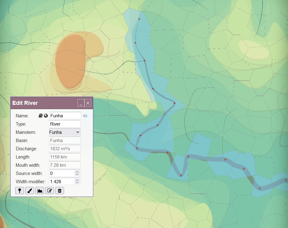
Azgaar’s Fantasy Map Generator – landforms modelling
2. Climate and Biomes:
Accurate representation of climate and biomes is key for adding depth to fictional maps. Azgaar’s Fantasy Map Generator excels in this aspect by allowing users to simulate different climate zones, precipitation patterns, and temperature variations. Users can create maps that reflect realistic ecological systems, from arid deserts to lush forests, enhancing the environmental storytelling of their worlds.
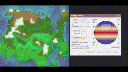
Azgaar’s Fantasy Map Generator – climate modeling
3. Political and Cultural Boundaries:
Mapping political and cultural boundaries is essential for worldbuilding in fantasy and science fiction settings. Tools like World Anvil offer features to define and customize states, provinces, and other administrative divisions. These platforms often include options to display cultural regions, languages, and population distributions, providing a comprehensive overview of the societal structure within the fictional world.
World Anvil – boundaries
Symbology
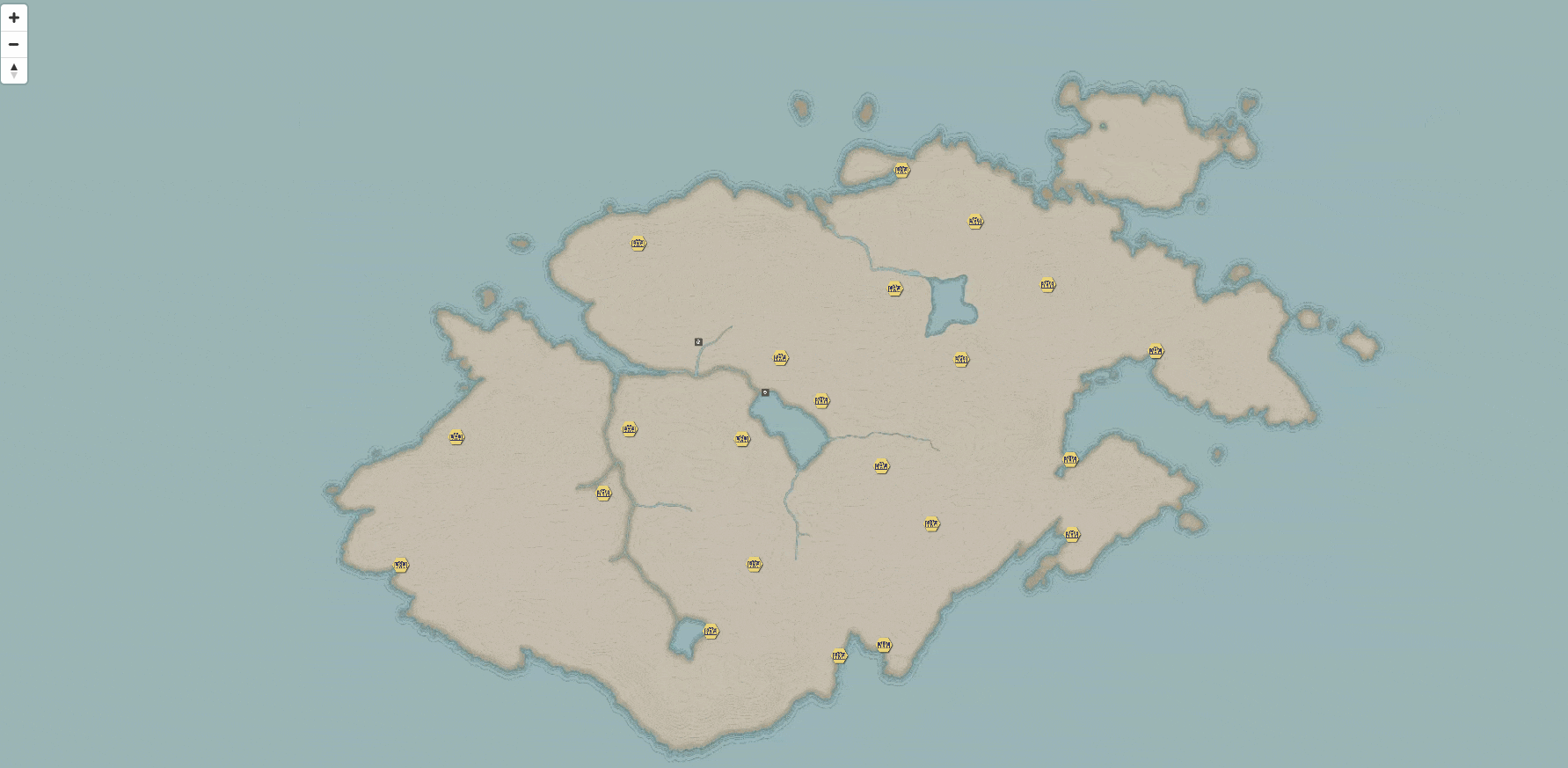
1. Icons and Markers:
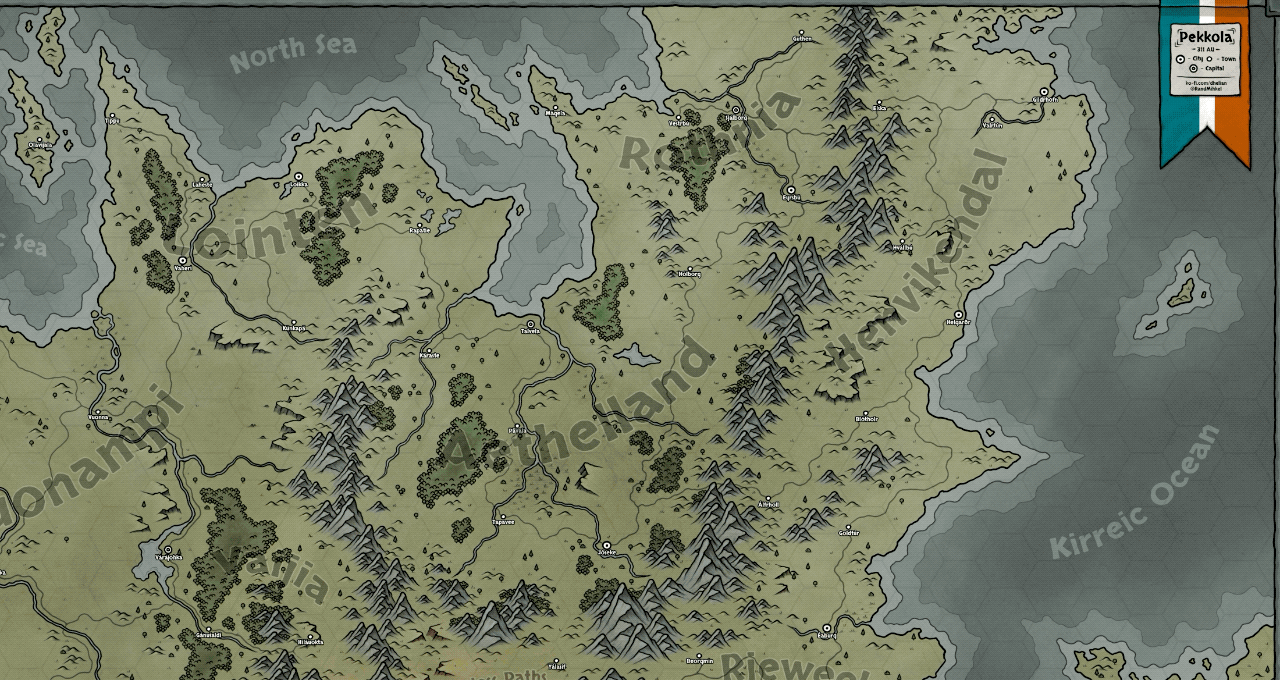
Symbols and markers play a key role in fictional cartography, representing various elements such as cities, castles, forests, and battle sites. Inkarnate and Campfire Writing provide extensive libraries of customizable icons, allowing users to add unique and context-specific symbols to their maps. These icons help convey important information at a glance and enhance the visual appeal of the map.
Campfire Writing – icons
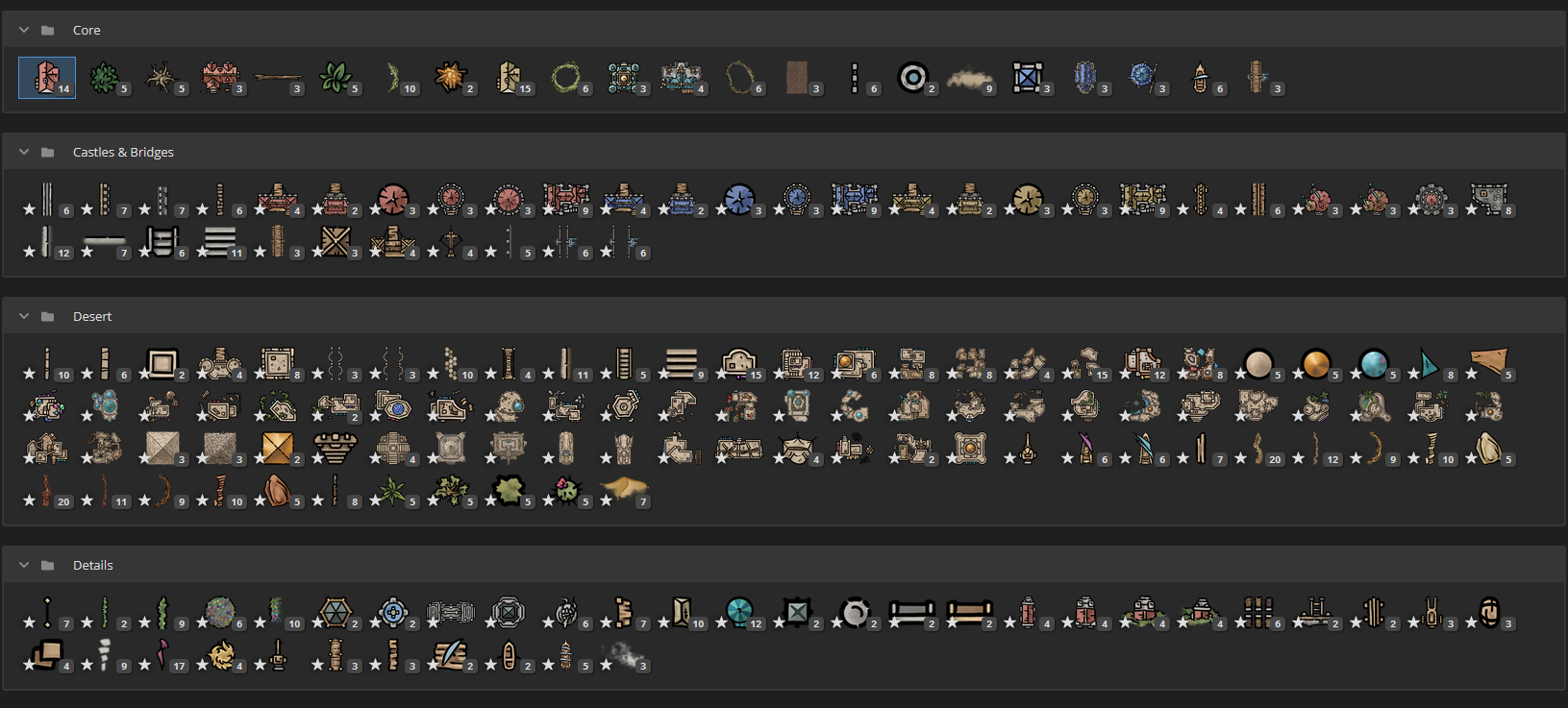
Incarnate – markers
2. Labels and Annotations:
Clear and well-placed labels are essential for the readability of maps. Platforms like Ross Thorn’s Interactive Fantasy Maps and World Anvil offer tools for adding and styling text labels, ensuring that place names, geographical features, and other annotations are easily distinguishable. Customizable font styles, sizes, and colors allow for aesthetic consistency and thematic coherence.
Ross Thorn – labels & annotations
3. Color Schemes and Styles:
The choice of color schemes and map styles significantly impacts the overall look and feel of a fictional map. Tools like Inkarnate and Azgaar’s Fantasy Map Generator provide various style presets, from antique parchment to modern vector graphics. Users can adjust color palettes to match the mood and setting of their worlds, whether it be a dark and foreboding landscape or a vibrant and whimsical realm.
Azgaar’s Fantasy Map Generator – map styles
User-Friendliness
1. Intuitive Interfaces:
User-friendly interfaces are paramount for making complex cartographic tools accessible to a broad audience. Platforms like Inkarnate and Campfire Writing excel in providing intuitive drag-and-drop functionalities, real-time previews, and straightforward navigation. These features lower the learning curve, allowing users to focus on creativity rather than technical details.
Campfire Writing
2. Customization and Flexibility:
The ability to customize and tweak every aspect of a map is a key feature of advanced cartographic tools. World Anvil and Azgaar’s Fantasy Map Generator offer extensive customization options, from modifying terrain features to creating custom symbols and color schemes. This flexibility ensures that users can create maps that are uniquely tailored to their storytelling needs.
3. Collaboration and Sharing:
Modern map-making platforms often include features for collaboration and sharing, enabling multiple users to work on a map simultaneously. World Anvil, for example, allows creators to share their maps with collaborators, making it easier to develop complex worlds in a team setting. Additionally, tools like Campfire Writing provide options to export maps in various formats, facilitating easy integration into other storytelling platforms or print media.
Incarnate – sharing
Campfire Writing – sharing
Conclusion
The creation of fictional maps has evolved into a sophisticated practice, thanks to the advanced features offered by online tools. By focusing on geospatial features, symbology, and user-friendliness, platforms like those mentioned in this article enable users to craft detailed, immersive, and visually appealing maps.
Whether for storytelling, gaming, or enjoyment, these tools empower users to bring their fictional worlds to life with ease and precision.
For more detailed explorations and tutorials, visit the respective platforms:
– Azgaar’s Fantasy Map Generator
– Ross Thorn’s Interactive Fantasy Maps
To explore map- and location-based games, take a look at the Top Google Maps & Map-Based Games of All Time.
Did you like this post? Read more and subscribe to our monthly newsletter!

#Fun


Next article
The most accurate map projection is a concept that cartographers have pursued for centuries. In this article, we will explore the world of map projections, focusing on their accuracy, applications, benefits, and limitations.
The Art of Map Projection
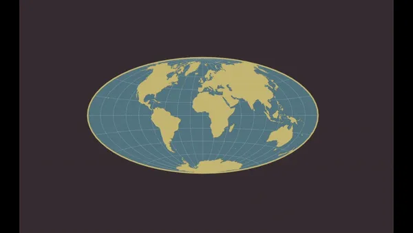
Map projection is the method of representing the curved 3D surface of a sphere, such as the Earth onto a flat 2D plane or map. This process is necessary because it’s impractical to use a globe to represent the entire planet or large portions of it.
The main reasons for using map projections are:
- To represent the spherical Earth onto a flat surface for both visualization and analysis.
- To minimize distortions of certain properties like area, distance, shape, or direction depending on the map’s intended use.
- To transform geographic coordinates (latitude and longitude) to planar coordinates (x and y) for creating maps.
It is impossible to flatten a sphere while accurately representing all properties of the spherical Earth without some distortion. These distortions can affect distance, area, and angle, posing significant challenges for cartographers. Each map projection attempts to minimize these distortions in specific ways, depending on its intended use.
Why do we have so many map projections? The answer is simple, each map projection focuses on a specific area, for instance, a country, and tries to minimize all distortions in its area. Different projections are chosen based on the region mapped and the purpose of the map.
That’s why it’s not recommended to use the wrong projection for your processing. The result of such an approach may look like in the image below. While the LAEA coordinate system is dedicated to topographical maps in Europe, using for example the Australian coordinate system may lead to huge angle, area, and distance distortions.
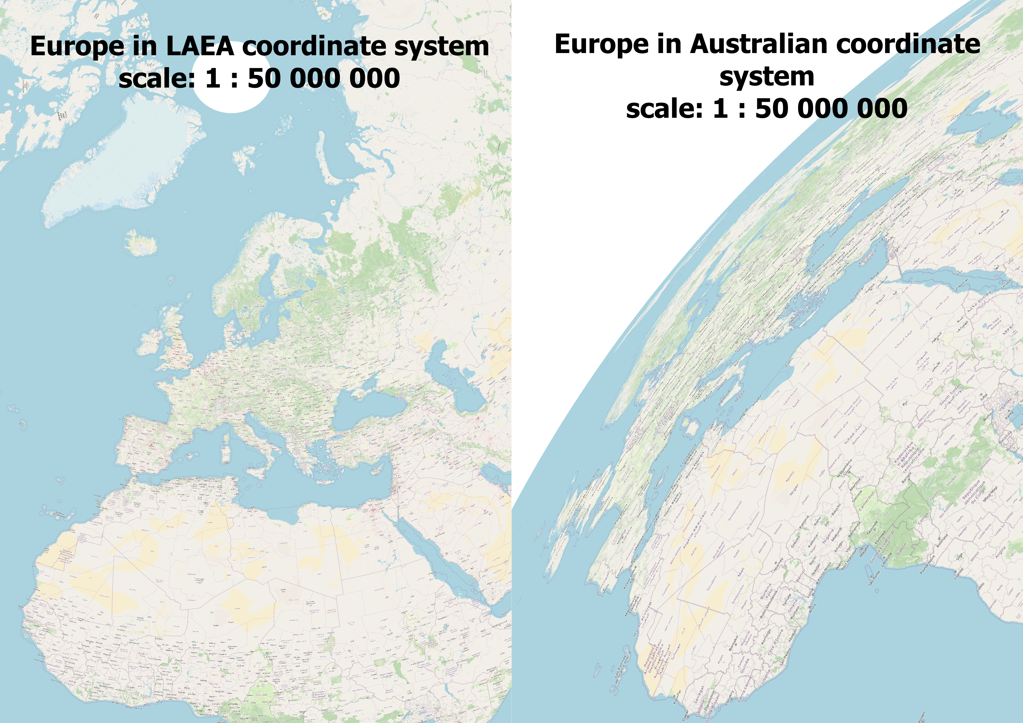
Example of using the wrong map projection
Exploring Various Map Projections
There are numerous map projections, each with its unique approach to dealing with distortion. Let’s explore a few notable ones:
1. Mercator Projection: Introduced by Gerardus Mercator in 1569, this cylindrical projection preserves angles, making it useful for navigation. It became the standard map for this purpose due to its unique properties of representing north as ‘up’ and south as ‘down’, while preserving local directions and shapes. However, it has a major drawback – it inflates the size of landmasses the further they are from the equator. This severely distorts areas, particularly near the poles, making Greenland appear as large as Africa, which is far from the truth.
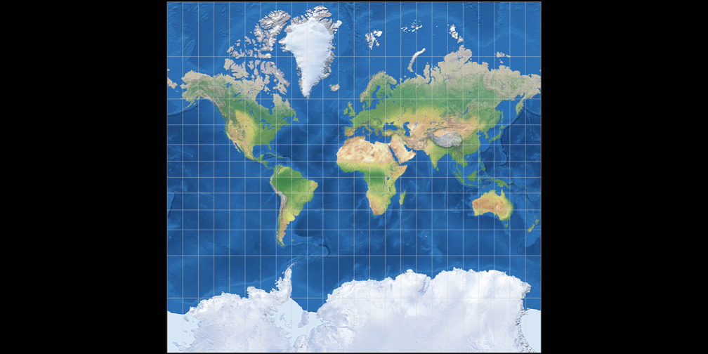
Mercator Projection. Source: map-projections.net
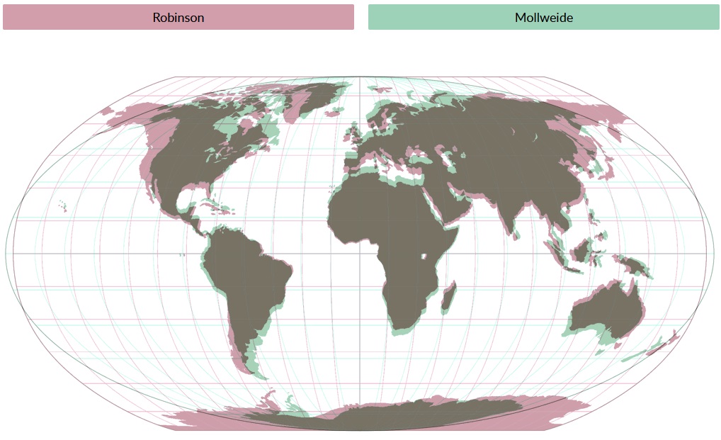
2. Robinson Projection: Arthur H. Robinson developed this projection in 1963 as a compromise. It aims to strike a good balance between area, shape, and distance distortions for world maps. This projection creates visually appealing maps by moderately distorting all properties (distance, area, and angle), making it ideal for world maps.
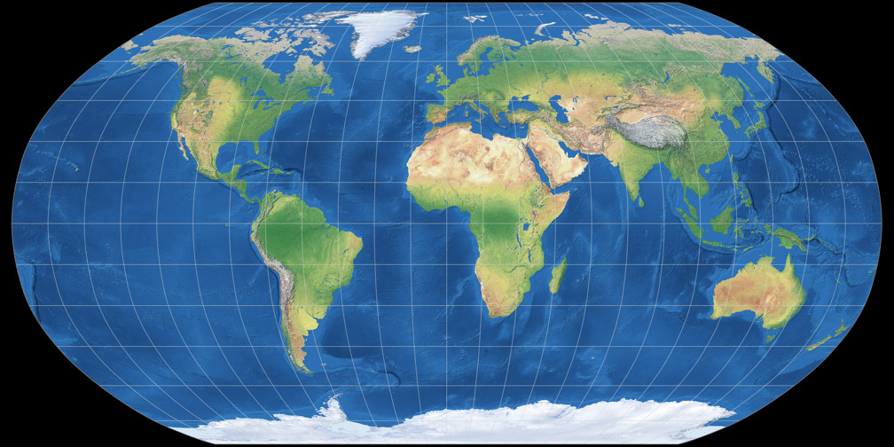
Robinson Projection. Source: map-projections.net
3. Equal-Area Projections (e.g., Albers and Mollweide): These projections preserve the relative sizes or areas of features on the map, accurately representing their true proportional areas on the Earth’s surface. As a result, equal-area projections are widely used for thematic mapping of quantitative data like population, economic activity, etc. where accurate area representation is crucial. However, they often distort shapes and angles, especially at higher latitudes.
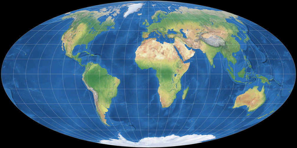
Mollweide Projection. Source: map-projections.net
4. Azimuthal Projections (e.g., Lambert Azimuthal Equal-Area): These are a category of map projections where the surface of a sphere or ellipsoid (like the Earth) is projected onto a plane from a point or a line. Azimuthal projections display true directions (azimuths) from the center point or line to any other point on the map. This makes them useful for navigation and mapping areas such as polar regions. With azimuthal projections, distortion increases further from the center.
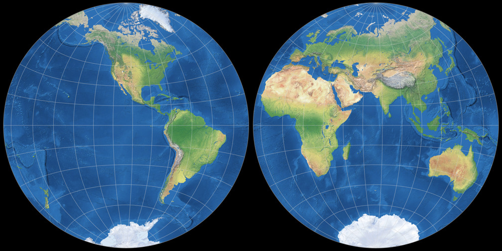
Lambert Azimuthal Equal-Area Projection. Source: map-projections.net
When comparing map projections, you can see differences in the shape and size of objects on the map. This fact has been used many times in the past for manipulation and even propaganda.
For example, Nazi Germany used the Mercator projection in maps like “A Study in Empires” to make the size of Germany appear insignificant compared to the vast British Empire, to argue that Germany could not possibly be an aggressor (Monmonier 1996). Countries often use map projections that depict disputed territories as being under their control, such as India’s political maps claiming the entirety of Jammu and Kashmir (Carnegie Ethics Online, 2018).
Comparison of different map projections. Source: map-projections.net
These 4 websites are useful for understanding map projections:
- Projection Wizard: Projection Wizard helps users select appropriate map projections based on the specific geographic area of interest and the distortion properties they want to minimize.
- Jason Davies Map Projection Transitions: This site provides interactive visualizations of transitions between different map projections, demonstrating how geographic shapes and areas transform.
- Compare Map Projections: This website allows users to compare different map projections side by side to understand their relative distortions and visual differences.
- World Map Generator: World Map Generator enables users to create and download customizable vector world maps for various uses.
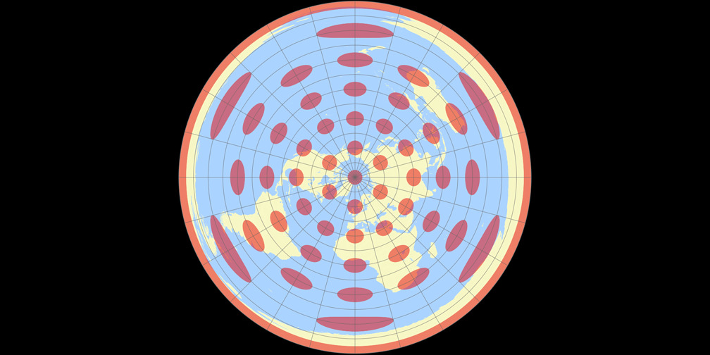
The Dance of Distortions
Every map projection must contend with distortion. We can present the scale of distortions on the map using an ellipse of distortion, known as Tissot’s indicatrix This is a valuable tool for visualizing and understanding the distortions introduced by different map projections.
It consists of small circles drawn on a globe or spherical model of the Earth at regular intervals of latitude and longitude. When these circles are projected onto a flat map using a particular projection, they become distorted ellipses called indicatrices (plural of indicatrix). The shape, size, and orientation of these ellipses reveal the type and degree of distortion at that point on the map projections.
For instance, the Mercator projection excels in angle preservation but fails in area accuracy – that’s why in distortion map we can notice gradual enlargement of circles towards the poles. The Robinson projection offers a balanced view but compromises on precise measurements. Understanding these trade-offs is crucial for choosing the right projection for specific tasks.
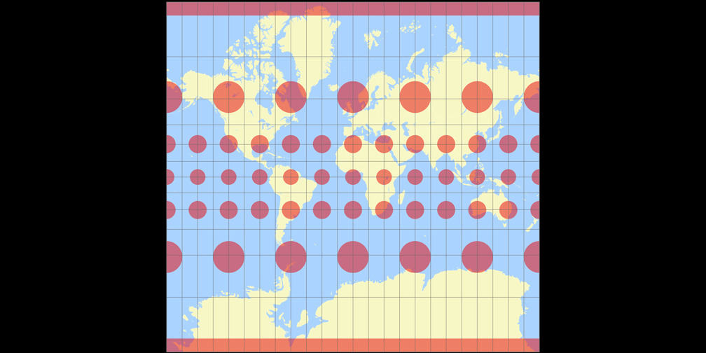
Distortions in Mercator projection. Source: map-projections.net
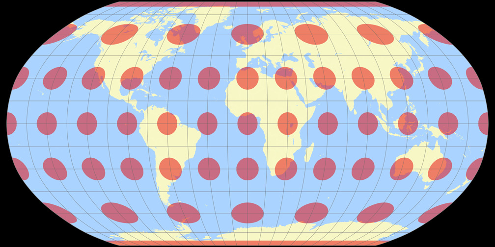
Distortions in Robinson projection. Source: map-projections.net
Choosing the Wrong Map Projection
Imagine a cartographer using QGIS to map a new city plan. They choose a projection without considering the nature of their data. As theyloads the layers, the streets and landmarks appear misplaced—buildings meant to align with roads float in disarray. This mishap occurs because each data type has its projection, and using the wrong one causes layers to misalign.
To avoid such errors, cartographers rely on EPSG codes—a standardized set of codes representing various coordinate systems and projections. Using the correct EPSG code ensures that the data aligns perfectly on the map.
EPSG Codes
EPSG codes, named after the European Petroleum Survey Group, are numerical identifiers for coordinate reference systems. For example, EPSG:4326 refers to the WGS 84 coordinate system, commonly used in GPS. EPSG codes simplify the selection of the appropriate projection, ensuring accuracy and consistency in mapping.
A list of all coordinate systems ought to be accessible in each GIS software. Additionally, on several websites, it’s possible to search through map projections or to make transformation from one coordinate system to another.
Applications and Limitations
Different map projections serve various applications. For global navigation, the Mercator projection’s angle preservation is invaluable. In contrast, equal-area projections are essential for demographic studies, where accurately representing population density is crucial.
However, no single projection is perfect. Cartographers must weigh the benefits and limitations of each, considering the purpose of their map. For instance, while the Mercator projection is excellent for navigation, its area distortion renders it unsuitable for educational purposes where size comparisons are essential.
The Role of Area Zero in Map Projection
In map projections, the term “area zero” refers to points where distortion is minimal. For example, in cylindrical projections like Mercator, the equator serves as the area zero. In the case of azimuthal normal projections, the place of zero distortion is the point of contact of the projecting plane with the Earth’s sphere.
Understanding these reference points helps cartographers optimize their maps for specific regions.
The place of zero distortions for the Azimuthal Equidistant Projection is the North Pole. Source: map-projections.net
Conclusion
The quest for the most accurate map projection is a journey without a definitive end. Each projection offers a unique lens through which to view our world, balancing distortions to serve specific purposes. Cartographers must navigate these choices, guided by their understanding of distortions, EPSG codes, and the intended use of their maps.
As technology advances, new projections and tools emerge, promising even greater accuracy and versatility. Yet, the fundamental challenge remains: transforming our three-dimensional Earth into two-dimensional maps that best serve our needs. This art and science continue to evolve, driven by the timeless human desire to chart and understand our world.
In another article, we considered the advantages and disadvantages of several map projections. Check it out!
Did you like the article? Read more and subscribe to our monthly newsletter!

