
Facebook created the most detailed Population Density Map to bring the rest of the world online

Facebook has been working on the Aquila project to deliver internet connectivity using solar-powered drones to 3rd world countries for a while already. The company says that 10 percent of the world’s population lives in places where the Internet is still not available. Other companies including Google are also working on solutions aiming to beam the network connectivity from the sky. But the technology to provide the connectivity is only a one side of the equation, another important thing is to analyze where it is actually needed.
Today Facebook announced that is has handled that problem by generating the most detailed available population maps of 20 countries including Algeria, Burkina Faso, Cameroon, Egypt, Ethiopia, Ghana, India, Ivory Coast, Kenya, Madagascar, Mexico, Mozambique, Nigeria, South Africa, Sri Lanka, Tanzania, Turkey, Uganda, Ukraine and Uzbekistan. The Project is a cooperation of the Facebook’s Connectivity Lab – technical arm of its Internet.org initiative that deals with delivering internet to rural areas and developing countries, and the Columbia University which developed the previous most accurate population density map together with the World Bank.
The methodology was to train algorithms in detecting human activity based on satellite images (exactly 14.6 billion images, weighing 350 terabytes). The first step was to detect buildings. Once the footprints were laid out, Facebook assigned weights to each building. Then using census data the population data has been redistributed according to weight of each building that acted as a proxy for where and how people live. This is not a perfect methodology but it is commonly used in a similar projects as the least error-prone way of determining how many people lived in a particular location.
The results are pretty amazing. You get a population density map with 5-10 meters resolution. “Later this year, we will be releasing this data to the general public. We believe this data has many more impactful applications, such as socio-economic research and risk assessment for natural disasters”, Facebook said in a statement.
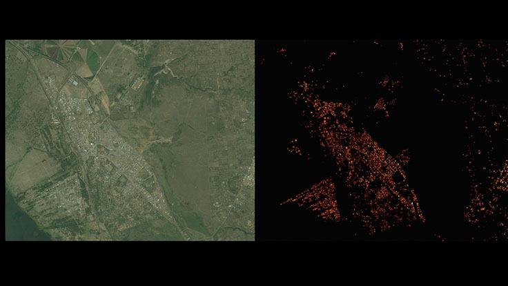
Facebook’s analysis of the population density in Naivasha, Kenya
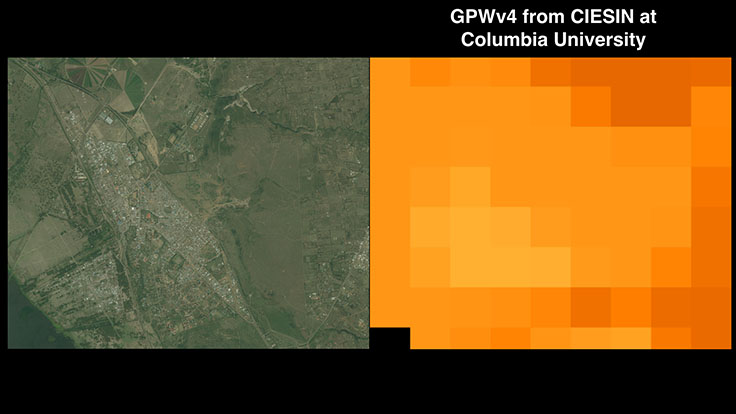
Previous most accurate population spatial distribution data from the Columbia University
Meanwhile, at Mobile World Congress 2016 in Barcelona the company has launched a new initiative – Telecom Infra Project (TIP) – that aims to come up with new ways to build and design telecom network infrastructure. The goal of the project is to make mobile internet connections better for users who are already online, as well as establishing the best way it can bring new users online.
All this combined shows that Facebook is doing significant efforts to bring the remaining 1 billion people online. It’s great that the company is planning to openly release the population density maps. As GeoGeeks we would like to also see a spatial relations map of the existing 1.6 billion users of the social network.

#Featured

Next article
Paris is an amazing city. It represents a unique combination of magnificent architecture, beautiful scenery, culture and people. It is the city where the history, present and the future meet together in a single place.
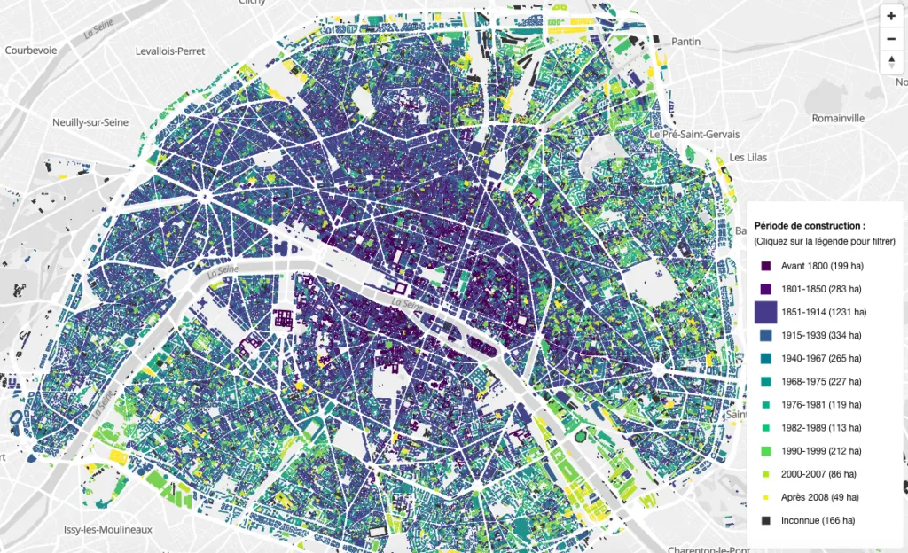
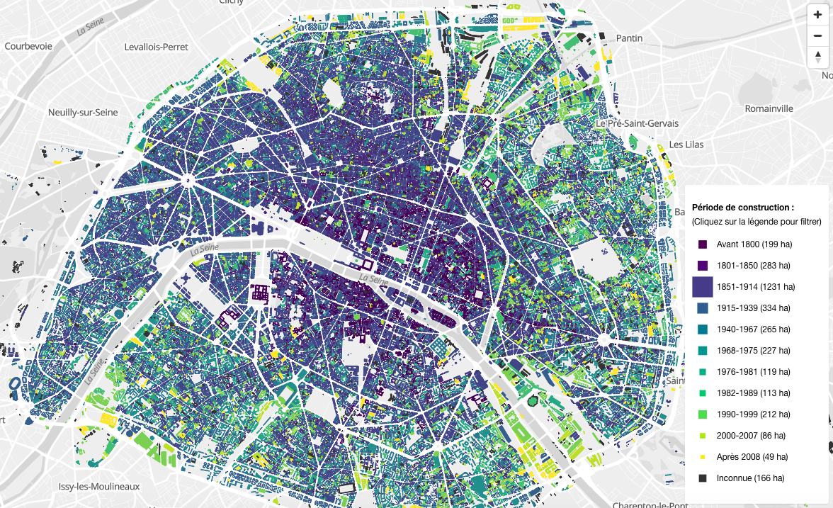
The new map called BatiParis is a great tool to understand how the city evolved over time. It shows age of buildings footprints in the city with each building colored according to its year of construction. You can turn on and off each period of time to visualize the major stages of the Paris development.
The map reveals that most of the buildings here are from the 1851-1914 period so between the beginning of the Napoleon times, until the beginning of the First World War. BatiParis is a detailed map of Paris, France, which provides an intricate representation of the city’s buildings and structures. Developed as part of a research project (Francepixel (Bâti)), the map serves as a valuable tool for urban planning and architectural analysis. It offers high-resolution models that capture the architectural diversity of Parisian structures, ranging from historic landmarks to modern skyscrapers. BatiParis enhances understanding of the city’s spatial organization, making it a resource for professionals and enthusiasts interested in the intricate urban landscape of Paris.
FrancePixel (Bâti) is a mapping initiative dedicated to creating a highly detailed 3D representation of France’s urban and rural landscapes. By combining data from various sources, the project aims to offer realistic and accurate models of buildings, infrastructure, and topography. These models are valuable tools for urban planners, architects, and geospatial analysts, providing them with a virtual environment to simulate urban growth, assess building designs, and analyze the environmental impact of construction projects. Through the FrancePixel (Bâti) project, users can explore detailed 3D models of French cities, enriching their understanding of the urban environment and informing decision-making processes across different sectors.
![]()
Nice project.
Related topic: We could breach key limit set in Paris agreement by 2022
Did you like this post? Read more and subscribe to our monthly newsletter!

