How Satellite Data Is Helping Tackle the Urban Heat Issue

Editor’s note: This article was written as part of EO Hub – a journalistic collaboration between UP42 and Geoawesome. Created for policymakers, decision makers, geospatial experts and enthusiasts alike, EO Hub is a key resource for anyone trying to understand how Earth observation is transforming our world. Read more about EO Hub here.
In 2018, 55% of the world’s population lived in urban areas. This number is projected to grow to 68% in 2050, according to data from the United Nations.
City streets catch and hold more heat than their surrounding areas. In addition, materials such as concrete affect the thermal energy dynamics to bring about zones that are generally a few degrees higher than non-urban zones.
These overheated urban areas are called Urban Heat Islands (UHIs), and they can cause reduced air quality, higher demand for water, and even heat casualties. For example, on an average “heat day,” Los Angeles County emergency rooms see an additional 1,500 heat-related patients.
But satellite data now allows for large-scale detection and monitoring of UHIs, and can be used in combination with heat-reducing techniques to improve the situation. The wide availability of satellite data, thanks to platforms such as UP42, makes it easy for companies and researchers to access and analyse the data at scale.
One notable example is data from NASA’s ECOSTRESS — the ECOsystem Spaceborne Thermal Radiometer Experiment on the International Space Station — which has successfully been used by several Los Angeles neighbourhoods to help determine what works to reduce UHI temperatures.
Dr Glynn Hulley of the Carbon Cycle and Ecosystems group at NASA’s Jet Propulsion Laboratory (JPL) spoke recently on a USGS podcast, detailing how ECOSTRESS works. He explained the difficulties in getting accurate and timely temperature measurements using ground sensors:
“There are [ground-based] sensors in different cities around the world operated by NOAA and NASA and other agencies,” he said, “but they’re pretty sparse. And so, they measure the general air temperature at a neighbourhood level. So for example, there are about three or four sensors in the San Fernando Valley in Los Angeles. The real benefit of the spaceborne data is that we can measure that routinely almost every day, but also at very high spatial resolution. With ECOSTRESS, the resolution there is about 70 by 70 meters for each pixel — that’s roughly the size of a football field. And we can measure that almost every day.”
Because ECOSTRESS satellite data is so comprehensive and obtained so quickly, it is the easiest way to rapidly establish if a neighbourhood cooling project is working or not.
The other reason ECOSTRESS is especially suited to obtaining comprehensive measurements is that it obtains temperature readings at various times of the day, every other day, building a history of the diurnal cycle that can be used for analysis. The reason for this is due to the ISS’s precessing orbit. “That’s a very powerful tool,” said Dr. Hulley. “And there’s no other sensor right now that is able to achieve that high frequency.”
For example, Landsat 8 and 9 provide readings at 10:00 AM and so are unable to give a nighttime view of the effects of urban heating.
ECOSTRESS’s extremely fine spatial resolution also lets it provide detailed info at the neighborhood level.
Using satellite data to help LA reduce Urban Heat Islands temperatures
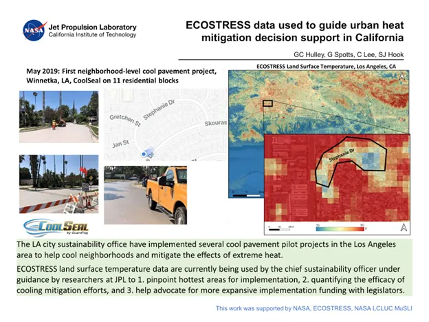
Dr. Hulley teamed up with Chief Sustainability Officer for Streets LA, Greg Spotts, to show exactly how this satellite data could be used to determine if cooling efforts in LA neighborhoods were working.
Spotts had previously used cool pavement coating to cool down various city blocks in LA, but didn’t have access to the testing and sensor data that satellite imagery could provide.
After meeting at a NASA briefing, the two men arranged to run a pilot in several LA neighborhoods, starting in the spring of 2019. They were going to coat certain neighborhood streets with cool pavement coating and then use ECOSTRESS data and imagery to determine if the coating had a positive effect on UHIs.
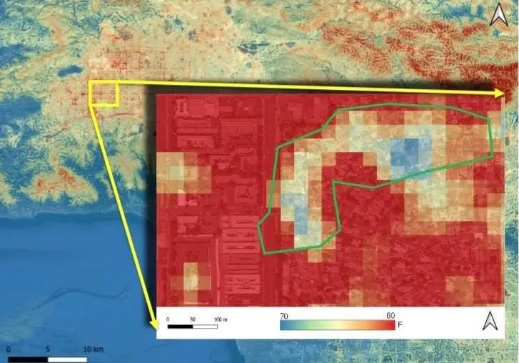
One of the neighborhoods they piloted was Winnetka in the San Fernando Valley. The area that they coated in that neighborhood with the cool pavement coating — Stephanie Drive, an eleven-block section including five cul-de-sacs — happened to be in the shape of a crescent.
When the ECOSTRESS heat map data became available, the crescent shape of the coated Winnetka neighborhood stood out starkly compared to the rest of the map. The crescent-shaped area was a cool blue compared to the red areas surrounding it, as shown in the image below.
Speaking on the same podcast, Spotts said, “We had a sort of Eureka moment about that.” The satellite imagery had shown unequivocally that the cooling program had worked. This clarity would not have been possible without satellite data.
Using ECOSTRESS’s data, Spotts and Hulley were also able to see cooling effects within a pixel or two of the coated streets, showing that the method helpedto cool the entire neighborhood.
The future of satellite data and Urban Heat cooling programs
Several other pilots followed in the wake of the first.
Satellite data were also correlated with demographic data and AC usage to create a Heat Vulnerability Model, which shows areas that are at risk during heat waves. For example, although ECOSTRESS might show a particular area as being extremely hot, additional data showing that the area has many trees or a high incidence of AC installations would mitigate the overall Heat Vulnerability rating of the area.
Both Spotts and Hulley agree that education at a societal level is vital so that citizen scientists can make better daily decisions to keep their cities cool.
ECOSTRESS is slated to finish in 2023. Fortunately, other projects are flowing, for example, the Land Surface Temperature Monitoring (LSTM) program by the European Space Agency and Airbus, or the ARSET or Applied Remote Sensing Training program by NASA. Also, higher resolution multispectral data available via platforms such as UP42 can make a significant difference for companies and researchers working on the UHI challenge.
It’s clear that satellite data adds substantial value in helping neighbourhoods cool themselves down and reduce potential health risks for vulnerable areas.
Did you like the article? Read more and subscribe to our monthly newsletter!

#Data source
Next article
How Satellite Data is Transforming Agriculture
Editor’s note: This article was written as part of EO Hub – a journalistic collaboration between UP42 and Geoawesome. Created for policymakers, decision makers, geospatial experts and enthusiasts alike, EO Hub is a key resource for anyone trying to understand how Earth observation is transforming our world. Read more about EO Hub here.
A look at some of the key earth observation applications in agriculture industry
Agriculture and Earth observation share a long history. The agriculture sector was one of the first industries to make use of satellite data, starting in 1972, when Landsat first began returning regular images of the Earth. The link-up is only natural, given the size of modern farms and the advantages to be gained by seeing them from above.
Recently, however, the relationship has received a turbo charge, thanks to a massive improvement in the quality and availability of satellite data. This, combined with the advent of precision agriculture, has presented a wealth of applications that can improve yields, maximize profits, and ward against disease. In the context of climate change and other threats to the global food supply, this is something that should be of interest to every one of us.
Digitalization in Farms Today: A Mixed Picture
There is a huge variety in the level of digitalization in agriculture around the world. Even across large farms in the Global North, there can be a big difference from one farm to the next. Some boast fully digitalized operations, leaning heavily on remotely sensed data and automated functions, whereas othersrely on traditional methods, fundamentally placing trust in the knowledge and experience of their agronomists.
Jorge Fernandez-Galarreta is Head of Product at UP42, and has extensive experience in precision agriculture. For him, it’s all about mindset: “One farm might have an agronomy team that is fully digital, already using satellite data, variable rate maps, weather stations and soil sampling. But on the next farm, you might find a farmer who still runs things using a notebook and has all that knowledge in his head. These are, of course, both totally valid ways of operating–every farm is different.”
Many farms today operate like any other business; not run by a farmer in the conventional sense, but by a general manager who deals with economics, suppliers, and various other day-to-day company affairs. The amount of digitalization in the business usually comes down to whether or not that person is invested in new technologies and automating processes.
Agricultural Applications: From Broad to Niche
The most common use for satellite data in agriculture is farm management. By obtaining a broad overview of multiple fields, farmers can visualize the state of their crops, to check plant health or assessing harvest readiness. Aerial scouting, on the other hand, is a more targeted method used to check for specific issues or diseases. Any identified anomalies will likely be followed up by an in-person inspection.
Another excellent use case is in variable rate application (VRA), where earth observation is both complementing and competing with traditional maps and remotely-sensed data. VRA refers to the application of various agricultural inputs (applying nitrogen or spraying fungicides, for example) at different rates depending on plant needs. Fernandez-Galarreta explains: “Ultimately, what farm managers or agronomists are looking for is how to split the field, so that they can use inputs more effectively, which has a direct impact on cost savings, productivity, and the environment.”
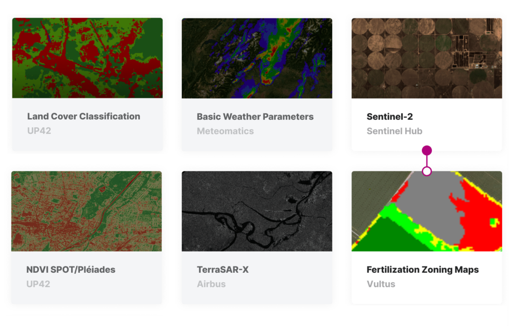
Selected agriculture-related data and algorithms available in U42 platform
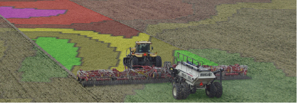
An overlaid VRA ‘prescription map’ from Farmers Edge. Image from Top Crop Manager.
Yield prediction is vital in industrial farming where crops are usually sold for a period of multiple years. Satellite imagery can be used to predict yield per acre earlier in the year—and this is especially effective when combined with deep learning technologies: Crop canopy reflectance is tracked over the growing season—to assess chlorophyll content, for example—and combined with climate, topography, and soil data. The data is mined and analyzed using tools like Artificial Neural Networks and ‘random forest’, which are more reliable than traditional prediction methods, to give an accurate prediction of eventual yield.
Agricultural insurance has become a major use case for satellite data, especially in major markets like the US and Australia, and is increasingly relevant in the face of extreme weather events. Insurance companies are now using remote imaging to assess damage, following a storm, for example, whereas in the past an adjuster would examine a small section of a farm and then extrapolate. “Satellite data may not fully substitute human inspections,” according to Fernandez-Galarreta, “but it can make it more transparent, objective, and scalable.”
Finally, one of the newest applications is in the carbon market. Companies like Regrow, Perennial (formerly Cloud Agronomics), and Deveron are estimating the amount of carbon that a farm is able to capture, which can translate into ‘carbon credits’—and they are investing heavily in it. Each carbon credit represents 1 ton of carbon dioxide removed from the atmosphere (e.g. captured by the vegetation on the farm), and farmers can sell it to companies interested in making up for their CO2 emissions.
Thousands of individual soil predictions create a ‘carbon fingerprint’ for each field. Image from Perennial.
Satellite Imagery: A Plethora of Open and Commercial Data
We have entered a golden era in terms of the availability of satellite data. There is a vast array of data products, and a farm manager’s choice of imagery will naturally depend on how they are planning to use it—a single specific use case or in-depth, low-level decision-making on day-to-day farm management.
Open data has been instrumental in improving knowledge, driving efficiency, and thereby increasing productivity across the industry. Fernandez-Galarreta believes that open data has “created a baseline understanding of the situation on the farm for hundreds of thousands of farmers.” Furthermore, open data has also facilitated the launch of dozens of startups providing software, services and applications that leverage satellite data—in short, we would not be where we are today without it. However, for most advanced applications, it is now insufficient, leading farmers to turn to one of an increasing number of commercial satellite data providers.
There are two main reasons ways that commercial data augments open data, and the first of these is resolution: According to Fernandez-Galarreta, “the 10-60m resolution available from Sentinel is often not enough for certainuse cases, especially more targeted ones, and it’s too broad for smaller and narrower fields”. Commercial providers, on the other hand, can offer very high resolution—with UP42, for example, sourcing 30cm resolution data from the cutting-edge Pléiades Neo constellation. This level of detail is essential for targeted applications like disease detection and insurance.
The second factor is revisit time. Companies like Airbus and Planet offer daily (or better) revisit time, and for farmers who want to track their crops closely throughout the growing season, this is essential. (On the other hand, if a farmer only uses satellite data for an infrequent operation like biannual nitrogen application, revisit time is less relevant, but timing is still extremely important.)

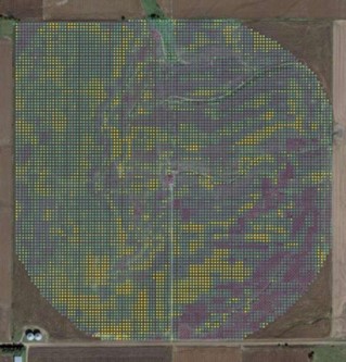
Timelapse of daily satellite imagery from North Platte, Nebraska. Video from Planet
What sort of Data Products Are Used in Agriculture?
Standard RGB imagery can provide a good overview for farm managers, but most vegetation indexes—obtained by analyzing the reflectance of the leaf canopy—rely on parts of the electromagnetic spectrum not visible to the naked eye, like infrared or ‘Red Edge’. A normalized difference vegetation index (NDVI) is one of the best-known products from spectral analysis, but there are also indices adjusted for soil, or based on the detection of water, moisture, or chlorophyll, which can all be of use at different stages throughout a crop’s lifecycle.
According to Fernandez-Galarreta, there is also growing interest within the industry about hyperspectral data. It holds huge potential in the identification of specific problems, like lack of a specific nutrient, and has applications in plant breeding. Hyperspectral data has incredible precision, with the capacity to hone in on individual plants! Finally, synthetic aperture radar (SAR) is another hugely powerful tool, as this type of imagery can be captured at any time of day, and even through cloud cover. Its best use is for monitoring large areas on a regular basis—to measure seed emergence, ensure compliance, or to assess whether a crop is ready to harvest, for example.
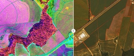
Hyperspectral satellite imagery. Image from AgFunder News
The Next Step: Putting it into Practice
These many rich sources of data count for nothing without the knowledge of how to use them, and to bring return on investment, any new technology needs to be used effectively. It’s also important to remember that satellite data is at its best when used in conjunction with other data sources and technologies. For example, a VRA map is unlikely to be created with earth observation data alone. The farm management software is also likely to be fed with digital elevation models and yield maps from previous years and soil samples. It isthe aggregation of all these tools that creates a deep and detailed picture of the field.
Of course, the farm needs to have an appropriate infrastructure in place—for example, a VRA map is useless unless the farm possesses a variable rate spraying machine. For Fernandez-Galarreta, that’s the biggest gap when it comes to satellite data in agriculture: “If the farm has the right ecosystem in place, then whatever technology is used, it will have a tremendous impact. If the farmer doesn’t have the infrastructure, it doesn’t matter how much technology you give them, it’s just not going to work.”
This brings us back to where we started: digital maturity and the mindset of individual farms across the world. The necessary technologies and data are readily available to all—and increasingly affordable—so the next step towards a full integration of satellite data into agriculture is educating the people who need to use them. Agronomy service providers can help prepare farms for digitalization by supporting those farmers who still work out of a notebook, and educating them–not just on how to implement new technologies, but also on introducing revolutionary new workflows.
Did you like the article? Read more and subscribe to our monthly newsletter!
Speaking on the same podcast, Spotts said, “We had a sort of Eureka moment about that.” The satellite imagery had shown unequivocally that the cooling program had worked. This clarity would not have been possible without satellite data.
Using ECOSTRESS’s data, Spotts and Hulley were also able to see cooling effects within a pixel or two of the coated streets, showing that the method helpedto cool the entire neighborhood.
The future of satellite data and Urban Heat cooling programs
Several other pilots followed in the wake of the first.
Satellite data were also correlated with demographic data and AC usage to create a Heat Vulnerability Model, which shows areas that are at risk during heat waves. For example, although ECOSTRESS might show a particular area as being extremely hot, additional data showing that the area has many trees or a high incidence of AC installations would mitigate the overall Heat Vulnerability rating of the area.
Both Spotts and Hulley agree that education at a societal level is vital so that citizen scientists can make better daily decisions to keep their cities cool.
ECOSTRESS is slated to finish in 2023. Fortunately, other projects are flowing, for example, the Land Surface Temperature Monitoring (LSTM) program by the European Space Agency and Airbus, or the ARSET or Applied Remote Sensing Training program by NASA. Also, higher resolution multispectral data available via platforms such as UP42 can make a significant difference for companies and researchers working on the UHI challenge.
It’s clear that satellite data adds substantial value in helping neighbourhoods cool themselves down and reduce potential health risks for vulnerable areas.
Did you like the article? Read more and subscribe to our monthly newsletter!

