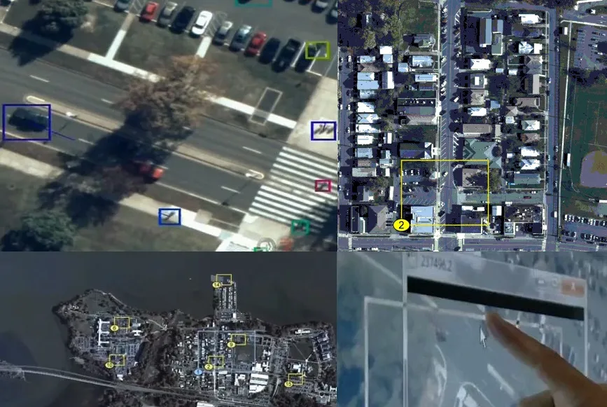
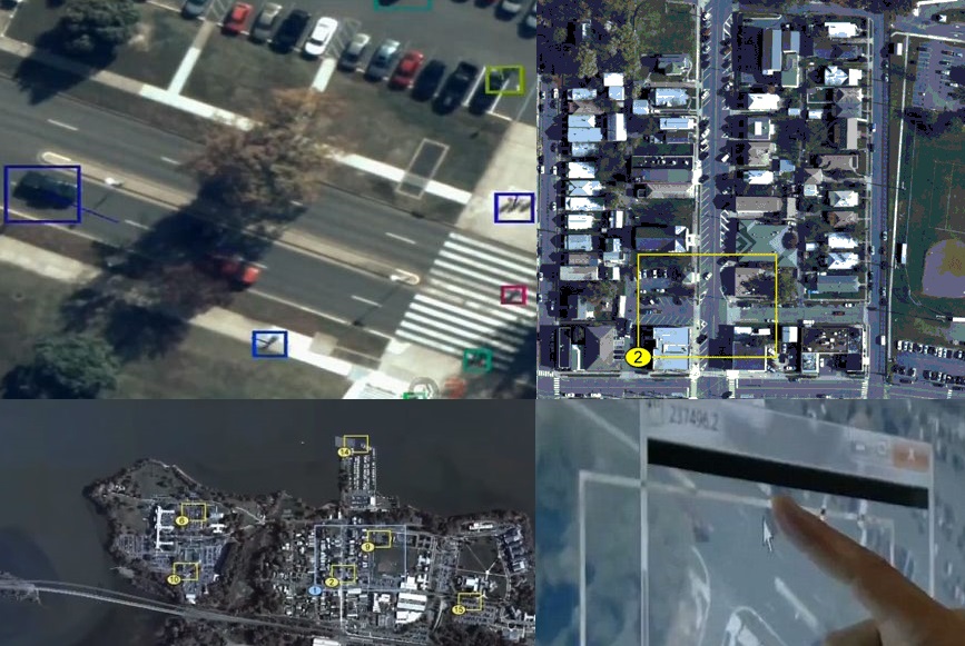
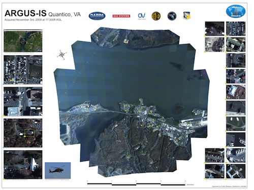
By showing the territories from above, the cartographer takes an artificial “objective” point of view. He stops being just a “regular inhabitant” who lives in the world to become an observer, as well as a reporter.
JUST LIKE THE PHOTOGRAPHER OR THE PAINTER, THE MAP MAKER TURNS INTO A MESSENGER BRINGING BACK DATA “FROM ABOVE” TO THE PEOPLE “ON THE GROUND”. IT IS NOT MEANINGLESS, AND IT IS CERTAINLY NEVER PURELY OBJECTIVE.
First maps were used more to conquest lands and assess resources than for anything else. There is something very powerful about being the one to draw others lands, to trace borders, to delimit people’s possessions. The one looking from above has more visibility. He gets the “big picture” of things. When human beings began to map their world, they started to act like “planet managers” and not just as passive creatures.
Humanity shifted then from the scale of immediacy (what you see everyday around you) to the regional & global scale of media (what you can now conceive above your every day world, thanks to media relating others knowledge, meaning you can access to things and places you haven’t experienced yourself).
Still today, even at the age of Google Earth and ubiquitous GPS, maps are still heavily connoted. Even if we are usually aware of the importance of keeping a critical mind when reading and looking at visual representations, it is hard to always perceive all the details that will influence our final opinion at the end of an article. There are however a few tricks to know to help keeping that distance when reading a map.
This set of posts called “The Hidden Meanings of Maps” will review them one by one, as follows :
THE PROJECTION CHOICE TELLS MORE THAN YOU THINK
Map projection is basically the canvas. It is the grid shape beneath the map, the angle the cartographer choose to illustrate his point & topic. Projections can modify the way countries and continents will look, draw attention on a specific phenomena, and its potential causes according to the cartographer.
Projection can put the emphasizing either on the distance between two places, the feeling of centrality or remoteness, the impression of high concentration or very low density…
NEVER FORGET THAT LOOKING AT A MAP IS LOOKING AT AN EARTH DEFORMATION. THE TYPE AND ASPECT OF THE DEFORMATION TELLS A LOT ABOUT THE EDITORIAL ANGLE THE CARTOGRAPHER CHOOSE TO ADOPT.
Example 1

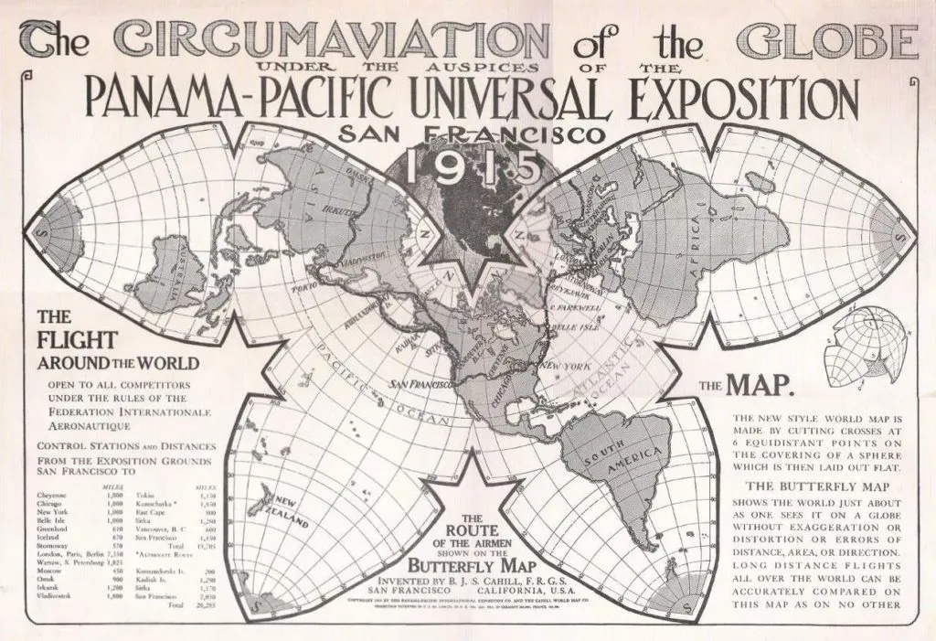
Source: Panama-Pacific Universal Exposition Archives
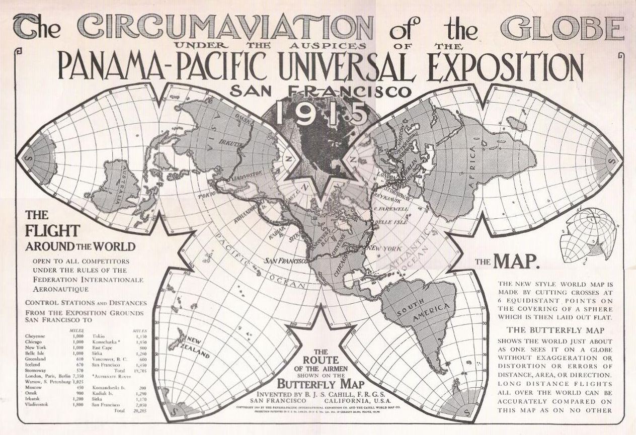
Let’s take for instance the Cahill’s butterfly projection that is perfect to illustrate circumnavigation. The projection was initially used in 1915 for the Panama Pacific International Exposition held in San Francisco to illustrate a flight trip around the world. It won a gold medal in the cartography category. Indeed, it was probably the most clever projection choice for this topic, as we visualize easily the circle drawn by the pilot route around the globe, while keeping San Francisco at the heart of the story.

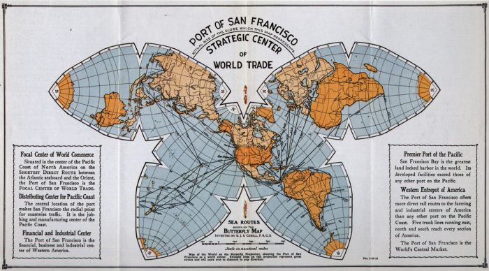
Source: Port of San Francisco
The projection was such a good way to emphasis San Francisco strategic position in the world that the Port of the city choose to use it a few years later as an advertising poster. On this version of the map, marine routes are the main topic to illustrate: it seems obvious that the port San Francisco is a central shipping hub in the world, from where you get the feeling to be able to reach out to any major city in the world.

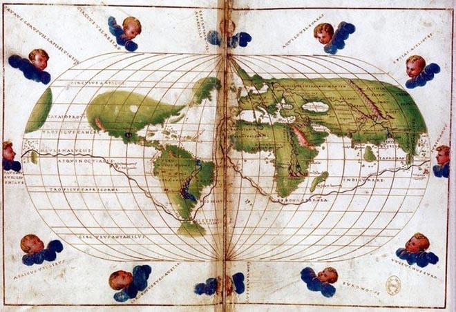
Source: Round About the Earth Book
The other way of showing circumnavigation is with on a more standard projection, like the Mercator one, here used to represent the ‘World map of route taken by Ferdinand Magellan (1480-1521) when he led first circumnavigation of the globe 1519-1521 (from the Round About the Earth book). Route can appear a lot longer on that kind of map than with a butterfly projection, and the feeling of “circum” (round trip) is less tangible.
Example 2
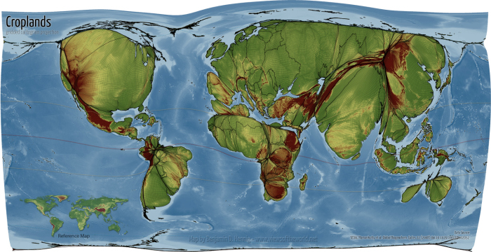
The more recent cartogram technique (below) makes grid size vary according to data. It is not a projection per se, but a fantastic way to embed the theme of your map in the very outlines of territories. On this example taken from Benjamin Hennig’s blog, size of countries vary according to their crop lands surface percentage. On this map, USA & India appear even bigger than they really are, illustrating how “above the average” they relatively are versus other countries of the world. On the other hand, it looks like Scandinavia or Peru barely exist, meaning their percentage of cropland is way “below the average”.
On that kind on map, average would be represented by countries looking like they haven’t been deformed (look at New Zealand for instance on this one).

Source: Benjamin Hennig’s blog
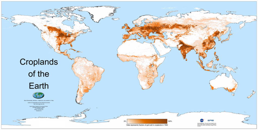
The map below, from University of Wisconsin (data from 1992), has the exact same topic, but the cartographer choose a different projection and a different data visualization technique. Looking at the second map, it is easy to spot darker areas that matches biggest deformations on the first map. Is there one projection better than the other here? The first one is probably better to highlight top 5 on both sides of the distribution, as the second one is likely to be more detailed and to allow a more precise view of spatial distribution of cropland.
We could say the second projection is more “neutral” than the first one.

Source: University of Wisconsin, Esri & Nasa
Example 3
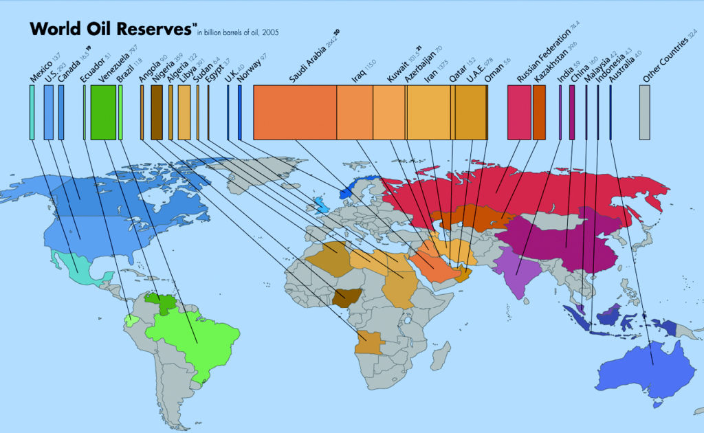
Here are two maps of oil resource in the world. The first one is using a Mercator projection, slightly sloping. Colors do not match anything but continents, and the size of rectangles indicated numbers of barrels produced in 2005. We kind of see that Saudi Arabia, Irak, Kuwait and Iran lead the market here, but more specific comparisons are made difficult. Plus, “other countries” are just put together as one category that is not clearly defined (I am assuming, all countries with less than 40 billion barrels produced this year).

Source: Terra Firma
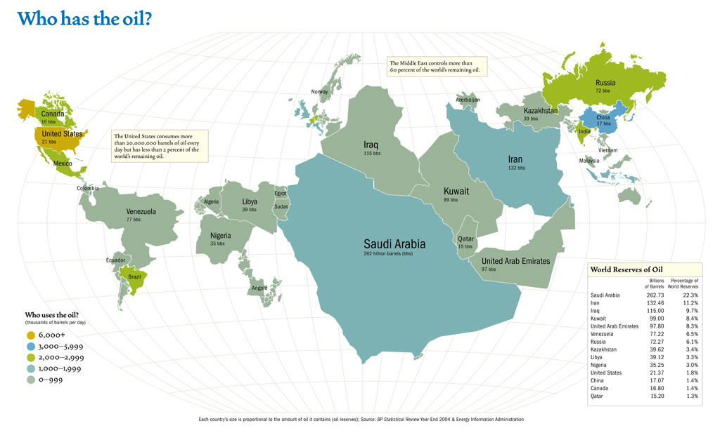
The second map is using a similar projection as the cartogram one, which makes the size of countries proportional to their oil annual production. On this one it takes 2 seconds to see who the main producers are, and give a good sense of proportions. The second one seems to have a much more powerful impact than the first one, doesn’t it?

Source : BP Statistical Review Year-End 2004
More examples…
What do you think of the following projection choices according to the topic of the map?
- How the Media See the World – the New York Time World Coverage Mapped (From Content Analysis Blog – Source: Observatoire des Medias): Link to the map – does the cartogram technique seems the right choice to you for the topic illustrated here?
- Ocean topography of the World – Link to the map – used here to explain seismic activity. What does the framing and projection tells you?
