
Call for nominations: Global Top 100 Geospatial Companies 2025 Edition

We’re thrilled to announce that the nomination phase for the Geoawesome Global Top 100 Geospatial Companies 2025 is officially open! ? Submit your entries by Friday, December 20th, 2024 and join us in this initiative to celebrate the most innovative and influential companies in the geospatial industry worldwide.
#GlobalTop100Geo 2025 Edition
What’s New This Year
- Enhanced Focus on Core Competencies: This year, we’re emphasizing core geospatial competencies and emerging trends shaping the future of the industry.
- Streamlined Nomination Process: We’ve simplified the nomination form by removing questions related to basic company data and reduced the total number of questions.
- Organic Awareness-Building Opportunities: All companies that participate in the nomination process will be contacted by our team with organic awareness-building opportunities, such as inclusion in our geospatial industry logo map, reports, and more.
How to Nominate
Starting today (October 1, 2024), you can nominate your company through our official nomination form.
Timeline and key dates:
- Open call for nominations: Tuesday 1st October 2024
- Deadline for nominations: Friday 20th December 2024
- Communication under embargo to 100 companies: Monday 27th January 2025
- Publication of the list and online event: Friday 31st January 2025
Criteria for Selection
As in past years, our expert panel will review all nominations and decide the final list. Companies will be evaluated based on:
- Product and Impact on the Industry
- Innovation and Technological Advancement
- Contribution to the Community
- Commitment to Diversity, Equity, and Inclusion (DEI)
- Environmental, Social, and Governance (ESG) Practices
About the Top 100 Geospatial Companies List:
Now in its 7th edition, this annual initiative celebrates the most innovative and influential companies in the geospatial industry worldwide. This authoritative list is not only a salute to these trailblazers but also an indispensable guide for professionals and aficionados across our diverse geospatial community. It’s an opportunity to recognize organizations that are pushing the boundaries of geospatial technology, driving innovation, and making significant contributions to the field.
You can check out our list from 2016, 2019, 2021, 2022, 2023 and 2024.
Expert Panel
- Sives Govender, Research Group Leader, CSIR, South Africa and Co- founder and coordinator of Environmental Information System-Africa
- Siau Yong, Director, GeoSpatial and Data & Chief Data Officer, Singapore Land Authority
- Osamu Ochiai, Senior Engineer, Manager for Satellite Applications and Operation Center at Japan Aerospace Exploration Agency
- Justyna Redelkiewicz, Head of Section Entrepreneurship and Environment at the European Union Agency for Space Programme (EUSPA)
- Chiara Solimini, Space Downstream Market Officer at the European Union Agency for Space Programme (EUSPA)
- Peter Rabley, CEO at Open Geospatial Consortium (OGC)
- Denise McKenzie, Manging Partner at PLACE Trust
- Dr. Nadine Alameh, Executive Director of the Taylor Geospatial Institute
- Paloma Merodio, VP at National Institute of Statistics and Geography of Mexico (INEGI)
and
- Aleksander Buczkowski and Muthukumar Kumar for Geoawesome


#Featured


Next article
Maps have long served as a tool for visualizing complex geographic data. In modern cartography, the bivariate map stands out for its ability to represent the relationship between two distinct variables in a single graphic.
By blending data into two different color schemes, bivariate maps offer insights that are often lost in single-variable (univariate) maps. This article explains the concept of bivariate maps, explores how to create one, and uses a case study to show how GDP and life expectancy across EU countries can be analyzed in QGIS using this method.
What is a Bivariate Map?
A bivariate map visually represents the relationship between two different data variables.
Typically, this is achieved through a grid where each axis corresponds to one of the variables, allowing cartographers to present a third dimension of insight. For instance, in the case of GDP and life expectancy, we can simultaneously evaluate countries that are both wealthy and have high life expectancies, or those with contrasting outcomes.
The power of bivariate maps lies in their ability to go beyond just showing patterns related to a single dataset. They allow us to compare and contrast multiple datasets simultaneously, identifying clusters, outliers, and correlations that would not be visible otherwise. This capability makes them useful in a wide range of fields, from public health to economics to environmental studies.
Steps for Creating a Bivariate Map in QGIS
Using GIS software such as QGIS, the process of creating a bivariate map becomes highly accessible. The following steps outline how this is done in the case study of GDP and life expectancy in EU countries, using publicly available datasets:
Step 1: Sourcing and Preparing Data
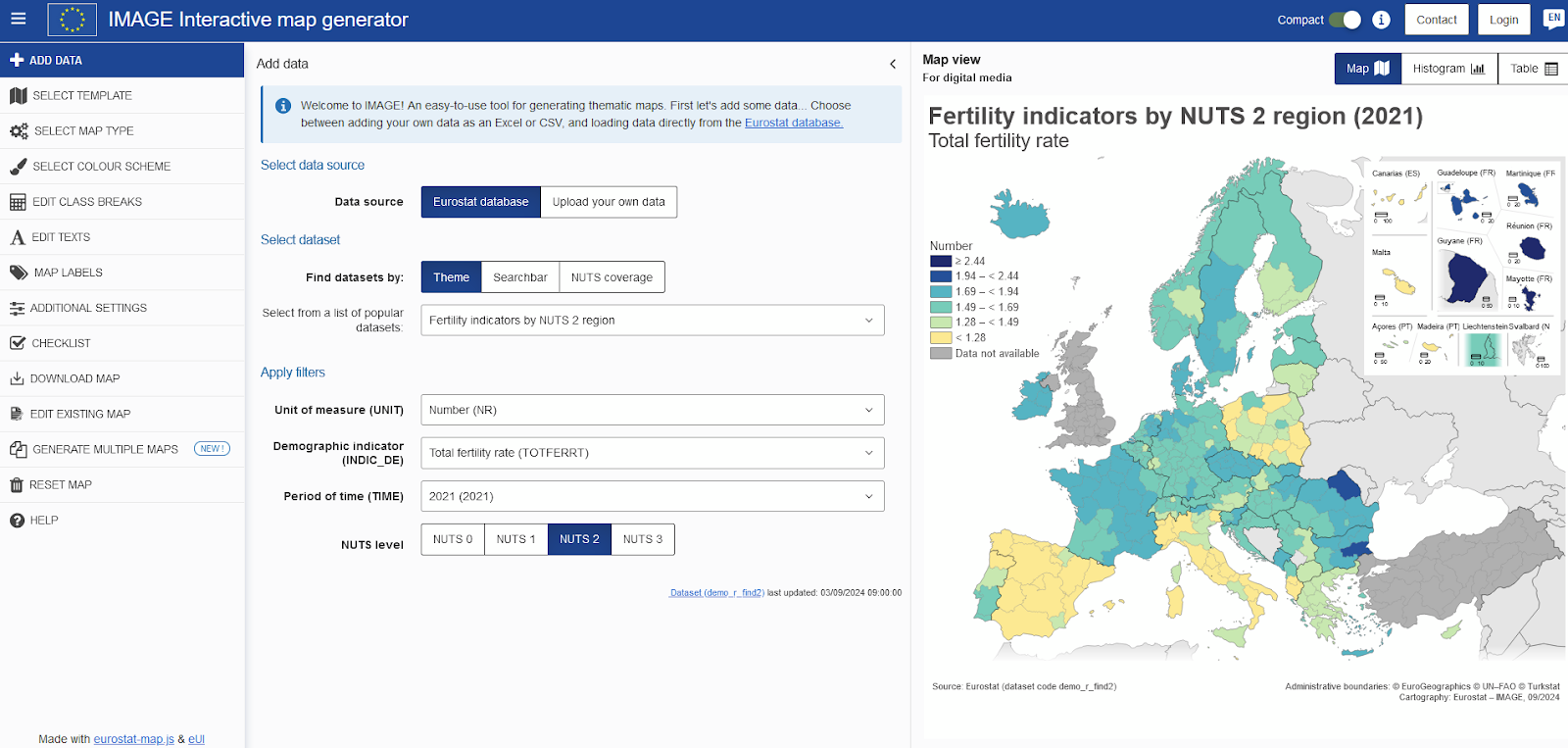
For this case study, data on GDP per capita and life expectancy were obtained from the GISCO (Geographic Information System of the European Commission) data services. We downloaded, cleaned, and imported the data into QGIS.
In QGIS, we then created separate layers for GDP and life expectancy. Each dataset was standardized and categorized using equal counts, a classification method that divides the data into classes containing an equal number of polygons (in this case, countries).
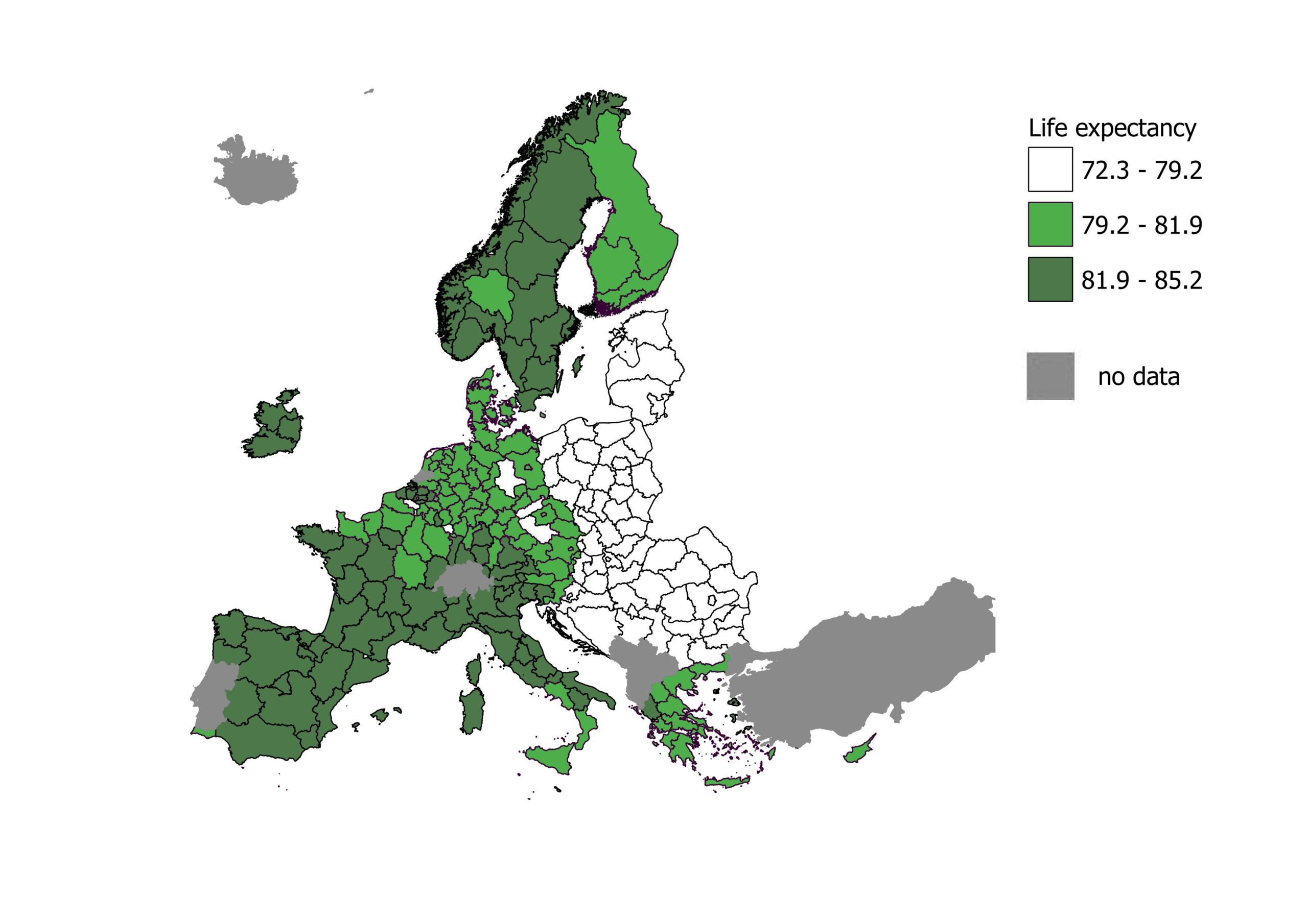
Life expectancy by age, sex and NUTS 2 region (2022)
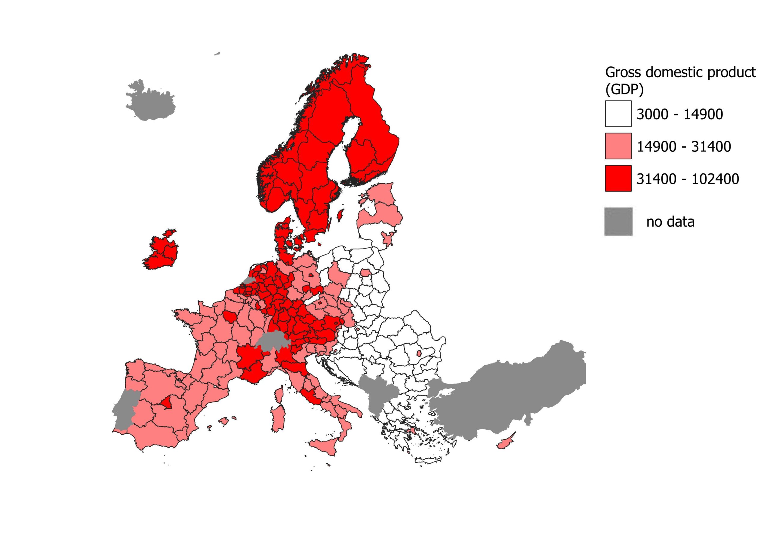
Gross domestic product (GDP) at current market price
Step 2: Categorizing Data into Equal Counts
One of the key steps in creating a bivariate map is classifying the data. In this instance, we used the equal counts method to ensure that each class contains the same number of polygons, making it easier to compare the distribution of data. For both GDP and life expectancy, we classified the countries into three distinct categories:
- Low
- Medium
- High
This method is particularly effective in bivariate maps because it distributes the data evenly, offering a balanced view of the spatial patterns.
Step 3: Using Field Calculator to Create Bivariate Classes
Once the data for GDP and life expectancy were classified, the next step involved creating nine bivariate classes that correspond to different combinations of the two variables. In QGIS, the field calculator tool was used to generate a new attribute for each country based on logical queries. The combinations of classes were defined as follows:
- Low GDP / Low Life Expectancy (1,1)
- Low GDP / Medium Life Expectancy (1,2)
- Low GDP / High Life Expectancy (1,3)
- Medium GDP / Low Life Expectancy (2,1)
- Medium GDP / Medium Life Expectancy (2,2)
- Medium GDP / High Life Expectancy (2,3)
- High GDP / Low Life Expectancy (3,1)
- High GDP / Medium Life Expectancy (3,2)
- High GDP / High Life Expectancy (3,3)
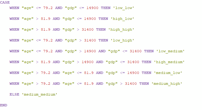
These nine categories capture the interplay between GDP and life expectancy across EU countries, revealing whether wealthier countries also experience better health outcomes or if there are notable exceptions.
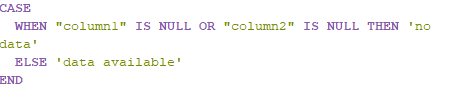
As there may be a lack in each dataset, we added a mask for regions with no data or only one variable available.
Step 4: Choosing a Color Scheme
A crucial aspect of bivariate mapping is the color palette. Since two variables are being represented, a two-dimensional color grid is necessary. Each combination of GDP and life expectancy classes must have its own unique color. For example, lower GDP and life expectancy may be represented by a light, muted color, while high GDP and life expectancy might be represented by a bold, vibrant color.
In QGIS, color blending is handled manually. To ensure clarity, it’s essential to choose a color scheme that remains legible and distinct across all nine categories. Colors that are easily distinguishable when put side by side allow for patterns and outliers to emerge at a glance.
Case Study: Mapping GDP and Life Expectancy in EU Countries
With the bivariate map now complete, it’s time to explore what it reveals about the relationship between GDP per capita and life expectancy in the European Union.
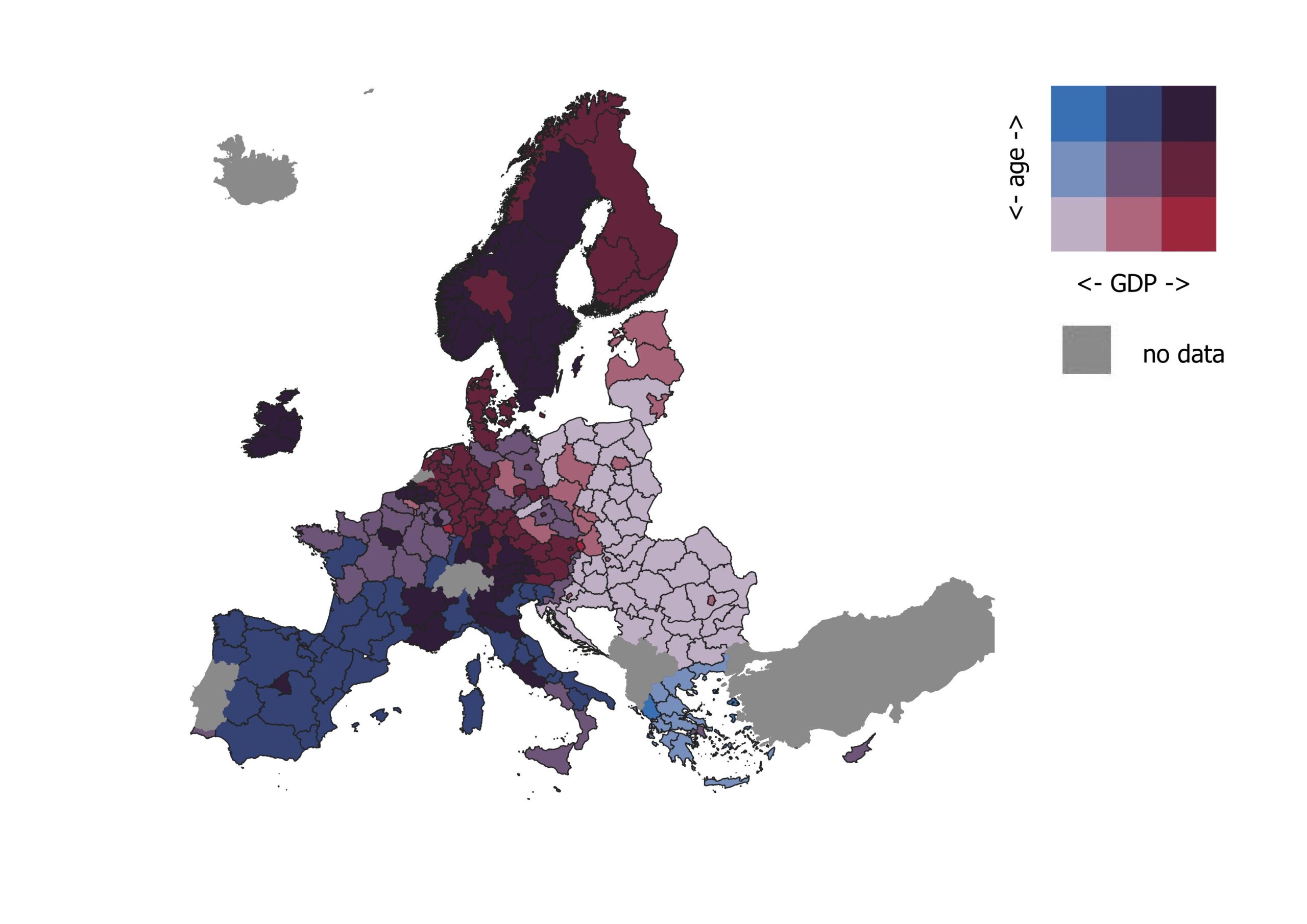
Output: bivariate map
Insights from the Map
The resulting bivariate choropleth map reveals a spatial pattern across EU countries. Countries in Northern Europe—such as Sweden, and Norway—fall into the High GDP / High Life Expectancy category, represented in bold colors. These nations not only have robust economies but also rank high in terms of the general health and longevity of their populations.
On the other hand, several Eastern European countries, including Bulgaria and Romania, fall into the Low GDP / Low Life Expectancy category. These countries, marked in lighter shades, reflect the economic and health challenges faced by regions that have not seen the same economic growth as their western counterparts.
There are, however, notable exceptions. For instance, southern regions of the EU show Medium GDP / High Life Expectancy, suggesting that life expectancy is not solely tied to wealth. These countries, including Italy, Spain, or Greece, have relatively modest economies compared to their northern neighbors, but their healthcare systems and lifestyles may contribute to better-than-expected health outcomes.
What Can We Learn from This?
The beauty of the bivariate map lies in its ability to uncover complex relationships that are difficult to observe from single-variable maps. The map of GDP and life expectancy across EU countries demonstrates the correlation between economic status and health, but also highlights exceptions and outliers where policies, culture, and infrastructure lead to deviations from expected trends.
By using bivariate maps, policymakers can gain deeper insights into how different factors interact. For instance, countries with high GDP but relatively low life expectancy might prioritize health-related investments, while countries with low GDP but high life expectancy could serve as models for achieving health improvements with fewer resources.
Bivariate maps are a useful tool for cartographers, policymakers, and researchers alike. By representing two variables in a single visual space, they reveal relationships and patterns, offering a more complete understanding of complex datasets.
Through QGIS and careful data categorization, cartographers can create insightful visualizations that drive better decision-making and deeper analysis. As datasets become more available and GIS tools become more user-friendly, the use of bivariate maps will undoubtedly continue to grow in popularity across various domains.
More about bivariate maps and palettes:
https://cran.r-project.org/web/packages/biscale/vignettes/bivariate_palettes.html
https://www.joshuastevens.net/cartography/make-a-bivariate-choropleth-map/
Did you like this post? Read more and subscribe to our monthly newsletter!

