#Featured #Ideas

Awesome visualisation of all underwater internet cables

Another great visualization from Business Insider. Last time we could watch how religions spread across the world. This time the BI team show us the location of every Internet Cable around the world. The visualisation is based on an interactive map by TeleGeography – a telecom data research firm. The map has been released back in 2011 but it’s regularly updated.

Today there are 885000 kms of cables under seas and oceans around the world and the number is growing, as we store and create more and more data. It is estimated that 99% of all international data is transmitted via cables on the ocean floor. The cables are not thicker than 8cm and lay at depths of up to 8,000 metres. Most importantly without them we wouldn’t have the Internet.

The cables are installed by special boats called cable-layers. This business requires detailed maps of ocean floors as the cables must typically run across flat surfaces of the ocean floor. Cable also need to avoid coral reefs, sunken ships, fish beds, and other ecological habitats and general obstructions.

Really interesting.

Say thanks for this article (0)
The community is supported by:
Become a sponsor
#Featured
#Business #Featured
The Earth Observation Hub Report: 2024 Industry Trends and Analysis
Avatar for Muthukumar Kumar
Muthukumar Kumar 03.13.2024
AWESOME 4
#Featured #Science
A Global Road Surface Type Classification Dataset Powered By Deep Learning and Mapillary Data
Avatar for Sukanya Randhawa
Sukanya Randhawa 11.15.2024
AWESOME 5
#Business #Featured #Ideas
Why Have Scientific Datasets Been So Widely Adopted in Earth Observation and What Role Does Data Quality Play?
GeoawesomeTeam 07.17.2024
AWESOME 4
Next article
#Business #Featured #Ideas

CityMapper app will tell you where to sit on the Tube

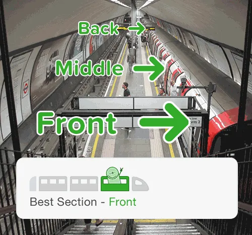
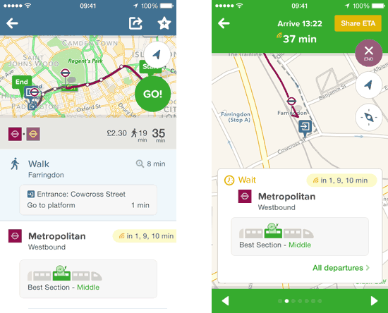
City mapper tube GeoawesomenessCityMapper a popular transit app offering public transportation directions in 30 cities around the world has added a new feature which is simple, useful and no one else has it.

The new functionality is called Train Car Exits. It shows you precisely where to sit on the train so you can be in the best possible spot to exit or transfer when you reach your stop.

This can actually save you 1–2 minutes of walking or even more time when you transfer.

In the blog post the company has admitted that its data is still imperfect and incomplete…  It comes from crowdsourcing as this kind of data are not structurally gathered in any way. The good thing is that the data will improve with time. Nonetheless, even today the data is  cool and the idea innovative. Way to go!

City mapper tube 2 Geoawesomeness

Read on
Search