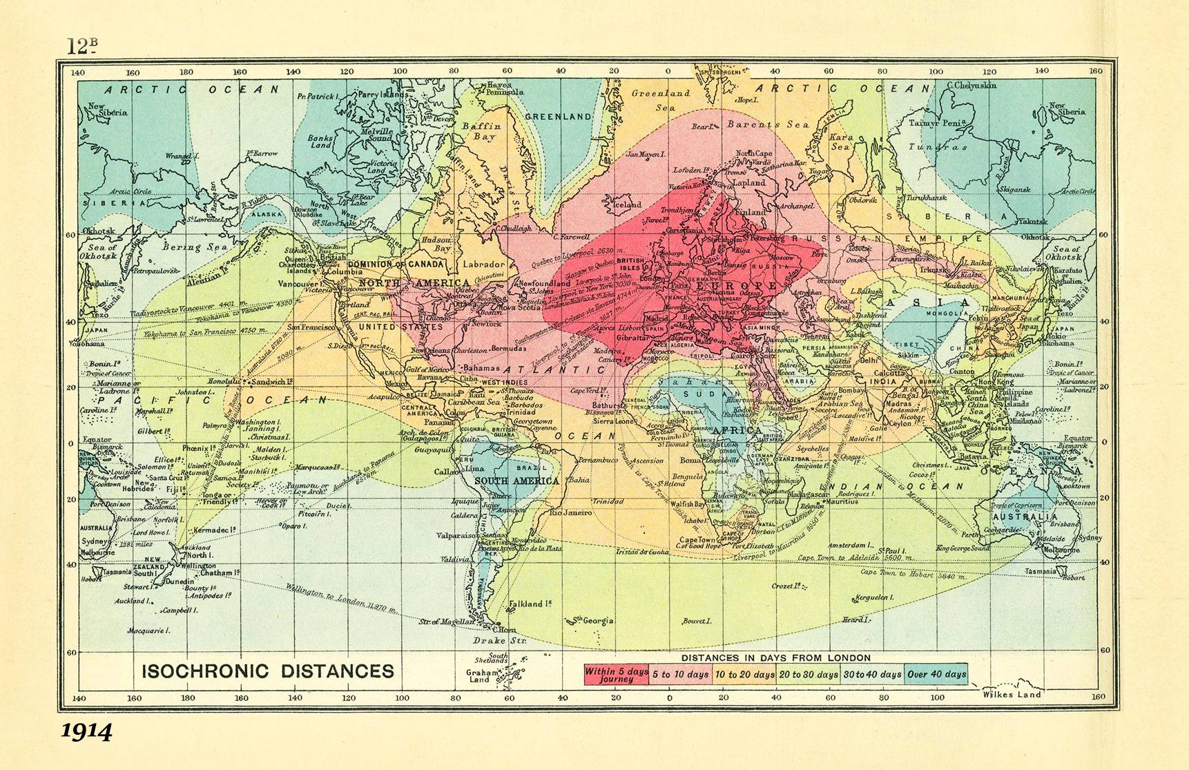
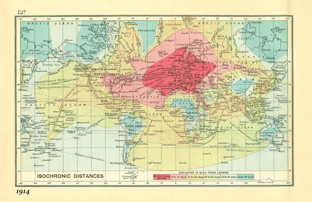
A few months ago we wrote about an amazing map created by British cartographer John G. Bartholomew in 1914. The map shows isochrones of travel from London to locations around the world.

It is striking that 100 years ago travelling was taking days or even weeks. You could travel the whole Europe within less than 5 days, getting to New York would take you up to 10 days and in order to get to Singapore or Australia you would need around 1 month.
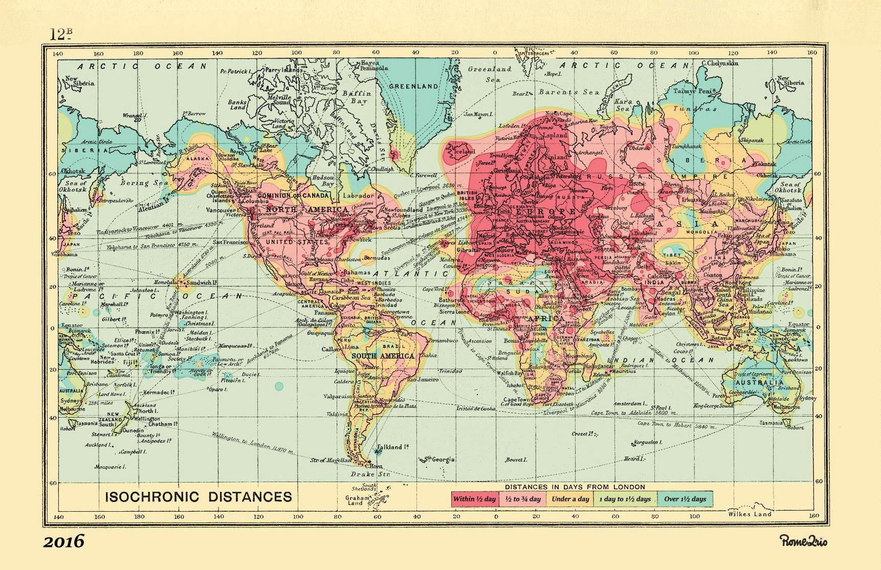
The map is so brilliant that guys from Rome2rio, a start-up that specialises in helping people get anywhere on the planet, decided to update it based on 2016 data. It is truly amazing how the mobility of people evolved together with the technological development. Today you can get almost anywhere in the world within 24h. There are a few places on the planet where it would take you more than 1 day to get to.

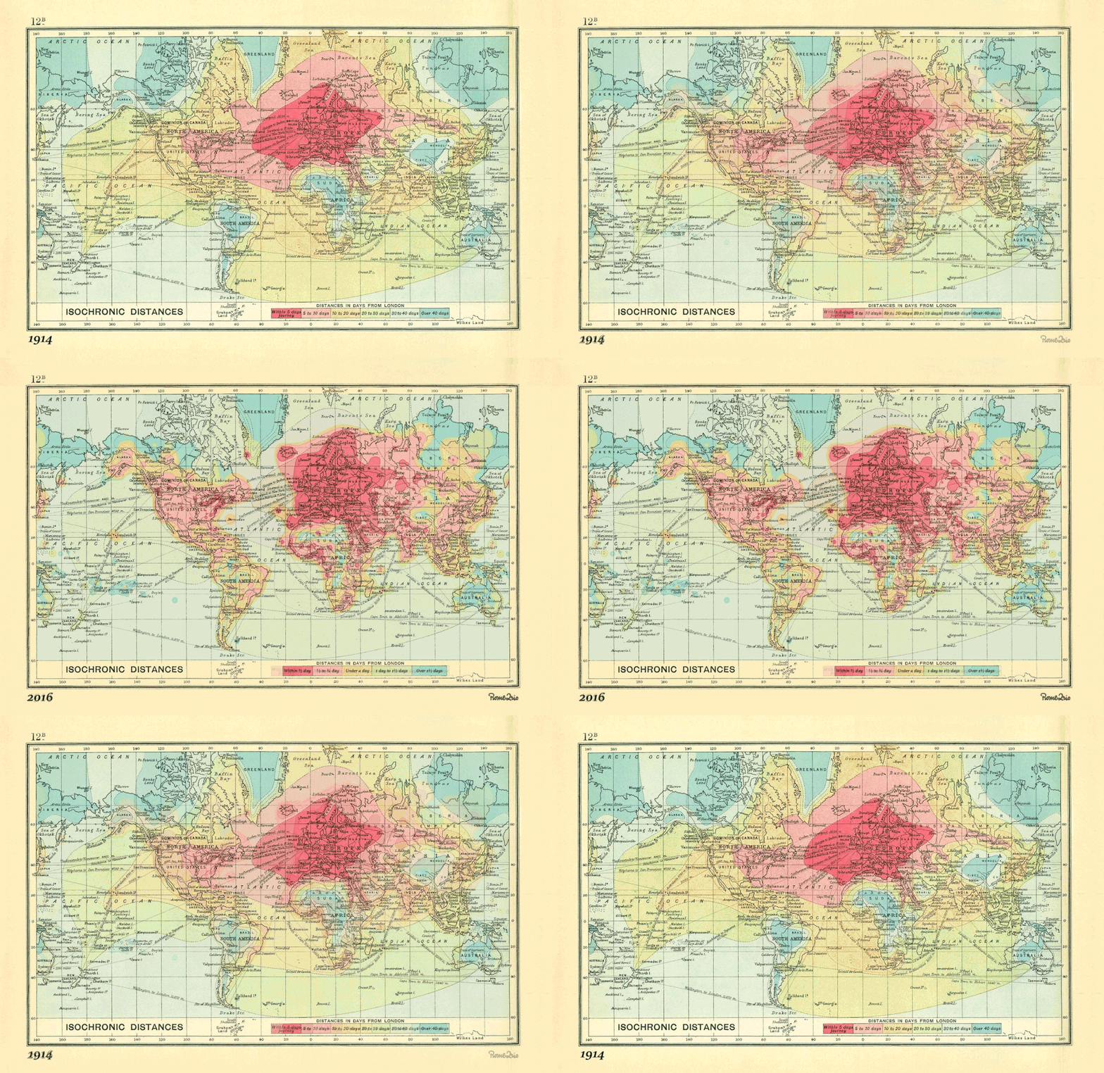
Based on these two maps I’ve decided to boot the overall impression and I’ve combined them into a small visualization that highlights where the biggest change occurred. Of course the map itself is amazing but what strikes me most is actually not the map but the legend of isochrones. Over just 100 years we’ve changed the unit of travel time from a day to an hour.

It’s amazing!


